25 Interior Trends: Navigating Warm vs Cool Tones for 2025
Welcome to the vibrant world of interior design, where the interplay of warm and cool tones can transform any space into a haven of style and comfort. As we step into 2025, the conversation around color is more dynamic than ever, with trends that reflect our evolving tastes, lifestyles, and desires. In this article, we’ll explore 25 interior trends that expertly navigate the spectrum of warm and cool tones, helping you discover how to create the perfect atmosphere in your home.Whether you’re looking to infuse energy into a tired room or achieve a calming retreat, the palette you choose can substantially impact the overall mood and aesthetic of your space. Expect to uncover fresh ideas, actionable tips, and inspiration drawn from the latest trends, so you can strike the perfect balance between warmth and coolness.From bold statements to subtle accents, this listicle promises to guide you in making informed design choices that resonate with your personal style. Let’s dive in and embrace the colors that will define our living spaces in the year ahead!
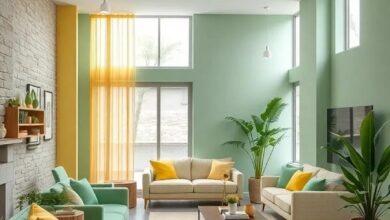
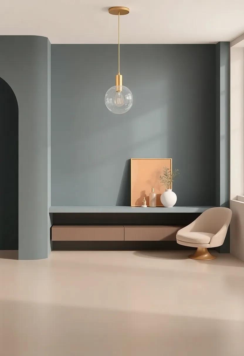
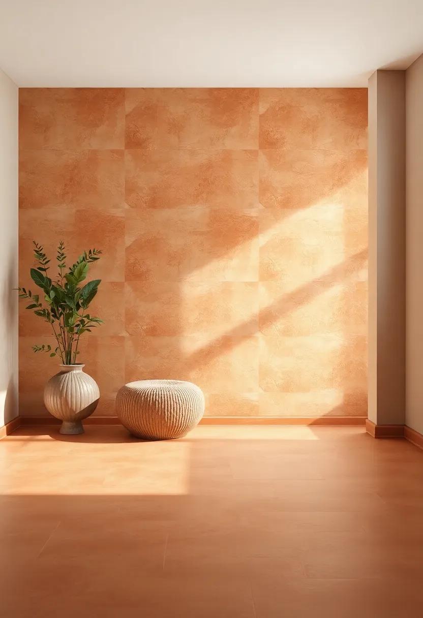
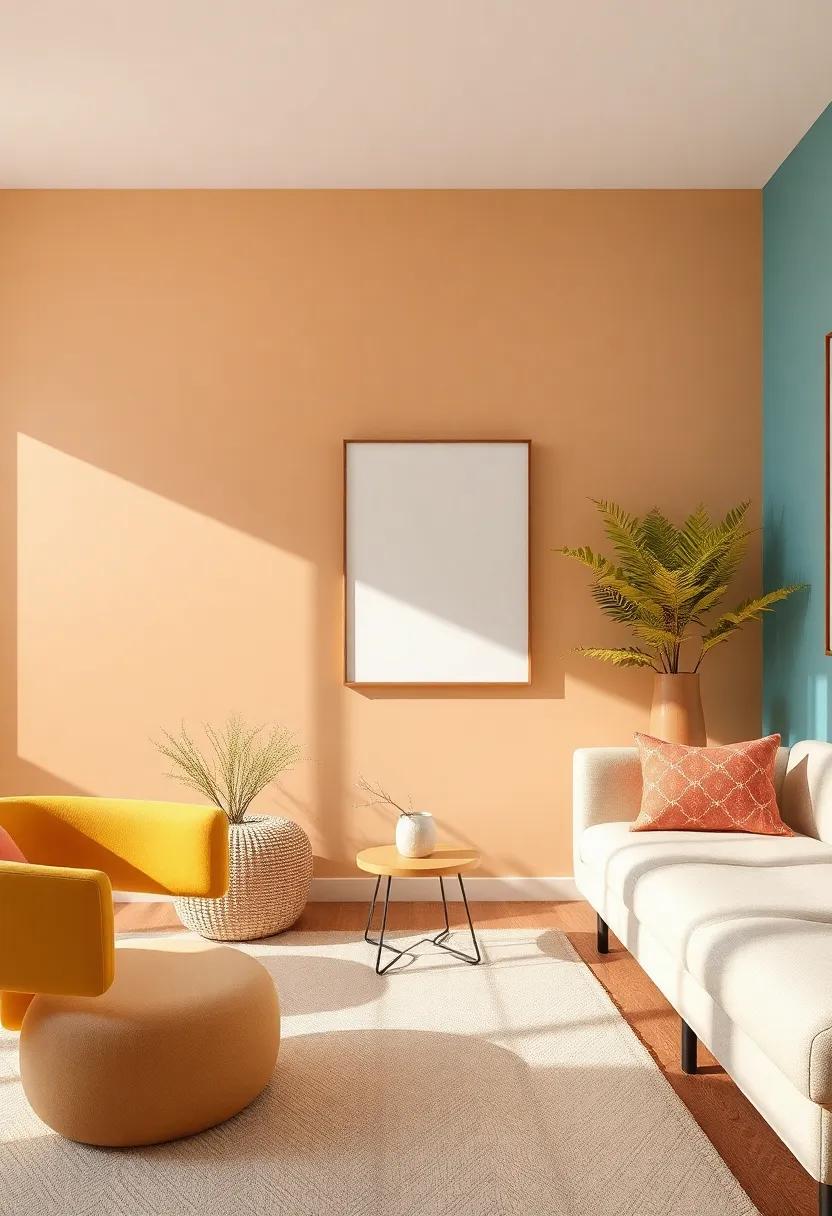
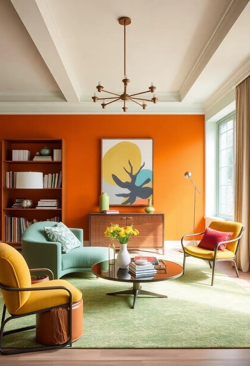
Embracing Earthy Tones: Learn how shades of terracotta and ochre create a comforting atmosphere that resonates with nature
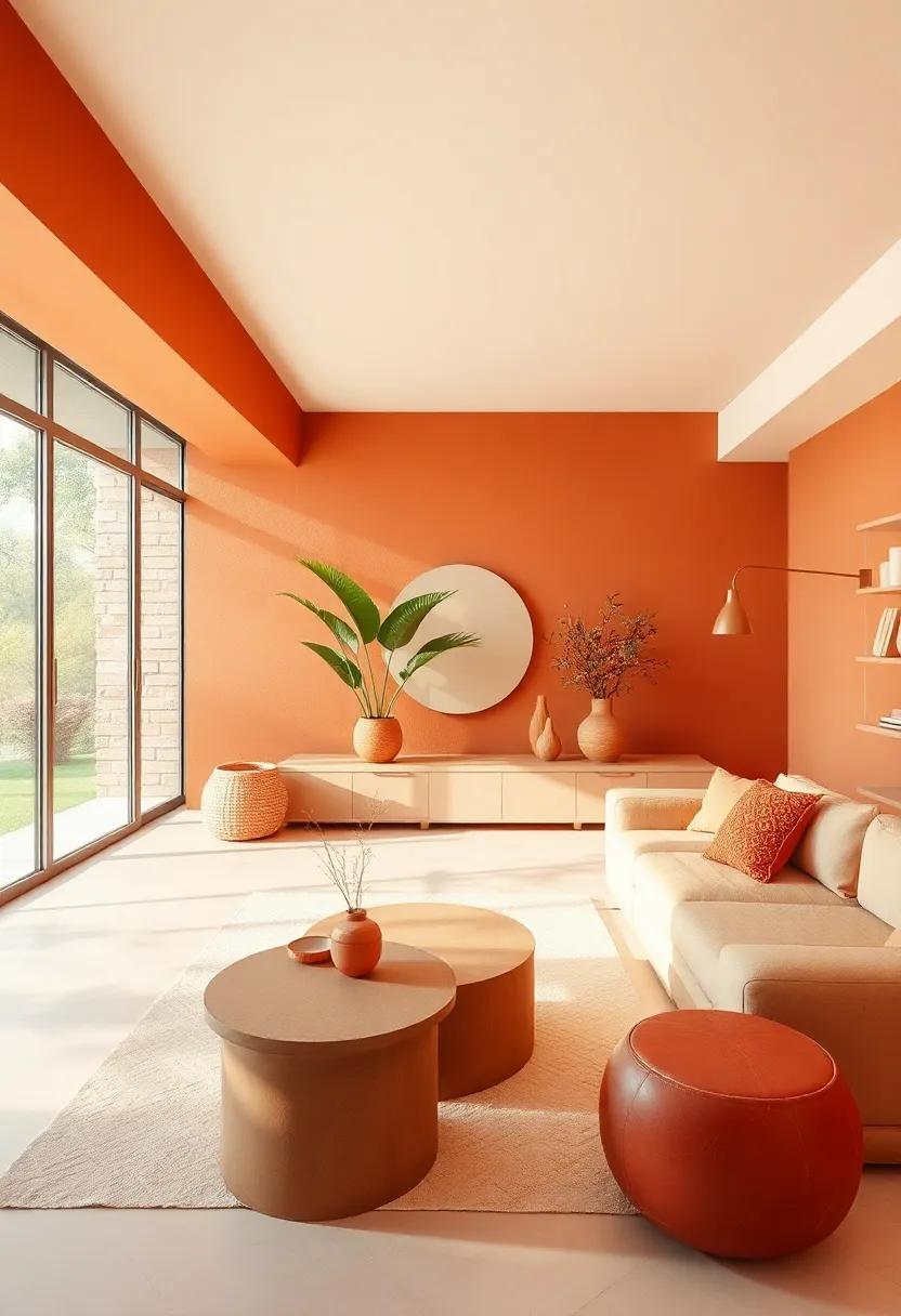
In recent years, the earthy shades of terracotta and ochre have emerged as stalwarts in interior design, offering a rich palette that fosters intimacy and warmth. These hues evoke images of sun-drenched landscapes and rugged terrains, making it easy to feel connected to nature even when indoors. By incorporating terracotta accents or ochre textiles, spaces transcend mere aesthetics and begin to nurture emotional well-being. Walls painted in soft terracotta can envelop a room in a cocoon of comfort, while ochre accessories introduce a lively yet serene touch that invigorates the senses.
Pairing these earthy tones with natural materials enhances the rustic charm of any space. Think wood beams, woven baskets, and ceramic pots, which further harmonize the warm color scheme with rustic textures. To create a cohesive look, consider these combinations:
- Terracotta tiles complemented by ochre-hued cushions
- Earthy artwork that includes both colors
- Natural fiber rugs to ground the color palette
In this way, the interplay between terracotta and ochre can craft a comforting atmosphere that not only decorates but also resonates deeply with the natural world around us. It transforms spaces into sanctuaries, encouraging relaxation and genuine connection.
Cool Coastal Vibes: Explore how soft blues and greens evoke the serenity of the seaside, perfect for tranquil spaces
Soft blues and greens mirror the hues of the ocean and forest, creating a refreshing backdrop that feels both calming and rejuvenating. When used in interior spaces, these colors harness the tranquility of nature, inviting a sense of peace into the home. Whether it’s the gentle lapping of waves or the rustling of leaves,these shades help replicate the serene soundtrack of the seaside,making them perfect for rooms meant for relaxation and unwinding.There’s something inherently soothing about integrating these colors into daily life, and they work beautifully in various design elements.
To fully embrace this aesthetic, consider incorporating the following elements into your décor:
- Pillow Textiles: Soft, plush cushions in pastel greens and soft blues create inviting seating areas.
- Wall Colors: Calm shades like seafoam green or sky blue can instantly transform a space into a restful retreat.
- art Pieces: Look for wall art featuring coastal landscapes or abstract watercolors to enhance the theme.
- Accent Furniture: Furniture in light, coastal-inspired tones adds to the overall ambiance.
Incorporating these serene colors can be done effectively through a thoughtful selection of accessories and textures. Here’s a simple comparison of ideal shades and their associated feelings:
| Color | Vibe |
|---|---|
| Sky Blue | Openness and clarity |
| Seafoam Green | Rejuvenation and freshness |
| Soft Aqua | Tranquility and calmness |
| pale Mint | Harmony and balance |
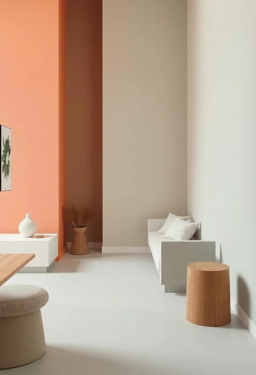
The Rise of Warm Neutrals: Discover the versatility of warm beige and taupe, setting a cozy backdrop for various decor styles
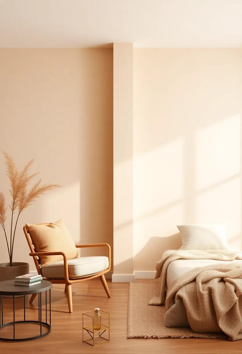
warm neutrals, particularly shades of beige and taupe, have emerged as the go-to color palette for creating inviting and versatile spaces.These hues can seamlessly adapt to a variety of decor styles, whether your aesthetic leans towards the modern minimalism of Scandinavian design or the rustic charm of farmhouse decor. Their subtle undertones provide a snug and cozy atmosphere while allowing for ample room to play with contrasting colors and textures. Interestingly, these shades harmoniously marry with both natural and classic finishes, making them a solid foundation for any interior vision.
Utilizing warm neutrals opens up a world of design possibilities, accentuated by carefully chosen accent colors that can elevate your space. Consider pairing warm beige walls with splashes of deep forest green or rich terracotta furnishings to evoke a sense of earthiness and connection to nature. Alternatively, taupe’s understated elegance serves as a refined backdrop for bolder statements—think metallic fixtures or artwork in stunning jewel tones. The interplay between these warm tones and vibrant accents not only enhances the depth of your decor but also reflects a personalized touch that captivates the eye.
| Accent Colors | Style Inspiration |
|---|---|
| Forest Green | Nature-inspired Retreat |
| Terracotta | Rustic Farmhouse Charm |
| Navy Blue | Modern Minimalism |
| Mustard Yellow | Art Deco Elegance |
Bold Jewel Tones: Dive into the world of deep emeralds and sapphires that bring a touch of luxury and sophistication to interiors
Bold Jewel Tones
In 2025, deep jewel tones like emerald green and sapphire blue are poised to elevate interiors to new heights of sophistication. These rich pigments create a sense of depth and luxury, transforming mundane spaces into opulent retreats.Incorporating these hues as accent walls, in furniture, or through decorative accessories can add an exquisite touch to living areas.Pairing jewel tones with metallic accents, such as gold or brass fixtures, enhances their luminosity and creates a stunning contrast that captives the eye.
Creating a cohesive look doesn’t require a complete overhaul of your space. Consider introducing jewel tones through various elements like velvet cushions, art pieces, or area rugs. This method allows you to play with color without overwhelming the room. A color palette that combines jewel tones with neutral shades,such as greys,beiges,or whites,can result in a balanced aesthetic that feels both inviting and majestic.
| Jewel Tone | Suggested Combinations | Room Suggestions |
|---|---|---|
| Emerald Green | Muted Neutrals, Gold | Living Room, Bedroom |
| Sapphire Blue | Soft Whites, Silver | Kitchen, Dining Room |
| Amethyst Purple | Warm Greys, Rose Gold | Home Office, Bathroom |
Monochromatic Magic: Uncover how layering different shades of the same color can either warm up or cool down a space
Exploring the nuances of a single color can transform your space into a harmonious work of art. With the mastery of layering different shades, you can manipulate the mood of a room effortlessly. By mixing light taupe with deep chocolate, as an example, you can create a cozy atmosphere, warming up the usually sterile feel of modern interiors. Similarly, using a spectrum of cool blues, from dusty sky to deep navy, fosters a refreshing and serene ambiance, ideal for relaxation. Consider incorporating textiles like curtains, cushions, and throws in varying shades to achieve this gradient effect, providing both depth and dimension.
To create a balanced layered look, consider the following combinations:
- Warm Layers: Peach, Coral, Terracotta
- Cool Layers: Mint, Teal, charcoal
- Neutrals: Beige, Taupe, sand
| Warm Tones | Cool Tones |
|---|---|
| Rust | Slate blue |
| Saffron | Cerulean |
| Brick Red | Pale Aqua |
Natural elements like wood accents can enhance these layered tones, grounding the color story and adding texture. Whether your goal is to embrace intimacy with warmer shades or instill calm with cooler hues, the art of monochromatic layering invites creativity and self-expression, allowing your space to become a personalized sanctuary.
The Influence of Biophilia: See how incorporating plant-inspired greens can bridge the gap between warm and cool aesthetics
The concept of biophilia emphasizes our intrinsic connection to nature, and this principle is increasingly being integrated into interior design. By embracing plant-inspired greens, designers can create spaces that effortlessly blend warm and cool aesthetics. Rich greens, such as emerald and sage, can offer a refreshing contrast against warm wood tones or terracotta elements, creating a harmonious balance that soothes the eye. This infusion of nature helps to soften stark design elements typical of cooler color palettes, resulting in a seamless transition between warm and cool tones.
Incorporating biophilic elements can be achieved through various design choices,such as:
- Living walls: Vertical gardens that introduce lush vegetation into living spaces.
- Botanical prints: Fabrics and wallpapers featuring botanical motifs, portraying greenery without the maintenance.
- Natural materials: Using stone, wood, and organic textiles that evoke a sense of the outdoors.
- Green accents: Accenting with deep greens through furniture and accessories to bridge contrasting colors.
| Element | Warm Aesthetic | Cool Aesthetic |
|---|---|---|
| wood Surfaces | Warm oak and maple | Cool bamboo finishes |
| Textiles | Rustic jutes and warm weaves | Crisp linens and cool-toned fabrics |
| Greenery | Vibrant greens like moss | Cool silvery greens like eucalyptus |
Textured Warmth: Delve into the use of rich fabrics like velvet and wool, which enhance warmth even in cooler color palettes
In the realm of interior design, the selection of fabrics plays a pivotal role in defining a space’s atmosphere. Rich textiles like velvet and wool not only infuse a sense of elegance but also enhance warmth,making them ideal choices even within cooler color palettes. Imagine a contemporary living room draped in deep teal velvet curtains, complemented by cozy wool throw blankets in charcoal gray that invite you to snuggle in. This juxtaposition of soft textures against a muted background creates a harmonious blend that marries comfort with sophistication.
Furthermore, the tactile quality of these materials offers an inviting allure, drawing the eye and creating depth in a design scheme.Incorporating rich fabrics can transform a stark ambiance into a welcoming sanctuary. Consider layering various textiles: plush velvet cushions on a sleek leather sofa or a handwoven wool rug underfoot. Such arrangements not only soften the overall look but also add a touch of luxury and intimacy to the space. Here’s a quick overview of how to effectively use these fabrics:
| Fabric | Effect | Ideal Use |
|---|---|---|
| Velvet | Luxurious and inviting | Curtains and upholstery |
| Wool | Warmth and texture | Rugs and throws |
| Combination | Depth and comfort | Accent pieces and layering |
Cool Gray Accents: Learn how cool grays can elevate a warm-toned room, adding depth and modernity without overwhelming
Incorporating cool gray accents into a warm-toned room can create a visually stunning balance that enhances the overall design without overwhelming the existing palette. The gentle contrast of cool grays against warm hues, such as soft golds or rich browns, can add elegance and sophistication. Consider introducing shades like slate, dove, or steel gray through decorative elements like throw pillows, artwork, or even feature walls. Here are some effective ways to integrate these tones:
- Accent Walls: A cool gray accent wall can serve as a striking backdrop, highlighting the warmth of your furniture and decor.
- Textiles: Incorporate gray in your textiles,whether it be curtains,rugs,or cushions,to add texture and visual interest.
- Furniture: Consider furniture pieces such as a light gray armchair or a sleek coffee table to introduce a modern touch.
When using cool grays, it’s essential to ensure they harmonize with the warm tones already present in the room. The subtle interplay can evoke a sense of calm and balance, making the space feel more cohesive. To visualize the contrast, consider a simple comparison table of shades that work well together:
| warm Tone | Complementary Cool Gray |
|---|---|
| Soft beige | Dove Gray |
| Golden Yellow | slate Gray |
| Terra Cotta | Charcoal Gray |
By thoughtfully incorporating cool gray accents, you can elevate the entire atmosphere of your space, fostering a modern elegance that feels both fresh and inviting.
Warm Metallics: Explore the charm of gold and brass fixtures that bring warmth to any design scheme, balancing cooler elements
Warm metallics have made a stunning comeback, brilliantly enhancing both modern and traditional spaces. The allure of gold and brass fixtures adds a layer of sophistication that can easily balance cooler colors and materials in any design scheme. These warm tones not only bring a luxurious feel but also evoke a sense of intimacy and comfort, making them the perfect choice for spaces meant to invite relaxation. Consider incorporating these luminous accents in your home through:
- Lighting Fixtures: Chandeliers, pendant lights, and wall sconces in brushed brass or polished gold can dramatically impact the ambiance.
- Hardware: Door knobs, cabinet pulls, and drawer handles fashioned in warm metallics can elevate the aesthetics of even the simplest cabinetry.
- Bathroom Accents: Faucets, towel bars, and mirror frames made of warm metals can create a spa-like atmosphere.
The beauty of these fixtures lies in their versatility; they can complement a wide array of styles, from bohemian to minimalist. To truly embrace the harmony they bring,consider pairing warm metallics with natural textures and bold colors,such as:
| Color Palette | Complementary Texture |
|---|---|
| Rich Emerald Green | Exposed Wood |
| Deep Blue | Soft Fabrics |
| Terracotta | Woven Rattan |
This combination creates depth and interest,allowing gold and brass accents to shine even brighter while enriching the overall warmth of your design. Whether used sparingly or as statement pieces, warm metallics are poised to create timeless charm in any interior for 2025.
Bold Black and White: Understand how the classic black-and-white palette can serve as a sophisticated backdrop for warmer accents
The timeless elegance of a black-and-white color scheme can provide a breathtaking canvas for the warm tones that are increasingly popular in contemporary interior design. This classic palette not only evokes a sense of sophistication but also highlights the beauty of complementary hues. Incorporating shades such as rusty oranges, soft corals, and warm yellows can transform the starkness of monochrome into a dynamic and inviting space. Consider using furniture pieces or decorative accents in these warmer tones to create focal points that draw the eye and break the visual severity of the black-and-white backdrop.
Here are a few ways to blend warmth with classic black and white:
- Artwork: Choose bold art pieces that incorporate golds or earthy tones to maintain visual interest.
- Textiles: Incorporating cushions and throws in warm textures adds both comfort and color contrast.
- Natural elements: Wooden accents or plants can introduce warmth and organic textures that soften the overall look.
Examine how these elements can be combined by exploring the table below, showcasing ideal pairings of warmer accent hues with black and white.
| Warm Accent Color | Best Complement | Suggested Use |
|---|---|---|
| Burnt Sienna | Deep Black | Cushions |
| mustard Yellow | Bright White | Artwork Frames |
| Cognac Brown | Charcoal Gray | Furniture |
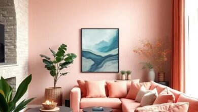
Pastel Play: Experience the shift towards soothing pastels that combine warmth and coolness, creating a harmonious balance
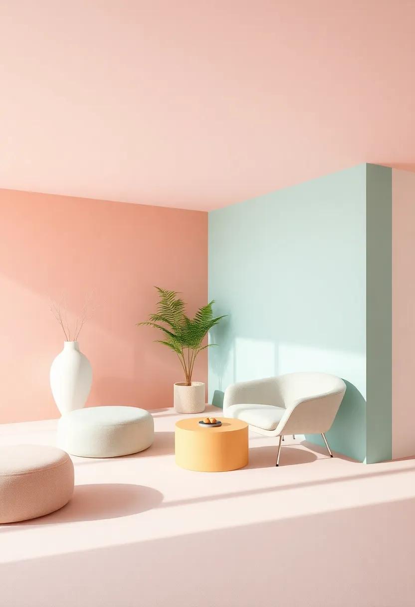
In the evolving world of interior design, a gentle wave of pastels is redefining the concept of comfort and style. These soothing shades, which seamlessly blend warmth and coolness, create an atmosphere of tranquility that invites relaxation. Think soft mint greens beside dreamy blush pinks, delicately complemented by warm beige accents. This harmonious palette not only enhances the visual appeal of a space but also plays an integral role in establishing emotional comfort. The pastels provide a sanctuary from the bustling energy of daily life, merging sereneness with a touch of vibrancy.
As the trend continues to gain traction, we can expect to see these muted hues applied across various interior elements. Whether it’s furniture, wall colors, or decorative accessories, the pastels will be at the forefront of creating cohesive and harmonious designs. homeowners are now favoring lighter woods and textured fabrics that allow these colors to shine. Key elements to look for include:
- Accent walls in soft lavender
- Textiles featuring sky blue and sandy beige patterns
- Accessories in pastel coral or mellow yellow
This brave yet gentle approach evokes feelings of warmth and calm, making it the ideal choice for both modern and traditional spaces.
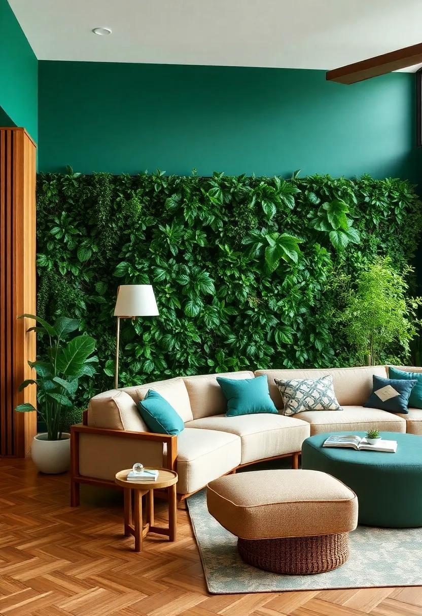
Urban Jungle aesthetics: Investigate how the integration of greens with warm wood elements creates a comforting yet vibrant space
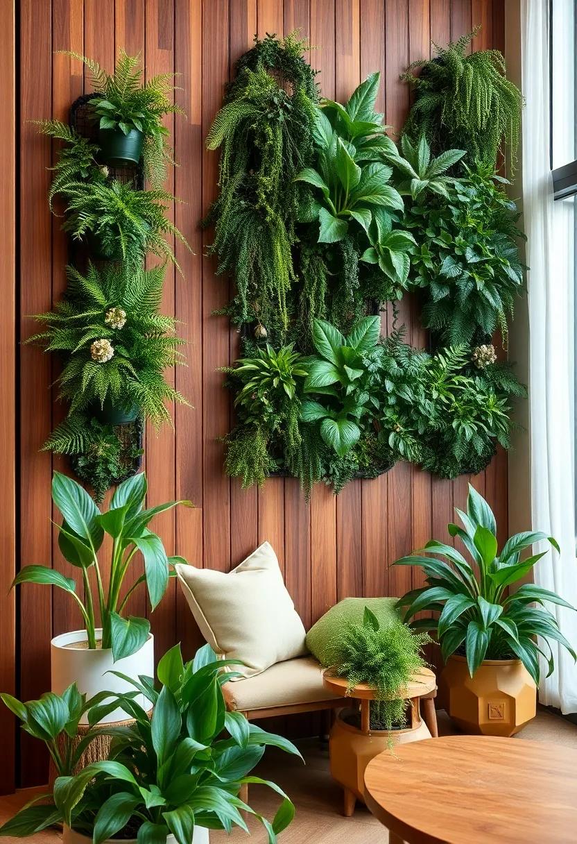
The integration of greenery and natural wood tones in interior design breathes life into urban spaces, crafting an atmosphere that is both calming and energetic. By incorporating various plant species, such as ferns and succulents, alongside warm wood finishes such as teak or walnut, interior designers are successfully bridging the gap between the harshness of urban environments and the tranquility of nature. The use of vertical gardens, for example, not only enhances the decor but also improves air quality, creating an inviting oasis. Incorporating these elements encourages a sense of serenity in the hustle and bustle of city living.
Key features of this design trend include:
- Warm Wood Accent Walls – Rich wood tones add depth, contrasting beautifully with greenery.
- soft Textiles – Combine natural fibers such as cotton and linen to soothe the senses against the vibrant backdrop of plants.
- Earthy Color Palettes – Complementing tones like terracotta and olive enhance the warm vibes while balancing the coolness from urban elements.
Tables crafted from repurposed timber not only add a sense of warmth but tell a story,embodying sustainability while inviting interaction. The marriage of greens with wooden accents cultivates a vibrant yet cozy space that’s ideal for social gatherings or a cozy retreat.
The Warmth of Terracotta Tiles: Discover why terracotta remains a timeless choice for flooring, marrying warmth with rustic charm
The allure of terracotta tiles lies in their ability to inject warmth into any space while evoking a sense of rustic charm that few other materials can replicate. Their unique, earthy tones vary from deep reds to soft browns, bridging the gap between modern aesthetics and traditional design. Homeowners are increasingly drawn to terracotta for its natural, handmade quality, which brings a personalized touch to interiors. With their rich texture and hue, these tiles serve as a stunning backdrop for various decor styles, from Mediterranean to Bohemian, creating an inviting atmosphere perfect for both cozy gatherings and quiet retreats.
Along with their aesthetic appeal, terracotta tiles possess practical benefits that enhance their enduring popularity. They are naturally porous,allowing them to regulate indoor humidity and keep spaces cooler in the summer while radiating warmth during colder months. This inherent thermal mass can result in energy efficiency, paired with their durability and low maintenance requirements. When considering traditional or contemporary designs, terracotta tiles make an extraordinary choice, offering versatility and longevity suited for both residential and commercial applications.
Cool White Spaces: Explore the minimalist trend leaning toward crisp,cool whites that open up spaces while providing a clean canvas
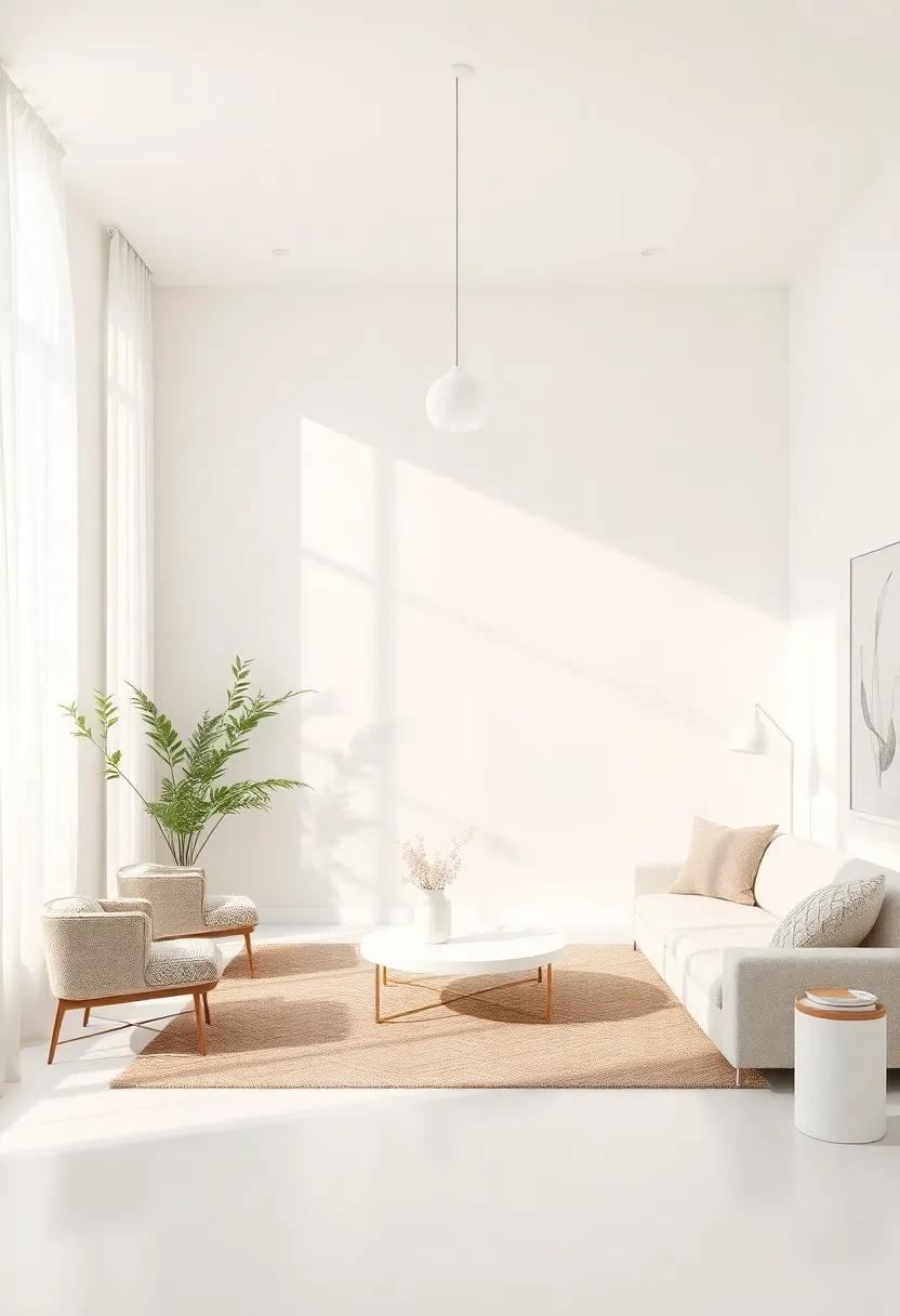
Minimalism continues to captivate design enthusiasts, and the embrace of crisp, cool whites is leading the charge into a new era of spacious elegance. This trend transforms interiors into serene retreats, where the lack of clutter and excessive color invites the mind to unwind. The palette is not simply about avoiding darker tones; instead, it plays with various shades of white, from bright alabaster to soft dove, creating layers of texture that maintain visual interest. A neutral canvas allows for brief pops of color through accessories and artwork, making it versatile enough for any style.
Implementing cool whites effectively can be achieved through a few clever design strategies:
- Accent Features: Incorporating sleek white furniture, like streamlined sofas or minimalist dining tables, can unify a room and establish focal points to draw the eye.
- Textural Play: Combine smooth, glossy surfaces with matte finishes; think white ceramic vases alongside knitted throws.
- lighting Choices: Harness the power of natural and artificial lighting to enhance the airy feel, opting for light fixtures that reflect warmth against cool whites.
to further illustrate the versatility of this trend, consider the following table showcasing ideal room elements and their potential color pairings:
| Room Element | Cool White Pairing |
|---|---|
| Sofa | Bright White with Light gray Cushions |
| Walls | Soft Pearl with Textured Artwork |
| floors | Whitewashed Wood with natural Fiber Rugs |
Warm Lighting Solutions: Understand how the right lighting can transform cool colors into cozy retreats, enhancing ambiance
When it comes to transforming spaces, the effect of warm lighting cannot be overstated. Unlike their cooler counterparts, warm light fixtures bathe a room in a gentle glow that enhances the richness of warm colors like reds, oranges, and yellows. Consider implementing these lighting solutions to create a cozy atmosphere:
- Soft White LED Bulbs: Mimicking incandescent lighting, these bulbs create a warm, inviting glow.
- Table and Floor Lamps: Strategically placed lamps can add visual interest and warmth, drawing attention to specific areas.
- Dimmer Switches: These allow you to control the intensity of your lighting, enabling you to set the perfect mood at any time.
- Accent Lighting: Use wall sconces or pendant lights to highlight artwork or architectural features without overwhelming the space.
Incorporating these combinations of warm lighting with cool color schemes can produce stunning results. A serene blue wall, when illuminated with soft golden lighting, transforms into a tranquil retreat, blurring the lines between cool and cozy. By experimenting with the following table ideas,you can further amplify the aesthetic of your interior spaces:
| Color | Suggested Lighting | Effect |
|---|---|---|
| Soft Gray | Warm Ambient Light | Creates a serene and sophisticated atmosphere. |
| Teal | Gold-toned Fixtures | Enhances depth and adds a touch of luxury. |
| Muted Lavender | Warm White Bulbs | Creates a soft, calming environment perfect for relaxation. |
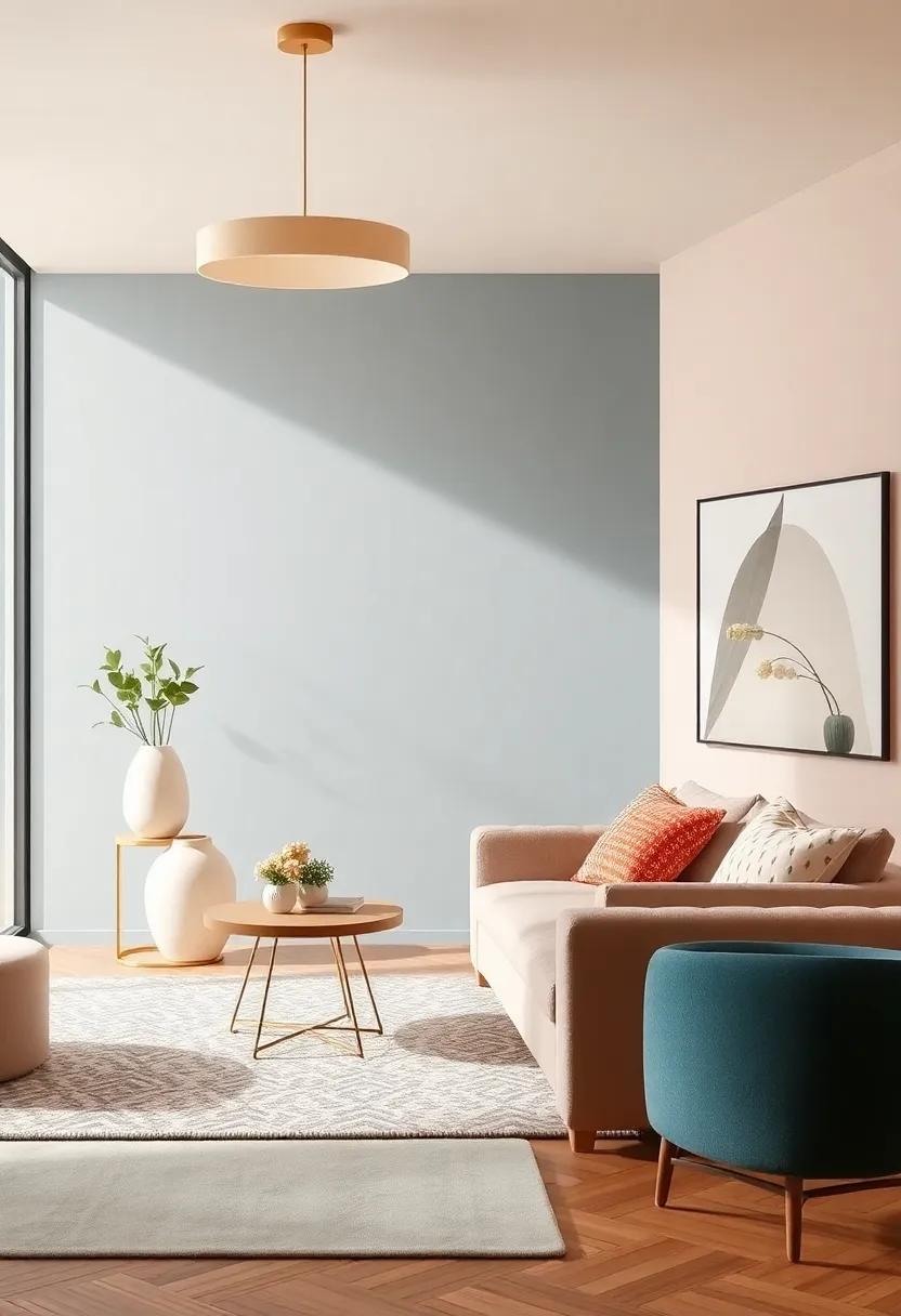
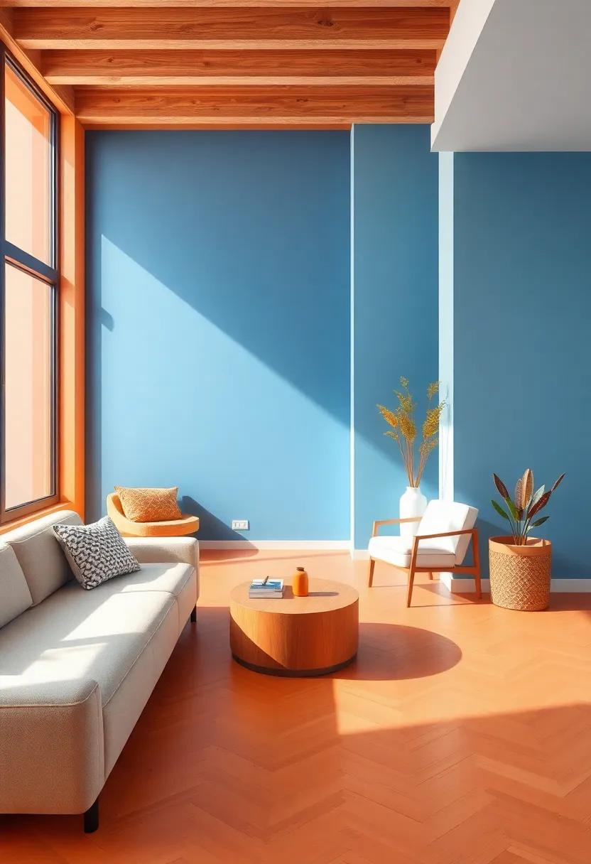
Transitional Color Schemes: Learn about the trending approach of blending warm and cool colors for a seamless, inviting look
Transitional color schemes have become a hallmark of modern interior design, skillfully blending warm and cool tones to create an inviting atmosphere that transcends styles and moods. Incorporating rich earth tones like terracotta and muted golds alongside cooler shades such as dusty blues and soft greys fosters a harmonious balance that feels both soothing and energizing. This approach allows for easy adaptability across seasons, ensuring that your space feels fresh and inviting all year round. Key color combinations to explore might include:
- Warm taupes paired with serene sage greens
- Rustic brick reds against deep teal
- Ivory whites complementing powdery blues
This method can be applied through small accents or larger elements in your design, and even extends to textiles, artwork, and furnishings. Consider using a color wheel to identify and experiment with complementary shades that resonate with the emotions you wish to evoke. Below is a simple guide to help visualize your options:
| Warm Tones | Cool Tones |
|---|---|
| sunset Orange | Ocean Blue |
| Golden Yellow | Soft Mint Green |
| Rich Burgundy | Cool Lavender |
By integrating these combinations, your interiors can achieve a seamless look that feels organic and thoughtfully designed. Remember, the beauty of transitional color schemes lies in their versatility; layering colors sensibly allows for personal expression while keeping your space adaptable and cohesive.
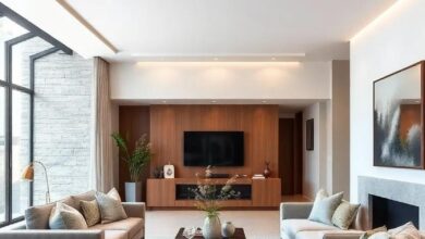
The Return of Rich Woods: Explore how warm wood tones are making a comeback, adding depth and character to modern designs
The resurgence of rich wood tones in interior design is a delightful nod to the past, bringing a sense of warmth and authenticity to contemporary spaces. As designers and homeowners alike look for ways to infuse character into modern settings,natural woods are stepping into the spotlight. Whether through a stunning walnut accent wall or a reclaimed oak dining table, these warm tones create a striking contrast against cooler hues, offering a balanced aesthetic that is both inviting and sophisticated.
Integrating rich woods into your design can be accomplished in various ways, allowing for versatility and personal expression. Consider incorporating elements such as:
- Wood Beams: Exposed ceiling beams can add rustic charm while enhancing vertical space.
- Furniture: Opt for handcrafted wooden pieces that showcase the grain and texture.
- Accent Walls: A feature wall made from richly stained wood can serve as a focal point in any room.
- Flooring: Warm-toned hardwood floors offer a timeless appeal that complements any decor style.
To further highlight this trend, take a look at how different wood types contribute to the overall ambiance:
| Wood type | Color Tone | Ideal Use |
|---|---|---|
| Walnut | Dark Brown | Furniture & Accents |
| Maple | Light Cream | Cabinets & Counters |
| Cherry | Rich Red | Flooring & Trim |
| Teak | Golden Brown | Outdoor & indoor pieces |
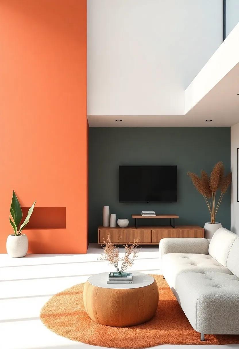
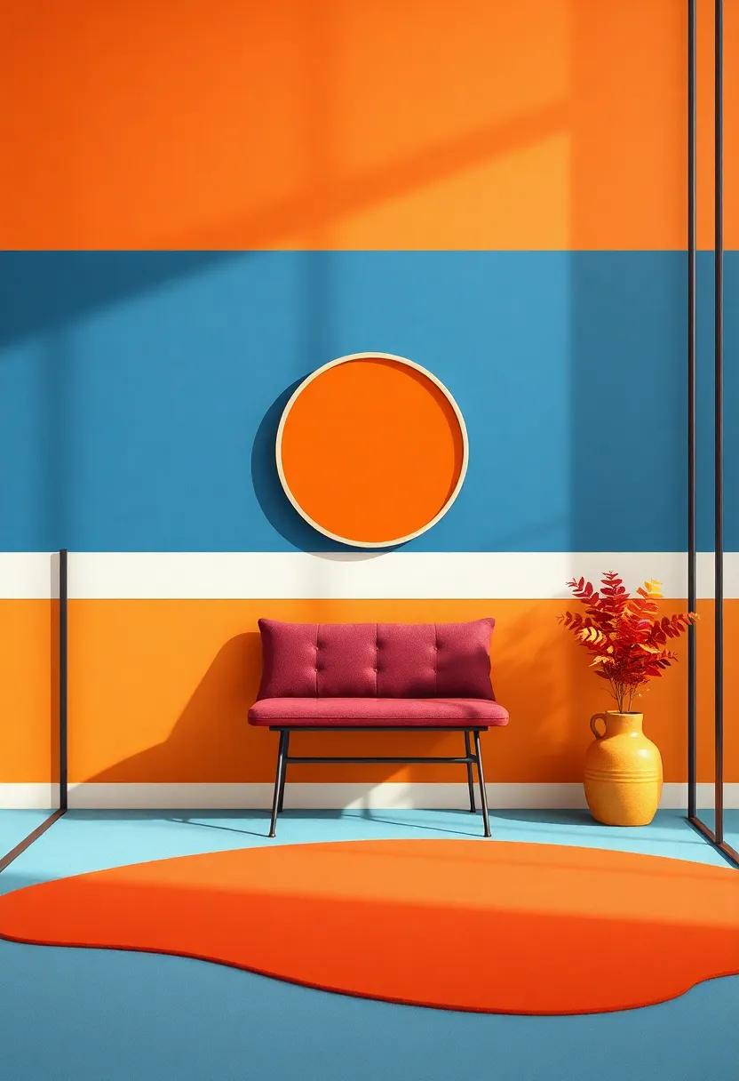
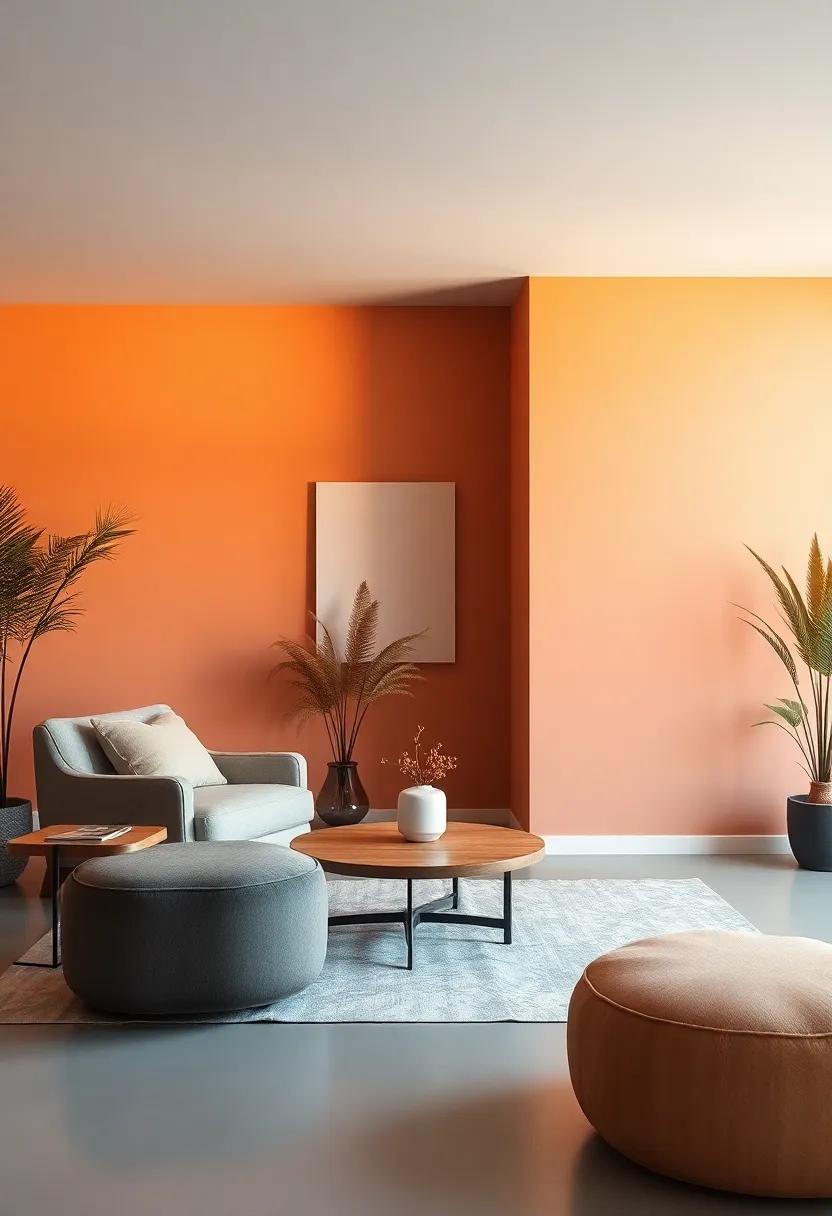
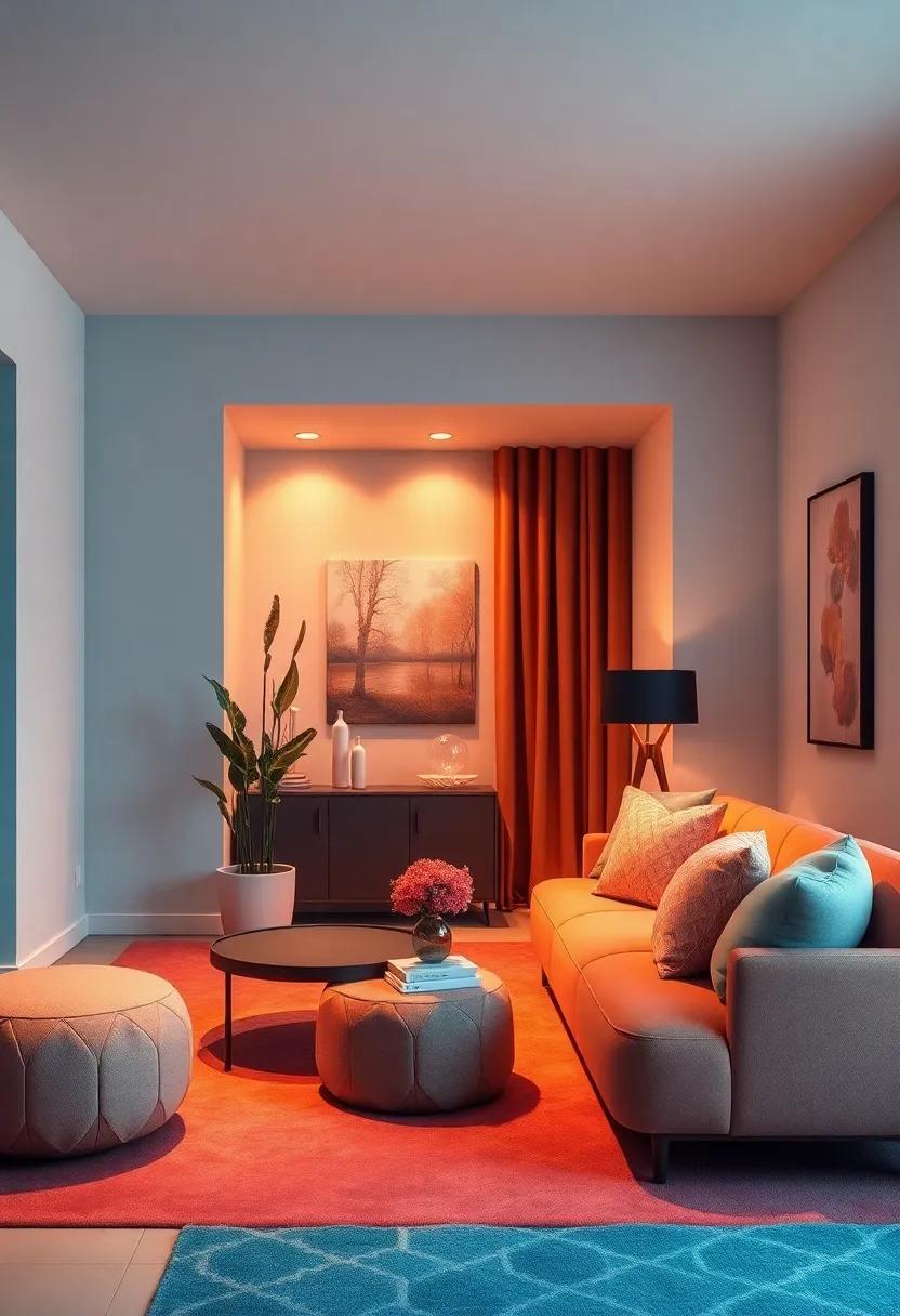
Color Blocking: Dive into the trend of bold color blocking, experimenting with warm and cool tones for striking visual impact
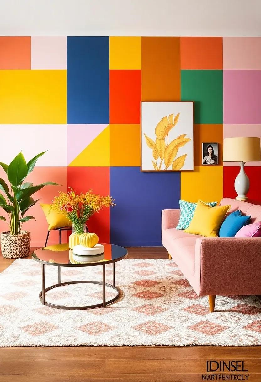
Color blocking is taking the design world by storm, transforming spaces into vibrant canvases bursting with personality. By merging warm tones such as fiery reds, radiant oranges, and sunny yellows with cool tones like tranquil blues, lush greens, and soft lilacs, homeowners can create environments that are both dynamic and inviting. Whether it’s a feature wall adorned with geometric patterns or a mix of furniture pieces that play off one another, embracing this trend allows for freedom of expression while maintaining a cohesive aesthetic. Incorporating bold shades can convert any mundane room into a theatrical masterpiece, encouraging creativity and sparking conversation.
To fully embrace color blocking, consider the following tips for striking visual impact:
- Start with a Neutral Base: Establish a foundation with neutral-colored walls or furniture to let your colors shine.
- Use Accessories: Play with cushions, throws, and art pieces in contrasting tones to add depth and interest.
- Choose Complementary Colors: Utilize the color wheel to determine which colors paired together will enhance the overall mood.
- Experiment with Textures: Mix various materials like wood, metal, and fabric in your chosen hues for a richer palette.
here’s a simple visual portrayal of how different color combinations can affect the ambiance of a room:
| Color Pair | Emotional Impact |
|---|---|
| Red & Blue | Dynamic and Energetic |
| Yellow & Green | Fresh and Uplifting |
| Purple & Orange | Bold and Creative |
| Soft Pink & Teal | Calm and Rejuvenating |
Embracing the daring combination of warm and cool hues through color blocking not only revitalizes your living spaces but also reflects individuality, making each room a unique expression of its inhabitants. Dive in, experiment, and let colors tell your story.
Vintage Revival: See how vintage warm tones are re-emerging to reflect nostalgia, offering a welcoming vibe to contemporary spaces
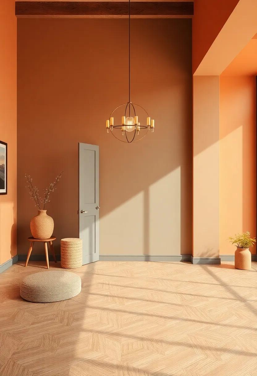
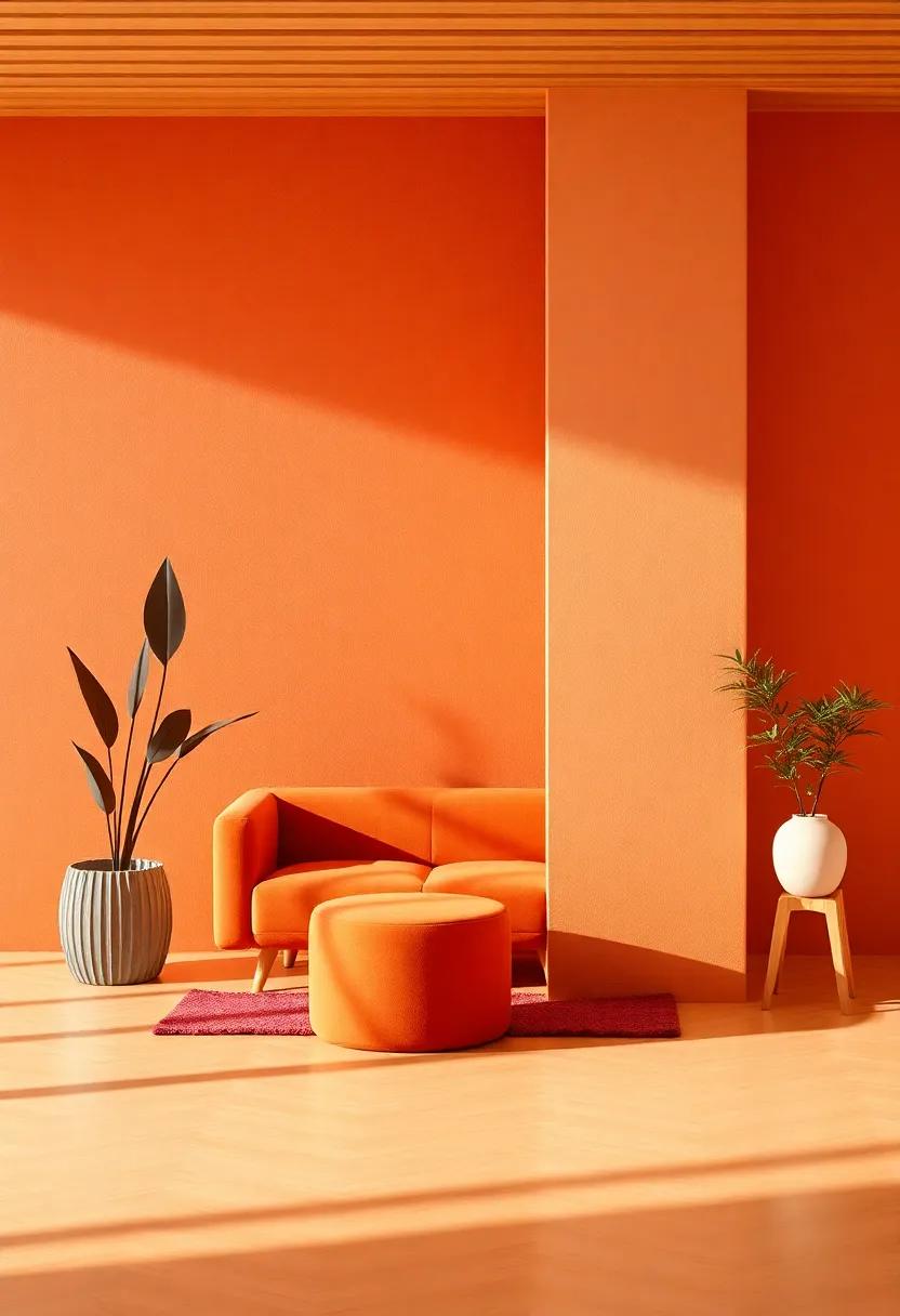
The resurgence of vintage warm tones is taking the interior design world by storm, bringing a nostalgic essence that envelops contemporary spaces with a cozy embrace. Colors like muted ochres, burnt siennas, and soft, sun-faded reds are making a statement in everything from wall paint to upholstered furniture. This palette draws inspiration from eras past, inviting a sense of comfort and familiarity that resonates deeply with current homeowners. By blending these tones into modern designs, interiors reflect warmth and charm, making spaces not just livable, but truly inviting.
Key elements fueling this revival encompass various design strategies and finishes, allowing vintage vibes to flourish alongside modern aesthetics:
- Textiles: Incorporating retro-patterned fabrics in pillows and curtains adds layers of texture.
- Accessories: Vintage-inspired art pieces and decorative items provide an authentic touch to contemporary setups.
- Lighting: Warm-hued lighting fixtures, such as Edison bulbs or brass accents, contribute to the overall welcoming vibe.
- Wood Finishes: Rich,warm woods in furniture pieces enhance the vintage feel and add depth.
| Vintage Warm Tones | Modern Applications |
|---|---|
| Muted Ochre | Accent Walls |
| Burnt Sienna | Upholstered Chairs |
| Soft red | Art Prints |
| Dusty Rose | Pillows & Throws |
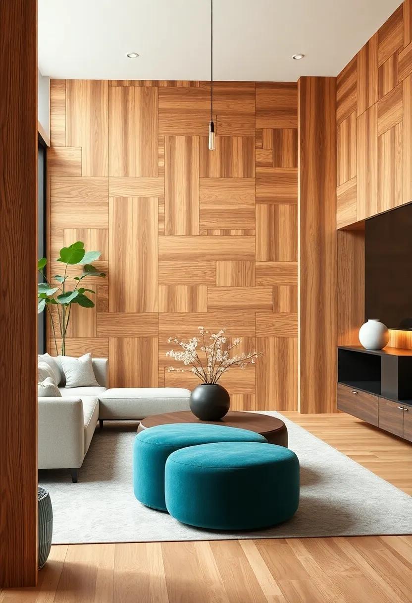
The Subtle Power of Accents: Learn how small cool tone accents can enliven warm rooms, injecting personality without overpowering
In the dance of color and design, accents wield remarkable influence, particularly when balancing warm spaces. By introducing cool tone accents, you can create a refreshing contrast that not only enlivens your environment but also adds depth and character. Consider incorporating elements like soft blues, gentle greens, or even dusty purples in pillows, art, and vases. These tones harmonize with warm neutrals like beige and terracotta, breathing life into rooms that might or else feel overly cozy or monochromatic.
To seamlessly blend these cool accents with warm interiors, think about their placement and scale.Here are a few impactful ways to incorporate cool tones:
- Wall Art: Choose prints with cool backgrounds to contrast warm walls.
- Textiles: Layer cool-toned throws over warm-toned sofas for visual texture.
- Decorative Objects: Use vases or sculptures in icy hues to draw the eye.
- Furniture: Consider statement pieces like a cool-toned accent chair against a warm palette.
Additionally, you can create a simple reference table to visualize how different cool tones can play with warm palettes:
| Cool Tone Accent | Complementary Warm Tone |
|---|---|
| Sky Blue | Warm Beige |
| Pale Mint | Terracotta |
| Dusty Lavender | Golden Yellow |
| Soft Grey | Warm Cocoa |
statement Fireplaces: Investigate how eye-catching fireplace designs can serve as the focal point, blending warm tones with cool elements
In the realm of modern interiors, statement fireplaces are emerging as artistic masterpieces that seamlessly blend function and aesthetics. These striking designs effortlessly command attention, transforming the living space into a cozy gathering spot while injecting personality into the decor. Homeowners are increasingly opting for eye-catching options that showcase bold colors, textured surfaces, and unique shapes, making fireplaces not just a source of warmth but also a vibrant statement piece. Whether you choose a sleek,minimalist design in cool hues or a rustic,earthy installation with warm undertones,the fireplace can serve as a unifying element in your home’s aesthetic.
The interplay of warm and cool tones creates a visually captivating atmosphere when paired with complementary decor. Consider the following elements to enhance the allure of your fireplace:
- Color Contrasts: Combine deep, rich browns with crisp whites, or soft grays with vibrant reds.
- Materials Mix: Pair smooth marble or polished stone with reclaimed wood, capturing both elegance and warmth.
- Artistic Accessories: Surround the fireplace with artwork or sculptures that echo the color palette, amplifying the statement.
- Cozy Textiles: Introduce textured throws and cushions in coordinating colors to soften the atmosphere.
| Warm Elements | Cool Elements |
|---|---|
| Rich Earthy Tones | Sleek Grays |
| Textured Woods | Metallic Accents |
| Bold Reds and Oranges | Calm Blues and Greens |
| Soft Creams and Beiges | Bright Whites |
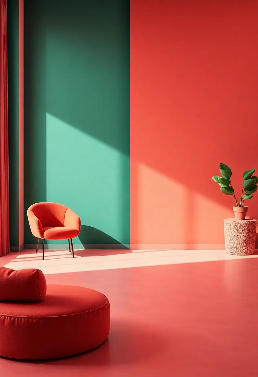
Inclusive Color Palettes: Embrace the trend of mixing both warm and cool tones, creating a dynamic range that caters to diverse tastes
As we step into 2025, the interior design landscape is increasingly favoring a blend of warm and cool color tones, creating spaces that are not only visually appealing but also deeply reflective of varied personal styles. Warm tones such as terracotta, amber, and soft coral bring an inviting warmth to a room, while cool tones like teal, lavender, and charcoal introduce a touch of tranquility and sophistication. This dynamic range encourages designers and homeowners alike to embrace a more eclectic approach, allowing for a unique interplay that can cater to both traditional and contemporary aesthetics.
Pairing warm and cool colors can transform a space into a vibrant tapestry that speaks to a wide audience.Consider incorporating styles such as:
- Accent Walls: Use a cool tone for a statement wall and complement it with warm-hued furnishings.
- Layered Textures: Mix fabrics and materials in varying tones to create depth and interest.
- Natural Elements: Incorporate plants or wooden accents to bridge the gap between the two palettes.
When designing your color scheme, it can be helpful to visualize the balance through various shades. Here’s a quick comparison table for reference:
| Warm Colors | Cool Colors |
|---|---|
| Terracotta | Seafoam Green |
| Mustard Yellow | Slate blue |
| Coral Pink | Pale Lavender |
This fusion not only caters to a diverse range of tastes but also allows homeowners to create spaces that feel both lively and serene. by thoughtfully intertwining these tones, you can achieve a harmonious ambiance that invites personalization and creativity in every corner of your home.
Natural Textures: discover how using raw materials can create a dialogue between warm and cool tones,enhancing the organic feel
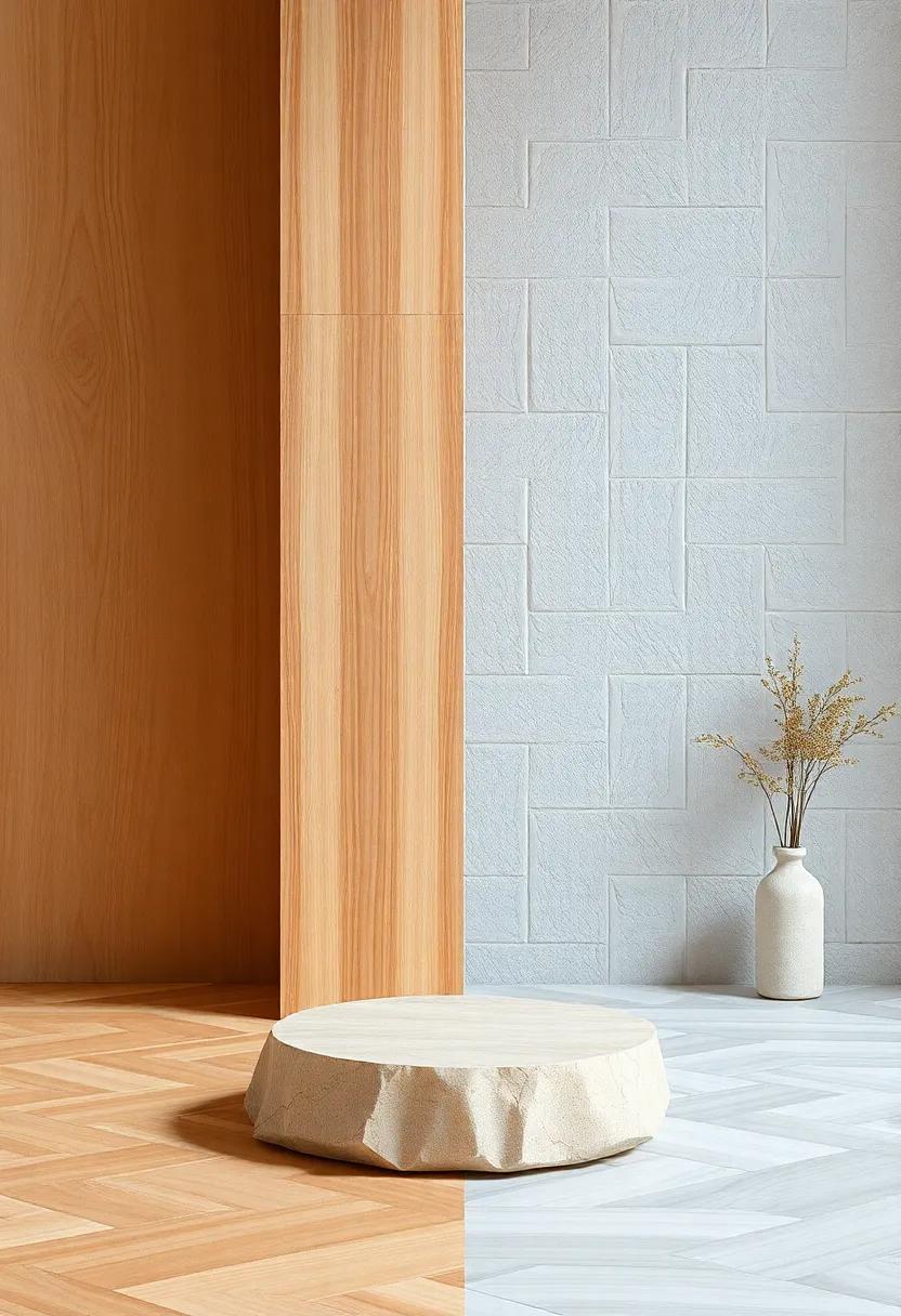
Embracing the beauty of the outdoors within our interiors can transform a space by utilizing raw materials that evoke a sense of serenity and organic charm. Incorporating elements such as natural wood,stone,and woven fibers creates a harmonious interplay of warm and cool tones that brings depth to any room. As an example, a polished oak table can be the centerpiece, radiating warmth, while sleek, cool stone countertops offer balance and sophistication. Wooden textures, especially when left in their raw form, can soften the sharpness of modern designs, allowing for a welcoming atmosphere that invites relaxation and connection.
To fully harness this dialogue, consider layering materials that contrast yet complement each other.You might pair a rough-hewn wooden beam with a smooth marble accent wall. Textiles, like soft linen or chunky wool throws, can bridge the gap between the textures, infusing warmth without overwhelming the cool elements. Here’s a quick reference for material combinations that can elevate your space:
| Material | Warm Tone | Cool Tone |
|---|---|---|
| Wood | Oak | Bamboo |
| Stone | Granite | Slate |
| Textiles | Wool | Linen |
Integrating these materials not only enhances the aesthetic appeal but also cultivates a tactile experience that resonates with nature. The interplay of light and shadow on rough surfaces against smooth finishes creates visual interest,urging viewers to touch and feel,further deepening their connection to the space. By thoughtfully selecting raw materials, you can craft a harmonious sanctuary that balances the inviting warmth of home with the cool tranquility of nature.
Scandinavian Influence: Explore how Scandinavian design balances warmth with cool tones, emphasizing simplicity and functionality
Scandinavian design epitomizes the art of balancing warmth and cool tones, creating spaces that feel both inviting and serene. this harmonious integration frequently enough features a palette that marries soft whites and creamy beiges with muted grays and cool blues,offering a visually pleasing contrast that promotes tranquility. Key elements of this design beliefs include natural materials such as wood, wool, and stone, which introduce tactile warmth to otherwise minimalist spaces.The result is an environment that feels cozy yet expansive, where every detail serves a functional purpose without compromising aesthetic appeal.
To fully appreciate this design ethos, consider how simplicity and functionality manifest in furniture choices and overall decor. Pieces are characterized by clean lines and organic shapes, often showcasing craftsmanship that emphasizes form and function in equal measure. To illustrate this balance, here’s a simple table highlighting key elements of Scandinavian design alongside their emotional impact:
| Design Element | Emotional impact |
|---|---|
| Natural Light | Invokes a sense of openness and tranquility |
| Neutral Palette | Creates calm and harmonious environments |
| Functional Furniture | Enhances comfort without clutter |
| Textured Fabrics | Adds warmth and depth to cool color schemes |
Personal Expression: Celebrate the individual approach to mixing warm and cool tones, allowing personal flair to shine through in home decor choices
In the realm of home decor, merging warm and cool tones offers a vibrant playground for individual expression.As homeowners increasingly seek to reflect their unique personalities, the art of balancing these tone types becomes essential.One can juxtapose soft, buttery yellows with deep cerulean blues or pair rich terracotta with crisp mint greens. This blending not only adds visual intrigue but also invites a sense of warmth and vitality into living spaces.Consider showcasing personal collections,art pieces,or even textiles that carry a story—these accents can help to create a dialogue between warm and cool shades,making the home a true reflection of the individual.
When exploring your unique aesthetic,think about incorporating varying materials alongside your color palette.As an example, mixing rustic woods with sleek metals can highlight the contrast between warmth and coolness while emphasizing the character of each piece. Additionally, layering textures is an effective way to enrich the visual experience of a room. Here’s a simple table showcasing some inspirational pairings to ignite your creativity:
| Warm Tone | cool Tone |
|---|---|
| Burnt Orange | Sage Green |
| Golden Yellow | Slate Blue |
| Crimson Red | Turquoise |
| Soft Beige | Cool Grey |
Insights and Conclusions
As we step into 2025, the dance between warm and cool tones promises to shape our living spaces in exciting and innovative ways. Whether you lean towards the sun-soaked allure of warm hues or the tranquil refreshment of cool palettes, this year offers a rich tapestry of options to explore.
Remember, interior design is not just about aesthetics; it’s about creating atmospheres that resonate with who you are. embrace the trends that inspire you, balance in your choices, and don’t hesitate to mix and match to cultivate a space that feels authentically yours.
as you embark on your journey of change, keep these 25 trends in mind as guiding stars. Now, go forth and design a haven that reflects the warmth of your spirit or the cool calm of your thoughts. Happy decorating!
As an Amazon Associate I earn from qualifying purchases.