25 Stunning Modern Eclectic Design Ideas That Celebrate Bold Colors in Style
If you’re ready to break free from the ordinary and infuse your space with personality,you’ve come to the right place. Our carefully curated list of 25 stunning modern eclectic design ideas celebrates bold colors in style, offering a fresh perspective on how to mix patterns, textures, and hues without overwhelming your senses. Whether you’re seeking inspiration for a vibrant living room, a daring bedroom makeover, or simply a splash of color to brighten your everyday surroundings, these ideas will guide you in creating dynamic, balanced interiors that speak volumes. Dive in to discover how to master the art of eclectic design with confidence and flair.
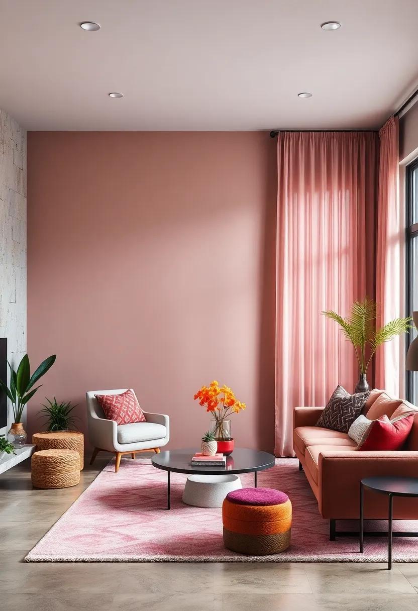
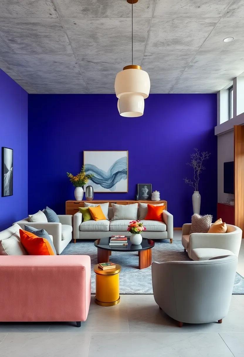
Vibrant Jewel-Toned Walls Paired with Sleek Metallic Accents
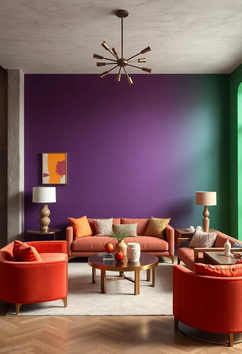
Immerse your space in the richness of deep, jewel-toned walls – think amethyst, emerald, sapphire, and ruby – to create an opulent backdrop that demands attention. These vibrant hues serve as the perfect canvas for introducing sleek metallic accents, such as brushed brass light fixtures, polished chrome table legs, or copper-framed mirrors. The dynamic interplay between the saturated colors and the glint of metal elevates any room from ordinary to exquisitely modern eclectic,balancing depth and shine with effortless flair.
to master this look, consider layering textures and finishes that emphasize contrast without overwhelming the senses. Velvet cushions, silk drapes, and glossy ceramic vases work beautifully against matte jewel tones, while metallic surfaces can be highlighted with softer lighting to prevent glare. below is a quick guide to pairing jewel tones with complementary metals that accentuate their natural beauty:
| Jewel tone | Best Metallic Accent | Suggested Accent Piece |
|---|---|---|
| Emerald Green | Brushed Gold | Geometric Wall Sconce |
| Amethyst Purple | Polished Chrome | Minimalist Floor lamp |
| Sapphire Blue | Copper | framed Accent Mirror |
| Ruby Red | Brushed Brass | decorative Candle Holders |
Mixing Bold Geometric Patterns with Plush, Colorful Textures
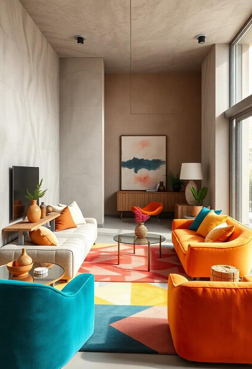
Embracing bold geometric patterns alongside plush,colorful textures creates a captivating interplay that energizes any modern eclectic space. Imagine a velvet armchair in a rich emerald hue paired with cushions boasting sharp chevrons or striking hexagons-this contrast not only adds dimension but also invites tactile curiosity. To balance the visual intensity, incorporate accents like fuzzy throws, woven rugs, or patterned curtains with a tactile finish.These elements create layers of interest, where texture meets graphic design in perfect harmony.
when mixing these elements, consider the power of scale and contrast to avoid overwhelming the space. Large-scale geometric rugs work beautifully beneath smaller, plush ottomans or patterned poufs. Alternatively, introduce bold wallpaper with repeating shapes and soften it with silky, tufted pillows in complementary colors. Below is a simple guide to combining patterns and textures effectively for a cohesive yet daring look:
| Pattern | Texture | Suggested Color Pairing |
|---|---|---|
| Triangle Prints | Velvet | Mustard & Deep Navy |
| Chevron | Faux fur | Blush Pink & Charcoal |
| Hexagons | Silk | Emerald Green & gold |
| Stripes | Bouclé | Burnt Orange & Ivory |
| Polka Dots | Looped Wool | Teal & Soft Gray |
Layering bright Abstract Art to Create a Dynamic Focal Point
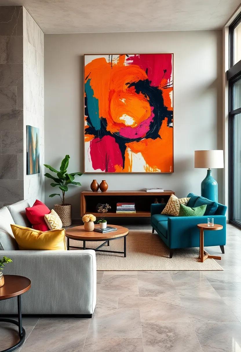
Stacking vivid canvases creates an engaging visual symphony that captivates any room. Start with a bold, oversized abstract piece as your primary focus, then layer smaller artworks with contrasting colors and shapes. Mixing textures-think glossy finishes paired with matte-adds depth and intrigue, inviting viewers to visually explore the gallery wall. To keep the look cohesive, use frames in complementary hues or sleek black, allowing the artwork’s energy to remain the star.This technique transforms bare walls into a pulsating centerpiece that commands attention without overwhelming the space.
- Vary canvas sizes for dynamic rhythm
- Incorporate geometric and freeform shapes
- Balance bright splashes with neutral backgrounds
- Try asymmetrical arrangements to avoid predictability
Experimentation is key when layering abstract art. Play with scale-not just the size of the pieces, but also the intensity of the colors. Deep crimsons and electric blues layered over softer pastels can make each element pop individually while contributing to a unified statement. Use strategic lighting, like track or spotlighting, to enhance contrasts and cast dramatic shadows that enrich the installation. The result? A vibrant, evolving focal point that breathes life into modern eclectic spaces through bold color dialog and fearless design.
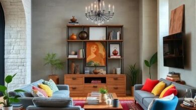
Incorporating Multi-Colored Velvet Sofas for Luxurious Comfort
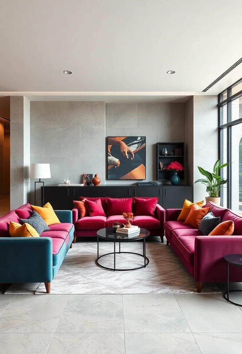
Transform your living space into a vibrant haven by inviting multi-colored velvet sofas to take center stage. These luxurious pieces, with their plush textures and rich hues, effortlessly fuse comfort with bold visual impact. Layered tones of jewel colors-think emerald greens, royal blues, and deep magentas-offer a dynamic palette that exudes sophistication while maintaining a spirited charm. Their sumptuous velvet fabric not only enhances tactile pleasure but also plays beautifully with natural and artificial light, casting a warm, inviting glow across any room.
To artfully balance their visual intensity, pair your velvet sofa with subtle accessories that echo its color story without overwhelming the senses. Consider integrating accent pillows with geometric patterns, a neutral-toned area rug, or metallic gold accents that complement the fabric’s sheen. The key is to create harmony by mixing textures and finishes,allowing the sofa’s bold character to shine as a statement piece. Below is a quick guide on pairing velvet hues with matching accents for a cohesive look:
| Velvet Sofa Color | Accent Colors | Suggested Materials |
|---|---|---|
| Emerald Green | Soft beige, Burnt Orange | Linen, Brass |
| Royal Blue | Mustard Yellow, Charcoal | Velvet, Wood |
| Deep Magenta | Light Gray, Gold | Silk, Marble |
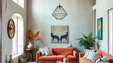
Combining Warm Terracotta with cool Teal for balanced Contrast
Warm terracotta and cool teal form an exquisite duet, balancing each other with a lively contrast that injects energy while maintaining harmony. Terracotta’s earthy warmth grounds a space, evoking rustic charm and coziness, while teal’s refreshing vibrancy adds an invigorating, contemporary edge. This pairing works beautifully in living rooms or bedrooms where you want to fuse comfort with a pop of personality. Try layering terracotta-hued textiles, such as cushions or rugs, against teal-painted accent walls or statement furniture pieces to create a dynamic but inviting atmosphere.
Mixing these two hues also offers versatility across design elements:
- Incorporate terracotta ceramics and pottery alongside teal glassware or metallic accents.
- Use teal draperies or lampshades to cool an overwhelmingly warm terracotta backdrop.
- Combine patterned fabrics incorporating both colors for eclectic upholstery or art pieces.
- Balance the duo with neutral bases like creamy whites or soft greys to keep spaces from feeling to intense.
| Design Element | Terracotta Application | Teal Application |
|---|---|---|
| Walls | Accent wall with terracotta paint | Teal geometric wallpaper |
| Furniture | Rustic terracotta leather sofa | Velvet teal armchair |
| Accessories | Terracotta planters or vases | Teal cushions or throws |
using Bright, Oversized Rugs to Anchor Eclectic Living Spaces
In the realm of eclectic design, bold, oversized rugs serve as more than just floor coverings-they become the visual foundation that brings together seemingly disparate elements. Choosing a rug with vivid hues and dynamic patterns not only injects energy into the room but also delineates living zones, anchoring furniture in an unexpected, yet harmonious way. Whether it’s a jewel-toned geometric print or a painterly splash of color, these rugs create a canvas that invites playful layering of textures and eclectic décor pieces.
When selecting these statement rugs, consider these tips for maximizing their impact:
- Balance while contrasting: Pair bright rugs with neutral walls or soft furnishings to avoid overwhelming the senses.
- Mix and match textures: Combine the softness of a plush oversized rug with sleek leather or rough-hewn wooden furniture for depth.
- Scale is key: Oversized rugs work best in spacious rooms where they can anchor multiple seating areas without crowding.
- Harmonize with accent colors: Pull hues from the rug to echo in pillows, art, or lighting fixtures to create cohesion.
Juxtaposing Neon Lighting with Rustic, Natural Materials
Blending the electric vibrancy of neon lighting with the grounded warmth of rustic, natural materials crafts a striking sensory dialogue within any space. Imagine the soft, organic textures of reclaimed wood or woven rattan set against the sharp, luminous outlines of neon signs. This interplay creates a layered aesthetic where bold color meets tactile richness, inviting both energy and comfort. The neon hues serve as focal points that invigorate otherwise serene, earthy setups, while raw elements temper the intensity of artificial glow, producing harmony through contrast.
- Textural Contrast: Pairing rough-hewn timber with sleek neon tubes highlights the beauty in discord.
- Color Pop: Neon accents in vivid pinks, blues, or greens elevate the understated tones of natural fibers and stone.
- Ambient Versatility: Adjustable neon brightness complements the varying moods evoked by natural lighting and material warmth.
| Material | Neon Accent Color | Design Impact |
|---|---|---|
| Reclaimed Wood | Electric Blue | Creates a cool yet cozy vibe |
| Jute & Hemp Textiles | Vibrant Pink | Adds playful, bohemian energy |
| Exposed Brick | Neon Orange | Injects an industrial-chic edge |
Decorating with Bold color-Blocked Furniture Pieces
modern eclectic interiors thrive when you introduce bold color-blocked furniture as statement pieces that bridge various design elements.Imagine a sleek sofa where vibrant panels of teal, mustard, and coral come together in harmonious contrast, energizing the room without overwhelming it. These pieces serve as focal points that invite conversation and creativity, especially when balanced with more subdued textures like natural wood or neutral rugs. To maximize impact, pair your color-blocked furniture with minimalist accessories, allowing the shapes and hues to speak volumes.
Mixing bold color blocks doesn’t mean sacrificing cohesion; it’s about strategic placement and thoughtful contrast. Here’s a quick guide to mastering this look:
- Start Small: Introduce color-blocked ottomans or side tables for a pop of personality.
- Layer Colors: Combine two or three complementary blocks rather than random splashes.
- Balance with Neutrals: Use beige, gray, or white walls and floors to ground the vivid furniture.
- Texture Play: Pair smooth upholstery with rougher textiles or natural fibers to add depth.
| Color Block Pairing | Recommended Furniture Piece | Best Complementary Accent |
|---|---|---|
| deep Blue & Mustard Yellow | Sectional Sofa | Brass Floor Lamp |
| Coral & Olive Green | Armchair | Woven throw Blanket |
| Teal & Blush pink | Storage Bench | marble Coffee Table |
Integrating Playful Pop Art prints into a Sophisticated Palette
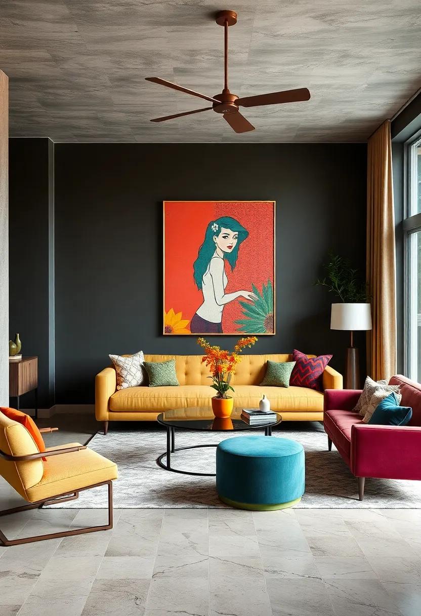
Infusing lively pop art prints into a room anchored by a muted, refined color palette *creates an irresistible visual dialogue*. The key is to select prints with punchy hues that echo subtle tones elsewhere in the space-think bright reds nodding to deep burgundy accents or pops of aqua complementing soft greys. These artworks should act as focal points without overpowering the room’s inherent sophistication.Layering textures like velvet cushions or sleek ceramics around these prints further balances playfulness with elegance, offering both depth and personality.
- Choose prints with limited but vibrant colors to avoid visual chaos while maintaining impact.
- frame artworks in simple, modern styles like black or white frames to ground vivid images.
- Repeat a single color from the print in subtle decor elements such as throw pillows or vases.
- Maintain a clean, uncluttered backdrop so the graphics can truly shine.
| Pop Art Element | Matching Sophisticated Element | Effect |
|---|---|---|
| Bright yellow comic strip | Soft beige upholstery | Warmth with a vibrant punch |
| Bold red graphic | Deep maroon velvet pillows | Rich, cohesive contrast |
| Electric blue shapes | Slate grey walls | Calm background amplifying energy |
Styling Open shelves with Vivid Ceramic and Glassware Collections
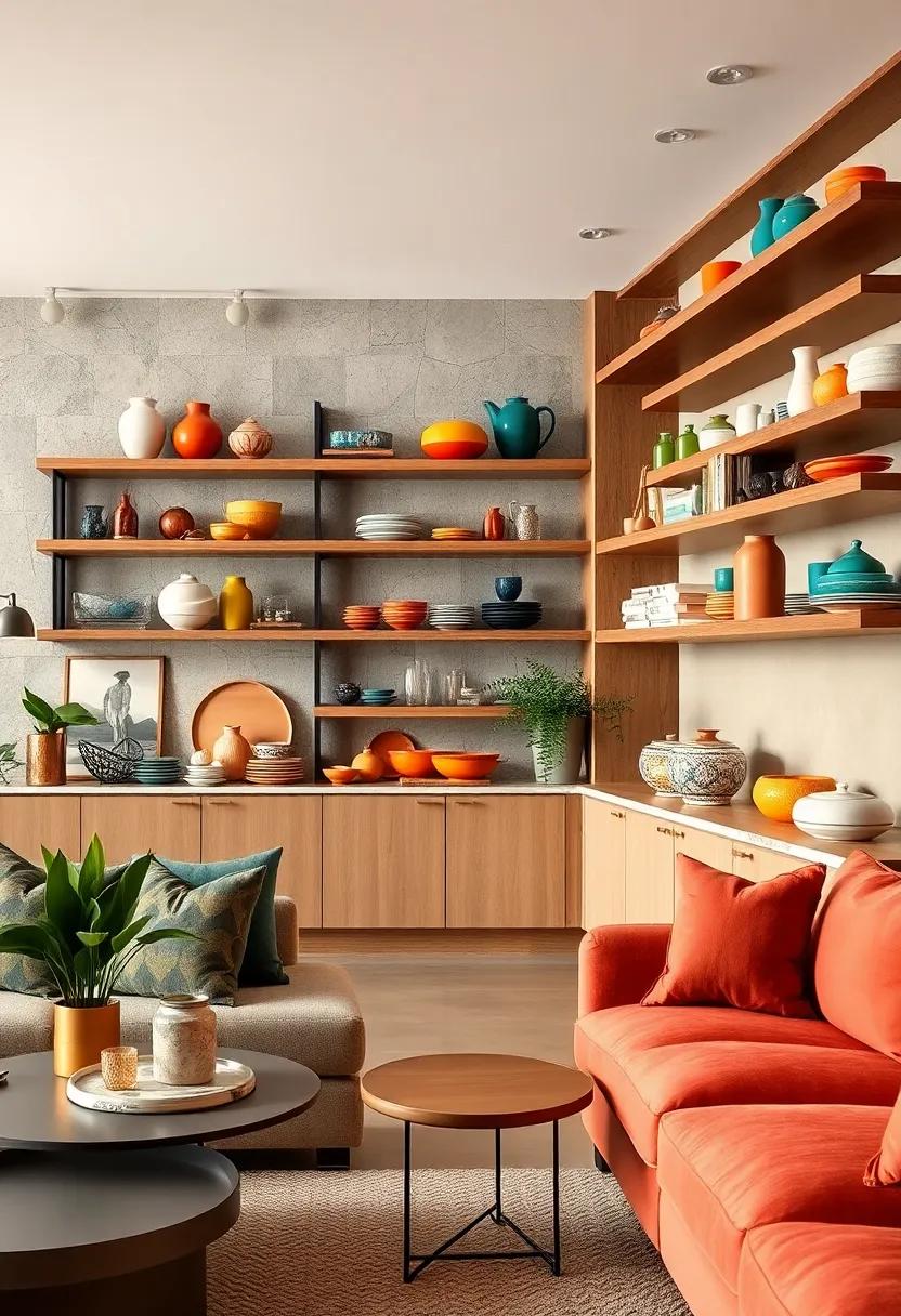
Vibrant ceramics and gleaming glassware bring a captivating splash of color and texture to open shelving, turning functional storage into a dynamic art display. Play with contrasts by pairing glossy, jewel-toned vases with matte, hand-painted bowls to create a layered visual story that invites closer inspection. incorporate varied shapes-from sleek cylindrical glasses to organically curved pitchers-to break monotony and add rhythm, making every glance a fresh experience. Mixing translucent pieces with opaque ceramics maximizes light play, casting subtle reflections that animate your space throughout the day.
To achieve a curated, yet effortlessly eclectic vibe, group your collections by color families or thematic motifs. Don’t be afraid to add unexpected pops of neon or metallic hues for a modern edge. Accessories like small plants, artisanal coasters, or vintage cookbooks enhance the narrative while softening the assemblage. The key is balance: ensure that surfaces aren’t overcrowded, allowing each piece room to breathe and shine-transforming ordinary shelves into a curated gallery of bold, modern charm.
Creating Contrast Through Black-Framed Windows and Colorful Interiors
Black-framed windows serve as a striking architectural statement, offering a graphic anchor against vivid, colorful interiors.their bold lines not only define the space but also create a dynamic interplay between the inside and outside worlds, allowing natural light to flood in while framing views like contemporary artworks. When paired with eclectic furnishings in saturated hues-think sapphire blues, fiery oranges, or lush emerald greens-these dark frames magnify the colors, making each shade pop and energizing the entire room.
To amplify this contrast effortlessly, consider incorporating elements that echo the black frames throughout your décor. Accent pieces such as minimalist black light fixtures, sleek furniture legs, or bold picture frames add cohesion without overpowering the playful spirit of a colorful space. Here’s a quick guide on balancing these elements:
| Design Element | Role in Contrast | Example |
|---|---|---|
| Black Window Frames | Defines architectural structure | Grid-style steel windows |
| Colorful Walls | Creates vibrant backdrop | Deep teal or mustard yellow paint |
| Black Accents | Unifies color pops with frames | Black metal pendant light |
| Bold Furnishings | Enhances eclectic energy | Cobalt blue velvet sofa |
Accentuating Rooms with Bold Color-Changing LED Installations
Transform any space with the dynamic allure of color-changing LED installations that shift moods and elevate interiors effortlessly. Whether framing shelves, highlighting architectural features, or outlining ceilings, these versatile lights allow you to play with bold hues throughout the day.Imagine a living room that flows from vibrant cobalt blue at dusk to a cozy amber glow by evening-inviting both energy and tranquility within the same walls. The continuous spectrum of colors empowers you to customize your environment on a whim, crafting a unique backdrop that celebrates eclectic modern creativity.
Incorporating these installations offers more than just aesthetics; it creates interactive elements that engage senses and redefine spatial perception. Consider pairing your LEDs with smart home technology to adjust tones via voice or app controls, syncing lighting to your favorite playlists or daily rhythms. Key ways to accentuate rooms with formidable LED impact include:
- Backlighting art pieces for dramatic contrast and focus
- Illuminated staircases adding depth and safety in style
- Under-cabinet lighting in kitchens that moves from cool whites to energetic reds
- Highlighting textured walls to make bold colors pop dynamically
| Area | Ideal LED Effect | Color Palette Suggestions |
|---|---|---|
| Living Room | Ambient ceiling strips | Deep teal, warm gold |
| Bedroom | Soft bedside glows | Blush pink, lavender |
| Kitchen | Under-cabinet task lighting | Lime green, electric blue |
| Bathroom | Mirror backlight | Cool white, sunset orange |
Mixing Traditional Patterns Like Ikat with Modern Color Schemes
Harnessing the heritage of ikat patterns by pairing them with a fresh, contemporary palette is a surefire way to energize any space. The intricate, blurred edges of ikat bring a timeless textural richness, but when matched with unexpected colors-think neon pinks, electric blues, or chartreuse greens-the effect is both dynamic and deeply personal. Use ikat textiles as statement pillows, rugs, or wall hangings against walls painted in matte charcoal or soft greys to give your room a sophisticated yet spirited vibe.This combination elevates traditional artistry without compromising on modern flair,making it perfect for those who want to honor cultural craftsmanship while embracing bold,audacious color choices.
To strike the right balance, consider these winning color and pattern pairings:
- Classic indigo ikat + muted blush or dusty rose for a subtle yet chic approach.
- Vibrant magenta ikat + sunny mustard accents to inject warmth and jubilance.
- Black and white ikat + bursts of teal or burnt orange for a graphic and energized contrast.
These curated combinations work beautifully in upholstery, draperies, and bedding, creating layers of visual intrigue that maintain cohesion through color while celebrating the expressive imperfections of ikat. Whether blending old and new in a living room or bedroom,allowing traditional pattern structure to play against modern-hued backdrops creates a conversation piece that is both timeless and electrifying.
Infusing Tropical Hues through Botanical Prints and Leafy Plants
Bring a vibrant splash of the tropics into your space by weaving botanical prints and leafy plants into your décor.These elements serve as natural mood enhancers, turning any room into a lush, inviting retreat.Think palm fronds and banana leaves splashed across textiles, wallpapers, or cushions - all bursting with rich greens, sunny yellows, and deep turquoise tones that effortlessly complement bold palettes. Layering patterns with real greenery creates a dynamic contrast, adding depth and movement that breathe life into your interiors.
To maximize impact, mix and match textures and scales for a curated eclectic look. As an example:
- Oversized leaf motifs on a statement wall paired with delicate fern sprigs in glass vases
- Abstract botanical prints on upholstery alongside chunky woven baskets with lush potted plants
- Bold tropical fabrics thrown over sleek modern furniture contrasted with rustic wooden plant stands
| Plant Type | Ideal Space | Color Accents |
|---|---|---|
| Monstera Deliciosa | Living Room | Deep Green,Glossy |
| bromeliad | Entryway | bold Reds,Oranges |
| Bird of paradise | Sunroom | Bright Yellow,Green |
Balancing Intense Colors with soft Neutrals and Natural Woods
When working with bold,intense colors,creating a harmonious space means allowing your vibrant hues to breathe. Soft neutrals act as a calming backdrop, offering balance without competing for attention. Imagine plush beige sofas or light gray walls that soften the impact of a striking cobalt blue accent wall. Adding natural wooden elements – like oak coffee tables, walnut shelving, or bamboo flooring – introduces warmth and organic texture, which grounds the design and injects a timeless, earthy essence. This interplay between punchy color and subdued tones ensures your space feels inviting rather than overwhelming.
Consider mixing these elements into your modern eclectic palette by combining:
- Soft linen cushions to temper a bright yellow armchair
- Lightwashed wooden frames around bold, abstract art pieces
- Natural jute rugs to mute and unify multiple vivid accent colors
| Bold Color | Neutral Partner | Wood Finish |
|---|---|---|
| Deep Emerald Green | Warm Cream | Light Oak |
| fiery Coral | Soft Taupe | Rustic Walnut |
| Vibrant Turquoise | Muted Gray | Natural Bamboo |
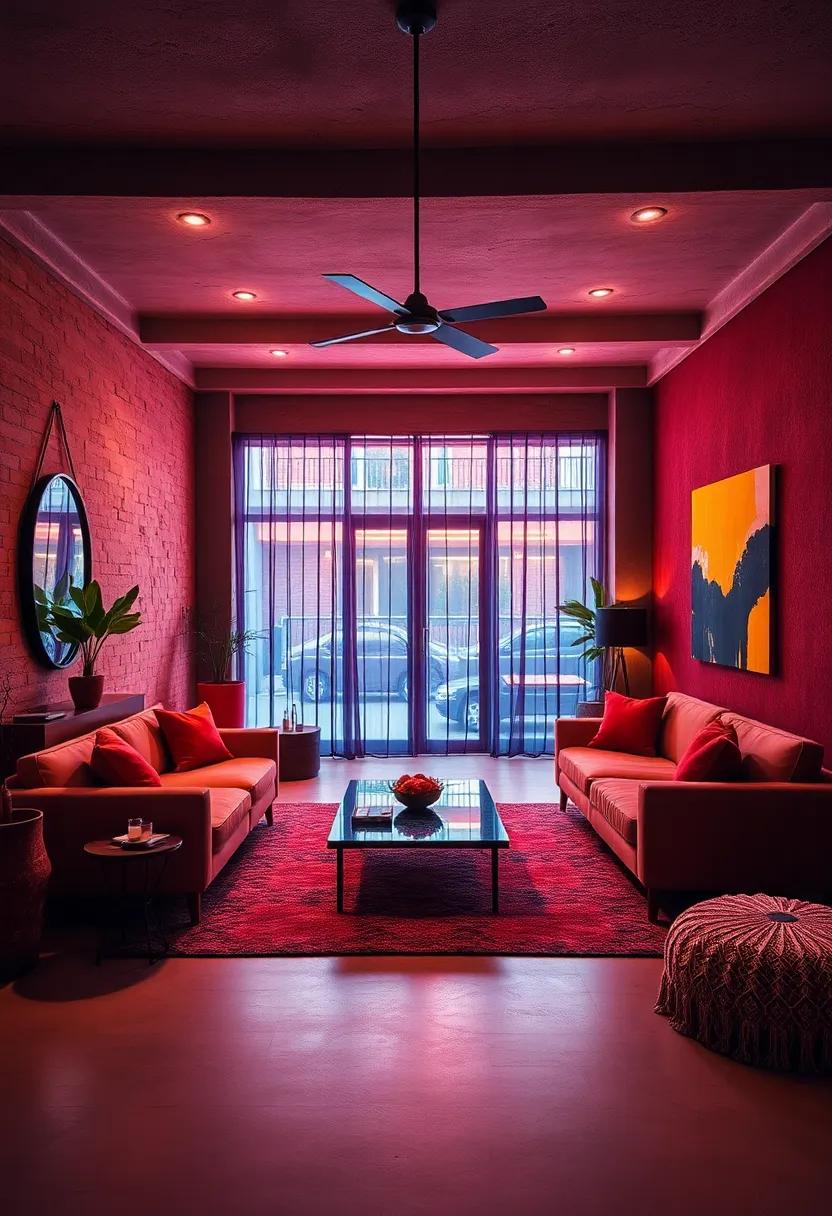
Showcasing Statement Ceilings Painted in bright, Unexpected Hues
Transform ceilings from overlooked architectural features into captivating focal points by painting them in bold, unexpected colors. Imagine a vibrant teal ceiling illuminating a crisp white living room, instantly energizing the space and adding dynamic depth. Or consider a rich mustard yellow crown that contrasts beautifully with muted gray walls, creating an eclectic yet harmonious vibe. These playful ceiling colors not only draw the eye upward but also redefine room proportions and mood, making your space uniquely vibrant.
When selecting the perfect hue, think beyond traditional shades and embrace colors with personality and punch. Here are some inspiring ideas to experiment with:
- Cobalt Blue: Perfect for a modern dining room that craves drama and sophistication.
- Coral Pink: Adds warmth and a hint of retro charm to creative studios or bedrooms.
- Lime Green: Brings a fresh, energizing burst ideal for kitchens and play areas.
- Deep Plum: Creates a moody, intimate ambiance in lounges or reading nooks.
| Room Type | Suggested Ceiling Color | Effect Achieved |
|---|---|---|
| Living Room | Turquoise | Cheerful & spacious feel |
| Bathroom | Bright Orange | Invigorating & playful mood |
| Home Office | Electric Purple | Creative & inspiring atmosphere |
| Bedroom | sunshine Yellow | Cozy & uplifting warmth |
Harmonizing Brightly colored Tiles with Minimalist Furnishings
brightly colored tiles act as vibrant focal points in any space, but balancing their visual energy with the right furnishings is key to achieving harmony. To let these tiles shine without overwhelming the room, opt for minimalist furniture with clean lines and neutral palettes-think whites, soft grays, or muted earth tones. Materials like natural wood, matte metal, or clear acrylic enhance the tiles’ luminosity while introducing texture without competing for attention. Avoid busy patterns or overly ornate details in seating and tables, and instead choose streamlined silhouettes that anchor the color without drowning it.
Strategically layering textures and finishes creates depth and cohesion. For example, pairing smooth, glossy tiles with matte-finished wood furniture softens the room’s dynamic. A curated selection of accessories-such as a single monochromatic rug, subtle throw pillows, or unadorned ceramic vases-offers visual breathing room and supports the deliberate spotlight on tiles. Below is a quick reference table to guide your choices:
| furniture Element | Recommended Material/color | Effect |
|---|---|---|
| Sofa | Light gray linen | Soft neutral base |
| Side Table | Natural oak wood | Warm texture contrast |
| Flooring | Matte concrete or light wood | Subtle neutral foundation |
| Accent Chairs | Clear acrylic or black metal | Modern, airy feel |
Employing Ombre and Gradient Effects on Walls and Draperies
Transform your interiors by weaving ombre and gradient effects into walls and draperies, introducing a dynamic play of color that effortlessly captures attention. These techniques blend multiple shades seamlessly,generating depth and movement that invite the eye to explore every corner of your space.Imagine a soft lavender fading into deep indigo on a feature wall,paired with matching drapes that echo the same spectrum-this not only amplifies the room’s color story but also lends a sophisticated,artistic vibe that defines modern eclectic style.
To maximize impact, consider pairing bold gradients with contrasting textures or subtle patterns. Velvet drapes gently shifting from emerald to lime work wonderfully against a matte,gradient-painted wall in complementary tones. Below is a quick reference to help you envision potential ombre pairings:
| Wall Gradient | Drapery Shade | Texture |
|---|---|---|
| Sunset Orange to Coral | Burnt Sienna Velvet | Soft, Plush |
| Teal to deep Navy | Steel Blue Linen | Light, Airy |
| Blush pink to Rosewood | Dusty Rose Silk | Smooth, Glossy |
By thoughtfully selecting gradient hues and matching fabric textures, you can create a layered, captivating environment that feels together bold and balanced-a testament to the fearless spirit of modern eclectic design.
Pairing Glossy Lacquered Furniture with Matte Color Walls
Glossy lacquered furniture brings an undeniable shine and sophistication to any space, capturing light and creating dynamic reflections that enliven a room.When set against matte color walls, this contrast amplifies the visual impact, balancing shine with softness. Matte walls act like a calm backdrop, allowing lacquered pieces to become the stars without overwhelming the senses.This interplay is perfect for showcasing bold colors,as the matte finish absorbs excess brightness while the glossy furniture adds pops of exciting,polished energy.
To master this pairing, consider the following tips for a harmonious modern eclectic look:
- Choose matte walls in deep or muted tones for a cozy, grounded feel that highlights glossy accents.
- Complement glossy furniture in vibrant or jewel tones to energize the space without clashing.
- Mix textures-think plush rugs or woven throws-to add warmth and tactile interest amid the shine.
- Use lighting strategically; matte walls prevent glare while glossy furniture reflects light, creating an inviting, layered ambiance.
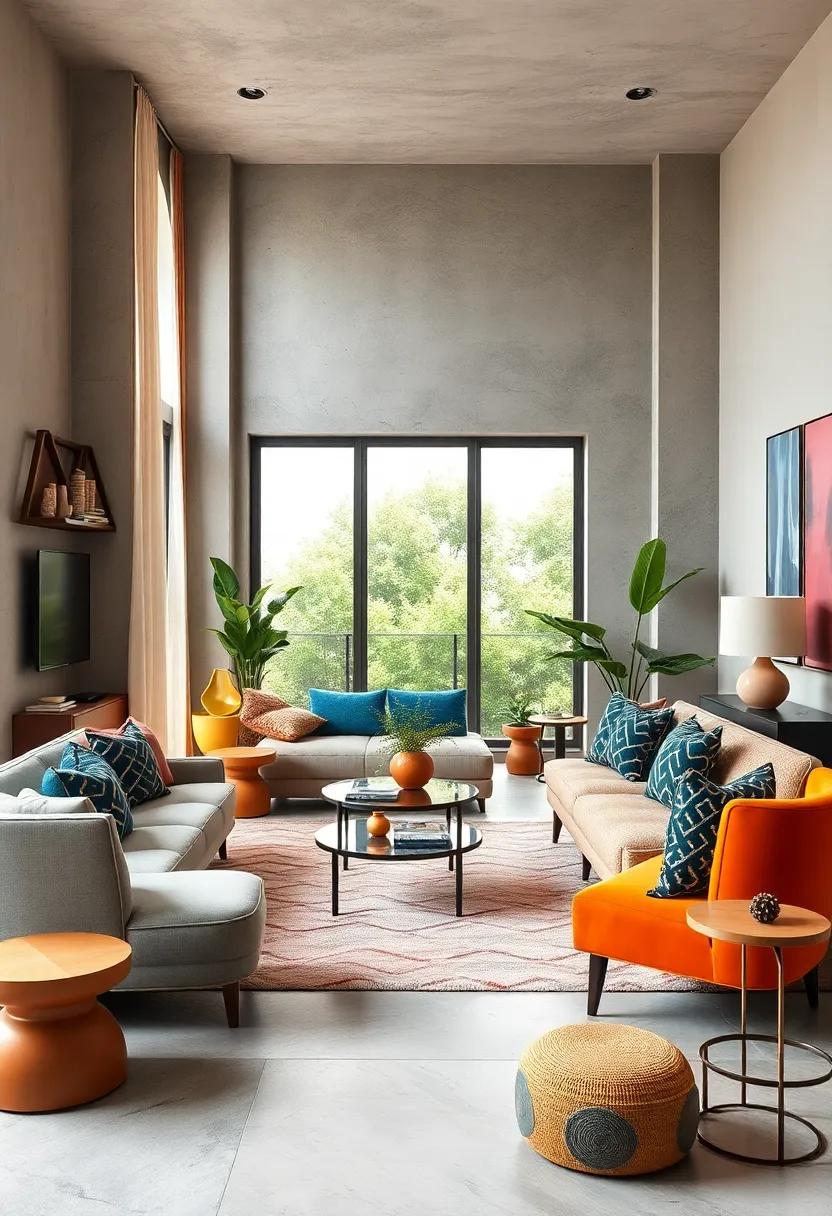
Layering Playful, Multicolored Throw Pillows for visual Interest
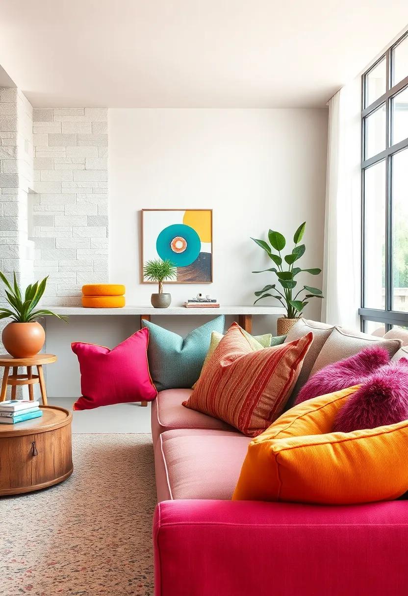
Transform any seating area into a vibrant focal point by incorporating an assortment of throw pillows in varying shapes, sizes, and patterns. Opt for rich, saturated hues like fuchsia, turquoise, mustard, and emerald to evoke energy and personality. Mix geometrics with florals or abstract prints to craft a dynamic interplay of visuals,ensuring no two pillows compete but instead complement one another. Layering these playful textiles not only adds depth and texture but also invites a tactile experience that entices guests to settle in and unwind.
To achieve a harmonious yet eclectic look, consider the balance of color intensity and pattern scale. For instance:
| Pillow Type | Pattern | Color Palette |
|---|---|---|
| Large Square | Bold Geometric | Deep Teal & Mustard |
| Medium Lumbar | Abstract brushstroke | Fuchsia & Charcoal |
| Small Round | Solid Velvet | Emerald Green |
The secret lies in creating layers with intention: a solid base balances visually busy prints, while a recurring color thread across pillows maintains cohesion. this approach draws the eye, elevates ordinary seating into a statement, and infuses the room with joyful vibrance without overwhelming the senses.
Combining Retro-Inspired Shapes with Contemporary Bold Pigments
Injecting nostalgia into modern interiors often begins with a nod to the past through retro-inspired shapes-think curvaceous chairs, geometric sofas, and rounded cabinetry. When these iconic silhouettes meet contemporary,bold pigments,they form a visual dialogue that captivates and energizes any space.Imagine a plush, velvet armchair in a daring fuchsia or a streamlined sideboard drenched in emerald green, where vintage contours are amplified by striking colors, creating an ambiance that’s both timeless and unapologetically fresh.
- Curved Forms: Lounge around in bubble chairs or low-profile sectionals enhanced with vibrant jewel tones.
- Angular Accents: Incorporate cocktail tables and lighting fixtures that contrast sharp lines with rich shades like cobalt or tangerine.
- Graphic Patterns: Use retro-inspired prints-polka dots, chevrons, and abstract geometrics-in eye-catching palettes to add playful rhythm.
| Retro Shape | Bold Pigment | Styling Tip |
|---|---|---|
| Rounded Ottoman | Burnt Orange | Pair with muted neutrals for balanced vibrancy |
| Mid-century armchair | Electric Blue | Complement with brass accents for luxe appeal |
| Cylindrical Lamp | Lemon Yellow | Use as a statement piece in minimalist rooms |
Using Colorful glass Pendants and Statement Lighting Fixtures
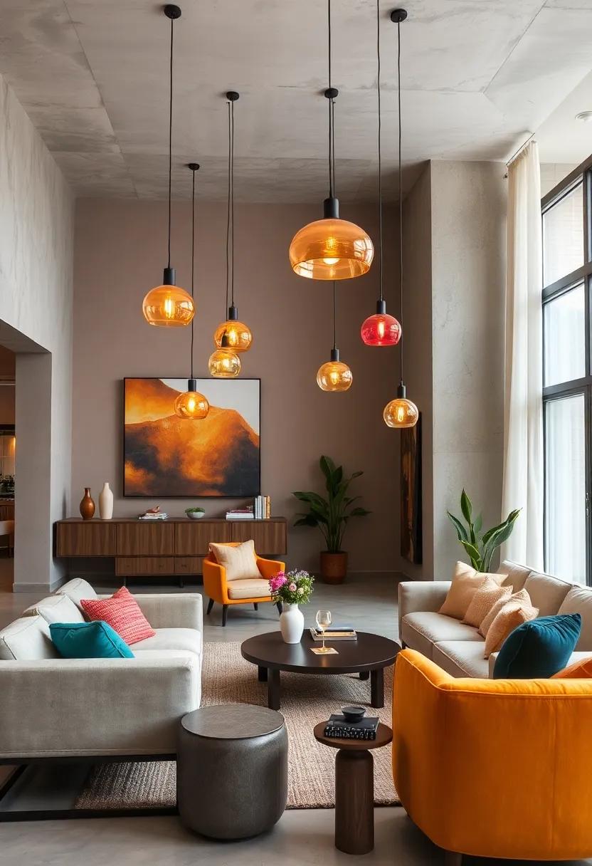
Colorful glass pendants instantly uplift any space by infusing it with vibrant hues and artistic flair. Whether clustered in a dramatic cascade or spaced evenly for a more subtle effect, these pendants act as miniature works of art that catch the light and captivate the eye. Opt for bold shades like cobalt blue, ruby red, or emerald green to create focal points that bring warmth and personality to minimalist or neutral backdrops. The translucent nature of glass allows for a dazzling interplay of color and light, transforming everyday lighting into an expressive statement that embodies modern eclectic charm.
Meanwhile, statement lighting fixtures serve not only as sources of illumination but also as sculptural centerpieces. Think oversized chandeliers with mixed metals, oversized geometric shapes, or multi-colored LED installations that become conversation starters. Pairing these with colorful glass pendants can create a layered lighting scheme that enhances depth and mood in any room. below is a quick guide to mixing pendant colors with statement pieces for maximum impact:
| Pendant Color | statement Fixture Style | Effect |
|---|---|---|
| Cobalt Blue | Industrial Metal Chandelier | Bold contrast & modern edge |
| Amber | Brass Orb Pendant | Warmth & vintage sophistication |
| Ruby Red | Geometric LED Fixture | Vibrant energy & futuristic vibe |
| Emerald Green | Minimalist Glass Sphere | freshness & elegant simplicity |
Creating Vibrant Entryways with Bold, Patterned wallpaper
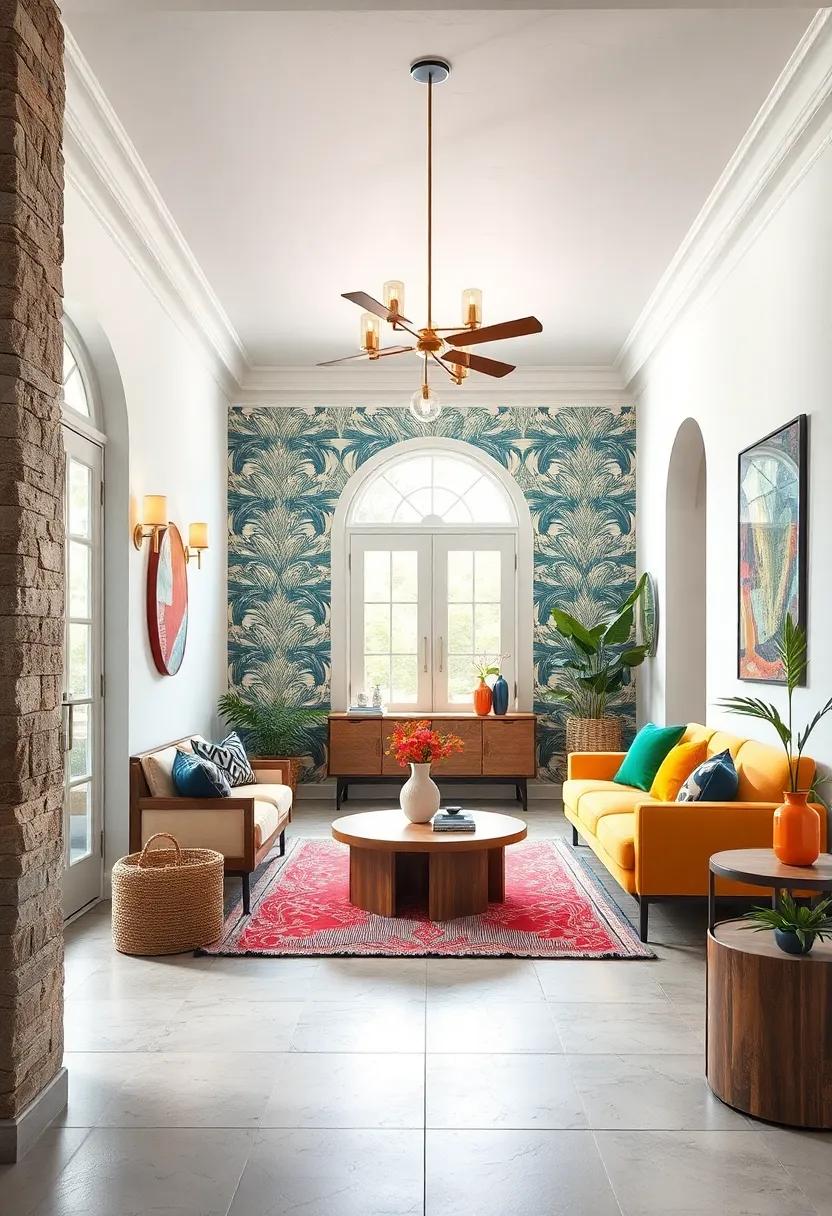
Step into an entryway that instantly captivates with bold, patterned wallpaper. This daring design choice transforms a transitional space into a vivid statement, showcasing eclectic style at its finest. Opt for geometric shapes, oversized florals, or abstract motifs in rich jewel tones or contrasting brights to amplify personality right at the doorstep. Pairing these striking wallpapers with minimalist furnishings and clean-lined accessories lets the patterns breathe, keeping the look balanced yet energized.
To enhance the visual impact, consider layering textures and finishes that complement the wallpaper’s vibrancy:
- Glossy ceramic accents: Reflect light and add a modern touch
- natural wood elements: Soften the boldness with warmth
- Monochrome rugs: Ground the space while enhancing theme cohesion
| Wallpaper Style | Color Palette | Suggested Pairing |
|---|---|---|
| Abstract geometrics | Emerald & coral | Brushed brass fixtures |
| Oversized florals | Navy & mustard | Light oak bench |
| Bold stripes | Black, white & gold | Matte black lighting |
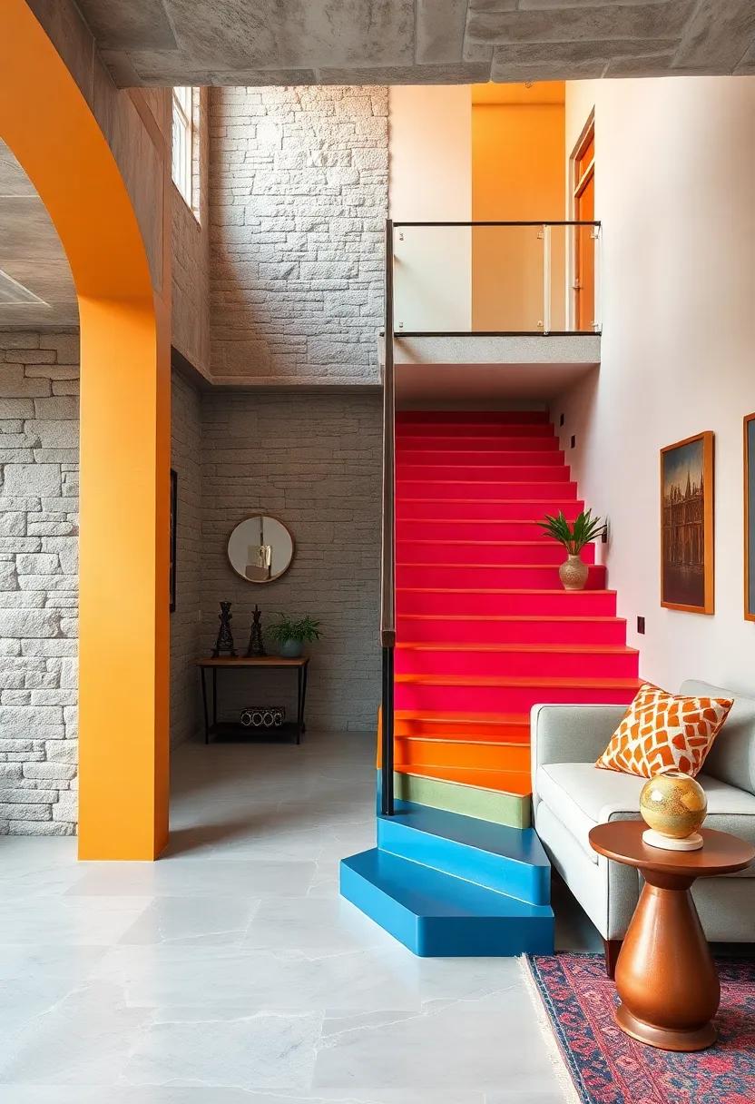
Incorporating Brightly Painted Staircases as Artistic statements
Transforming staircases into vibrant canvases is a brilliant way to infuse personality and energy into any living space. Whether it’s a bold monochrome splash or a playful patchwork of contrasting hues,brightly painted stairs command attention and serve as a functional piece of art. Opt for high-gloss finishes to amplify color intensity and make each step shimmer with life. Incorporate quirky patterns like geometric shapes, stripes, or even hand-painted motifs to weave a narrative that complements your eclectic home decor. The staircase becomes more than just a transition point – it evolves into an experience, inviting guests to journey upward through waves of creative expression.
To harmonize brightly painted staircases effortlessly within your design scheme, balance is key. Pair bold colors with neutral walls or natural textures like wood and stone to avoid visual overload. consider adding statement lighting or sleek metal railings to elevate the modern eclectic vibe further. Here’s a quick guide to color pairing that ensures your stair design stays ahead of the style curve:
| Primary Stair Color | Complementary Wall Shade | Accent Decor |
|---|---|---|
| Electric Blue | Soft Grey | Brushed Metal Fixtures |
| Sunset Orange | Ivory White | Natural Bamboo Elements |
| canary Yellow | Muted taupe | Black Iron Railings |
| Vibrant Purple | Cool Mint | Glass Light Pendants |
Integrating Eclectic color Palettes in Kitchen Backsplashes and Cabinetry
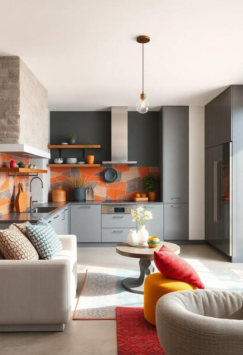
Bold color choices transform kitchens from mundane to artistic playgrounds,especially when combining backsplashes and cabinetry through eclectic palettes. Consider pairing vivid teals and rich mustard yellows on cabinets with a backsplash that uses patterned tiles in complementary hues. this interplay creates visual intrigue, anchoring the kitchen’s personality without overwhelming the senses. The key is balancing saturated tones with neutrals like crisp white or deep charcoal to avoid chaos and rather deliver harmony. unique textures-glossy tiles against matte cabinetry-enhance this vibrant conversation, ensuring each element shines on its own while contributing to a cohesive whole.
- Layered patterns: Mix geometric and floral motifs in backsplash tiles with solid-colored cabinet fronts for contrast.
- Unexpected combos: Pair jewel-toned cabinetry such as emerald or sapphire with a backsplash of warm terracotta or burnt orange.
- Accent hardware: Sculptural handles in brass or matte black add subtle punctuation to bold color choices.
- Textured finishes: Incorporate rattan or concrete elements alongside painted wood to deepen eclectic appeal.
| Color Pairing | Backsplash Style | Cabinet Finish |
|---|---|---|
| Burnt Sienna & Olive Green | Hand-glazed Moroccan Tiles | Matte woodgrain |
| Cobalt Blue & Blush Pink | subway Tiles With Bold Grout | Glossy Lacquer |
| Mustard Yellow & Charcoal | Chevron Ceramic Tiles | textured Matte |
The Conclusion
Whether you’re looking to inject vibrant personality into a blank canvas or seeking inspiration to refresh your space with fearless flair, these 25 stunning modern eclectic design ideas prove that bold colors and stylish harmony can coexist beautifully. Embrace the unexpected, celebrate your unique tastes, and let your home become a vivid reflection of creativity and confidence. After all, in the world of design, color isn’t just decoration-it’s a statement waiting to be made.
As an Amazon Associate I earn from qualifying purchases.