 goodworksfurniture Decoration and home design ideas
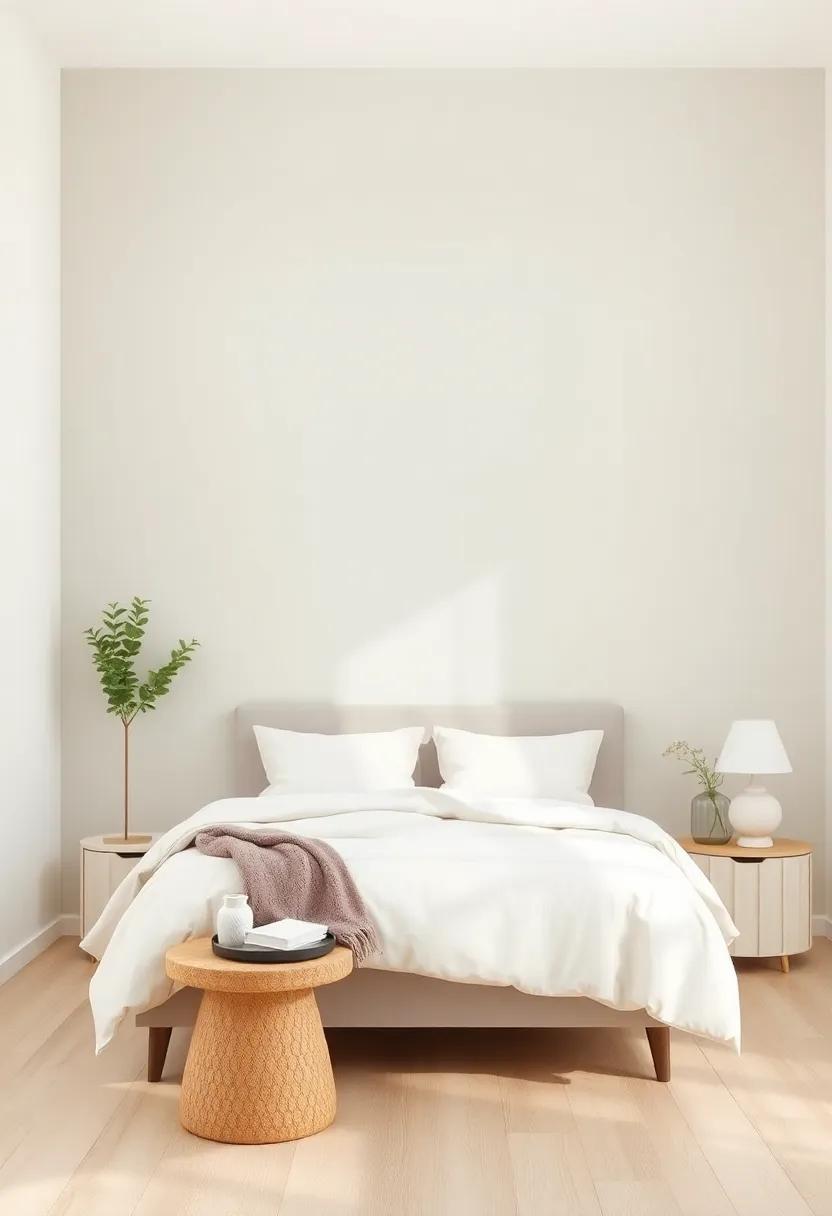
In a world that often demands our attention, creating a serene sanctuary within our own homes has never felt more essential. The bedroom, as our personal retreat, serves as a canvas for rest and rejuvenation. One powerful tool in achieving this tranquil space is the use of neutral paint.With their calming hues and versatile appeal, neutral colors can transform any bedroom into a sanctuary of peace and comfort. Whether you seek the subtle elegance of a soft beige, the crisp freshness of a gentle gray, or the warm embrace of a muted taupe, each shade offers a unique chance to express your personal aesthetic while fostering a harmonious atmosphere. Join us as we explore inspiring neutral paint ideas that will breathe new life into your bedroom, helping you craft a haven where serenity reigns and relaxation awaits.
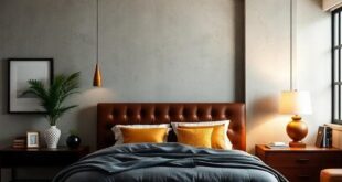
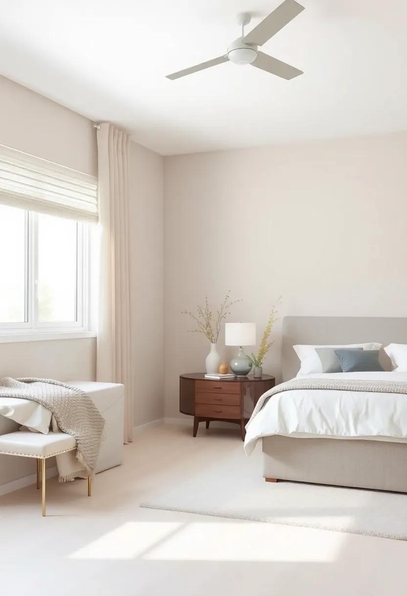
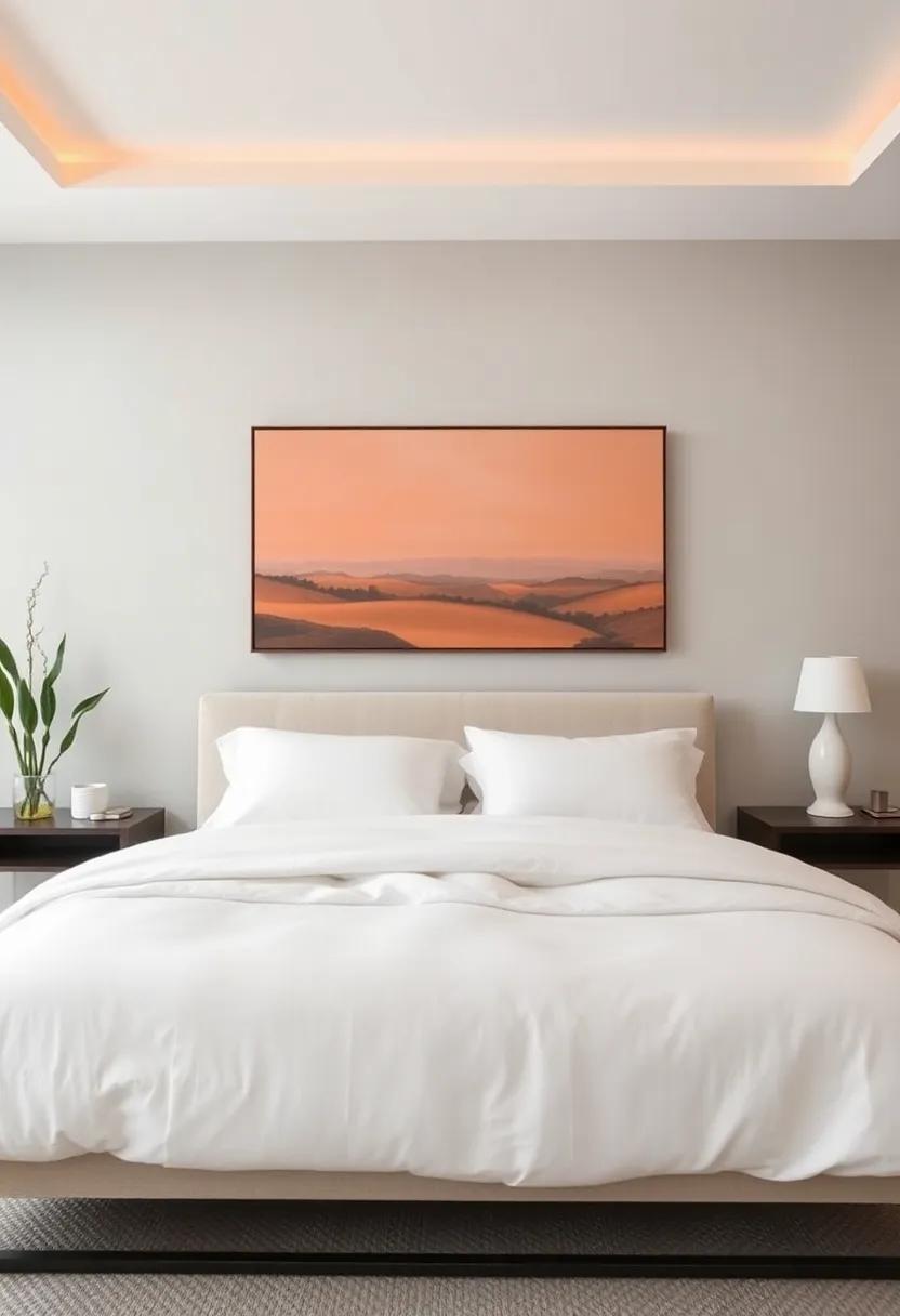
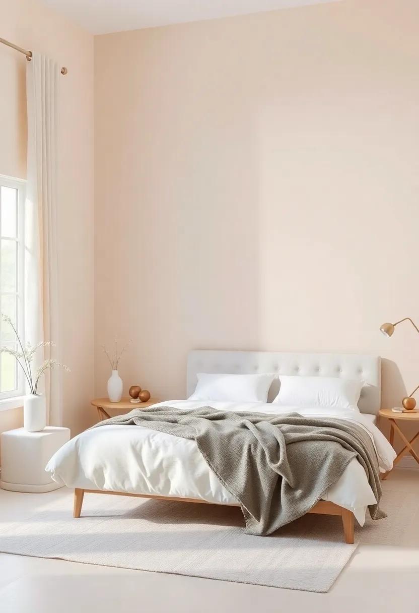
Incorporating Warm Neutrals for a Cozy Atmosphere in Your Bedroom
Creating a cozy atmosphere in your bedroom can be beautifully achieved by incorporating warm neutral tones into your design palette.These colors not only promote tranquility but also enhance the overall warmth of your space,making it feel inviting and cozy. Consider using shades such as soft beige, warm taupe, or creamy ivory on your walls. pairing these hues with rich textures like knitted throws, plush area rugs, and wooden furniture can amplify the sense of warmth. You might also want to incorporate accents of deep browns or muted terracotta to add depth and dimension without overpowering the serene vibe.
To further entice a relaxed atmosphere, emphasize natural light and layer your lighting options. Opt for soft,warm bulbs in bedside lamps and add dimmers to ceiling fixtures,which can allow for customizable brightness.A gorgeous way to balance this look is by integrating earthy accessories. For example, you can incorporate:
- Soft linen curtains that gently filter sunlight
- Textured throws in complementary neutral colors
- Natural wood elements in your furniture and decor
Additionally, adding greenery—like soft, understated plants—can introduce a refreshing element to your design. Check out websites like Apartment Therapy for more ideas on how to seamlessly weave nature into your warm neutral theme. This not only enhances the comfort of your space but also presents a perfect backdrop for relaxation and recovery after a long day.
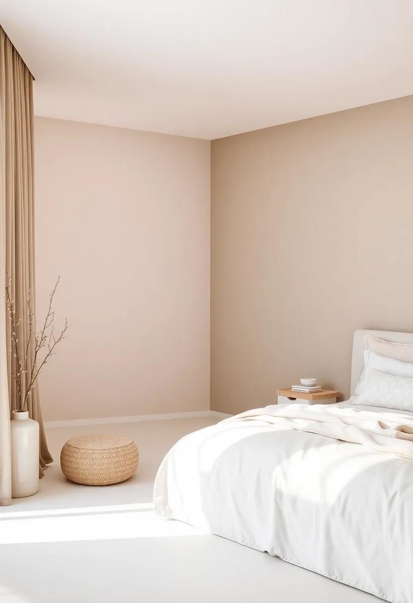
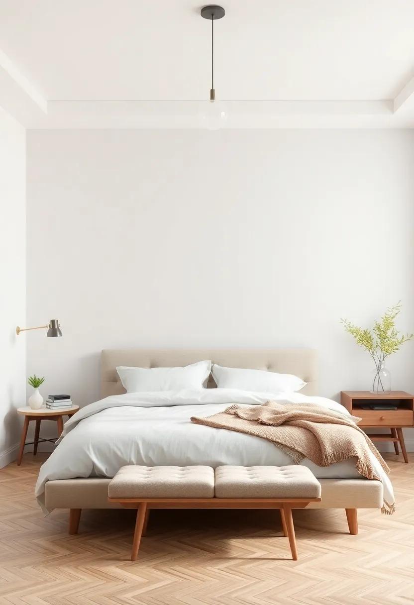
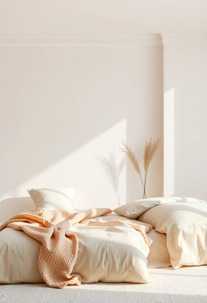
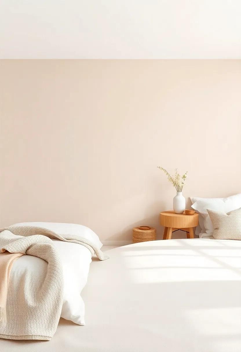
Exploring the Calming Effects of Soft Beige and Cream Shades
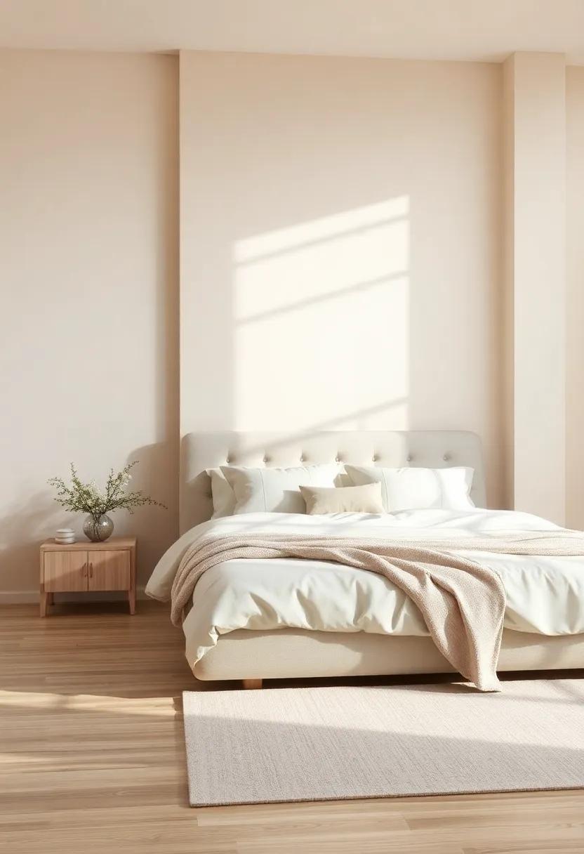
Soft beige and cream shades offer a serene backdrop that encourages relaxation and tranquility within a bedroom retreat. These hues work harmoniously to create a gentle, inviting atmosphere, making it easy to unwind after a long day. When paired with soft textiles, natural wood accents, and plants, these colors enhance the overall sense of calm. Consider incorporating varying tones of beige and cream across different elements of your decor, such as:
- wall Color: Choose warm beige or soft cream for your walls to maintain an open and airy feel.
- Bedding and Textiles: Opt for plush cream comforters layered with beige throw pillows that add depth and comfort.
- Accessories: Introduce decorative items in similar tones, such as picture frames or vases, to continue the soothing theme.
Furthermore, enhancing your space with light-filtering sheer curtains in a soft beige can help create a warm glow throughout the day while maintaining privacy. To maximize serenity, consider incorporating a few lifestyle elements inspired by nature—think of soft, organic shapes found in decorative baskets or driftwood art. Below is a simplified table outlining easy ways to integrate these calming colors into your bedroom:
| Element | Color Options | Texture Suggestions |
|---|---|---|
| Walls | Warm Beige, Cream | Matte, Eggshell Finish |
| Bedding | Light Taupe, Ivory | Cotton, Linen |
| Accents | Soft Sand, Off-White | Woven, Glass |
By selecting soft beige and cream as key colors in your space, you not only enhance its aesthetic appeal but also cultivate a peaceful environment suited for relaxation and rejuvenation.For more inspiration on creating a calming atmosphere, check out dwell.com.
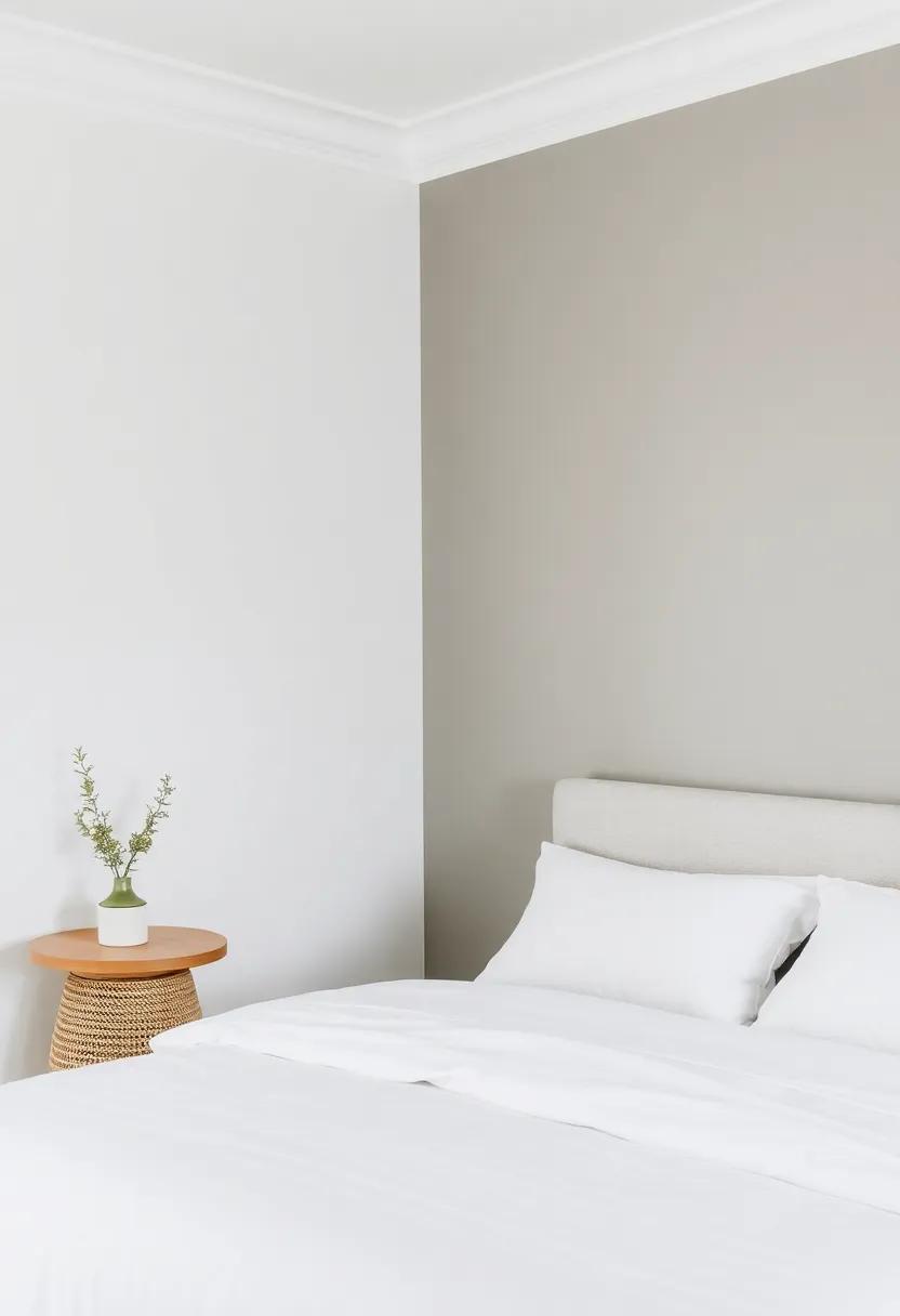
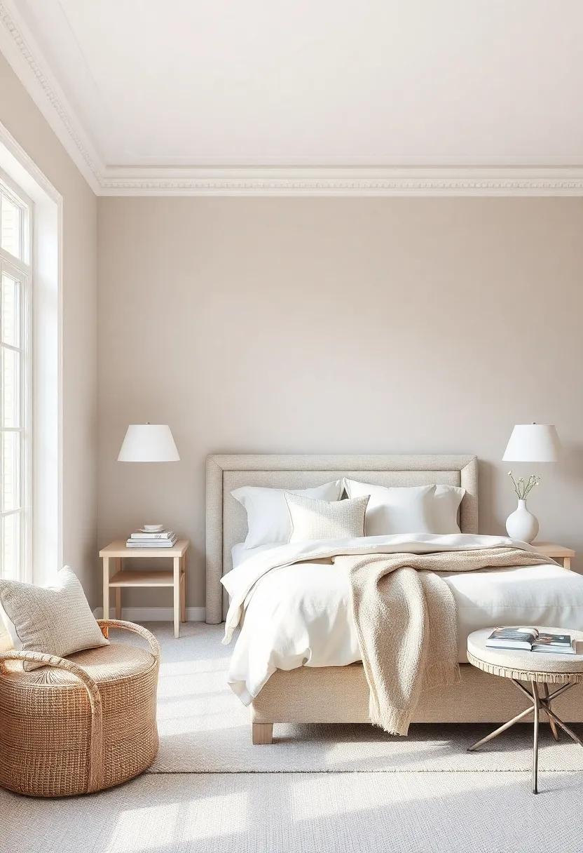
The Elegance of Gray: Balancing Cool Tones in Your retreat
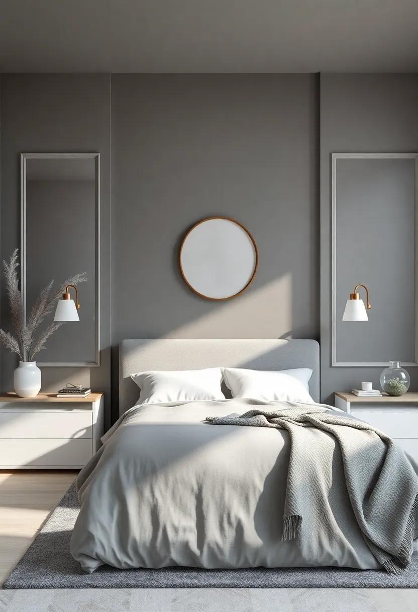
Gray is often regarded as a color of sophistication and understated elegance. when it comes to creating a serene bedroom retreat, this hue offers a unique ability to balance warmth and coolness. Utilizing different shades, from soft dove grays to deeper charcoal tones, can definitely help craft a calming ambiance that invites relaxation. By incorporating gray into your design, you can create a elegant backdrop that enhances other elements, allowing accents in natural wood, pastel colors, or even bold metallics to shine without overwhelming the space.
Furthermore,layering textures can intensify the elegance of gray in your retreat. Think about incorporating various materials: plush throw blankets, soft bedding, and cozy area rugs. Additionally, consider using varied finishes in fabrics and decor items such as:
- Matte textiles for a cozy feel
- Lustrous surfaces to reflect light
- Metallic accents for a modern twist
For optimal results, combine different shades of gray within the same space to create depth and interest. Use a neutral color palette as a foundation while adding personality with art, plants, or decorative pieces. Visit Pantone for inspiration on current color trends that complement gray beautifully.
Creating Depth with layered Neutral Paint Finishes and Textures
Layering neutral paint finishes introduces a captivating depth to your bedroom, transforming it into a peaceful sanctuary.By combining different textures and tonal variations, you can create a visually interesting space that feels both inviting and serene. Consider using a matte finish on your walls to ensure a soft look, and juxtapose it with satin or eggshell finishes on moldings or furniture pieces. This contrast not only highlights architectural details but also enhances the overall ambiance by playing with light and shadow. Incorporating textured paint techniques such as sponging or rag rolling can further elevate the depth, lending a subtle yet captivating charm that invites relaxation.
Another effective strategy is to use a neutral color palette comprised of warm beige, soft greys, and creamy whites, which can create a harmonious flow throughout the room. To intensify the dimensionality, you might think about adding an accent wall—perhaps with a slightly darker neutral or a wallpaper featuring a subtle pattern. When choosing finishes, consider the following options that harmonize beautifully with each other:
| Finish Type | Effect |
|---|---|
| Matte | Soft and inviting |
| Satin | Light reflects gently |
| Textured | Visual interest & depth |
Each painted surface provides an opportunity to enhance the mood, making your serene retreat a delightful place to unwind. For additional inspiration and guidance on choosing the perfect neutral shades, visit bhg.com to explore timeless designs and expert advice.
Highlighting Architectural Features with Subtle Paint Contrasts
When considering paint choices to enhance architectural features, subtle contrasts can breathe new life into your bedroom. By selecting a palette that incorporates various shades of your chosen neutral,you can create a dynamic yet tranquil environment. as a notable example, soft taupes can highlight molding and trim, while a lighter cream can be used for the walls. This creates a visually interesting interplay of textures and depth without overwhelming the senses.
Incorporating strategic paint contrasts can also help to draw attention to specific elements in the room. Consider the following suggestions for maximizing architectural features:
- Accent Walls: Choose a slightly darker shade for a feature wall to accentuate a headboard or a unique architectural element.
- Trim and Ceilings: Painting the ceiling a couple of shades lighter than the walls can provide a spacious feel.
- Built-in Furniture: Use a soft, complementary contrast to differentiate built-in shelving or cabinetry.
| Architectural Feature | best Paint Color |
|---|---|
| Molding | Soft Taupe |
| Walls | Light Cream |
| Accent Wall | Dark Beige |
For further inspiration on how to utilize color effectively, you might find useful ideas on Dwell.
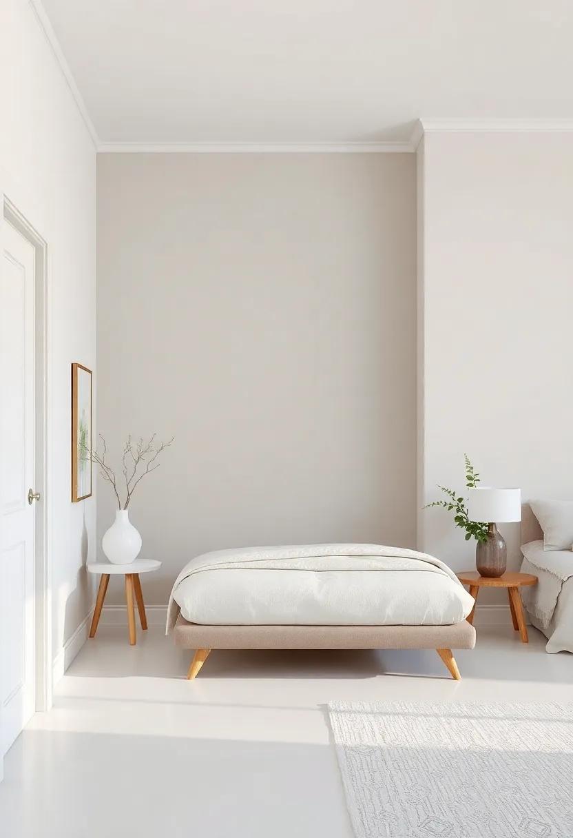
Embracing Minimalism: The Beauty of White-on-White schemes
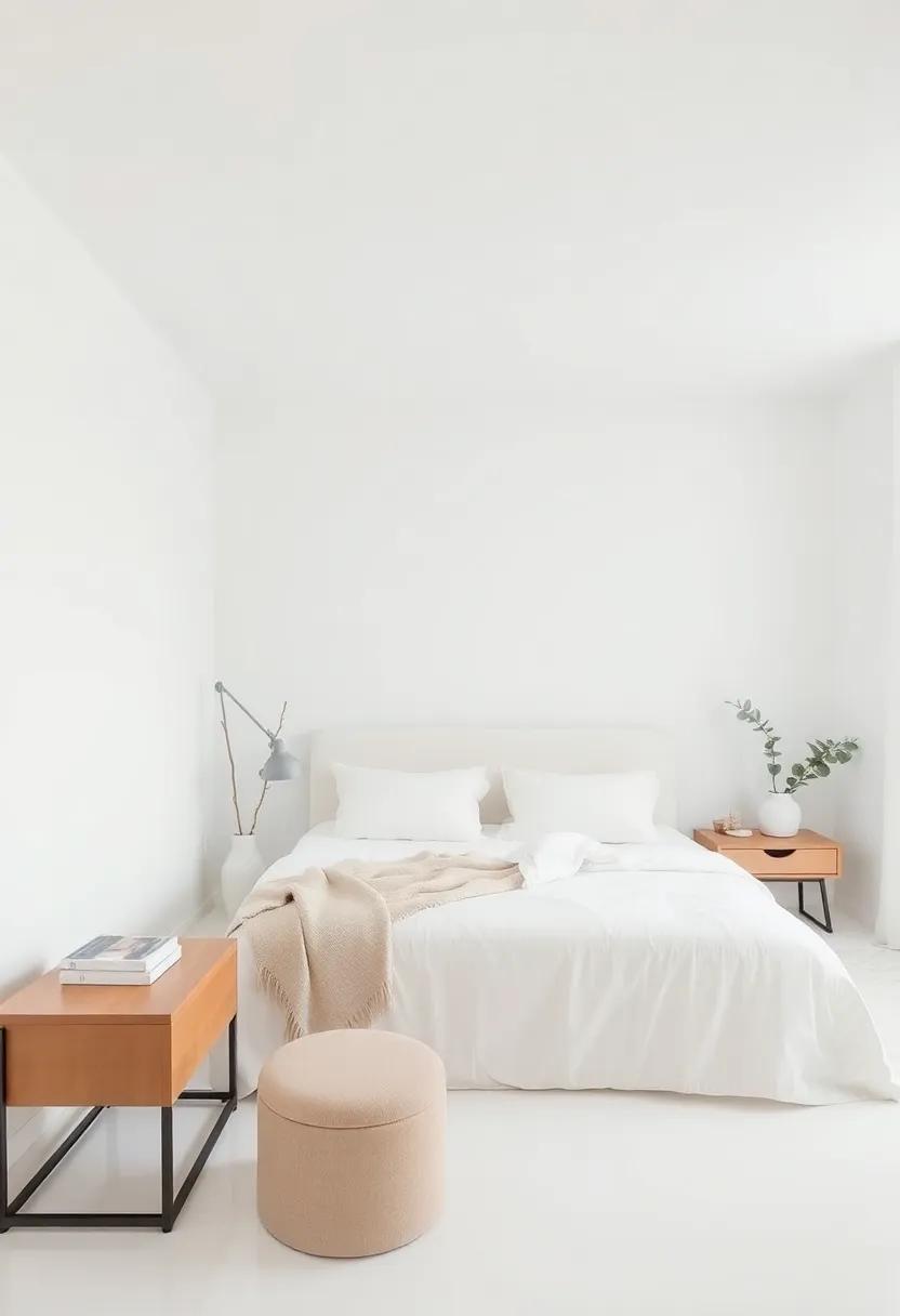
White-on-white schemes offer an elegant solution for those seeking a calm and cohesive atmosphere. This approach employs varying shades and textures of white to create a serene space that feels both spacious and inviting.By incorporating elements such as soft linens, sleek furniture, and natural materials, you can enhance the visual interest while maintaining the simplicity that minimalism embodies. Consider adding elements like:
- Layered Textiles: Use different fabrics, from crisp cotton to soft linen, to provide subtle contrasts.
- Accent Pieces: Incorporate white ceramics or glossy metal items to add depth without overwhelming the eye.
- Plants: A few green leaves peeking from a white pot can bring life to the monochromatic palette.
Utilizing a white-on-white approach means each piece must be thoughtfully selected to contribute to the overall harmony of the room. Lighting plays a crucial role in this design; opt for large windows or soft lanterns to wash the space in natural or warm light. Mixing different textures,such as a shaggy rug with a smooth wall,provides visual appeal while adhering to the overall color scheme. A well-chosen palette can lead to a balanced retreat, echoing a sense of tranquility that fosters relaxation and restfulness. For inspiration on other neutral palettes and ideas, check out Apartment therapy.
Infusing Natural Light: How Neutral Colors Enhance Bright Spaces
Natural light plays a crucial role in bringing life to a space, and when paired with neutral colors, it can create an atmosphere of tranquility and openness. By choosing shades like soft beiges, light greys, and warm whites, you can reflect sunlight beautifully, allowing your serene bedroom retreat to feel both airy and inviting. These versatile hues not only complement a variety of furniture styles but also enhance the overall brightness of the room, making it a perfect sanctuary to unwind and recharge.
Incorporating textures and surfaces into your design can further amplify the effect of natural light. Consider adding elements such as linen curtains,wooden blinds,or textured wall panels in neutral tones to enhance the room’s depth and warmth. Decorate with soft accessories—like plush throw blankets and woven baskets—and consider a minimalist approach to furniture layout that allows light to flow freely. Here’s a simple table to illustrate some neutral paint ideas and their corresponding vibe:
| Color | Vibe |
|---|---|
| Soft Beige | warm and Inviting |
| Cool Grey | Calm and Modern |
| warm White | Fresh and Open |
By leveraging the power of neutral colors along with natural light, your bedroom can transform into a peaceful oasis. For more inspiration and tips on design, you might want to check House Beautiful. Embrace the serene aura that these colors bring, and create a retreat that is undeniably your own.
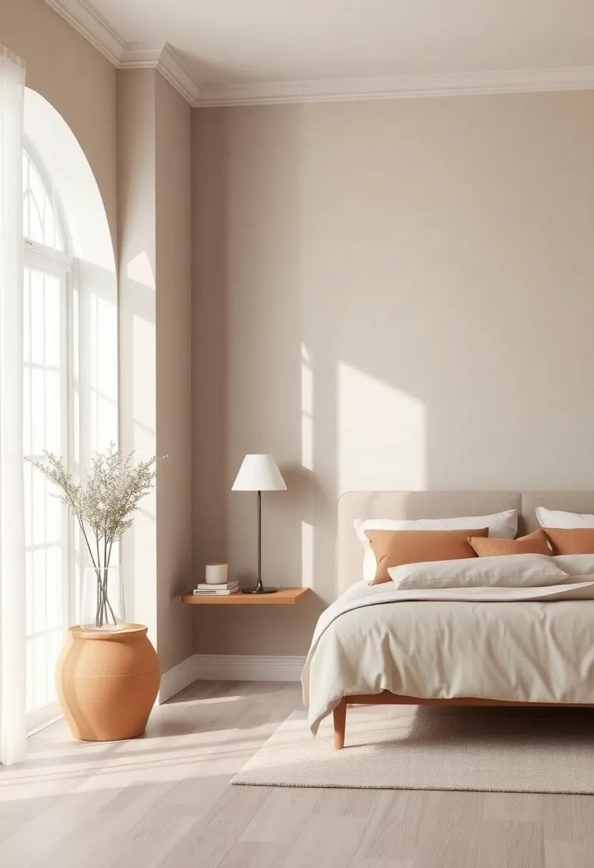
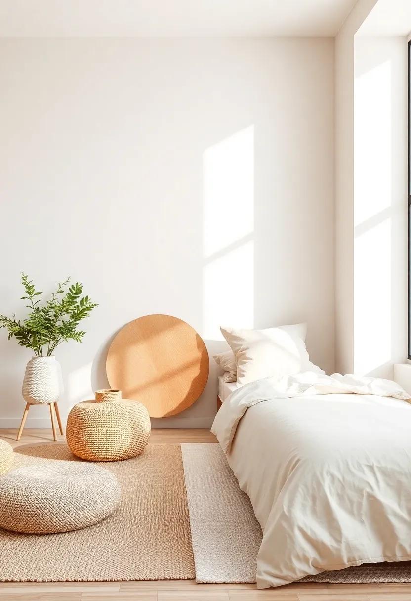
The Serenity of Earthy Tones: Evoking a Connection to Nature
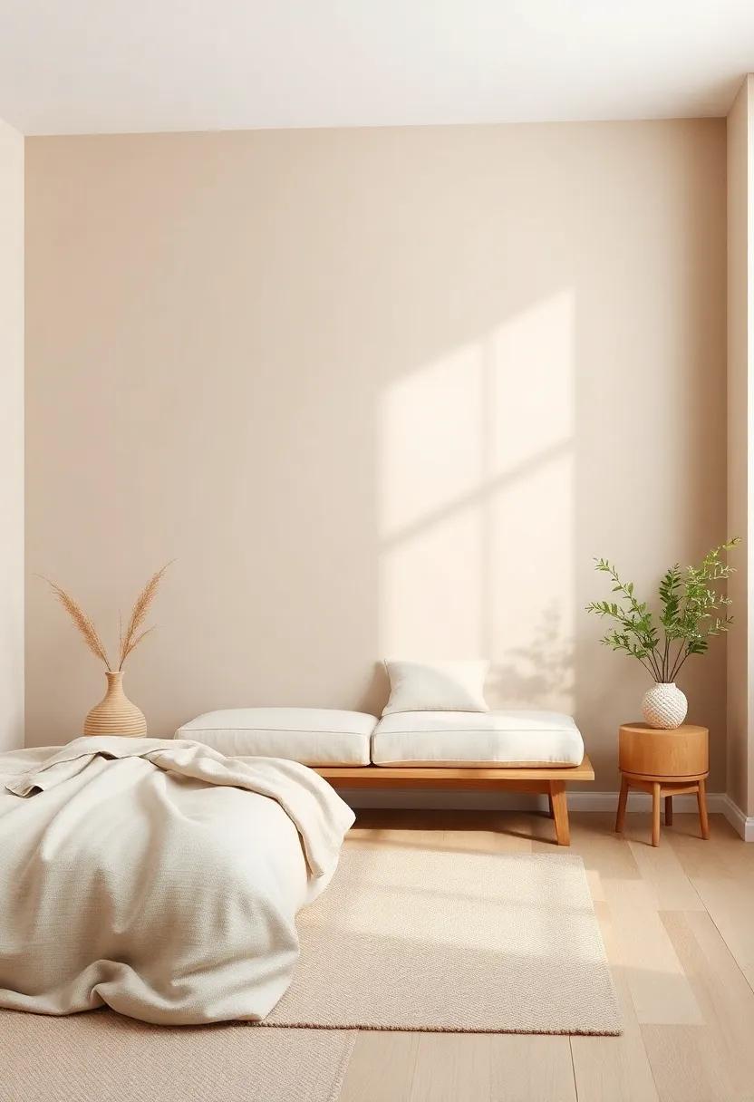
Earthy tones bring an understated elegance to any bedroom, serving as a bridge between the interior and the natural world outside. Colors like soft taupes, muted greens, and warm terracottas mimic the hues found in nature, creating a peaceful atmosphere conducive to relaxation and rest. When applied as the main palette, these colors can transform walls into a gentle backdrop, inviting serenity and calm into the space. Incorporating decorative elements such as wooden furnishings, woven textiles, and houseplants further enhances this connection, making the room feel like a tranquil retreat.
To achieve an earthy aesthetic, consider the following elements:
- Accent Walls: A deep forest green or rich clay can serve as a striking focal point.
- Textures: Incorporate natural materials like linen, jute, and reclaimed wood.
- Artistic Touches: Use botanical prints or landscapes to add depth and interest.
Creating a harmonious composition of colors and textures not only beautifies your space but also promotes a sense of well-being. To explore more neutral color inspiration and tips for your bedroom,visit House Beautiful.
Crafting a timeless Look with Classic taupe and Ivory Combinations
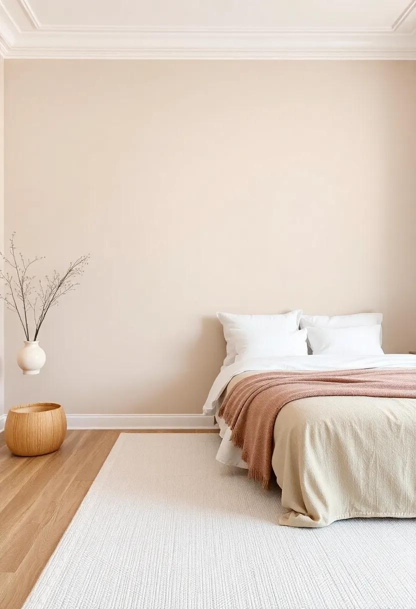
Using classic taupe and ivory together creates a foundation of tranquility, infusing your bedroom with a timeless elegance.These soft, neutral hues can effortlessly complement various decor styles, enhancing the overall ambiance while providing a perfect backdrop for personal expression. When selecting shades of taupe, consider those with warm undertones to create a cozy feel alongside crisp ivory accents. The beauty of this combination lies in its versatility, allowing for rich textures and layered linens that invite relaxation. Emphasize this serene palette by incorporating elements such as:
- Textured pillows in taupe fabrics
- Ivory throws draped across a bed or chair
- Natural wood furniture to add warmth
- Artistic pieces featuring soft earth tones
Incorporate captivating elements like muted artwork or decorative mirrors that reflect the surroundings,creating a more expansive environment. Sustain the theme with muted lighting fixtures and soft window treatments that allow for filtered natural light—enhancing the calmness. Furnishings in taupe with ivory detailing can seamlessly tie together the color palette.To inspire your decor journey, consider utilizing resources that delve deeper into color theory and design. One such website is House Beautiful, which offers insights and ideas for creating serene spaces that resonate with peace and comfort.
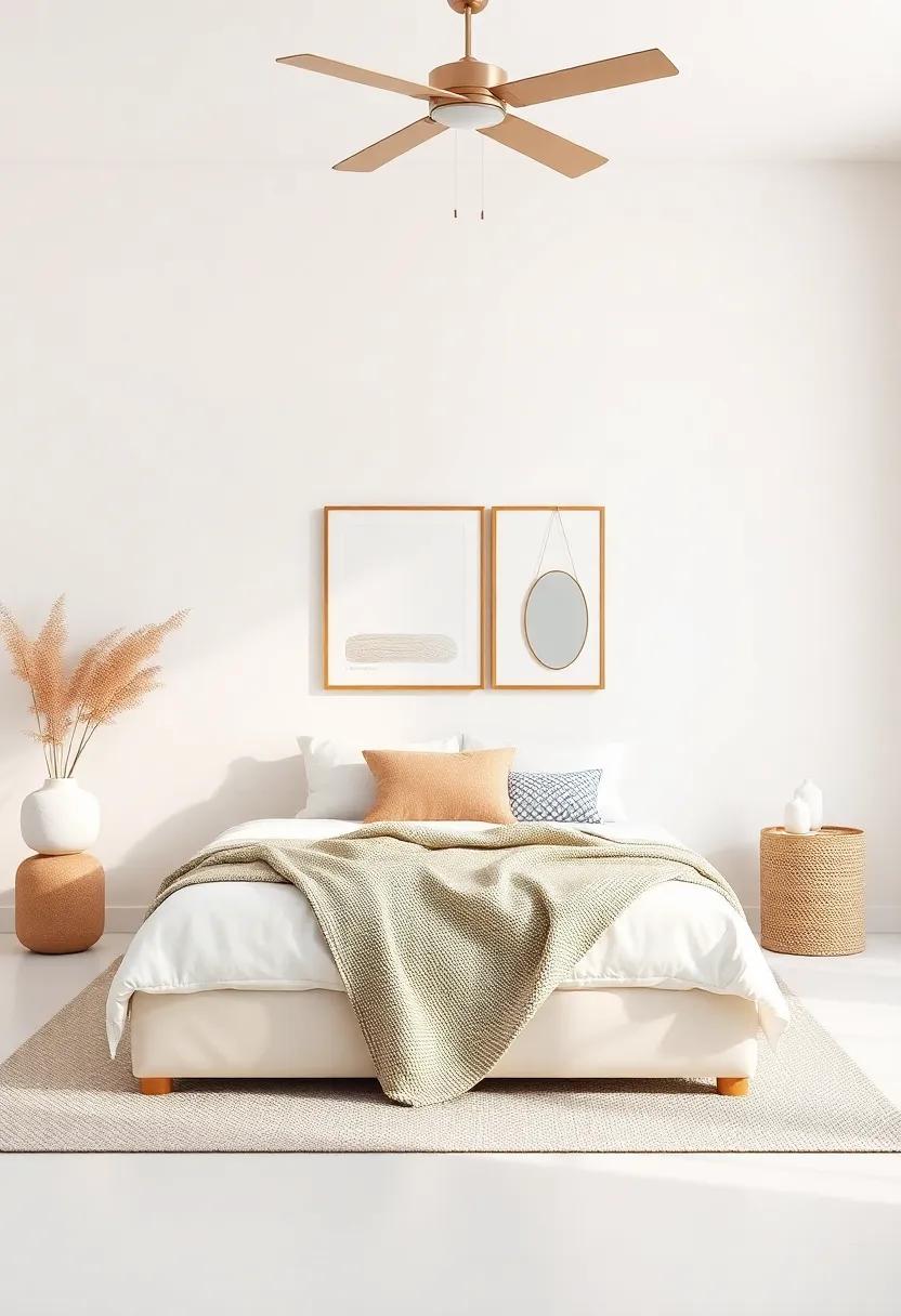
Accent Walls: the Impact of Rich Neutrals in Small Spaces
Incorporating rich neutral tones into small spaces can work wonders in transforming their overall ambiance. An accent wall painted in a deep taupe, warm beige, or muted olive offers a dramatic yet inviting backdrop, creating a focal point that draws the eye. These colors can enhance architectural features, such as a beautifully crafted headboard or a collection of artwork, making them feel even more significant. Consider textures like a matte finish or a subtle gloss to add depth and sophistication to the vibrancy of the hues,allowing light to interact with the surface in delightful ways. By contrasting soft furnishings with these rich tones, you can achieve a balanced aesthetic that feels both serene and stylish.
To further enhance the impact of your accent wall, look to complement your chosen color with carefully selected decor elements. Thoughtful additions such as patterned throw pillows, textured blankets, and layered lighting can bring warmth and dimension to the space. Here are some ideas for choosing complementary elements:
| Element | Color Combination |
|---|---|
| Textiles | Soft Greys + Deep Taupe |
| Artwork | Muted pastels + Warm Beige |
| Lighting Fixtures | Brushed Metals + Olive green |
By adding layers of texture and contrasting colors, you create an inviting atmosphere that enriches the bedroom experience. Explore more ideas about the use of neutral palettes in decor at House Beautiful for creative inspiration.
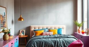
Balancing Neutrals with Pops of Color for a Dynamic Retreat
Creating a serene bedroom retreat often begins with a neutral palette that forms the foundation of your space. Soft shades of beige,cream,and gray can envelop your room in a calming embrace,promoting relaxation and tranquility. To avoid a monochromatic space that lacks visual interest, consider adding pops of color through various design elements. this can be achieved with vibrant accent pillows, colorful artwork, or even a bold area rug that draws the eye and uplifts the mood. By choosing colors that resonate with your personality, you can transform a subdued environment into one that reflects your unique style.
When selecting your accent colors, consider the overall atmosphere you wish to create.A table can help you visualize and plan your palette:
| Neutral Base | Accent Color |
|---|---|
| Soft Beige | Turquoise |
| Light Gray | Mustard Yellow |
| Warm Taupe | Coral Pink |
Additionally, textural variety can elevate the space as much as color does. Consider incorporating different materials—like a sleek velvet throw, a hand-woven wool blanket, or a gallery wall of framed prints. This layered approach not only emphasizes the pops of color but also adds depth to your serene retreat. For more color inspiration, explore design resources from House Beautiful.
Selecting the Right Paint Finish for a Cohesive Bedroom Style
Choosing the appropriate paint finish is integral to achieving a cohesive atmosphere in your bedroom. each paint finish has its own unique characteristics that can either enhance or detract from the overall style of the room. For a tranquil retreat, opt for matte or eggshell finishes; they provide a soft, inviting appearance that complements neutral tones beautifully. This subtlety can help create a serene backdrop for your decor,allowing other elements to shine while maintaining a calm ambiance. In contrast, if you prefer a slight shimmer, a satin finish can add just the right amount of elegance without overpowering your chosen palette.
When selecting a finish, consider the following key aspects to ensure harmony in your design:
- Room Functionality: If your bedroom receives a lot of natural light, a satin or semi-gloss finish can add depth to the walls.
- durability needs: For high-traffic areas or rooms needing frequent cleaning, select a finish that withstands wear and tear.
- Style Elements: Align the finish with your existing furnishings and fabrics—matte finishes pair well with plush textiles, while glossier options complement sleek furniture.
Moreover, experimenting with varying degrees of finish can provide an interesting visual texture without straying from the soothing neutral theme. Consider accent walls in a higher gloss finish while keeping the rest in a matte, creating a subtle contrast that adds depth and intrigue to your serene bedroom retreat. For additional inspiration and detailed data on paint finishes, visit House Beautiful.
Pairing Neutrals with Natural Materials for a Harmonious Space
Incorporating neutral shades with natural materials creates a peaceful ambiance that is ideal for a serene bedroom retreat. Consider using a palette of soft beiges, warm grays, and gentle whites as a base for your walls. These colors not only provide a soothing backdrop but also allow for natural elements to shine. Combine these hues with wooden accents, such as a reclaimed oak bed frame or teak side tables, to introduce warmth and an organic feel to the space. The contrast between the muted tones of neutrals and the rich textures of wood enhances visual interest while maintaining a calm aesthetic.
To further augment this soothing environment, integrating natural textiles can play a significant role. Think about layering your bedding with luxe cotton or linen in creamy whites or muted earth tones, complemented by jute or wool area rugs that provide tactile warmth underfoot. Adding greenery through indoor plants in beautifully simple pots can also enliven the room, encapsulating the harmony of nature and neutrals. Here’s a simple table highlighting some ideal materials to consider for your tranquil retreat:
| Material | Color Palette | Texture |
|---|---|---|
| Wood | Warm Oak, Ash Gray | Natural Grain |
| Textiles | Cream, Soft Beige | Soft, Cozy |
| Ceramics | Earthy Terracotta, Soft White | Matte Finish |
In blending these elements, you’ll craft a harmonious atmosphere that fosters rest and rejuvenation. To gather more insights on design inspirations, check out House Beautiful for further ideas on how to elevate your serene sanctuary.
Exploring Monochromatic Palettes: The Art of One-Color Wonders
Embracing the essence of monochromatic design, a room drenched in shades of a single color can evoke a potent sense of calm and unity. Picture soft beiges and warm taupes melting into one another, creating a tranquil oasis. This serene atmosphere can be achieved by playing with various textures, such as a plush area rug, a knitted throw, or linen curtains. Implementing different tints and tones of one color further enhances visual interest, while maintaining that cohesive feel. Consider the following elements to inspire your neutral palette:
- Accent Pieces: Use bold decorative items to add depth.
- Artwork: Incorporate monochromatic paintings or prints as focal points.
- Lighting: Choose fixtures that complement your primary shade, enhancing its glow.
In achieving the ultimate bedroom retreat, it’s crucial to select complementary furnishings that align with your chosen palette. A tranquil space can be accentuated with soft bedding options, woven baskets, and wooden furniture that reflect the inherent beauty of your color scheme. When considering texture and tone, layering becomes essential. Don’t shy from contrasting surfaces—think of matte lamps against shiny frames, or textured cushions next to smooth linens. Below is a simple guide to common neutral shades and their inspiring benefits:
| color | Benefit |
|---|---|
| Soft Beige | Creates warmth and comfort. |
| Cool Gray | Promotes relaxation and neutrality. |
| Warm Taupe | Invites earthiness and elegance. |
For further inspiration and design ideas, visit House Beautiful.
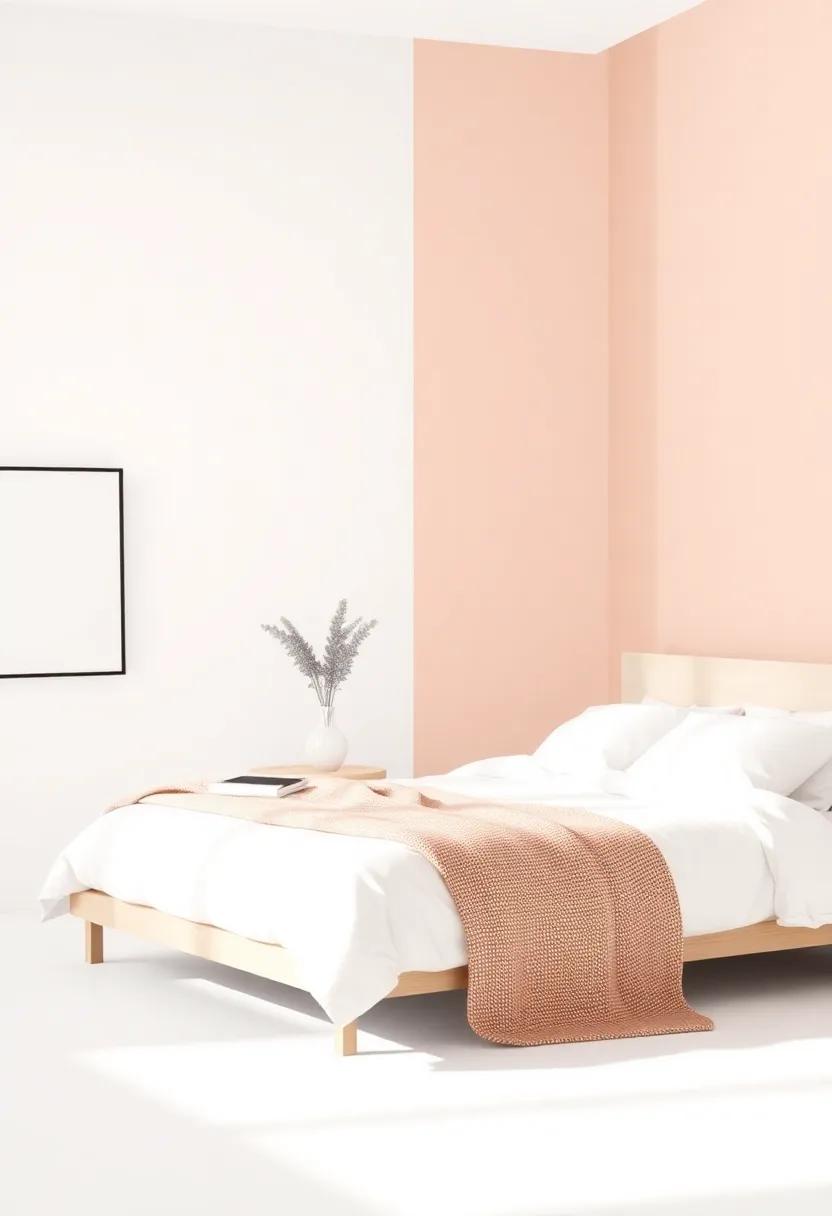
Creating a Calm Escape with Soft Pastels in Neutral Hues
To cultivate a tranquil environment,consider infusing your bedroom with soft pastel shades that dance harmoniously with neutral tones. These muted colors not only establish a serene ambiance but also complement various design elements, from furniture to accessories. Think of the calming effects of a delicate lavender paired with warm beige, or a gentle seafoam green accented by creamy whites. Such combinations can create a soothing backdrop, encouraging relaxation and ease.to enhance this effect,incorporate textures—lightweight throws,plush pillows,and soft rugs—that invite comfort and warmth into your retreat.
Layering these pastel hues in various elements can further elevate the space. Consider painting the walls in a whispering peach while introducing bedding in powdery mint. Accentuate with furniture pieces in light oak or soft grey to maintain a cohesive look. For a touch of visual interest, integrate accessories like candles or artwork featuring subtle patterns that echo your color palette. Embracing nature is another great way to enhance your serene escape; a few potted plants can bridge the gap between stylish decor and the refreshing vibes of tranquility. To explore more about the interplay of colors and decor, check out House Beautiful.
utilizing Textured Fabrics to Complement Neutral Paint Choices
Textured fabrics can be a game-changer when it comes to enhancing the visual interest of a bedroom adorned with neutral paint. By strategically layering various materials such as velvet, linen, and cotton, you create depth and warmth that invite comfort and relaxation. Consider incorporating bold textures in items like cushion covers, bedspreads, and upholstered chairs. This not only breaks the monotony of flat finishes but also transforms your serene space into an inviting retreat. Here are some fabric options to consider:
- Velvet: Adds a luxurious feel and contrasts beautifully with matte painted walls.
- Linen: Offers a breezy, casual vibe, perfect for a relaxed aesthetic.
- Textured Knits: bring a cozy, homey element that softens the overall look.
In addition to these fabric choices, think about using woven materials or embroidered accents to create layers within your decor. Think about eclectic throw pillows or a chunky knit blanket draped over a neutral chaise.These elements not only provide tactile variety but also invite a sense of tactile enjoyment. To complement your textiles,you can balance out the room with understated accessories—like minimalist lamps and simple art pieces—that echo the room’s calming palette. Discover more inspiration for creating textured spaces at Apartment Therapy.
blending Traditional and Modern Styles through Neutral Paint
Blending traditional elements with modern aesthetics can create a harmonious and tranquil environment, especially in a bedroom setting. By utilizing a neutral paint palette, you can effortlessly marry classic design motifs with contemporary flair. Imagine soft taupes intermingling with deep charcoal accents; this combination can evoke a sense of timeless elegance while maintaining a fresh, updated feel. To enhance this balance, consider integrating textured fabrics and unique furniture pieces that reflect a mix of both styles, such as a vintage armchair paired with sleek, modern nightstands.
When selecting your neutral shades,aim for versatile hues that adapt to different lighting throughout the day. A palette of creamy whites, gentle beiges, and muted greys can serve as a backdrop, allowing decorative elements like artwork and textiles to stand out. Here are a few ideas for infusing personality into your serene space:
- Accent Walls: create a focal point with a darker neutral tone.
- Mix Materials: Combine wood, metal, and fabric for depth.
- Subtle Patterns: Introduce soft patterns in bedding or curtains.
- Earthy Decor: Use plants to bring warmth and life into the space.
| Style Element | traditional Influence | Modern Twist |
|---|---|---|
| Color Palette | Warm, rich tones | Cool, subdued shades |
| Furnishings | Ornate details | Sleek designs |
| Textiles | Heavy drapes | Light, airy fabrics |
| Artwork | Classic portraits | Abstract pieces |
Moreover, integrating elements from both worlds not only adds depth but also creates a personalized retreat that feels inviting and calming. For more inspiration on blending styles and achieving the perfect neutral palette, check out House Beautiful.
Finding Your Unique Style: Personalizing Neutral Palettes
Embracing a neutral palette doesn’t mean sacrificing personality; rather, it opens the door to expressing your unique style through thoughtful accents and decor. Consider layering different textures to create depth and interest within your serene color scheme. Incorporate elements such as woven throw blankets, plush rugs, and textured curtains to elevate the visual appeal without detracting from the calming essence of your space. Paint finishes also play a crucial role—glossy surfaces can add a modern twist, while matte finishes evoke a more tranquil vibe. by carefully selecting your fabrics and finishes, you can achieve a harmonious balance that highlights your individuality.
To personalize your space further, add statement pieces that reflect your aesthetic, such as artwork, photographs, or vintage finds. neutral backgrounds allow these items to shine, turning your bedroom into a curated gallery. Consider the following ideas when selecting your decor:
- Accent Furniture: A unique chair or side table can serve as a focal point.
- Natural Elements: Incorporating plants adds freshness and life.
- Personal Mementos: Items that tell your story enhance the emotional connection to the space.
By thoughtfully combining these elements, you transform your neutral haven into a personalized retreat that speaks to your style. For more inspiration on decorating with neutrals, check out House Beautiful.
Reflecting Serenity with Neutral Colors: A Guide to Mood and Tone
The harmonious balance of neutral colors serves to cultivate an ambiance of tranquility, crucial for transforming your bedroom into a serene retreat. Utilizing a palette that features soft beiges, understated grays, and muted whites will not only amplify light but also provide a canvas for personal expression. Consider incorporating hues like champagne, taupe, and cream to create a soothing environment. These shades effectively blend together to emit warmth while maintaining a cool composure, allowing for a serene backdrop that encourages relaxation and reflection.
To further enhance the peaceful vibe of your bedroom, mix textures and patterns in your furnishings and decor. As an example, soft linens, plush throws, and natural wood accents harmonize beautifully in a neutral space, adding depth without overwhelming the senses. Here are a few ideas to consider:
- Accent pillows in soft taupe
- A statement rug with gentle gray patterns
- Wooden furniture with a light oak finish
These elements contribute to a calming atmosphere that promotes restfulness. You can explore more inspiring ideas on color schemes at Behr.
Visualizing Warmth: How Lighting Affects Neutral Paint Choices
When considering a neutral palette for your bedroom, lighting plays a crucial role in showcasing the warmth of your chosen hues. Natural light, with its soft and dynamic qualities, can breathe life into shades like warm beige and soft taupe, making them feel inviting and cozy. in contrast, the harshness of artificial lighting may cast an unflattering gray tone over your paint, diminishing its warmth. To enhance the serene ambiance, it’s essential to think about how various light sources can alter the visual perception of your space. Pay attention to how your room looks during different times of the day and consider layering your lighting with:
- Soft table lamps that emit a gentle glow.
- String lights that add a whimsical touch.
- Candles for a warm flickering effect.
To find the perfect balance, experiment with paint samples under the various lighting conditions you experience daily. Keeping samples on hand can help you visualize how different neutrals pair with your unique lighting setup.Additionally, consider the texture and finish of your paint, as a satin or eggshell finish can reflect light beautifully, enhancing warmth and depth in your neutral selections. For further inspiration on lighting and design, visit Houzz.
In Summary
As we conclude our exploration of neutral paint ideas for your bedroom retreat,remember that color is more than just a visual choice; it’s a mood-setter,a comforter,and a reflection of your personal style. embracing neutral tones can transform your space into a serene sanctuary, inviting calm and tranquility into your daily life. From soothing beiges and soft grays to gentle whites and muted taupes, the possibilities are endless.
Let your imagination guide you as you reimagine your room—not just as a place to sleep, but as a haven to nurture your well-being. Surrounding yourself with calming hues can enhance your relaxation rituals, elevate your creativity, and promote a restful atmosphere. So, pick up that brush, explore the palettes, and let the journey of conversion begin. After all, every stroke brings you one step closer to your ideal retreat—a space that resonates with peace and harmony, tailored just for you. Happy decorating!
As an Amazon Associate I earn from qualifying purchases.