 goodworksfurniture Decoration and home design ideas
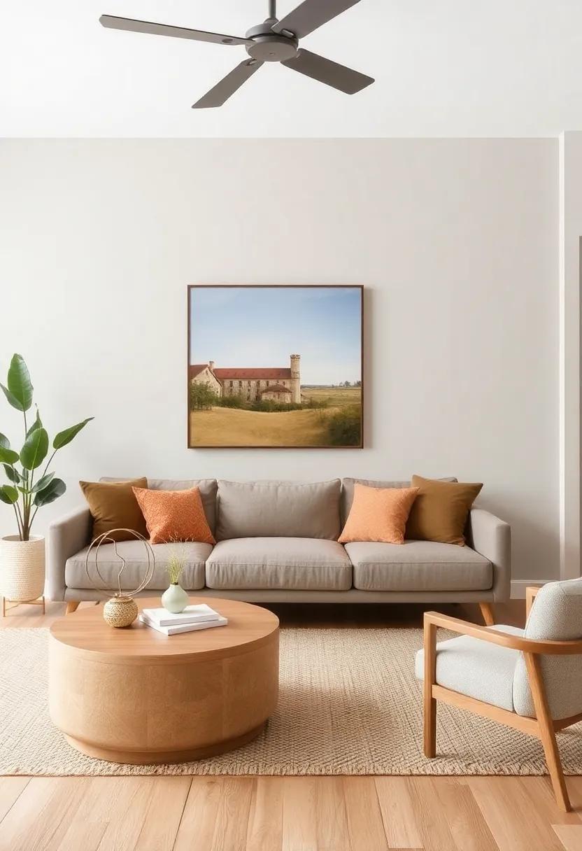
 When it comes to home design, the living room often serves as the heart of the home—a space that invites relaxation, fosters conversation, and reflects personal style. Among the myriad choices of colors and materials, few combinations are as timeless and appealing as neutral wall shades paired wiht natural wood accents. This harmonious duo can elevate your space,creating a serene backdrop that allows the warmth and texture of wood elements to shine. Whether you’re aiming for a cozy, rustic retreat or a modern, minimalist haven, the right neutral tones can perfectly complement the beauty of your wood furnishings. In this article, we’ll explore a selection of neutral wall color ideas that not only enhance the allure of natural wood but also create a balanced, inviting atmosphere in your living room. Get ready to transform your space into a sanctuary of style where every hue tells a story.
Neutral shades That Enhance Warmth in Wooden Interiors
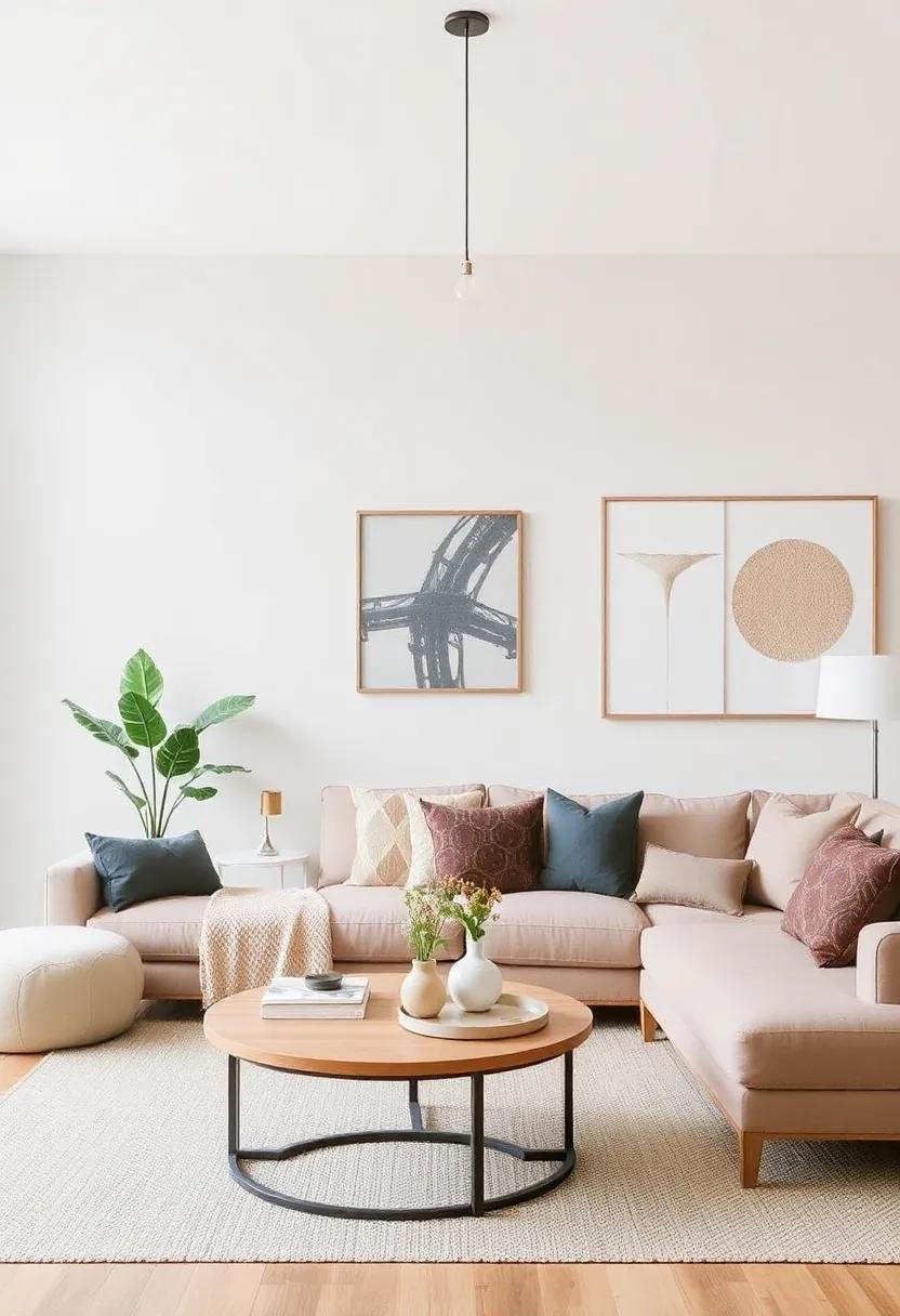
Choosing the right neutral shades can significantly impact the ambiance of your living space, especially when combined with natural wood accents.Shades such as soft beige, gentle taupe, and warm greys can perfectly complement wooden finishes, creating a harmonious blend that feels inviting. These colors ensure that the beauty of the wood grain stands out while bathing the walls in a soothing glow. Each of these options acts as a backdrop, allowing your wooden furniture and decor to shine and become the centerpiece of the room.
To further enhance the warmth, consider deeper neutrals like charcoal or olive green which add depth without overpowering the natural beauty of wood. Accent walls in these tones can provide a stunning contrast, drawing the eye to intricate wood details.Pair your neutral walls with accent pieces like brass fixtures or textured textiles to enrich the overall aesthetic. Here’s a fast view of shades that harmonize beautifully with wooden elements:
| Neutral Color | Wood Type | Vibe |
| Soft Beige | Maple | warm & Cozy |
| Gentle Taupe | Oak | Elegant & Timeless |
| Warm Gray | Walnut | Modern & Chic |
| Charcoal | Cedar | Bold & Dramatic |
| Olive Green | teak | Natural & Earthy |
The Timeless Elegance of Soft Grays Against Wooden Features
Soft grays have emerged as a sophisticated choice for wall colors,especially in living spaces where natural wood accents shine. when paired together, they create a tranquil habitat that emphasizes warmth and elegance. The cool undertones of gray serve as a perfect backdrop for the rich textures of wooden features, whether they be exposed beams, hardwood floors, or stunning furniture pieces. This combination not only highlights the unique characteristics of the wood but also promotes a sense of balance and harmony within the room.
To further enhance this exquisite pairing, consider accentuating the decor with complementary elements. Here are a few ideas to elevate the aesthetic:
- metallic Accents: Incorporate brass or gold fixtures that pop against the soft gray and wood.
- Textured Fabrics: Use wool or linen in muted colors to add depth and coziness.
- Natural Greenery: Introduce plants that bring a splash of color and vitality.
By thoughtfully selecting these accents, the serene ambiance created by soft grays and wooden elements can be transformed into a sophisticated sanctuary that is both inviting and timeless.
Warm Beige and Honey Hues: A Perfect Match for Wood Accents
When it comes to achieving a serene and inviting ambiance, warm beige and honey hues stand out as ideal companions for wood accents.These colors create a seamless blend that enhances the natural beauty of wooden elements in your living room. The soft, earthy tones of warm beige evoke a sense of calm, while honey hues bring a touch of richness and warmth, making the space feel cozy and welcoming.Together, they form a balanced palette that beautifully complements various wood finishes, from light oak to deep walnut.
To maximize the effect of these shades, consider incorporating them through various design elements. Here are some ideas to explore:
- Painted Walls: A warm beige backdrop allows wood furniture and decor to pop without overwhelming the space.
- Accent Pieces: Introduce honey-hued decorative items like vases or cushions to create contrast and depth.
- Flooring Choices: Light wood floors paired with warm beige walls can make a living room feel airy while still retaining that warm, inviting atmosphere.
| Design Element | Color Pairing |
|---|---|
| Wall Color | warm Beige |
| Accent Color | Honey |
| Furniture | Natural Wood |
| Textiles | Neutral Tones |
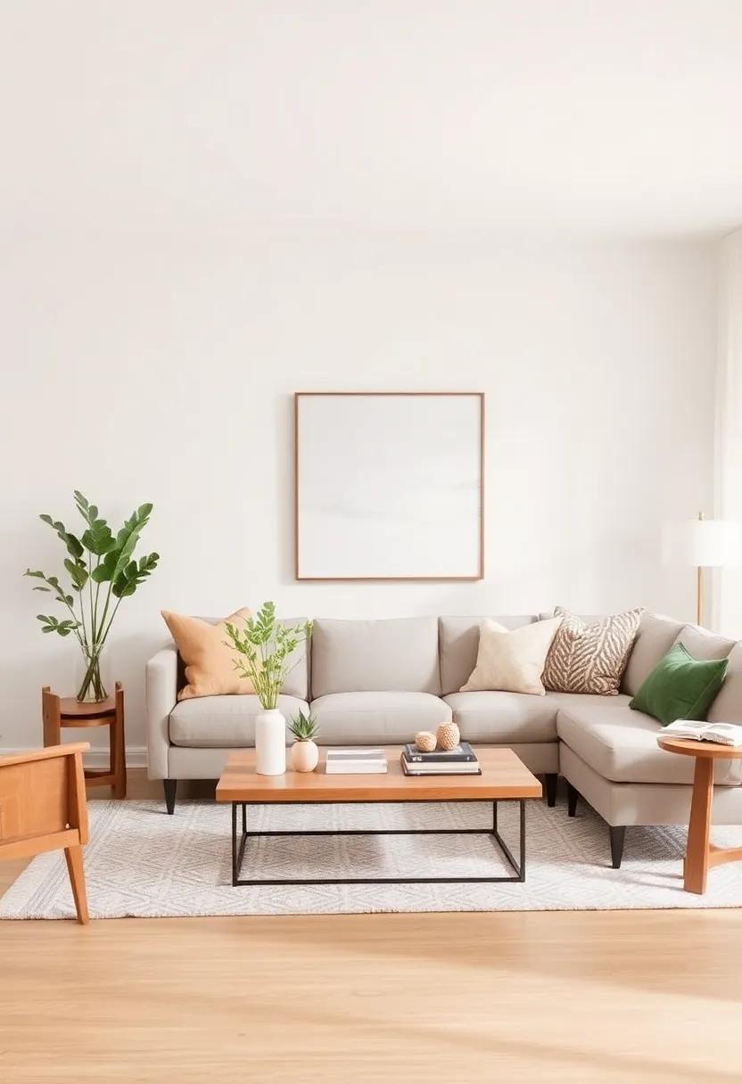
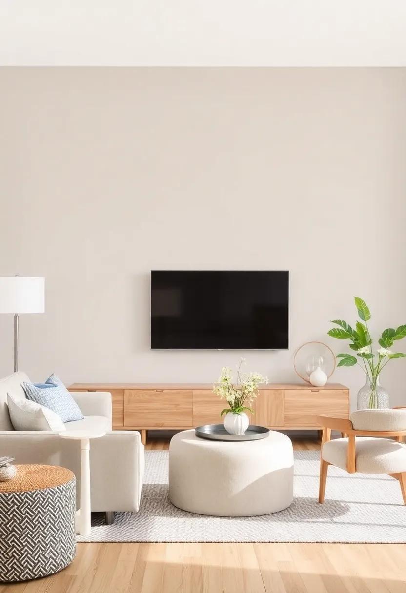
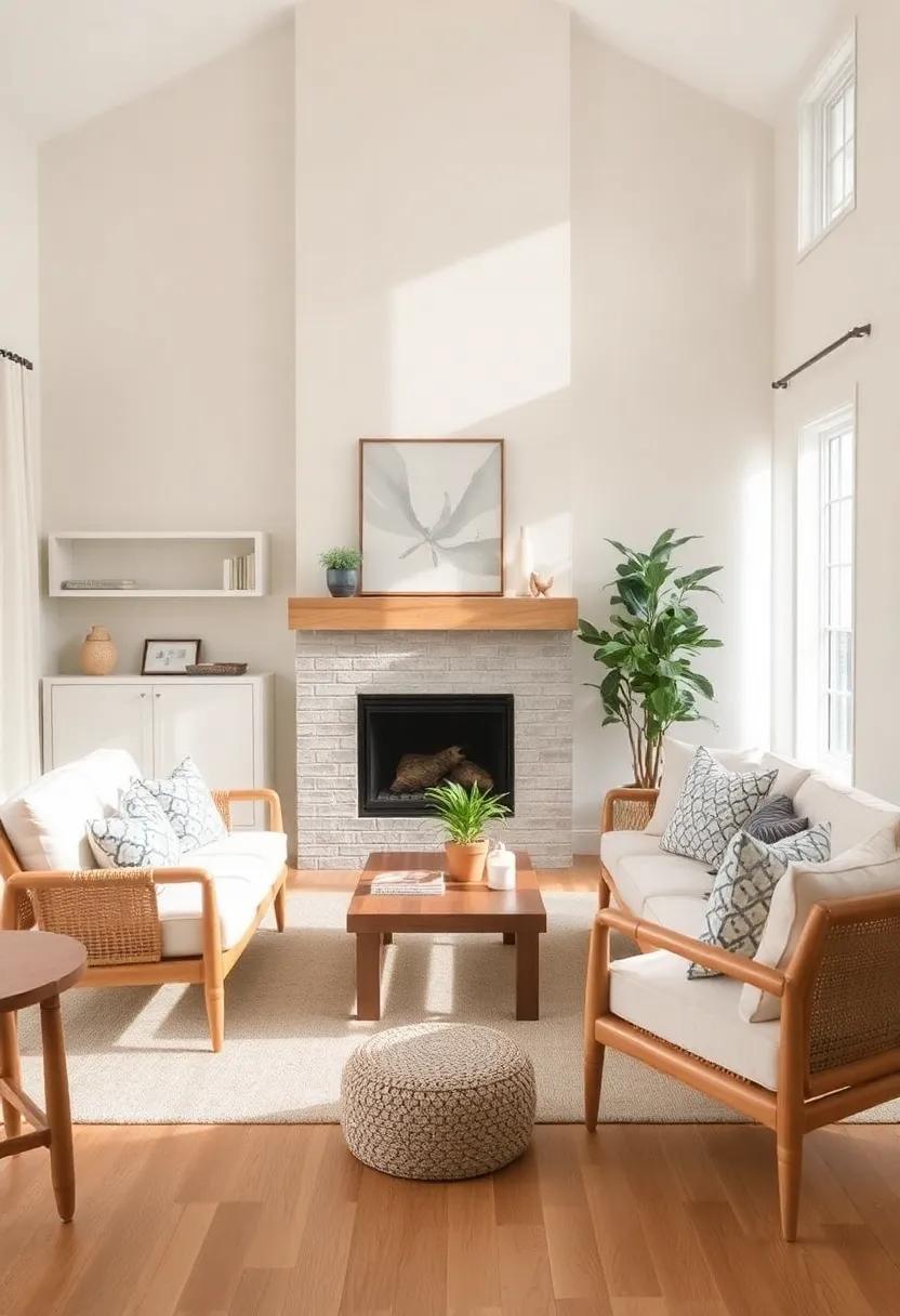
Whites with Subtle Undertones: Elevating Natural Wood Elements
Incorporating whites with subtle undertones can significantly enhance the warm, organic feel of natural wood elements in your living room. Consider shades such as soft ivory, warm cream, or barely-ther dove gray. These delicate hues blend harmoniously with the earthy tones of wood while providing a serene backdrop that highlights the beauty of your wooden furniture and accents. The interplay of light against these warm whites creates an inviting atmosphere, allowing natural wood grains and textures to shine without overpowering the space. You can use these colors as a main wall treatment or in complementary accents, such as window frames or shelving.
to further elevate the aesthetic, incorporate textures and materials that echo the warmth of the wood. A few ideas include:
- Textured fabrics: Soft linen or cotton cushions in off-white tones.
- Natural fibers: Include jute or sisal rugs to add depth.
- Metallic accents: Consider brass or matte gold finishes to add a touch of elegance.
This clever integration of whites with subtle warmth will not only unify your living room’s color palette but also establish a sophisticated yet cozy vibe that invites relaxation and conversation.
The Allure of Greige: Balancing Warmth and Coolness with Wood
The subtle charm of greige—a sophisticated blend of gray and beige—offers an ideal backdrop that elegantly pairs with the warm textures of natural wood accents. This versatile hue serves as a canvas that neither overwhelms nor fades into the background, allowing wood elements to shine. Imagine a spacious living room where rich oak furniture meets greige walls, creating a serene atmosphere infused with both warmth and tranquility.Greige’s adaptable nature complements various wood tones, from the light undertones of maple to the deep, robust shades of walnut, forming a harmonious balance that invites relaxation.
Incorporating this neutral shade can also elevate various design styles, whether you favor modern minimalism or rustic charm.To enhance the greige experience further, consider these accents:
- Textured Fabrics: Soft throws and plush cushions in complementary hues can soften the space.
- Metallic Touches: Brass or matte black fixtures introduce a touch of sophistication and contemporary flair.
- Natural Elements: Decorate with houseplants or wooden art pieces to build depth and vitality.
Below is a simple table outlining the ideal wood finishes that work beautifully with greige:
| Wood Type | Undertone | Ideal Greige Shade |
|---|---|---|
| Maple | warm | Cool Greige |
| Oak | Golden | Balanced Greige |
| Walnut | Dark | Light Greige |
Sandy Tones: Blending Nature with Neutral in Living Rooms
Creating a serene and inviting living room is all about the interaction between colors and textures. When you choose sandy tones as your wall color, you’re setting up a perfect backdrop that harmonizes beautifully with natural wood accents. the warmth of sandy hues not only evokes a sense of calm but allows wooden elements like furniture, beams, or decorative pieces to shine. Consider sandy shades such as soft beige, taupe, or creamy ivory. Each of these tones effortlessly complements the organic feel of wood, creating a cohesive look that feels both grounded and sophisticated.
To enhance the sandy aesthetic and enrich your living room, you can incorporate various materials and accessories that echo nature’s palette. This might include textiles in earthy colors, decorative objects made from stone or ceramics, and greenery to bring freshness into the space. Here are some accent color ideas to pair with your sandy wall tones:
- Muted Greens – Evoking lush landscapes
- Soft Blues – Mimicking the sky or water
- Warm Rust – Adding a touch of autumn
- Dusty Rose – For a soft, romantic feel
Creamy Whites Infusing Cozy Vibes Around Wooden Accents
Imagine stepping into a living room where the soft glow of creamy whites envelops you, creating a serene and inviting atmosphere. These light, airy hues effortlessly enhance natural wood accents, allowing them to breathe and shine. With their muted brightness, creamy whites serve as an ideal backdrop, complementing the rich textures of wooden furniture and decorative elements. The result is a harmonious dialogue between the warmth of the wood and the cool elegance of the walls, fostering a sense of tranquility that feels both modern and timeless.
To bring out the best of this pairing,consider integrating elements such as:
- Textured fabrics in plush whites or soft beiges
- Natural fiber rugs that add warmth underfoot
- Statement lighting with wood accents to tie the room together
These small additions will enhance the cozy vibes,inviting you to relax and unwind. Whether your wood accents are light ash or rich walnut,creamy whites will highlight their natural beauty,creating a sophisticated yet cozy living space designed for both style and relaxation.
Light Taupe: A Versatile Canvas for Natural Wood Décor
Light taupe serves as a gentle backdrop that enhances the warmth of natural wood elements in your living room. This soft, neutral hue creates an inviting atmosphere, allowing wood accents—such as a rustic coffee table or elegant shelving—to stand out without overpowering the space. The subtle undertones of taupe can complement various types of wood finishes, from light oak to darker walnut, ensuring harmony throughout your decor. The versatility of this color makes it easy to incorporate different textures and patterns, enriching the overall aesthetic of your room.
To make the most of light taupe in your living room, consider incorporating earthy tones and organic materials. Here are some elements that marry perfectly with taupe and wood:
- Natural textiles: Linen or cotton cushions in soft greens or creamy whites.
- Artwork: Earth-toned prints or landscapes framed in reclaimed wood.
- Plants: Greenery in handcrafted pots to add a fresh pop against taupe walls.
These additions not only enrich the aesthetic but also create a cohesive look that draws the eye toward the beauty of your living space. Additionally, including metal accents—such as brass or matte black—can introduce a modern touch while still respecting the serenity of natural materials. Experimenting with various shades and textures will yield a living room that feels both serene and sophisticated, seamlessly blending taupe and wood elements.
Muted Pastels: Adding a whisper of Color to Wood Accents
Muted pastels are an enchanting way to breathe life into your living space while maintaining the organic warmth of natural wood accents. Paint colors such as soft lavender, dusty rose, and pale mint can bring a sense of tranquility and sophistication to the room. Their subdued tones provide just enough contrast against wooden textures, allowing the unique grains and knots of the wood to become features rather than just backgrounds. Consider incorporating these hues through accessories, such as cushions and throws, or even a statement piece of artwork that ties the look together.
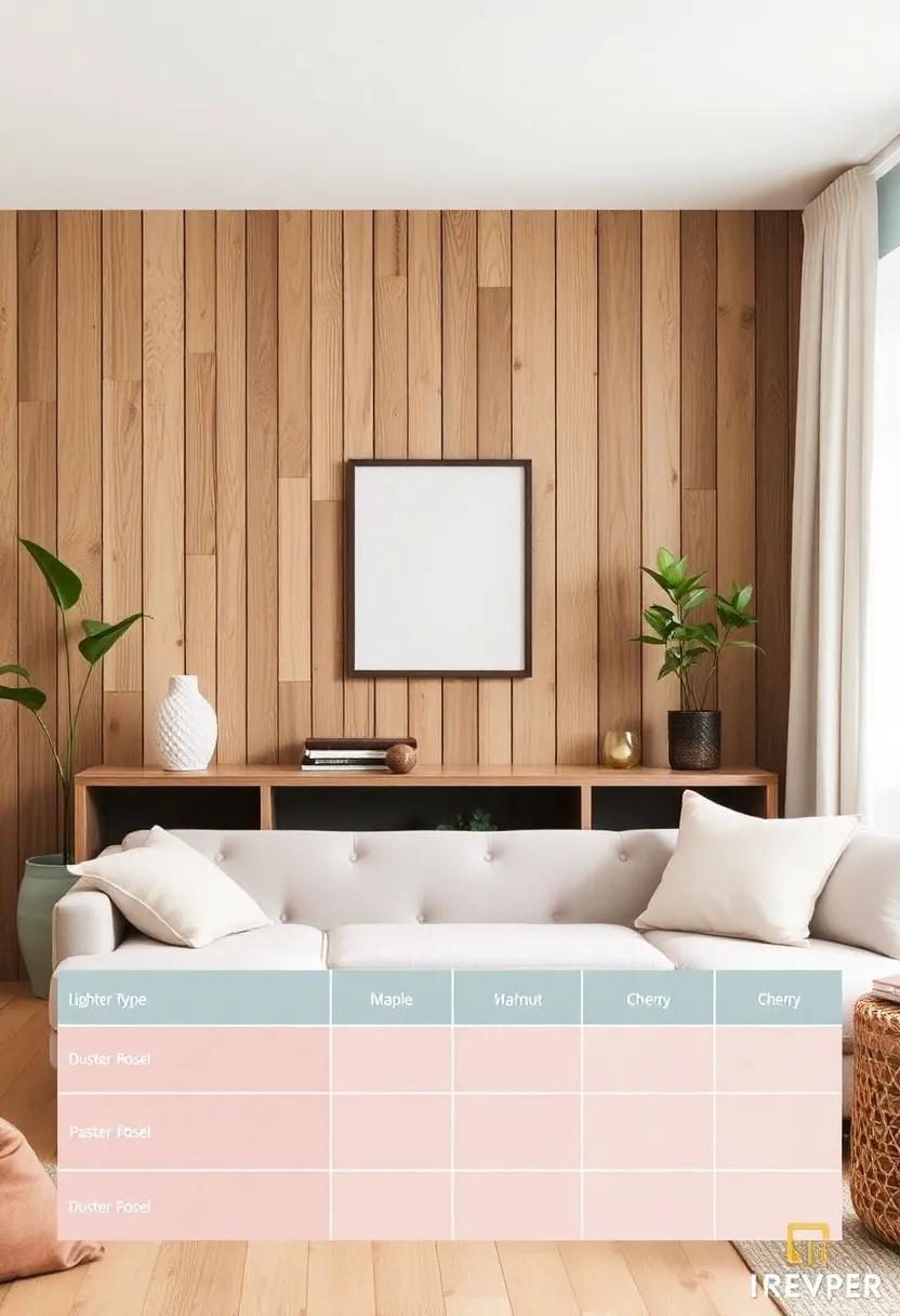
In your quest to harmonize these soft shades with wood, it’s essential to choose the right wood tones as well. Lighter woods like maple and birch not only complement pastel shades but also create an airy feel, perfect for smaller spaces.Conversely, richer woods like walnut or cherry can add an element of sophistication to muted color palettes. To help you visualize this balance, here’s a concise table showcasing suggested wood-pastel pairings:
| Wood Type | Pastel Pairing |
|---|---|
| Birch | Pale Mint |
| Maple | Dusty Rose |
| walnut | Soft Lavender |
| Cherry | Peach |
Chic Off-whites: Enhancing the Beauty of Wooden Elements
When it comes to selecting a color scheme that complements wooden elements in your living room, chic off-whites are a timeless choice. These soft, muted shades create a serene backdrop, allowing the warmth of wood to take centre stage. Consider hues like ivory, eggshell, or cream, which enhance the natural beauty of wood grain while adding a contemporary flair. The subtle richness of off-white shades can also elevate the textures within your space, making it feel more inviting and sophisticated. By softening the contrast between the walls and wooden features, you foster a harmonious connection that highlights your design intention.
incorporating off-white tones can also be achieved through the right choice of furnishings and decor.Complement your wooden accents with elements that echo the off-white palette, such as:
- Soft linen curtains to filter sunlight
- Neutral textiles like cushions or throws
- Decorative ceramics in subtle tones
Pairing these with your natural wood features, from flooring to furniture, promotes a unified look that is both elegant and cozy. This carefully curated combination ensures that your living room feels balanced, allowing the exquisite character of wood to shine through while setting a soothing, stylish tone throughout the space.
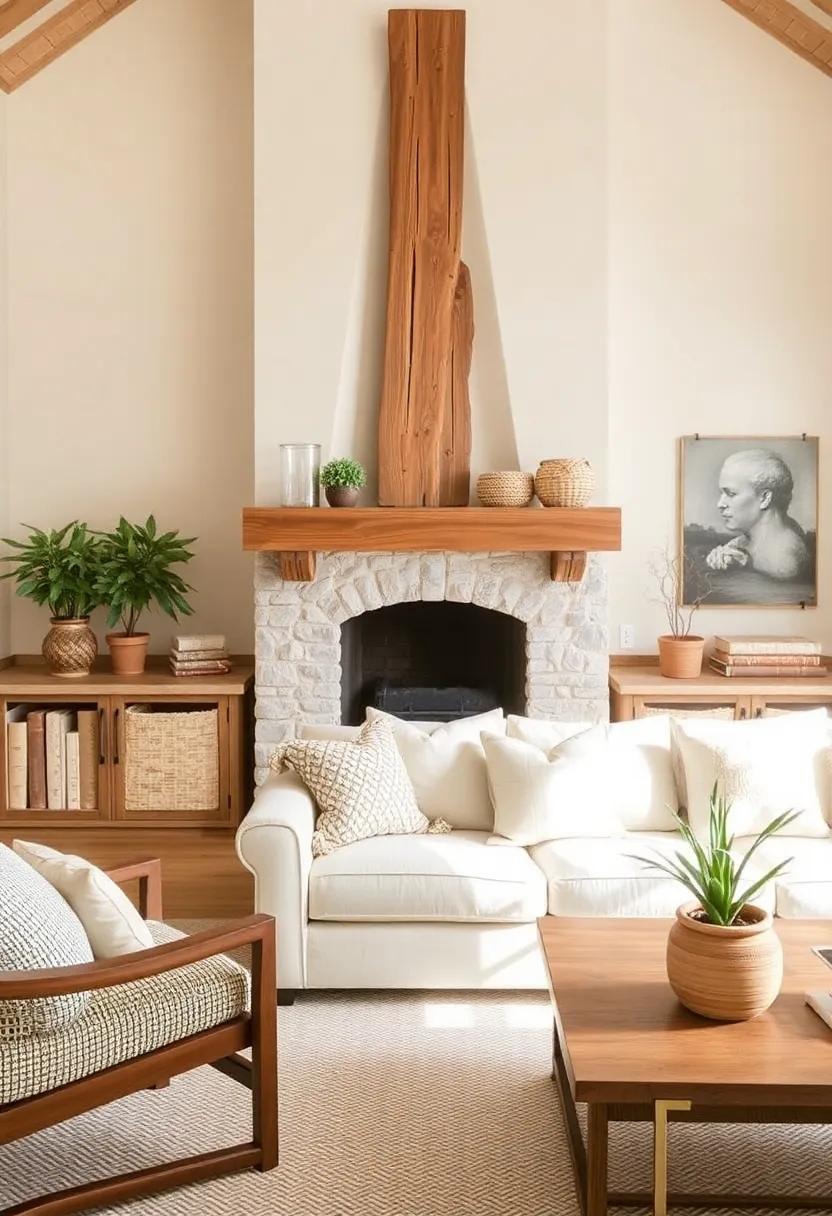
Earthy Tones: Grounding Your Space with Nature-Inspired Neutrals
The beauty of earthy tones lies in their ability to create a serene and inviting atmosphere. Shades such as soft taupe, muted olive, and warm beige offer a perfect backdrop that harmonizes effortlessly with natural wood accents. These colors not only embody a sense of tranquility, but they also emphasize the rich textures and grains of wooden furniture and flooring. To enhance this natural aesthetic, consider using rich textiles in similar tones, such as cozy wool throws or linen pillows, which bring warmth and depth to your living room.
When incorporating these nature-inspired neutrals, think about how the interplay of colors can elevate your space. As an example, a light greyish-brown wall can beautifully complement deep mahogany furniture while allowing for light oak fixtures to shine. The following palette highlights complementary shades you can experiment with:
| Wall Color | Wood Accent Color |
|---|---|
| Soft Taupe | Light Oak |
| Muted Olive | Pine |
| Warm Beige | Mahogany |
| dusty Gray | Walnut |
By selecting the right combination, you’re not just decorating your living room; you’re crafting a peaceful refuge that evokes the essence of nature. Accent your neutral walls with artwork or decor that features organic motifs,such as botanical prints or wooden sculptures,to further bring the outdoors inside,fostering a deeper connection with the natural world.
Warm Charcoal: A Striking Contrast with Natural Wood Finishes
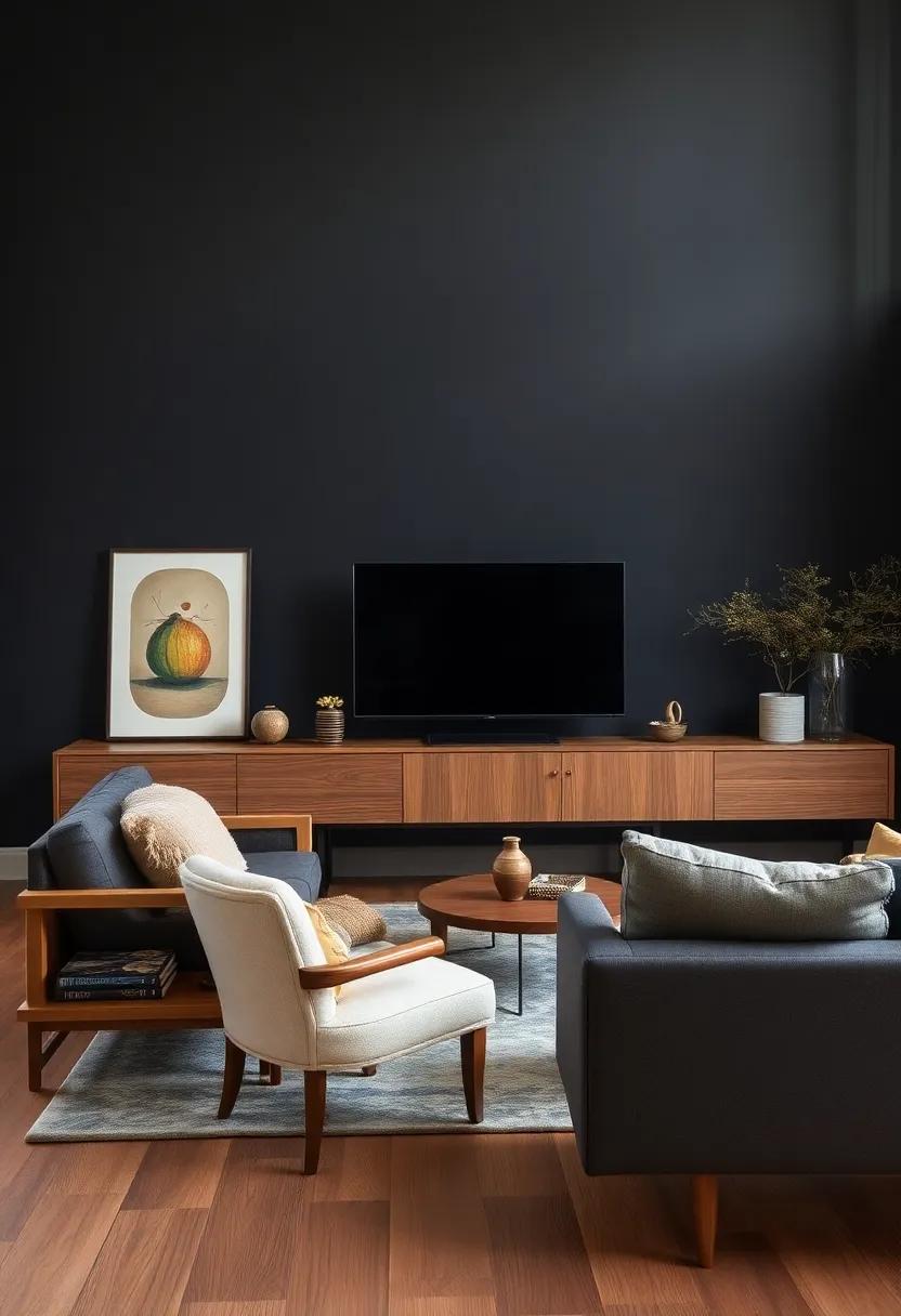
When envisioning a living room adorned with natural wood accents, introducing a warm charcoal hue can create an enticing visual balance. This deep, elegant tone acts as a dramatic backdrop that highlights the organic beauty of wood, creating a stunning contrast that feels both modern and inviting. A warm charcoal wall can serve to anchor the space, allowing the rich textures and grains of wooden furniture and décor to stand out, showcasing their craftsmanship while adding depth to the overall aesthetic.
To enhance the synergy between warm charcoal and natural wood finishes,consider incorporating elements that harmonize these two earthy tones. Here are a few suggestions:
- Textiles: Use soft fabrics in muted colors, such as beige or cream, to break the darkness of the charcoal.
- Art Pieces: Hang artwork with hints of terracotta, gold, or deep greens to tie in additional warmth.
- Accent Lighting: Choose warm-white LED lighting or brass fixtures that reflect warmly off the wood surfaces.
The Serene Touch of Soft Blue Grays Against Timber accents
Imagine stepping into a living room where the calming embrace of soft blue grays washes over you,creating a tranquil atmosphere that invites relaxation. These muted tones, reminiscent of gentle skies and serene waters, complement natural wood accents beautifully, forging a harmonious balance between cool and warm elements. The understated palette allows the grain of the timber to become the star of the show,enhancing its texture and warmth without overwhelming the senses. The subtle interplay between these hues can turn a room into a serene oasis, making it a perfect retreat for unwinding after a long day.
when designing your space, consider incorporating various shades of blue gray to create depth and intrigue. Here are several options to inspire your color scheme:
- Soft Mist: A light, airy gray with a hint of blue
- Slate Blue: A deeper, more pronounced blue-gray
- Dusty Blue: A muted tone that pairs well with warmer wood colors
- Pale Steel: A gray with subtle blue undertones that can create a monochromatic look
To ensure a streamlined approach, you might want to explore the following combinations that effectively merge these soft tones with various types of wood finishes:
| Wood Finish | Complementary Blue Gray |
|---|---|
| Light Oak | Soft Mist |
| Walnut | Slate Blue |
| Pine | Dusty Blue |
| Ebony | Pale Steel |
Creating Contrast with Cool Neutrals and Rich wood Surfaces
to achieve a harmonious yet dynamic look in your living room, consider incorporating cool neutral hues alongside rich wood surfaces. The tranquility of soft grays,crisp whites,and subtle taupes can create a serene backdrop that allows the warmth of wood to stand out. This pairing not only enhances the natural beauty of wood grain but also promotes an inviting atmosphere. Here are some cool neutral colors that work exceptionally well:
- Soft Gray: A versatile choice that complements both light and dark woods.
- Whisper White: Provides a clean canvas that emphasizes the texture of wooden elements.
- Cool Beige: adds warmth without overwhelming the richness of darker wood tones.
When selecting wood accents,focus on those with rich,deep finishes such as walnut or mahogany,which create a striking contrast against lighter neutrals. The interplay of light and dark elements can be further accentuated with carefully chosen decor. Consider the following options to enhance this contrast:
| Wood Type | Neutral Pairing |
|---|---|
| Walnut | Soft Gray |
| Maple | Whisper White |
| Mahogany | Cool Beige |
By thoughtfully selecting your cool neutrals and ensuring they complement your wood elements, you’ll create a space that feels both elegant and grounded. This consideration will not only elevate your living room’s aesthetic but also enhance its overall warmth and character.
Classic Ivory: Timeless Charm in Natural Wood Spaces
In the pursuit of creating a harmonious living space, the right wall color plays a pivotal role, especially when juxtaposed with the warmth of natural wood. One option that exudes understated elegance is classic ivory, a shade that offers a gentle contrast without overwhelming the serene beauty of wooden accents.This neutral tone not only amplifies the light within the room but also serves as a perfect backdrop for showcasing intricate wood grains and textures. By selecting classic ivory, you ensure that your natural elements take center stage, enhancing the overall aesthetic of the living room.
To complement the charm of classic ivory with wood accents, consider incorporating a few strategically chosen decor elements. Here are some options that resonate splendidly with this timeless palette:
- Rich Browns: Deep wood tones like mahogany or walnut add depth.
- Soft Taupes: These shades create a warm, cohesive vibe.
- Muted greens: Sage or olive can infuse a touch of tranquility.
- Dusty Blues: Blues can evoke calmness while complementing wood.
The interplay of these colors with classic ivory can elevate your living room, ensuring that every element seamlessly works together to create a cozy, inviting atmosphere. Carefully curated accents, such as cushions, throws, and decorative items in these hues, can further accentuate the beauty of both the wall and the wood.
Mellow Sage: A Refreshing Partner for Rustic Wood Elements
The soothing hue of mellow sage sets a serene atmosphere, making it an remarkable partner for rustic wood elements in your living room. This muted green tone complements the organic texture of wood, enhancing the natural beauty of both the color palette and furniture. Incorporating mellow sage into your space can create a harmonious balance between warmth and tranquility, allowing for a comforting yet sophisticated environment. You can achieve this look by pairing mellow sage walls with a range of wood finishes,such as:
- Weathered oak: The gentle gray undertones in weathered oak create a soft contrast that enhances the green hues.
- Rich Mahogany: The deep, reddish tones of mahogany offer a dramatic and elegant feel against the calmness of sage.
- Reclaimed Barn Wood: This rustic element adds character, perfectly juxtaposed with the smooth finish of mellow sage.
to optimize the impact of your mellow sage walls, consider adding furniture and accents that echo this color scheme. Selecting decor that includes shades of sage green will maintain consistency and enhance the earthy ambiance. A beautifully styled tableau could include:
<td<artistic Wall HangingsAntique Pine Shelves
| Accent Pieces | Wood Pairing |
|---|---|
| Throw Pillows | Maple Wood Coffee table |
| Textured Rugs | Cedar Accent Chair |
By thoughtfully incorporating these elements with mellow sage, you’ll create an inviting space that feels both grounded and refreshing, perfectly reflecting the beauty of nature within your home. Embracing this color not only highlights your rustic wood accents but also elevates the overall aesthetic of your living room, making it a true sanctuary for relaxation and connection.
Delicate Whites with Gray Undertones: Sophisticated Wood Pairings
When considering wall colors that harmonize with natural wood accents, delicate whites infused with gray undertones bring a refined elegance to your living room. These subtle hues work wonderfully with a range of wood types, creating an atmosphere that feels both airy and grounded. Incorporating textures and layering can enhance the visual interest of the space. Opt for pieces like:
- Light Oak – Complements cool undertones.
- Driftwood – Offers a rustic yet polished look.
- Maple – Adds warmth without overpowering.
- Whitewashed Pine – Softens with a beachy vibe.
To ensure a cohesive design, consider incorporating decor elements that echo these tones, such as soft textiles or artwork featuring gray and white palettes. here’s a simple guide to pairing various shades:
| Wall Color | Wood Accent |
|---|---|
| Warm Gray White | Walnut |
| Cool White with Gray | Birch |
| Soft Cream | Cherry |
| Frosty White | Beech |
The Subdued Beauty of Pale olive: Harmonizing with Wood
The allure of pale olive lies in its subtlety, inviting a sense of tranquility that effortlessly complements the warm textures of natural wood.This understated hue serves as a delicate canvas, enhancing rather than overshadowing the organic beauty of wood accents. Whether you have light oak shelves or rich walnut furniture, pale olive provides a soothing backdrop that highlights the distinct grain patterns and rich hues of the wood. With its gentle undertones, it harmonizes beautifully in various lighting, ensuring that your living room radiates warmth throughout the day.
To achieve a balanced aesthetic, consider combining pale olive with natural wood through the following elements:
- Furniture: Opt for raw-edged coffee tables or reclaimed wood side tables to create a rustic charm.
- Accents: Incorporate wooden picture frames or decorative bowls to tie in the wood elements.
- Textiles: Introduce linen or cotton throw pillows in harmonious shades to soften the palette.
Additionally,a careful selection of lighting can further elevate the atmosphere:
| Light Type | Effect |
|---|---|
| warm LED Bulbs | Enhance the warmth of the wood and create a cozy vibe. |
| Soft Pendant Lights | Direct light down to highlight textures and add depth. |
Warm Stone Shades: Bridging the Gap Between Walls and Timber
Incorporating warm stone shades into your living room can create a harmonious balance with natural wood accents, fostering an inviting and cozy atmosphere. The subtlety of these earthy tones ensures that they complement rather than overpower the rich textures of timber. Consider soft hues like taupe, sandy beige, or warm greys that evoke the essence of natural elements. These colors serve as excellent backdrops for wooden furniture and fixtures, allowing them to shine while still feeling integrated within the overall design. The warmth of stone shades can enhance the inviting quality of wood,marrying two organic materials to bring comfort and a touch of sophistication to your space.
To further enhance this seamless transition between your walls and wooden elements, consider the following color pairings that can illuminate the beauty of both materials:
| Warm Stone Shade | Wood Type | Accent Idea |
|---|---|---|
| Warm Taupe | Mahogany | Natural fiber textiles |
| Soft beige | Oak | Woven baskets |
| Sandy Grey | Pine | Terracotta pots |
This approach not only enhances the aesthetic appeal but also fosters a sense of unity throughout the space, making it feel cohesive and thoughtfully curated. With the right combinations, you can effortlessly create a living room that radiates warmth and serenity, while showcasing the natural beauty of wood.
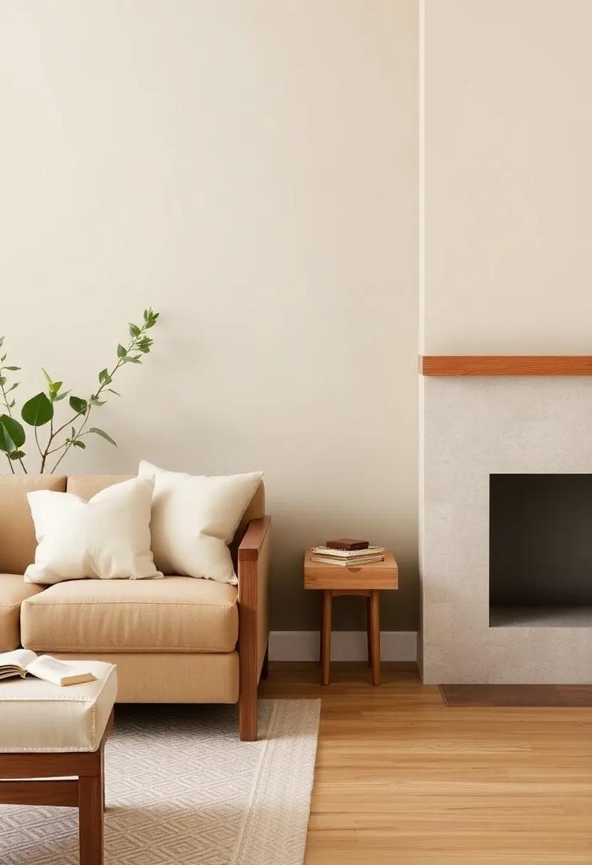
The Soft Appeal of Light Almond: A Perfect Backdrop for Wood
Embracing the soft allure of light almond creates a soothing sanctuary in your living room, effortlessly enhancing the warmth of natural wood elements. This neutral shade complements a wide range of wood tones,from light maple to deeper walnut,offering a palette that feels both fresh and timeless. The subtle undertones in light almond help to soften the sharp edges of modern interior designs while maintaining an inviting and cozy atmosphere. Pair it with your favorite wood finishes, and watch as the space transforms into a harmonious retreat that beckons you to unwind.
To further emphasize the connection between the walls and wood accents, consider integrating the following elements into your décor:
- Wooden furniture: Select pieces with clean lines to balance the soft wall color.
- Layered textures: Introduce woven textiles and soft cushions that tie in with the warmth of the wood.
- Natural light: Maximize sunlight with sheer curtains that allow the room to glow, enhancing the almond hue.
here’s a quick reference table highlighting complementary wood tones:
| Wood Type | Characteristics |
|---|---|
| Maple | Light, smooth grain that adds brightness |
| Oak | Strong, rustic appeal with visible grain |
| Walnut | Rich, dark tones for elegant contrast |
In Retrospect
As you embark on your journey of creating a serene living space, remember that the magic of neutral wall colors lies in their ability to foster harmony and elegance, particularly when paired with the warm embrace of natural wood accents. From soft taupes to airy greys and creamy whites, each shade offers a versatile backdrop that enhances the organic beauty of wood, allowing your furnishings to tell their own unique story.As you select your palette, consider the light in your space, the mood you wish to evoke, and the textures around you. Whether you opt for a minimalist aesthetic or a cozy, layered look, the right wall color can breathe new life into your living room, transforming it into a timeless haven.
So, gather inspiration, explore your options, and let your creativity flow—after all, your living room is not just a room; it’s a canvas for your personal expression. With the right neutral shades, your natural wood accents will shine, creating a welcoming space that feels both stylish and grounded. Happy decorating!
As an Amazon Associate I earn from qualifying purchases.