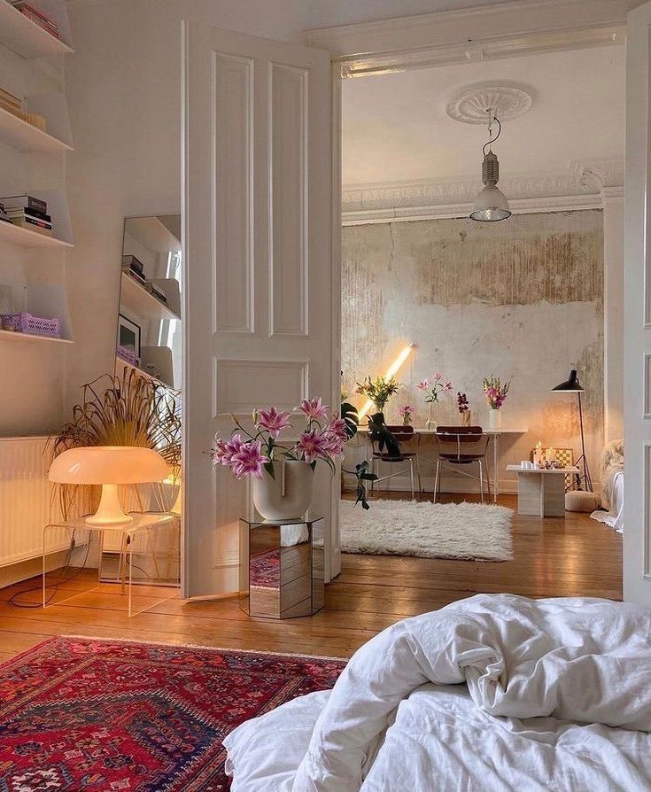
Creating a cohesive color palette in interior design is essential for achieving a harmonious and well-balanced space. By carefully selecting a range of colors that complement each other, you can create a visually appealing and cohesive look that ties the whole room together. In this article, we will explore some tips and tricks for creating a cohesive color palette in your home.
1. Start with a Base Color: Begin by selecting a base color that will serve as the foundation for your color palette. This could be a neutral shade such as white, beige, or gray, or a more bold color like navy blue or emerald green. Your base color will set the tone for the rest of the room and will help guide your choices for other accent colors.
2. Choose a Color Scheme: Once you have a base color in mind, decide on a color scheme that will complement it. There are several popular color schemes that can help guide your choices, such as complementary (colors opposite each other on the color wheel), analogous (colors next to each other on the color wheel), or monochromatic (different shades of the same color). Consider the mood you want to create in the space and choose a color scheme that reflects that.
3. Use the 60-30-10 Rule: A common rule of thumb in interior design is the 60-30-10 rule, which dictates that 60% of the room should be in your base color, 30% in a secondary color, and 10% in an accent color. This ensures that the color palette is balanced and cohesive without being overwhelming.
4. Consider the Flow of the Space: When selecting a color palette, it’s important to consider the flow of the space and how each color will interact with the others. Make sure that the colors you choose transition smoothly from one area of the room to another, creating a cohesive look throughout.
5. Pay Attention to Undertones: When selecting colors for your palette, pay attention to the undertones of each color. For example, if your base color has warm undertones, choose accent colors that also have warm undertones to create a harmonious look. Mixing cool and warm tones can create a disjointed and jarring effect.
6. Test Before Committing: Before painting your walls or purchasing furniture, test out your color palette in the space. Use paint swatches, fabric samples, and other materials to see how the colors look together in different lighting conditions. This will give you a better idea of how the colors will interact and whether they create the cohesive look you’re aiming for.
In conclusion, creating a cohesive color palette in interior design is essential for achieving a well-balanced and visually appealing space. By following these tips and tricks, you can select a base color, choose a complementary color scheme, and use the 60-30-10 rule to create a harmonious and cohesive look that ties the whole room together. With careful planning and attention to detail, you can create a color palette that enhances the overall design of your home.
 goodworksfurniture Decoration and home design ideas


