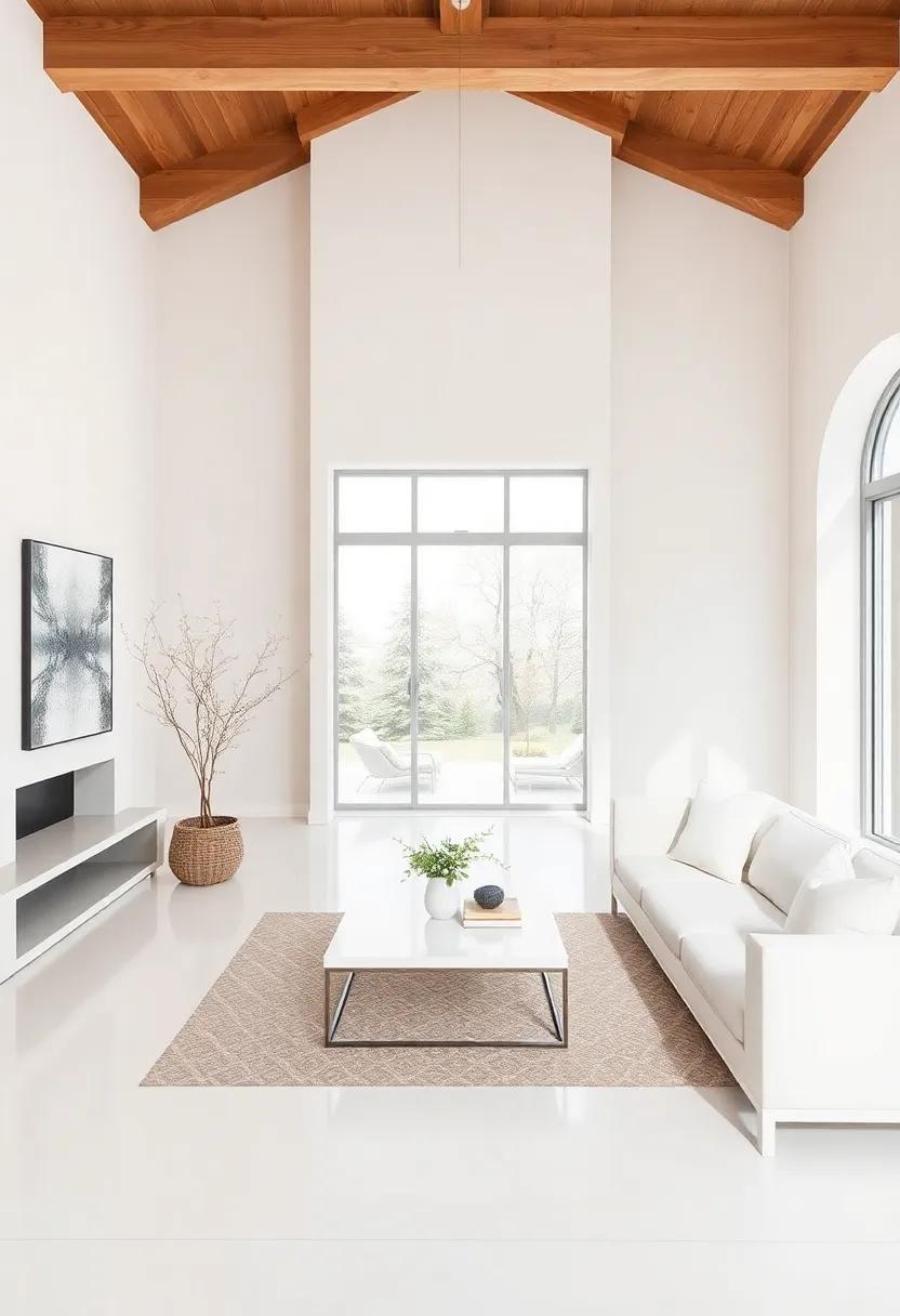
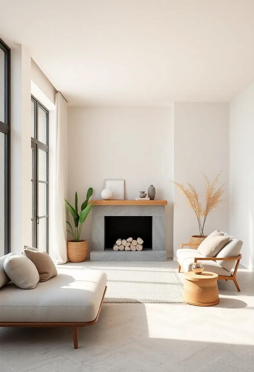
Elevate Your Space: Exploring High-End Neutral Color Schemes for Luxury Homes
In the world of interior design, color is more than just a visual element; it encapsulates mood, influences perception, and sets the tone for every space. as luxury homes continue to redefine comfort and elegance, high-end neutral color schemes have emerged as a quintessential choice for those seeking to cultivate sophistication without overwhelming visual noise. these palettes, often understated yet profoundly impactful, possess the ability to seamlessly blend warmth and tranquility while serving as a canvas for the luxurious details that define exceptional living. In this article, we invite you to explore the nuances of these refined neutral tones, discover how they can elevate your space, and uncover the transformative power they hold in creating a sanctuary that reflects both style and serenity.
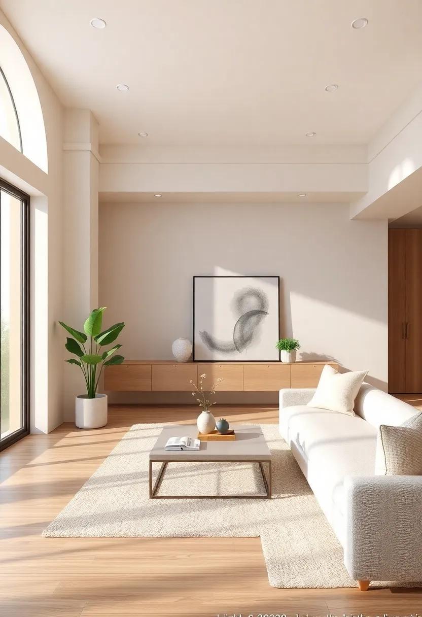
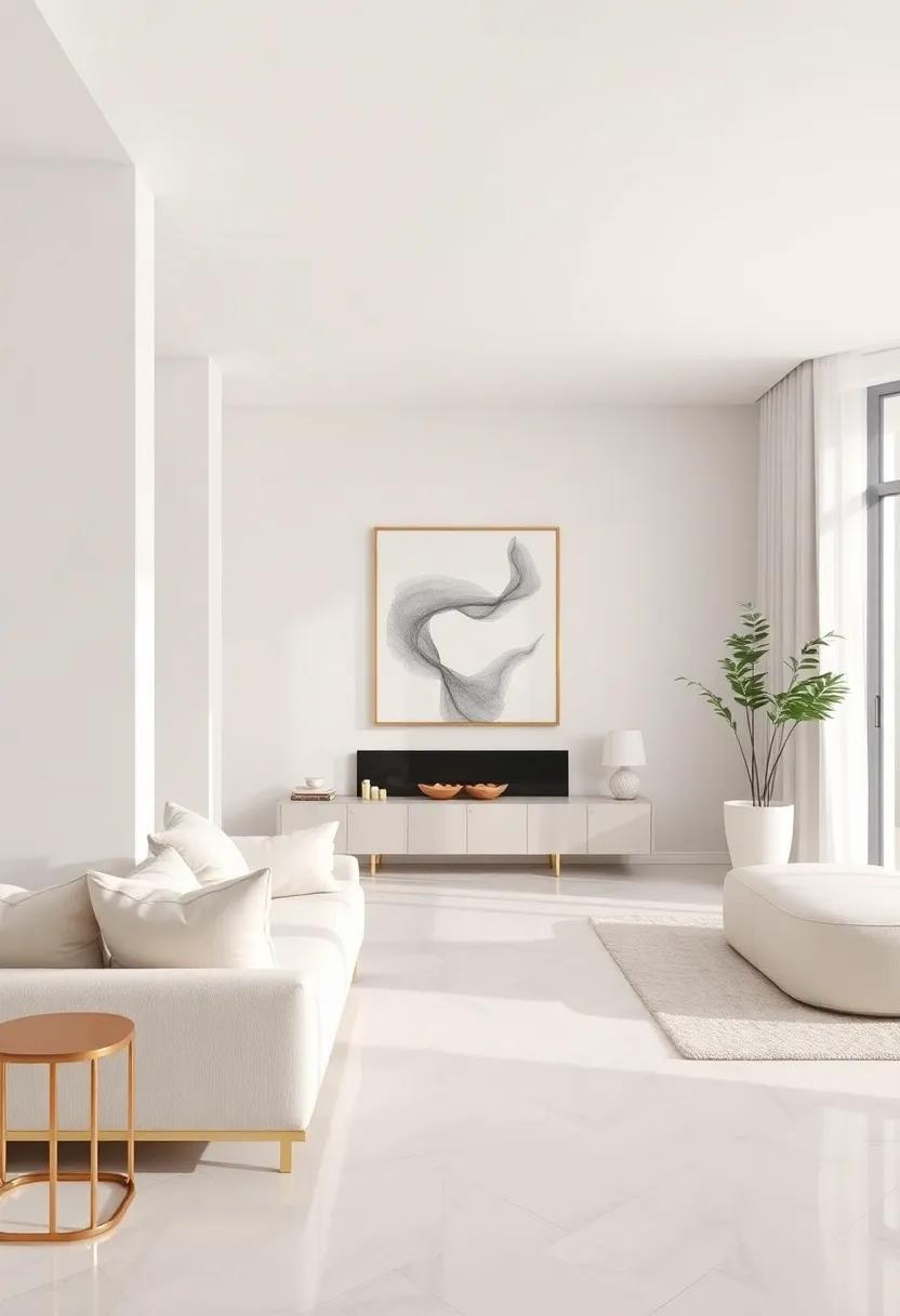
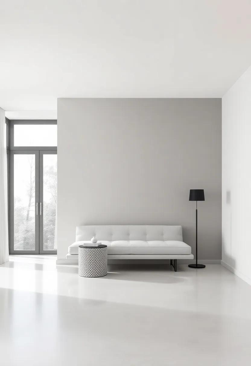
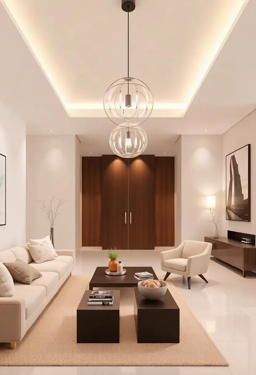
Elevate Your Living Room: Embracing Subtle Beige and Cream for Timeless Elegance
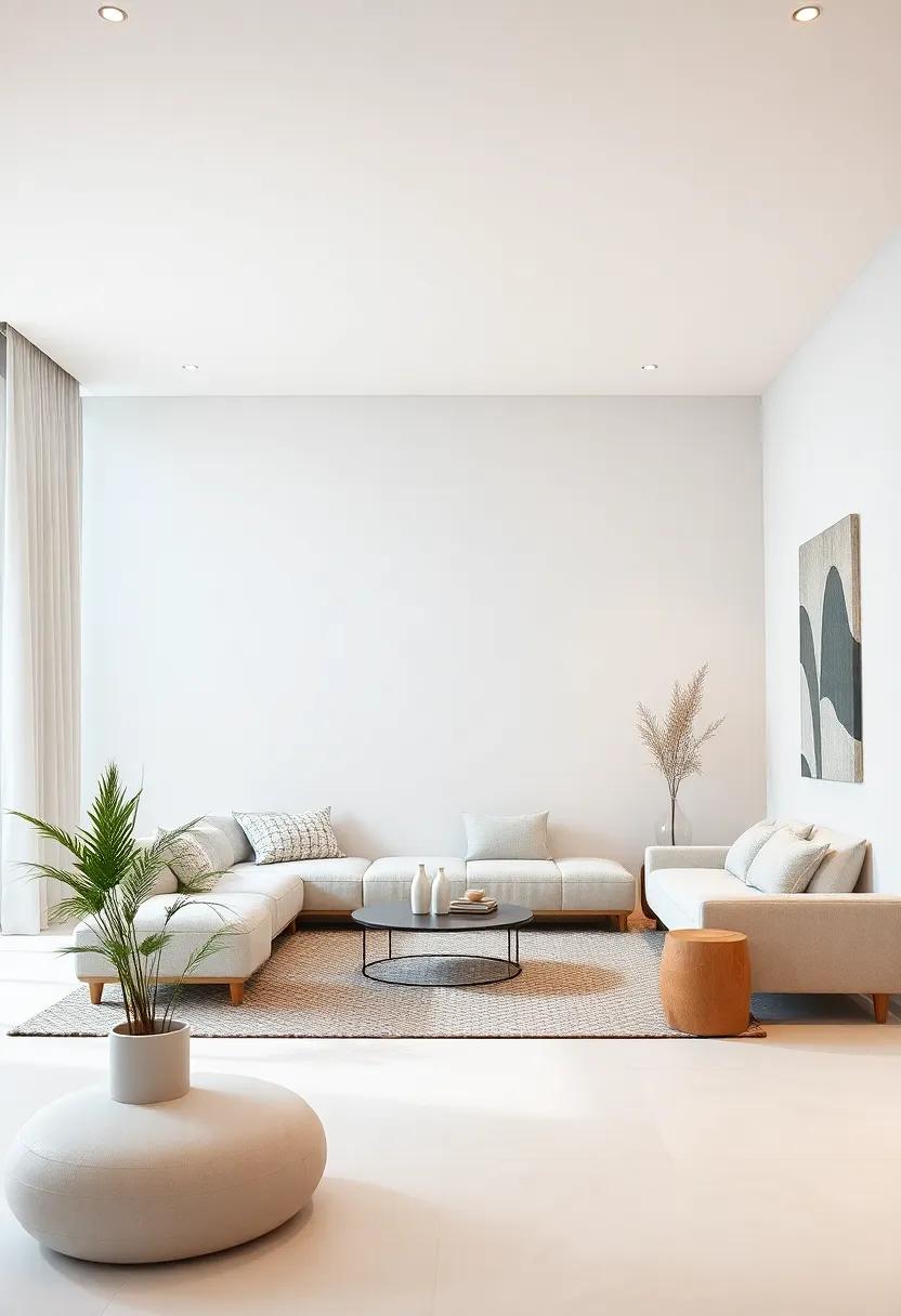
Creating a luxurious atmosphere in your living room can be effortlessly achieved with a palette of subtle beige and cream tones. These colors evoke a sense of calmness and sophistication, allowing for a versatile backdrop to showcase your personal style. Consider incorporating textured fabrics such as velvet, linen, and wool in soft neutrals to enhance the sensory experience. A few clever accessory choices, like gold or brass accents, can add a touch of opulence without overwhelming the space. Aim for a harmonious balance by selecting furniture pieces that possess clean lines, fostering a sense of openness and relaxation.
To accentuate the elegance of your neutral theme, play with layering techniques. Introduce various shades of beige and cream through different elements within the room. Here are some ideas to consider:
- Area rugs in rich beige tones can ground the space.
- Accent pillows in cream with subtle patterns or textures can add depth.
- Wall art featuring soft hues can serve as focal points without detracting from the overall serenity.
Pair these elements with natural light, which enhances the beauty of this color scheme, creating a warm and inviting ambiance. With thoughtful curation, your living room will not only embody timeless elegance but also serve as a true reflection of your personality and taste.
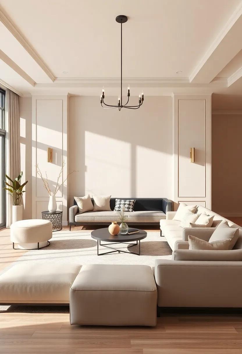
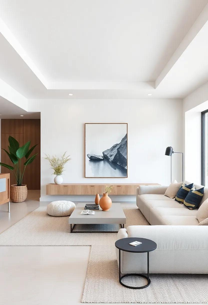
Luxurious Layering: Combining Textures and Patterns in Neutral Color Palettes
Embracing the elegance of neutral color palettes opens a realm of possibilities in luxury decor, especially when we consider the transformative power of textures and patterns. Layering different materials not only adds depth but also exudes sophistication within your living space. Imagine a plush velvet sofa in a warm taupe, paired with a subtly patterned throw blanket, which can create a stunning visual contrast against a sleek, smooth silk cushion. This harmonious blend can be further enriched with elements like intricate wool rugs, ceramics with matte finishes, and polished metal accents that catch the light. The careful selection and combination of these components not only ground the design but also elevate it, allowing each piece to shine.
When orchestrating a collection of textures, its essential to strike a balance that feels intentional and curated. Consider the following key elements:
- Soft Textiles: Incorporate a mix of linen,cashmere,and faux fur for an inviting atmosphere.
- Natural Materials: Introduce wood, stone, or rattan to evoke a sense of organic elegance.
- Geometric Patterns: utilize subtle prints in neutral hues—like soft greys and creamy whites—that add dimension without overwhelming the senses.
- Metallic Accents: Gold, silver, or bronze finishes on fixtures and decor can bring a touch of modern luxury.
By thoughtfully blending these elements, spaces can become a tapestry of understated glamour. To visualize this intricate layering process, consider the table below illustrating some ideal combinations of textures and patterns in neutral shades:
| Material/pattern | Description |
|---|---|
| Velvet | Soft and luxurious, perfect for upholstered furniture. |
| Linen | Lightweight and breathable, ideal for drapery and throws. |
| Wool | Textured and warm, great for rugs that add comfort. |
| Geometric Prints | Subtle designs that offer visual intrigue without overpowering. |
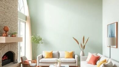
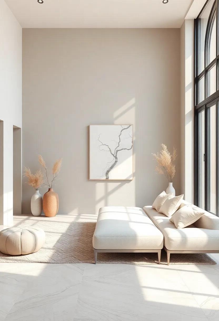
The Serenity of Taupe: Creating Calm Retreats with Earthy Undertones
The soothing shade of taupe has the remarkable ability to ground a space,enveloping it in a warm,inviting aura. When it comes to crafting a calm retreat, taupe acts as a versatile canvas that harmoniously combines with various textures and materials. Its earthy undertones echo nature’s tranquility, ensuring that every room radiates serenity. Incorporating taupe can transform environments into peaceful sanctuaries, perfect for unwinding after a long day. Consider pairing taupe with complementary shades like soft creams or muted greens to enhance the overall ambiance and create visually engaging spaces.
To further amplify the richness of taupe in your home, consider introducing elements that celebrate its depth.Textured fabrics such as velvet or linen can add layers of interest, while metallic accents in brass or soft gold can elevate the elegance of taupe tones. Here are some effective ways to incorporate taupe into your design scheme:
- Painted walls: Choose a soft taupe for an understated backdrop.
- Furniture: Opt for taupe upholstery to add sophistication and comfort.
- Decorative accents: Integrate taupe through cushions, curtains, or artwork.
Gleaming Accents: Incorporating Metallics into High-End Neutral Designs
incorporating metallic accents into neutral spaces can transform a room from ordinary to unusual. The shimmer of gold, silver, or bronze against a soft taupe or creamy white creates a striking contrast that catches the eye. Explore incorporating metallics through thoughtful selection of decor elements such as:
- Light fixtures: Opt for a statement chandelier with metallic finishes to become the focal point.
- Furniture: Choose pieces with metallic legs or accents,such as side tables or chairs.
- Decorative accessories: Use vases, sculptures, or picture frames in various metallic tones to add depth.
For a complex touch, consider layering metallic finishes. Combining different shades can create a unique interplay that enhances the visual dynamics of the space. A well-curated selection of textures ensures the room feels both inviting and elegant. To help illustrate various combinations, the table below highlights some popular metallics alongside their ideal complementary neutral palettes:
| Metallic Finish | complementary Neutrals |
|---|---|
| gold | Warm Beige, Soft Taupe |
| Silver | Cool Grey, Crisp White |
| Bronze | Earthy Brown, Sand |
Sophisticated Shades: Blending Charcoal and Soft gray for Modern interiors
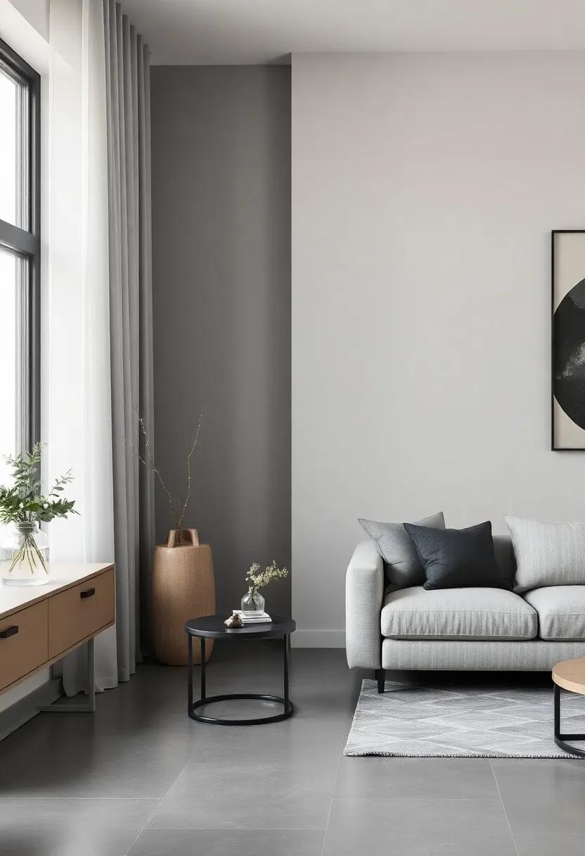
In the realm of contemporary interior design, a harmonious blend of deep charcoal and soft gray creates a sophisticated backdrop that elevates any luxury home. This combination not only establishes a sleek and modern aesthetic but also adds depth and dimension to the space. Charcoal, with its bold presence, evokes a sense of strength and grounding, while soft gray introduces an airy lightness, making the scheme versatile across various styles. Pairing these shades can enhance architectural features, complement high-end furnishings, and create a tranquil atmosphere where relaxation meets elegance.
To effectively implement this color pairing, consider using charcoal for accent walls or furniture pieces that anchor the room, while allowing soft gray to dominate larger areas like walls and drapes. The balance between dark and light fosters a sense of fluidity, encouraging a seamless flow throughout the home. Additional elements, such as metallic accents or textured fabrics, can further enrich this palette, providing visual interest. Key components to keep in mind include:
- Lighting: Ensure ample natural light to prevent darker shades from overwhelming the space.
- Textures: Incorporate varied textures, such as plush throws or sleek modern finishes, to create contrast.
- Artwork: Utilize art pieces that feature complementary or contrasting tones to tie the look together.
The Allure of White: Designing Bright Spaces with Warm Undertones
When it comes to creating luminous and inviting interiors, the use of white hues is unmatched. However, to avoid a stark atmosphere, it’s essential to incorporate warm undertones that bring depth and personality to the design. These undertones can be found in shades such as creamy beige or soft taupe,seamlessly integrating with various styles,from modern minimalism to rustic elegance. The key is to layer whites and warm tones thoughtfully to enhance the space’s warmth while preserving a refreshing clarity.Here are some strategies to achieve this:
- Incorporate Textures: Use textured materials like rattan, linen, or knitted fabrics to soften the starkness of white.
- Choose the Right Fixtures: Opt for lighting with warm bulbs or brass finishes to cast a cozy glow.
- Accent with Color: Delicate pastel accents can complement warm whites, adding subtle charm without overpowering the scheme.
To further enhance the elegance of your space, consider mixing different shades of white on various surfaces. This approach creates visual interest while maintaining a sense of cohesion. Below is a comparison of popular white shades that feature warm undertones:
| Shade | Undertone | Best Used In |
|---|---|---|
| Warm White | Beige | Living Rooms |
| creamy White | Soft Yellow | Bedrooms |
| Almond White | Light Brown | Kitchens |
This curated palette demonstrates how the interplay of whites and their warm undertones creates an inviting environment. By embracing the subtleties of these shades, you can craft a space that is not only sophisticated but also remarkably warm and welcoming, elevating the overall aesthetic of your home.
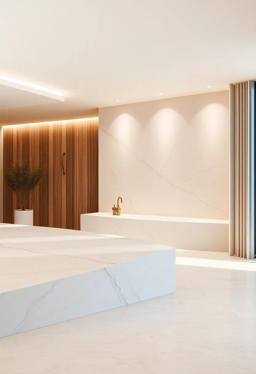
Natural inspirations: Using Stone and Wood to Enhance Neutral Color Schemes
Emphasizing texture within your neutral color palette can create a warm and inviting atmosphere while maintaining a sophisticated simplicity. The introduction of natural stone—such as marble, granite, or slate—can serve as an impressive anchor point in any room. Using these materials in surfaces like countertops, backsplashes, or even flooring adds depth and character. Wood elements, whether through beams, cabinetry, or furniture, introduce a rustic charm and a sense of organic warmth that complements a muted color scheme beautifully. The interplay between the cool tones of stone and the rich hues of wood cultivates a space that feels both grounded and luxurious.
Incorporating these materials allows for a seamless transition between indoor and outdoor environments. accent pieces made from stone, such as sculptures or coasters, can subtly highlight your color scheme while providing functional additions to your decor. Simultaneously occurring, utilizing reclaimed or sustainably sourced wood not only adds to the aesthetic appeal but also enriches the narrative of your space. Here are some specific elements to consider when blending these materials into neutral settings:
- Stone countertops: Create striking focal points in kitchens and bathrooms.
- Wooden accents: Use furniture or decor items to juxtapose the sleekness of stone.
- Mixed-composition walls: Combine wood paneling with stone feature walls for a dramatic effect.
Elegant Monochrome: Exploring the Beauty of Shades Within a single Color
Embracing a monochrome palette transforms a space into a calming sanctuary, revealing the subtle elegance that can be achieved through variations in a single color. Shades of gray, from charcoal to delicate dove, can create depth and dimension, while still maintaining a cohesive aesthetic. this approach allows for the layering of textures—think smooth silks alongside coarse wools—that harmonizes beautifully. The key is to play with the contrast of light and dark, which not only adds richness but also creates visual interest without overwhelming the senses.
Incorporating a range of other neutral hues like soft creams and muted taupes can further enhance the effectiveness of a monochrome scheme. Creating a balanced environment using natural materials such as wood, stone, and metal will amplify the beauty of these shades. Here are some ideas for accentuating your monochrome design:
- Layered Textiles: Introduce cushions, throws, and curtains in varying textures.
- Artistic Touches: Utilize artwork and sculptures that follow the same color theme.
- Subtle Accessories: Choose vases and decor items that incorporate the selected monochrome shades.
| Color Shade | Effect |
|---|---|
| Charcoal | Creates a dramatic focal point |
| Soft Gray | Promotes a serene atmosphere |
| Warm Beige | Adds a cozy, inviting feel |
| Ivory | Enhances light and openness |
Dramatic Contrast: Pairing Light Neutrals with Dark Accents for Stunning Effects
In the world of interior design, few combinations are as visually captivating as light neutrals paired with dark accents. The gentle warmth of soft creams or pale grays creates a soothing backdrop, enhancing the sense of space and light. When complemented by bold dark elements—such as charcoal gray furniture, deep navy accents, or even sophisticated black trim—the result is a striking interplay that adds depth and drama. This contrast does more than catch the eye; it establishes a powerful dialog between the two shades, allowing each to enhance the other’s beauty.
To achieve a harmonious balance, consider the following elements in your design:
- Furniture: Opt for light neutral sofas or chairs, accented with dark throw pillows or a striking coffee table.
- Wall Color: Paint the walls a soft beige or ivory while incorporating dark wood moldings or frames.
- Accessories: Use dark metal light fixtures or art pieces that draw from the moodiness of deep tones.
this approach not only elevates the aesthetic but also creates distinct zones within spaces, guiding the eye and enhancing functionality. A well-curated mix of textures and materials, such as sleek leather paired with soft textiles, can transform a simple room into a luxurious sanctuary, perfectly balancing warmth and sophistication.
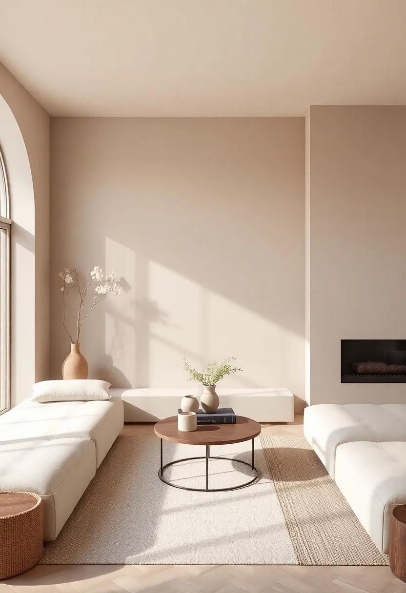
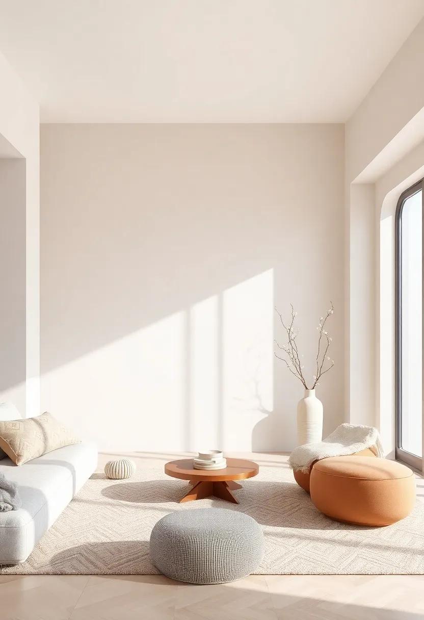
Warmth in White Spaces: Adding Comfort and Coziness to Minimalist Designs
In the realm of minimalism,white spaces frequently enough evoke a sense of tranquility,yet they can sometimes feel stark or uninviting. To achieve a harmonious balance, infusing layers of warmth through texture and subtle accents is essential. Consider incorporating natural materials such as soft wool or organic cotton throws, which invite touch and add depth to your aesthetic. By integrating elements that engage the senses, you can transform these open areas into delightful enclaves of relaxation. Create contrast with earthy hues and soft neutrals to bring visual intrigue while maintaining that serene, minimalist vibe.
To enhance the cozy ambiance without cluttering the space, focus on strategically placed accessories and decor.Implementing a carefully curated selection of items can make all the difference—think of:
- Plush cushions in various shades of beige or taupe.
- Warm light sources such as sconces with dimmers and cozy table lamps.
- Natural elements like indoor plants that breathe life into your layout.
This blending of the simple and the luxurious transforms minimalist designs into inviting environments that resonate with warmth while still celebrating the beauty of simplicity.
nature’s Palette: Drawing Influence from the Outdoors to shape Your space
Drawing inspiration from the rich hues found in nature can lead to an elegant and harmonious aesthetic in luxury home design. The subtle variations of the earth, from sandy beiges to soft greys reminiscent of misty mountains, provide a timeless foundation around which to build your decor. Consider incorporating materials such as natural stone, wood, and linen to further evoke the tranquility of the outdoors, allowing your space to breathe with a sense of serenity. The use of layered textures enhances this palette, creating a warm and inviting atmosphere that feels both plush and refined.
To create a truly cohesive environment, aim to integrate accents that echo these natural elements. A well-chosen color palette can provide depth and sophistication while maintaining an airy feel. Here are a few complementary hues and textures to enhance your neutral spaces:
- Warm Whites: Bright, clean whites that mimic sunlight.
- Soft Taupes: Earthy tones that ground the design.
- Dusty Greens: Subtle, muted greens for an organic touch.
- Cool Blues: Light blues that reflect the sky, adding freshness.
Incorporating these shades in thoughtfully curated furniture pieces or artwork can also reflect natural landscapes and shift the ambiance of the room. Using a variety of finishes—matte, glossy, textured—will create visual interest while keeping the overall scheme sophisticated and refined. Below is a simple table showcasing popular neutral tones alongside their natural inspirations:
| Color | Natural Inspiration |
|---|---|
| Alabaster | White Sand |
| Sage | Leafy Foliage |
| Soft Stone | River Pebbles |
| Pebble Grey | Mountain Terrain |
Textures that Talk: Selecting Fabrics that Complement Neutral Color Schemes
Choosing the right fabrics is essential when striving to create an atmosphere of elegance and sophistication in a luxurious space dominated by neutral tones. Think beyond color and consider how different materials can inject personality and warmth into your interiors. Textured fabrics like linen and velvet can offer tactile contrasts, while woven materials can lend an organic feel that enhances the understated beauty of neutral palettes. Layering different textures not only adds depth but also makes the overall design feel more cohesive and inviting.
When curating your fabric selections, consider incorporating items such as:
- Silks: Indulge in the sheen and luxurious drape that silk brings to window treatments.
- Suede: This fabric adds a unique touch with its soft, plush surface.
- Knitted textiles: Perfect for throws or accent pillows to introduce a sense of comfort.
- lace: Use delicately embroidered lace to add an element of sophistication to table settings.
To illustrate the impact of texture, consider this simple breakdown of popular fabric combinations:
| Fabric | Description | Best Paired With |
|---|---|---|
| Velvet | Soft, rich texture that adds opulence | Silk, Linen |
| Linen | Lightweight and breathable, ideal for layers | Cotton, Canvas |
| Leather | Durable, luxurious, and versatile | Wool, Tweed |
| Cotton | Soft and versatile, great for everyday use | Lace, Knits |
The Power of Contrast: Utilizing Bold Black Clashing with Soft Neutrals
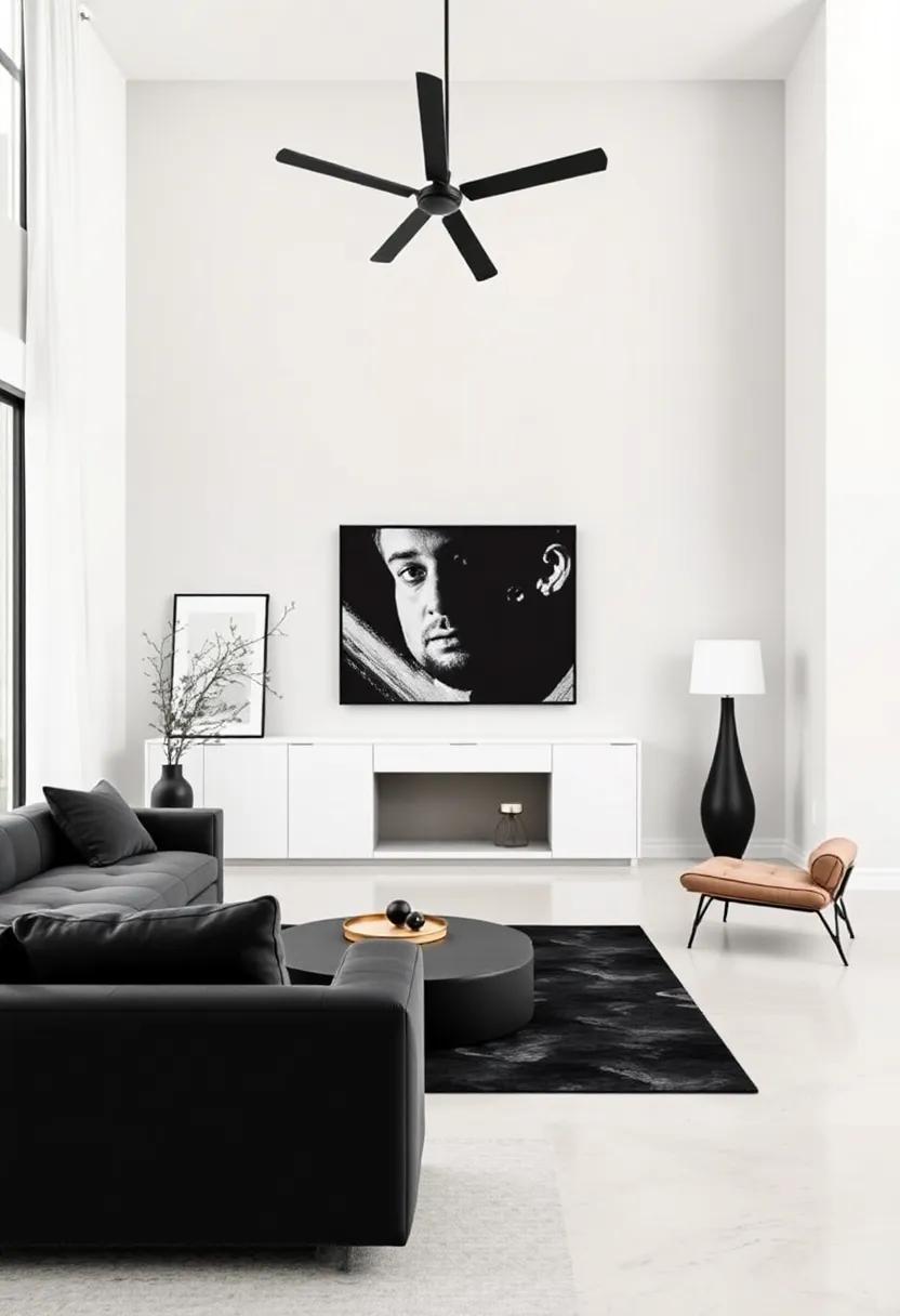
In the realm of luxury design,the interplay between bold black and soft neutrals creates a striking visual harmony that can transform any space. By introducing deep, rich hues of black, you can anchor a room, adding depth and drama, while the accompanying neutral shades—think creams, taupes, and soft grays—provide a soothing backdrop. This combination not only highlights architectural elements but also brings an element of sophistication. Consider the following elements to enhance this captivating color palette:
- Furnishings: Choose black leather sofas paired with light linen cushions.
- Wall Treatments: opt for matte black accent walls alongside soft white or beige surrounding it.
- Artwork: Include striking black-framed artworks over neutral backgrounds to create focal points.
A well-planned layout can further emphasize the beauty of this contrast. by distributing black accents throughout the space—in furniture, light fixtures, or decorative pieces—you create a sense of cohesiveness. Use soft neutrals for larger surfaces, such as rugs and curtains, to reflect light and maintain an open feel. Consider the following table for inspiration on furniture selections that harmonize with this aesthetic:
| Item | Color | Material |
|---|---|---|
| Sofa | black | Leather |
| Cushions | Soft Beige | Linen |
| Rug | Cream | Wool |
By thoughtfully balancing these elements, you not only achieve a lovely space but also craft an atmosphere that exudes luxury and comfort, captivating anyone who enters.
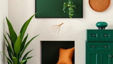
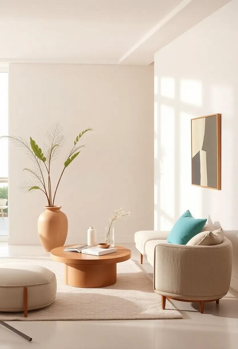
Lush Neutrals: Introducing Greenery to Enhance Subtle Color Combinations
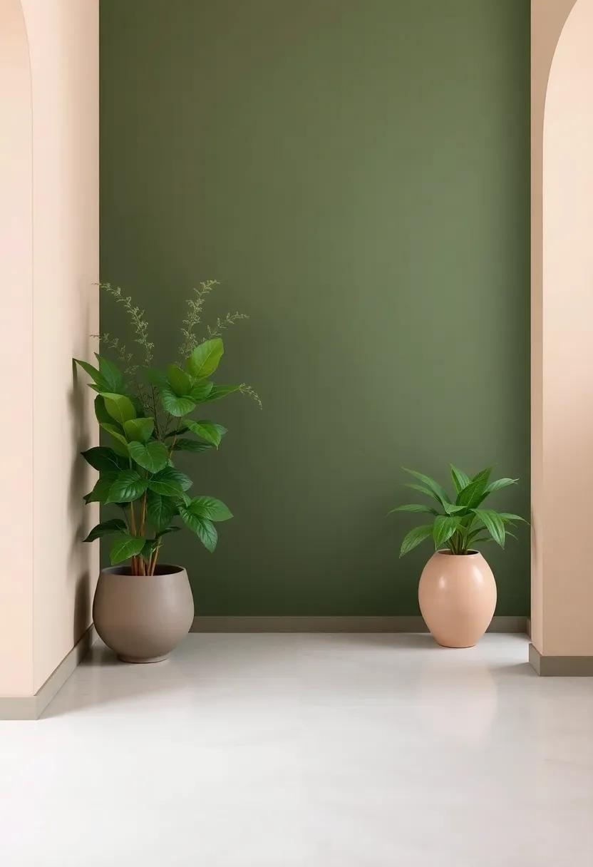
Incorporating greenery into a neutral color palette can create a refreshing contrast that breathes life into your living space.The lush hues of indoor plants, when paired with a sophisticated range of beige, taupe, or gray, create a serene and harmonious environment. Consider the following elements when blending these shades:
- Plants: Select a variety of textures and sizes, from tall floor plants to delicate succulents.
- Furniture: Choose pieces in soft, muted tones that complement your chosen greenery, such as light wood or plush upholstered items.
- Accessories: Use vases, cushions, and art that echo the natural colors found in your plants to tie the look together.
Creating a cohesive look goes beyond mere aesthetics; it’s about fostering an atmosphere of peace and tranquility. Consider using a simple color table to visualize your choices,keeping in mind the balance between neutrals and the vivacity of green:
| Neutral Color | Complementary Greenery |
|---|---|
| Soft Beige | Fiddle leaf Fig |
| Warm Taupe | Pothos Vine |
| Cool Gray | Snake Plant |
| Off-White | Peace Lily |
This thoughtful integration of natural elements not only enhances visual appeal but also promotes wellness,creating an inviting sanctuary within your home. With careful selection and arrangement, greenery can elevate even the simplest of neutral color schemes into a luxurious retreat.
Elevating Spaces with color Psychology: The Emotional Impact of Neutrals
When designing luxury homes, the choice of color can significantly influence the mood and perception of a space. Neutrals, with their timeless appeal, create an elegant backdrop that promotes a sense of calm and sophistication. By incorporating shades like soft greys, warm beiges, and cool whites, homeowners can achieve a refined aesthetic that remains versatile across any style. These hues facilitate collaboration with various textures and materials, allowing for a rich visual experience that can evoke feelings of simplicity and relaxation.
Utilizing neutrals strategically can enhance different aspects of a room, creating dynamics that encourage emotional well-being. for instance, a living room dressed in earthy taupes paired with crisp whites can foster connection and comfort, while a bedroom enveloped in gentle greys and creamy off-whites may promote restful sleep. Below is a simple reference table illustrating the emotional impacts associated with select neutral shades:
| Color | Emotional Impact |
|---|---|
| soft Grey | Calming and sophisticated |
| Warm Beige | Cozy and inviting |
| Cool White | Fresh and expansive |
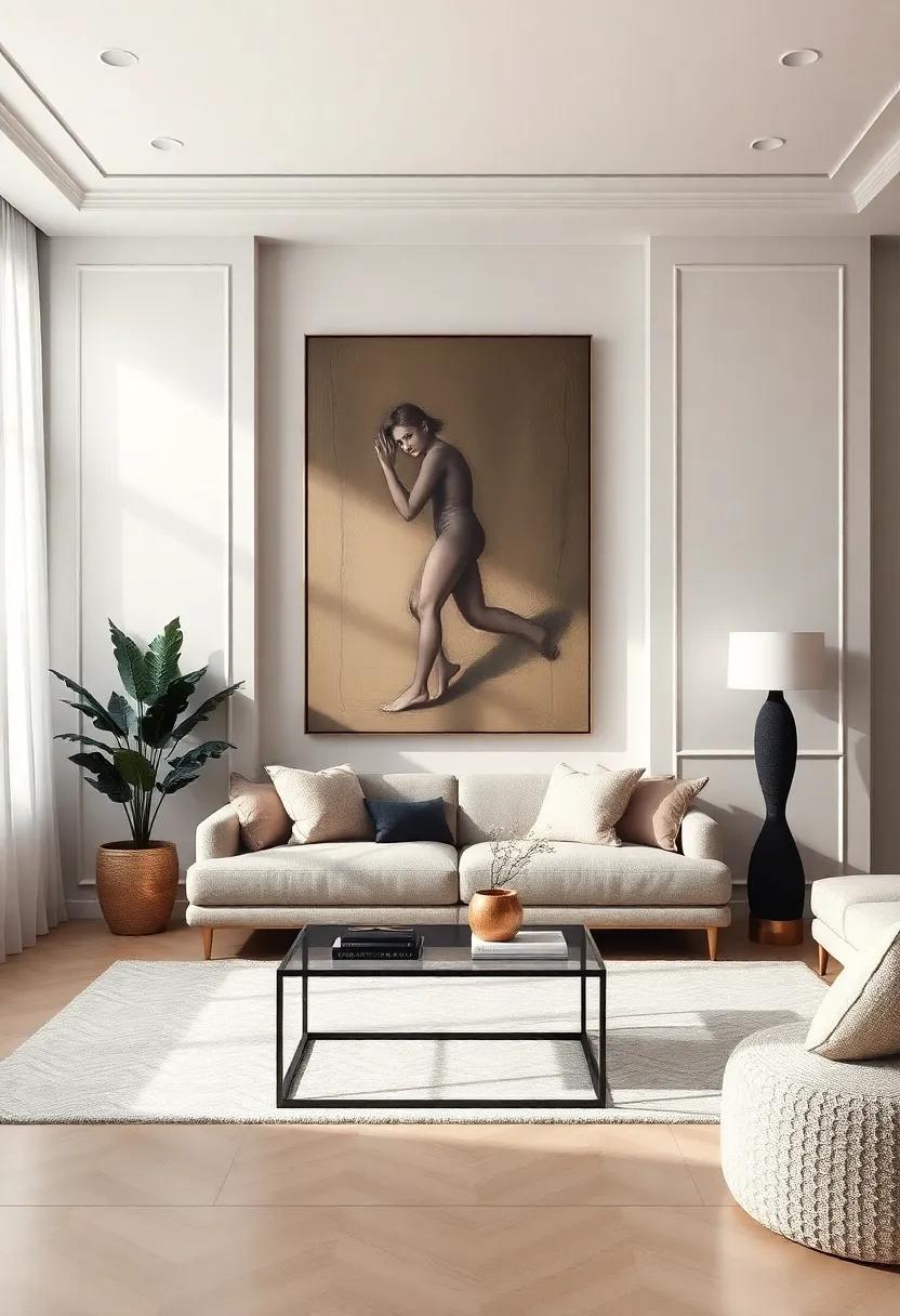
Artistic Accents: Using Statement Art Pieces to brighten Neutral Environments
In a world where neutral palettes dominate luxury interiors, statement art pieces emerge as the quintessential charm.These striking artworks serve not only as focal points but also as conversation starters, injecting personality into otherwise subdued spaces. Consider incorporating pieces that offer a sense of rhythm and movement with bold brushstrokes or vivid colors that contrast beautifully against soft beige, ivory, or taupe backgrounds.Here are some ideas to enhance your space with the right artistic accents:
- Oversized Canvas: A large-scale painting can anchor a room, making it feel cohesive and thoughtfully curated.
- Sculptural Art: Opt for three-dimensional pieces that bring depth and intrigue, enticing viewers to engage from different angles.
- Mixed Media Creations: Blend textures such as metal, wood, and fabric for a multi-sensory experience that invites touch and exploration.
To complement your selected art pieces, consider the layout and arrangement within your space. The placement can dramatically affect perceived size and flow. A well-placed artwork can draw the eye towards key architectural features or inviting vistas, seamlessly integrating the art with the overall design. Review the following elements to maximize the impact of your statement pieces:
| Art Element | Consideration |
|---|---|
| Color | Select colors that resonate with your neutral tones for a harmonious balance. |
| Scale | Choose sizes that fill your wall space without overpowering. |
| Context | Pair art with furniture and lighting to enhance the overall ambiance. |
Crafting Focused Zones: Designing Functional Areas with Neutral Coordinates
Creating distinct zones within a luxury home not only enhances functionality but also elevates the overall aesthetic appeal. Using a neutral color palette as the foundation allows for versatile design elements while maintaining an airy, cohesive flow throughout the spatial layout. Textures and materials play a pivotal role, as they can transform these functional areas. Consider integrating the following strategies to craft focused environments:
- Layered textures: Introduce various textures through rugs, textiles, and upholstery.
- Strategic Lighting: Utilize soft, ambient lighting to create warmth in neutral settings.
- Spatial Definition: Employ furniture arrangements to delineate areas without physical barriers.
Incorporating elements that resonate with the essence of your chosen neutral theme can enhance comfort and functionality.A minimalist approach to decoration will help in maintaining an uncluttered feel while accentuating the intended elegance. consider designing areas dedicated to specific activities—like a reading nook or a home office—using a consistent color palette. Below is a simple portrayal of potential focused zones and their respective color schemes:
| Zone | color Scheme |
|---|---|
| Living Room | Warm beige & Soft Greys |
| Home Office | Cool Taupe & Crisp Whites |
| Dining Area | Light Ivory & Sage Green |
Statement Lighting: Choosing Fixtures that illuminate Neutral Spaces Beautifully
When it comes to elevating neutral spaces, statement lighting serves as a transformative element that not only illuminates but also enhances the overall aesthetic. Consider fixtures that incorporate a mix of materials, such as brass, glass, and wood, to draw attention without overpowering the subtleness of a neutral palette. The right lighting can serve as a focal point, guiding the eye and creating a striking contrast against organic hues. Here are some options to consider:
- Sculptural Chandeliers: These can redefine a room’s character while offering ambient light.
- Elegant Floor Lamps: Perfect for cozy nooks, they add height and personality.
- Statement Wall Sconces: Ideal for hallways or beside artwork,providing both task lighting and decorative flair.
Combining lighting styles can also create an inviting atmosphere, especially in spaces designed primarily in beige, taupe, or soft whites.Utilizing a mix of functional and decorative fixtures can enable each area to speaking a distinct story.Consider using a combination of pendant lights, layered with dimmable options, to introduce warmth and depth. Below is a simple guide to choosing the right fixtures:
| Lighting Type | Best For | Key Features |
|---|---|---|
| Pendants | Over dining areas | Adjustable height, varied styles |
| Wall Sconces | Along hallways | Space-saving, directional light |
| Floor Lamps | Reading corners | Mobility, warm light options |
Sublime surfaces: Selecting High-End Materials to Complement Neutral Designs
In the realm of high-end interior design, the selection of materials plays a pivotal role in enhancing the overall aesthetic while maintaining a neutral palette. Textures, patterns, and finishes can transform a subtle backdrop into a luxurious experience. Consider incorporating the following high-end materials to achieve a harmonious balance:
- Marble: Ideal for countertops and accent walls, this natural stone adds both elegance and sophistication.
- Leather: use leather upholstery or accents to provide warmth and richness against neutral tones.
- Brushed Metal: Incorporate brushed bronze or brass fixtures for a modern touch that contrasts beautifully with softer colors.
- Textiles: Opt for linen or silk drapes and cushioning to introduce softness and depth.
Utilizing a carefully curated assortment of materials not only elevates the visual appeal but also adds a tactile dimension to the space. A focus on sustainable materials can further enhance the luxury aspect while promoting eco-friendliness. As an example,pairing reclaimed wood with polished concrete can create a stunning juxtaposition. Below is a brief comparison of distinctive materials that resonate well within neutral environments:
| Material | Characteristics | Best Use |
|---|---|---|
| Quartz | Durable, low-maintenance | Countertops |
| Ceramic Tile | versatile, moisture-resistant | Floors and backsplashes |
| Bamboo | Eco-pleasant, sustainable | Flooring or accents |
| Glass | Reflective, lightweight | Decorative elements |
Transformative accessories: Curating Décor to refine and Elevate Your Space
In the realm of high-end design,accessories serve as the punctuation marks that complete the narrative of your living space. Curating a selection of thoughtfully chosen décor elements can dramatically transform an environment, ensuring it resonates with elegance and style. Consider items that bridge functionality with artistry. For instance:
- Statement Lighting: A sculptural pendant light can not only illuminate but become a focal point in the room.
- Textural Fabrics: Layering various textures through cushions and throws adds depth without overshadowing the neutral palette.
- Artisanal Wall Art: Unique, handcrafted pieces can serve as conversation starters and enhance the character of your walls.
When selecting accessories, it’s essential to maintain a cohesive aesthetic that harmonizes with your neutral color scheme.Opt for pieces that incorporate tones of cream, taupe, gray, and soft browns, allowing for a sophisticated yet inviting ambiance. To help with your selection process, consider the following attributes in your accessories:
| Attribute | Description |
|---|---|
| Versatility | Choose items that can adapt across different rooms or occasions. |
| Longevity | Invest in timeless pieces that won’t go out of style. |
| Personal Connection | Select items that reflect your unique story or interests. |
In Retrospect
As we draw the curtains on this exploration of high-end neutral color schemes, it becomes clear that these elegant hues wield a transformative power in luxury homes.From the soft whispers of taupe to the grounding depth of charcoal, neutrals provide a sophisticated backdrop that not only enhances architectural features but also reflects the unique personalities of the inhabitants within.Embracing a neutral palette is more than a mere design choice; it is indeed an invitation to curate an atmosphere of tranquility and refinement. As you set out to elevate your space,remember that the beauty of neutral colors lies in their versatility—each shade serves as a canvas,allowing your furnishings and decor to shine while creating a cohesive and inviting ambiance.
So, whether you’re embarking on a complete redesign or simply updating a room, consider the understated elegance of neutrals. They have the remarkable ability to breathe life into a space, making it timeless and luxurious. With thoughtful selection and attention to detail, your home can truly become a sanctuary of sophistication, embodying the essence of modern living. Now, go forth and elevate your space with the artful embrace of neutral tones!
As an Amazon Associate I earn from qualifying purchases.