Embrace Serenity: Choosing the Perfect Cottage Kitchen Colors for Cozy Charm
In a world that often feels hurried and chaotic, the charm of a cozy cottage kitchen beckons like a warm embrace. Its a sanctuary where the aroma of freshly baked bread mingles with the gentle hum of conversation, creating an atmosphere of comfort and tranquility. One of the key elements in achieving this serene ambiance lies in the choice of colors. just as each brushstroke can transform a canvas, the right palette can breathe life into your kitchen, evoking feelings of warmth, nostalgia, and peacefulness. In this article, we invite you to explore the art of selecting the perfect colors for your cottage kitchen—a journey that celebrates the harmony between hue and homeliness. Whether you’re drawn to soft pastels, earthy tones, or vibrant accents, discover how to curate a palette that not only complements your space but also envelops it in a delightful sense of cozy charm.
Embracing Nature: Palette Inspirations from Scenic Landscapes for Your Cottage Kitchen
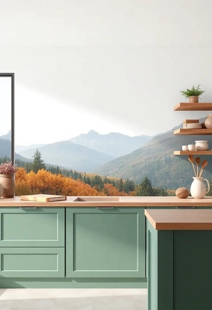
When designing a cottage kitchen that reflects the tranquility of nature, look no further than the breathtaking hues found in serene landscapes. imagine the soft greens of rolling hills, the warm beiges of sandy shores, or the cool blues of a tranquil lake. These tones can transform your kitchen into a sanctuary of calm, inviting you to cook and gather with loved ones. Consider incorporating a palette inspired by these natural elements, where shades of sage greens and dove grays serve as the perfect backdrop, complemented by rich wooden accents that evoke the nostalgia of rustic charm.
To create visual harmony,use a combination of colors that mimic the textures and variations found in nature. For instance, pairing seafoam green with light cream creates a refreshing atmosphere reminiscent of a coastal retreat. You might even opt for a soft lavender echoing the colors of a sunset over lavender fields, making your kitchen not just a place for meals, but a serene escape. Here are some suggested palettes to consider:
- Forest Nook: deep Greens, Earthy Browns, Crisp Whites
- Coastal Calm: Soft Blues, Sandy Beiges, Creamy Whites
- Sunset Glow: Warm Oranges, Gentle Pinks, Faded Lilacs
- Meadow Breeze: Light Yellows, Fresh Greens, Bright Blushes
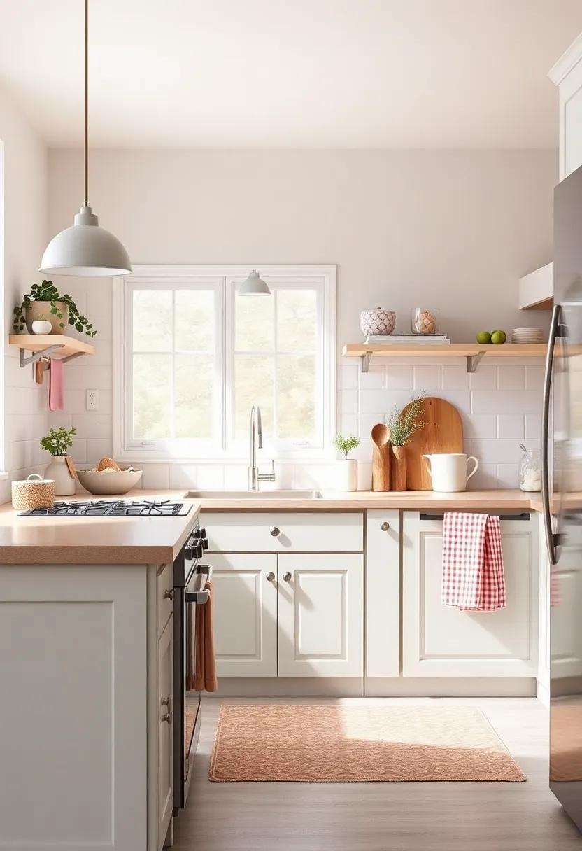
The Allure of Soft Neutrals: Creating a Calm and Inviting Atmosphere in Your Kitchen
soft neutrals have an enchanting ability to transform a kitchen into a serene retreat.Whether you’re inspired by the charm of a country cottage or the sleekness of modern minimalism, hues like cream, soft gray, and gentle taupe serve as a perfect backdrop for culinary creativity. These colors create a sense of peace and warmth, inviting you to linger longer over family meals and casual gatherings. Layering these tones allows for subtle depth—pairing a creamy cabinetry with a sandy countertop can evoke a sun-drenched coastline while accenting with vintage brass fixtures adds a touch of nostalgia to your space.
To further enhance the inviting feel of your kitchen, consider integrating natural textures and accents that resonate with the soothing palette. Incorporate elements such as:
- Woven textiles like linen or cotton in soft hues
- Wood accents that complement the soft color scheme
- Plants to add a vibrant touch of life against a neutral background
Additionally, implementing open shelving painted in a muted tone can create an airiness, while displaying carefully curated rustic dishware adds character and charm, further enriching the calming atmosphere of your kitchen.
Charming Pastels: Adding a Sweet Touch to Cottage Kitchens with Light Colors
One of the most enchanting aspects of a cottage kitchen is its ability to evoke a sense of peace and nostalgia through the use of soft,light hues.Embracing charming pastels—like mint green,pale lavender,and gentle peach—can transform a mundane space into a delightful retreat. These colors not only brighten the atmosphere but also complement natural elements often found in cottage designs, such as wood beams and vintage cabinetry. When selecting your color palette, consider pairing these pastels with white accents or natural wood finishes to create a cohesive look that radiates warmth and tranquility.
Incorporating pastel shades can also provide various decorative possibilities, allowing enthusiasts to express their personality while maintaining that cozy vibe. For instance, using pastel-colored kitchenware or accent pieces, such as dish towels and ceramic jars, can create beautiful focal points. Additionally,consider the following options to enhance your pastel theme:
- Painted Cabinets: Opt for soft colors on lower cabinets while keeping upper cabinets white.
- Backsplashes: Choose tiles in light shades to tie the pastel colors together.
- Wall Art: Decorate with vintage posters or botanical prints in complementary colors.
Ultimately, achieving the perfect balance of charming pastels in your cottage kitchen invites a sense of serenity, making the space inviting and cheerful. by gracefully blending these subtle shades with your existing decor, you can create a sweet oasis that beckons both family and friends to gather, enjoy, and create lasting memories.
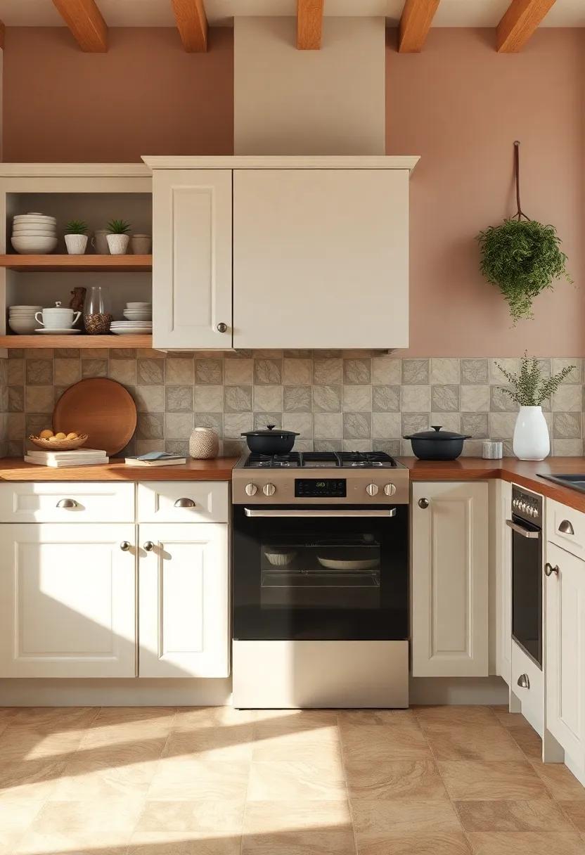
Warm Earth Tones: Infusing Comfort and coziness into Cottage Kitchen designs
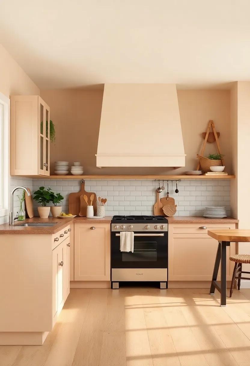
When envisioning a cottage kitchen, the use of warm earth tones can transform the space into a sanctuary of comfort. These colors, reminiscent of nature, elicit feelings of coziness and tranquility, making them perfect for a kitchen that serves as the heart of the home. Think shades of soft beige, muted olive green, and warm terracotta, which can create an inviting atmosphere. By incorporating natural materials alongside these tones, such as wooden countertops and rustic ceramic tiles, one can enhance the connection to the outdoors while still maintaining an air of sophistication.
To effectively balance the rich,warm hues,consider adding accents that complement the primary palette. Elements such as handwoven baskets, vintage dishware, and earthy textiles can enhance the overall design while introducing texture and depth. Here is a simple guide to the best color combinations and accent features:
| Base Color | Accent Features |
|---|---|
| Soft Beige | Woven Baskets, Creamy White Pottery |
| Muted Olive Green | Terracotta Vases, Natural Jute Runners |
| Warm Terracotta | brass Fixtures, Wooden utensils |
Combining these colors and accessories not only ensures a coherent look but also fosters a sense of functional elegance, perfect for gathering with family and friends. Embracing the warmth of earth tones creates a timeless kitchen that embodies comfort, inviting you to spend more time cooking, sharing meals, and building memories.
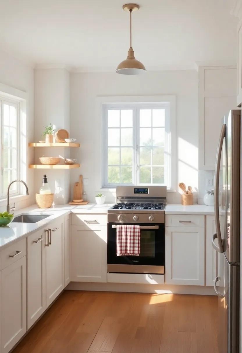
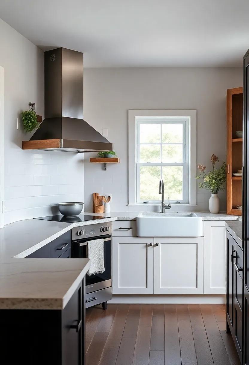
Classic White: The Timeless Elegance of Light Shades in a Cottage kitchen
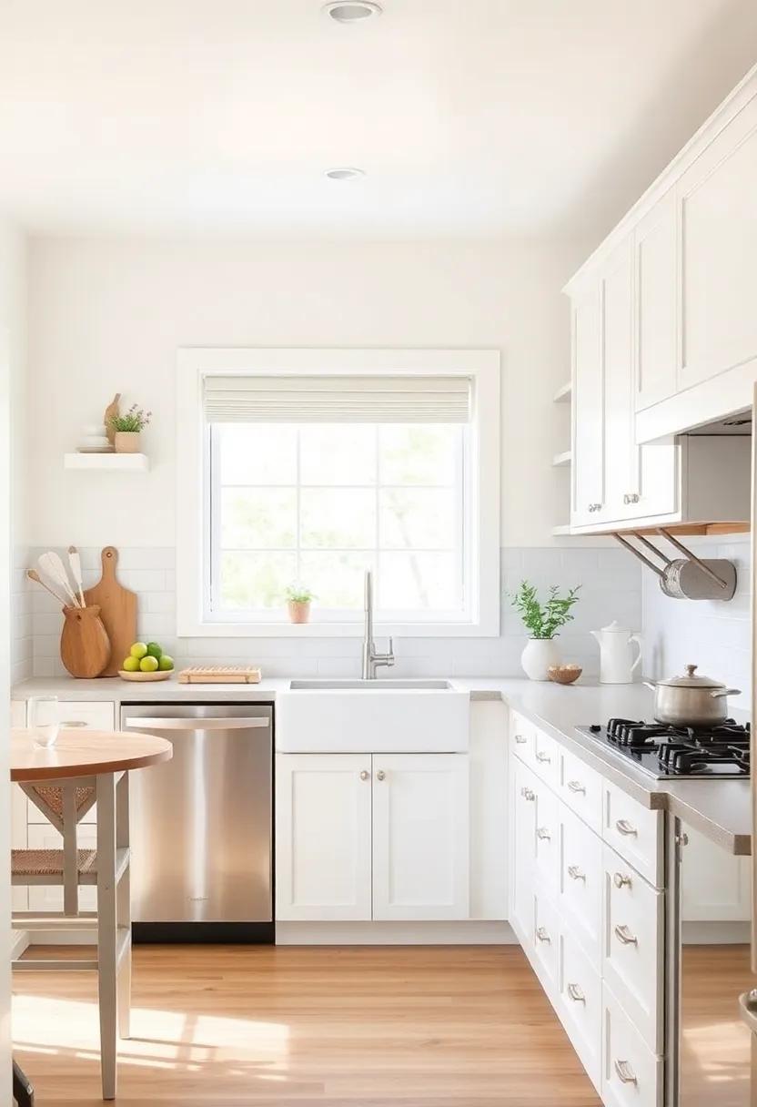
Choose a classic white palette for your cottage kitchen to evoke an airy and serene atmosphere that never goes out of style. this timeless color, reminiscent of soft clouds and fresh linens, creates a washed-out elegance that invites light and enhances the sense of space.With its clean lines, this hue provides the perfect backdrop for other design elements and furnishings, allowing them to shine without overwhelming the senses. Consider pairing white cabinetry with subtle textures and warm wood accents to foster a welcoming environment.
To further enrich your kitchen’s design,combine white with gentle,muted tones to create a layered depth. Soft pastel shades such as sage green, pale blue, or blush pink can evoke a garden-like ambiance, harmonizing beautifully with the classic aesthetic. Incorporating natural materials into this color scheme amplifies the charm,creating a cozy yet complex vibe. Here’s a quick reference table highlighting complementary color ideas:
| Color | Complementary Effect |
|---|---|
| Sage green | Brings tranquility and a touch of nature |
| Pale Blue | Creates restful, airy vibes reminiscent of sky |
| Blush Pink | Adds warmth and softness, perfect for a cozy feel |
Bold Accents: Creating Visual Interest in Cottage Kitchens with Striking Colors
Incorporating bold accents into a cottage kitchen transforms the space, infusing it with vibrant energy and personality. Consider pairing rich teal or deep navy cabinets with warm, earthy wood tones for a harmonious balance. These striking colors can also be highlighted with unexpected elements like a marigold yellow island or a raspberry pink backsplash, drawing the eye and creating focal points throughout the kitchen. Add in accessories like bold-colored cookware or decorative open shelving that showcases colorful dishware, and you’ll have a delightful mix that welcomes creativity while staying true to the cozy cottage aesthetic.
To keep the overall feel inviting, choose accent colors that echo nature and evoke a sense of peace. A beautifully curated color palette may include:
- Forest Green – Complements natural wood and plants
- Burnt Orange – adds warmth and a touch of vintage charm
- Mustard Yellow – Infuses a sunny,cheerful atmosphere
This combination not only enhances the cozy vibe but also provides a visual narrative,where each color plays a role. Here’s a simple breakdown to help envision the contrasts:
| Color | Emotion | Pairing Suggestions |
|---|---|---|
| Teal | Calm | Wood Accents, White Fixtures |
| Raspberry Pink | Joyful | Neutral Tones, Vintage Decor |
| Burnt Orange | Welcoming | Soft Cream, Gray |
Rustic Textures: Using Color to Highlight Natural Materials in Your Kitchen
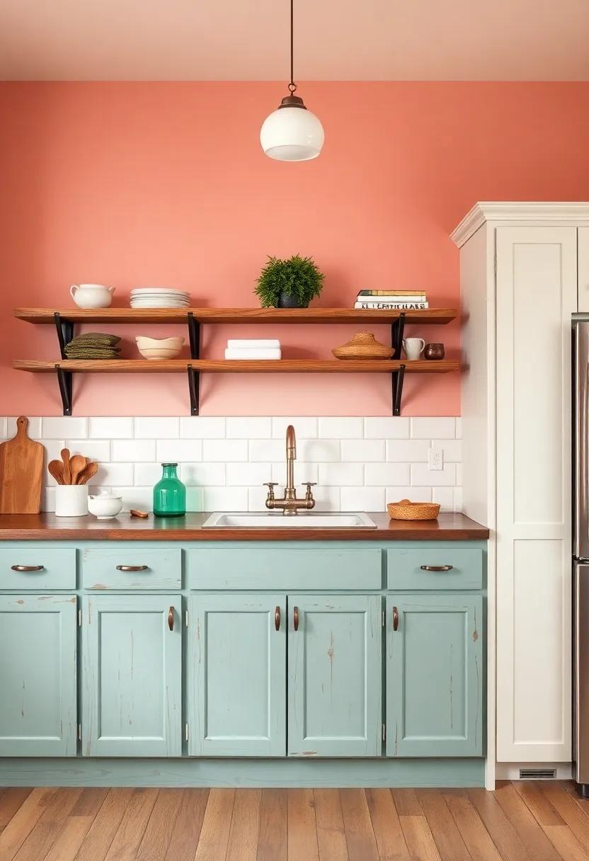
Creating a tranquil atmosphere in your cottage kitchen begins with an astute selection of colors that enhance the natural textures around you. Soft, muted tones like pistachio green or sunset peach can beautifully complement rustic wooden surfaces and stone backsplashes, giving off a warm and inviting feel. These colors can serve as the perfect backdrop to highlight the grain and imperfections of reclaimed wood cabinetry and the ruggedness of exposed brick walls. Pair these hues with subtle highlights such as cobblestone gray for countertops or cream for walls to maximize the natural beauty of your materials.
When choosing paint colors,consider using shades that mimic elements found in nature to create a cohesive design. Options like earthy browns and soft blues can evoke feelings of serenity and comfort, while also underscoring the authenticity of the materials in your kitchen. Another great approach is to play with color blocking techniques—applying different shades on lower cabinets versus upper wall spaces can add depth and intrigue. Explore the possibilities with a simple table showcasing some of the best color combinations for your rustic kitchen:
| Material | Color Pairing | Effect |
|---|---|---|
| Reclaimed Wood | Pistachio Green + Cream | inviting Warmth |
| stone Backsplash | Cobblestone Gray + Soft Blue | Serene Calm |
| Exposed brick | Sunset Peach + Earthy Brown | Cozy Charm |
The Power of Blue: Incorporating Serene Tones to Evoke Peacefulness in Your Cottage Kitchen
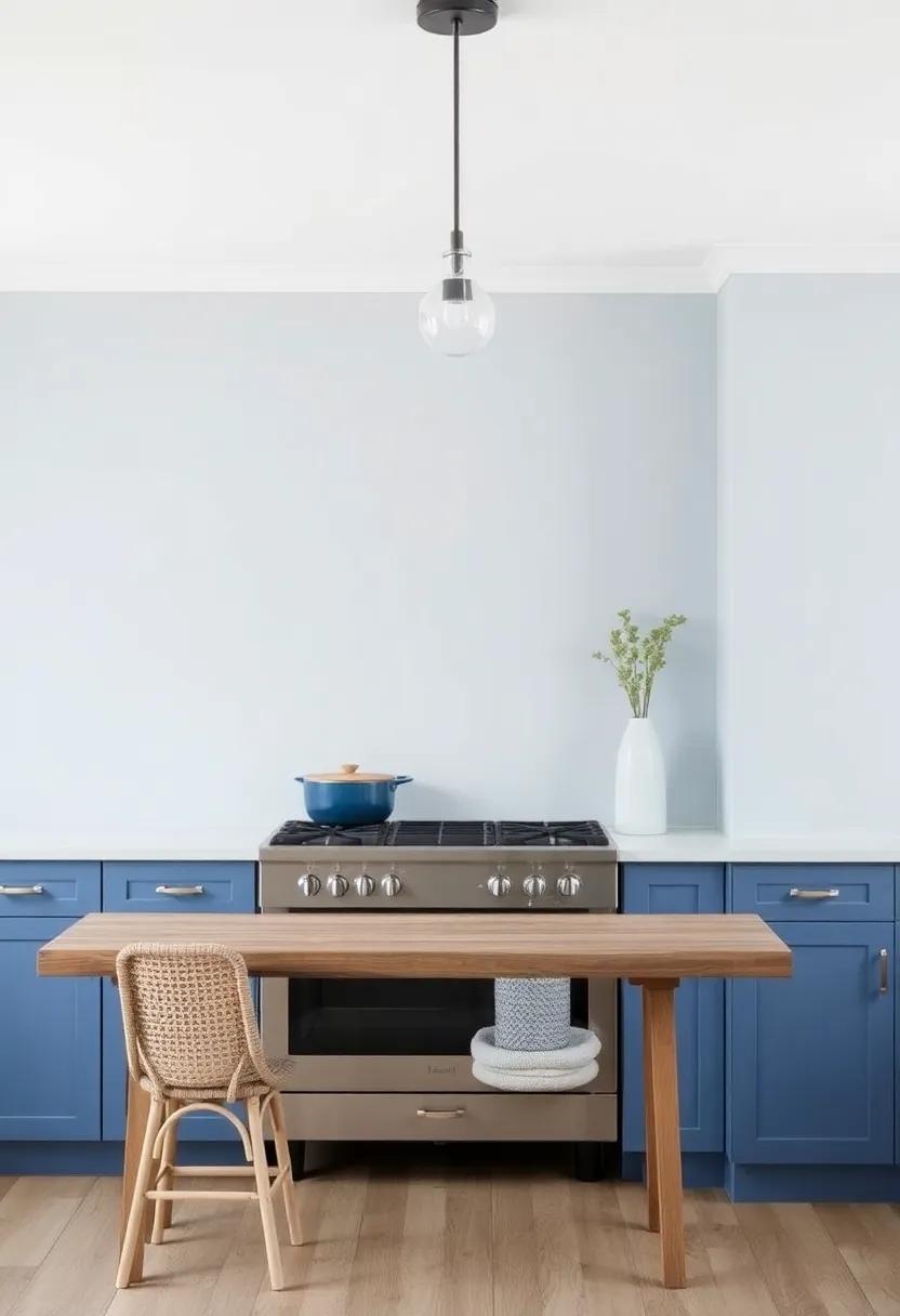
The enchanting allure of blue in your cottage kitchen can transform the space into a sanctuary of calmness and serenity. Soft, muted shades like powder blue or sky blue can instantly uplift the atmosphere, creating an inviting environment that promotes relaxation. These tranquil tones can serve as a perfect backdrop for rustic wooden elements, allowing them to shine without overwhelming the senses. By incorporating blue hues in various ways, whether through cabinetry, backsplash tiles, or accent pieces, you can establish a cohesive, peaceful palette that lingers in the heart of your home.
To fully embrace the serenity that blue offers, consider a combination of shades to create depth and interest in your cottage kitchen. You might explore color pairings such as:
- Soft Blue & Cream – A coastal vibe that feels fresh and airy.
- Slate Blue & Warm Gray - A more sophisticated touch while remaining calming.
- Pale Turquoise & White - A cheerful combination that invites joy and tranquility.
Additionally, incorporating elements of nature can enhance the peaceful ambiance even further. A table showcasing some natural elements to blend with your blue tones would include:
| Element | Color Pairing |
|---|---|
| Wood Accents | Soft Blue |
| Plants | Pale Turquoise |
| Textiles (Rugs/Curtains) | Slate Blue |
Implementing such harmonious combinations not only elevates the aesthetic appeal of your kitchen but also fosters an environment where peace, creativity, and connection can thrive.
Sunshine yellow: Infusing Brightness and Cheerfulness into Your Cooking Space
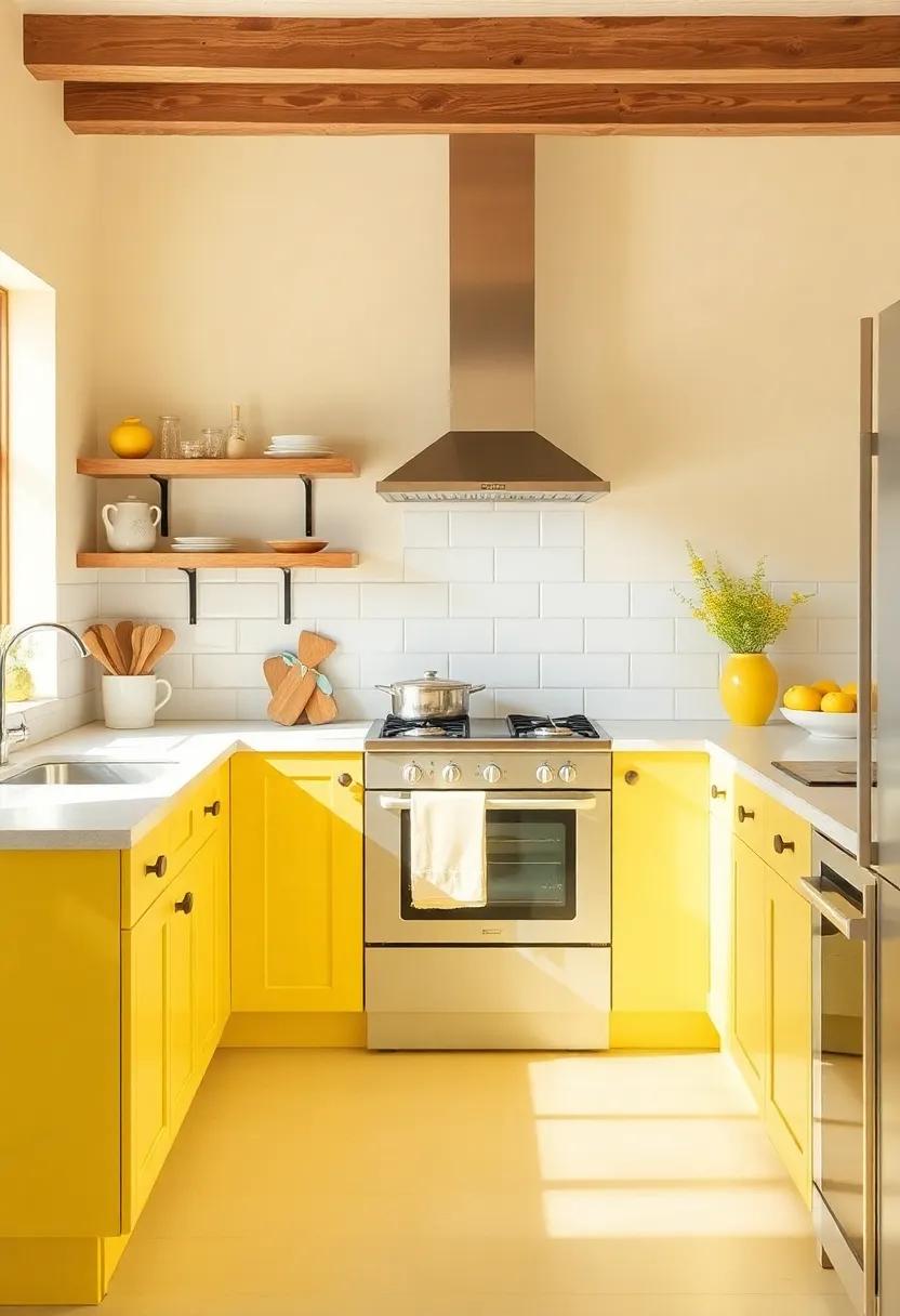
Incorporating sunshine yellow into your cooking space can instantly elevate the mood of the entire room. This vibrant hue brings an element of cheerfulness,filling the kitchen with warmth and inviting energy that encourages creativity. Whether you opt for a bold accent wall, cheerful cabinet colors, or delightful decor accents, yellow can create a welcoming atmosphere that feels both uplifting and joyful. Consider integrating this lively shade through:
- Wall Paint: A soft buttery yellow can soften the corners of your kitchen,enhancing natural light.
- Accessories: Bright yellow kitchenware, such as dish towels and pottery, can easily add splashes of color without overwhelming the senses.
- Furniture: A yellow farmhouse table can serve as a stunning focal point, blending well with rustic elements.
To harmonize with sunshine yellow, pairing it with complementary colors is essential for a balanced look. Soft greys, crisp whites, or earthy greens can create a serene backdrop that allows the yellow accents to radiate even more vibrancy. Consider using a simple color palette where yellow serves as the star, ensuring that it stands out while still harmonizing with the overall design. Below is a quick overview of ideal pairings:
| Color Pairing | Description |
|---|---|
| Soft Grey | Creates a calm, modern appeal that can tone down the brightness. |
| Crisp white | Balances the vibrancy, making spaces look clean and airy. |
| Earthy Green | Brings a touch of nature indoors, adding depth and serenity. |
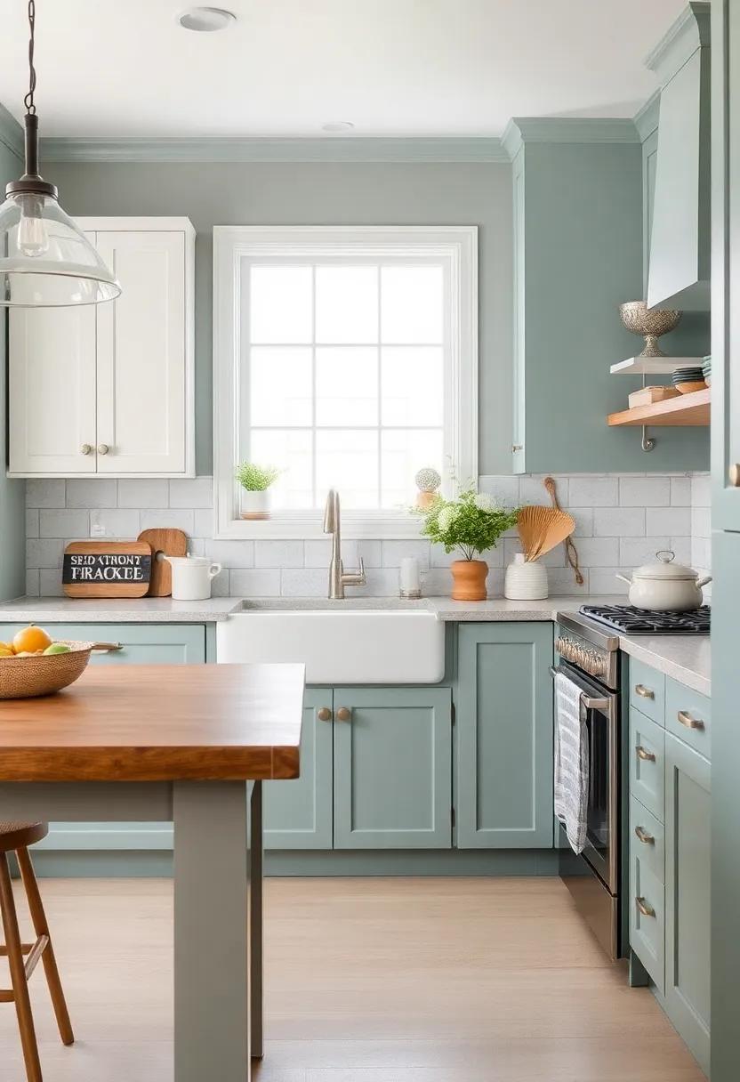
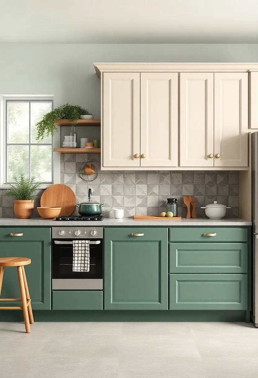
Soft Greens: Bringing the Essence of Nature Indoors with Serene Kitchen Hues
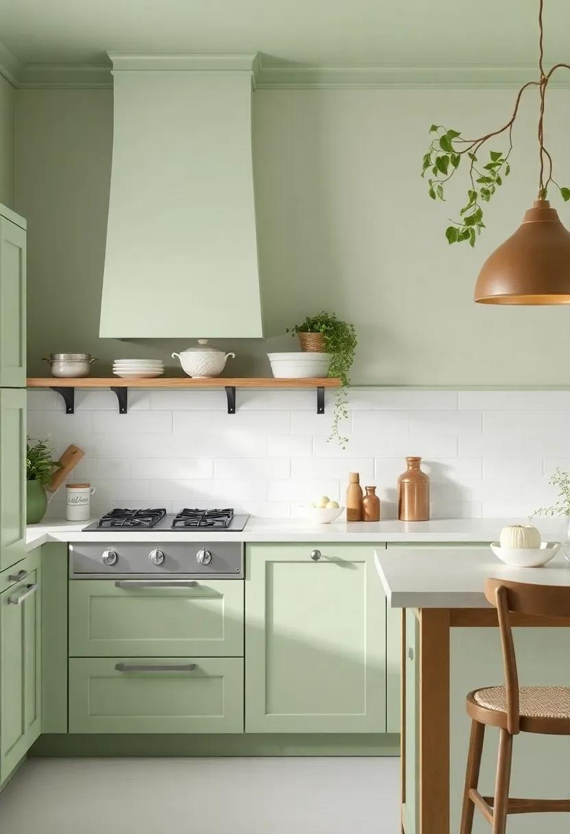
Incorporating soft greens into your kitchen design transforms the space into a tranquil haven that echoes the beauty of nature.These gentle hues can evoke a sense of calm, making meal readiness and family gatherings feel more relaxed and inviting. Whether you opt for a muted sage or a fresh mint,these colors seamlessly blend with natural wood tones and rustic accents,creating a cohesive and harmonious environment. Consider pairing these greens with various textures, such as woven baskets, linen tablecloths, or even potted herbs, to enhance the organic feel of the space.
When selecting the perfect shades, think about the following elements to elevate your kitchen’s aesthetic:
- Natural Light: Soft greens reflect light beautifully, brightening your kitchen and energizing the atmosphere.
- Complementary Colors: Pair greens with warm neutrals or deeper earth tones to create contrast and depth.
- Accent Features: Introduce elements like speckled tiles or copper accents to add character to the soft backdrop.
These choices not only beautify your cooking space but also promote an environment of relaxation and serenity, perfect for everyday gatherings with family and friends.
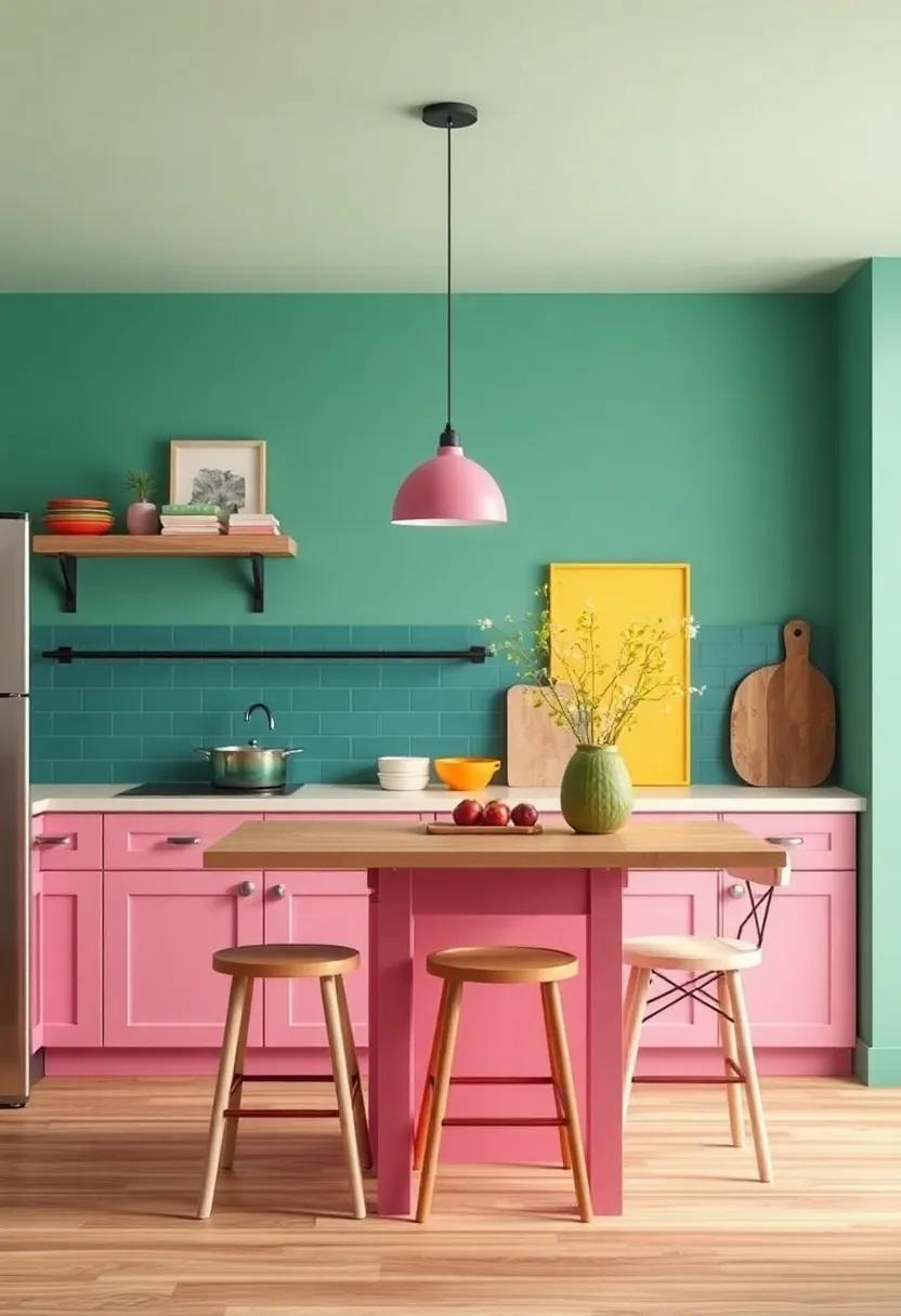
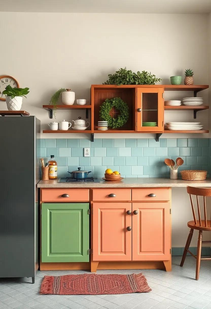
Inspirational Color Blocks: Designing a Playful and Inviting Cottage Kitchen
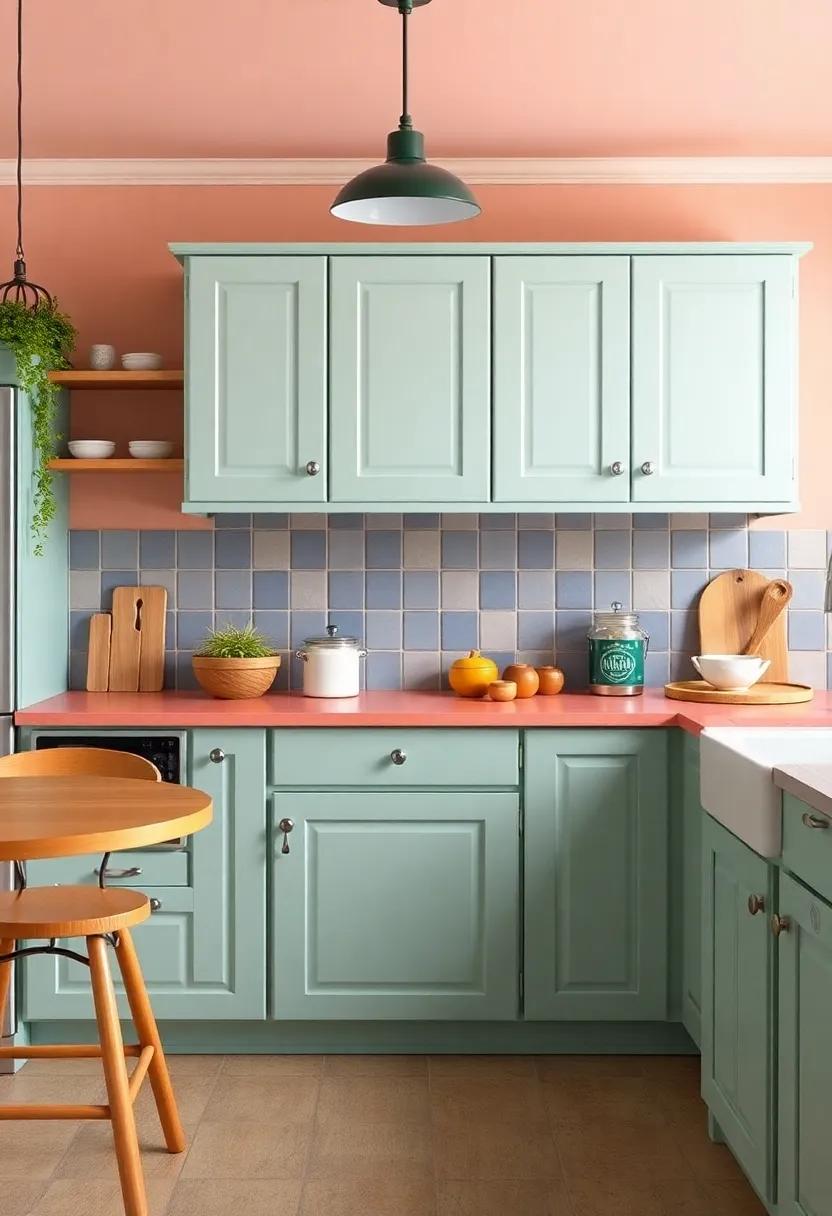
Transform your cottage kitchen into a vibrant sanctuary with a spectrum of colors that evoke cheerfulness and warmth. Think outside the box by incorporating playful accents through color blocks that give every corner a sense of personality.Consider a palette featuring soft pastels like mint green,pale yellow,or blush pink—perfect for cabinets or feature walls that invite interaction and joy. To heighten the playful spirit, mix in bold primaries like cobalt blue or sunny orange in utensils, textiles, and decorative accessories.
The magic lies in the balance.Use neutral backgrounds such as off-white or pale beige to let your colorful selections pop while maintaining an inviting atmosphere. Layer colors creatively through various textures and materials, from ceramic pottery to wooden accents. A well-thought-out layout not only showcases your chosen palette but also creates visual interest. Here’s a quick guide for color pairings that can uplift your kitchen decor:
| Primary Color | Complementary Shade | Accent Option |
| Mint Green | Pearl White | Coral accents |
| Cobalt Blue | Soft Gray | Mustard Yellow |
| Pale Pink | Ivory | Deep Purple |
The Serenity of Grays: A Balancing Act Between Modernity and Tradition
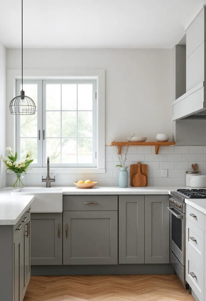
In the quest to find peace within your home, the hues of gray offer a perfect blend of calm and sophistication. They can evoke a serene environment while serving as a versatile backdrop for any cottage kitchen. by incorporating shades such as charcoal, mist, and pearl, you establish a foundation that harmonizes modern elements with classic charm. This palette invites natural light to dance across the surfaces, enhancing the cozy appeal that a cottage kitchen embodies.
To truly embrace the tranquility of gray, consider pairing it with warm wooden accents or soft pastel accessories. This strategy not only adds warmth but also creates a visual balance that mitigates the sterility sometimes associated with modern designs. Some excellent combinations to explore include:
- Light Gray with Soft Blue
- Charcoal with Mint Green
- Pale Gray with Blush Pink
To visualize these color combinations,here’s a simple overview:
| color Pair | Effect |
|---|---|
| Light Gray & Soft Blue | Inviting Calm |
| Charcoal & Mint Green | Modern Freshness |
| Pale Gray & Blush Pink | Charming Warmth |
Through careful selections and thoughtful combinations,the use of gray in your kitchen can create a space that honors both the tranquility of nature and the allure of contemporary living. Adopting these strategies not only fosters an inviting atmosphere but also encourages a delightful balance that resonates within every corner of your home.
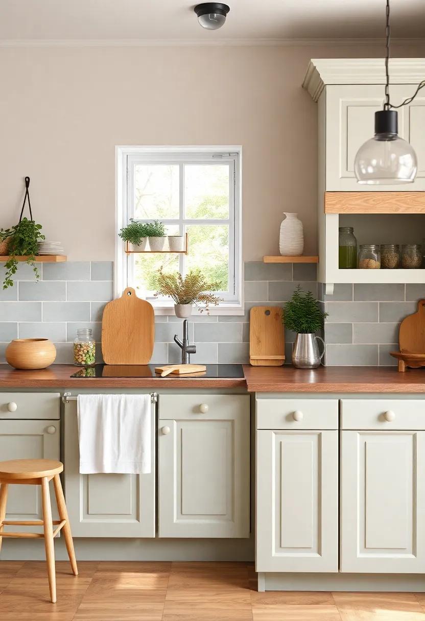
Cottage Vibes with Muted Shades: A Subtle Approach to a Warm Kitchen Aesthetic
When it comes to achieving that dreamy cottage aesthetic in your kitchen, muted shades reign supreme. Soft hues of sage green,dusty blue,and warm taupe create a backdrop that invites tranquility and comfort. These colors not only promote a sense of relaxation but also serve as a perfect canvas for complementing natural materials such as wood and stone. Consider incorporating subtle textiles like linen or cotton in gentle neutrals to enhance the soft ambiance. Paired with rustic accents—think vintage kitchenware or handmade pottery—these muted shades can transform the heart of your home into a serene sanctuary.
To truly encapsulate the essence of cottage charm, layering textures is key. Mix woven baskets, ceramic dishes, and aged metals to add depth to your muted palette while maintaining a cohesive look. A simple color scheme can be elevated with pops of greenery, whether through potted herbs on the window sill or trailing plants adorning open shelves. Below is a table to inspire your color choices, showcasing some ideal muted shades that can harmonize beautifully in your kitchen space:
| Color | Hex Code | suggested Use |
|---|---|---|
| Sage Green | #B7C9A5 | Cabinetry or Accent Walls |
| Dusty Blue | #A3B0C8 | Kitchen drapes or Backsplash |
| Warm Taupe | #D8C4B8 | Countertops or Flooring |
Personal Touches: the Importance of Choosing Colors that Reflect Your Personality
Colors have a profound ability to influence our mood and bring out our innermost selves.When designing a cottage kitchen, it’s essential to consider hues that resonate with your personality.If you gravitate towards calmness and clarity, shades of soft blue or gentle green can evoke feelings of serenity while adding a refreshing touch reminiscent of nature. For those who cherish warmth and comfort, yellows and soft peaches can create a welcoming atmosphere, often inviting family and friends to gather around the kitchen table for heartfelt conversations.
Moreover,incorporating your personal style through accent colors can further enhance the cozy charm of your space. Think about adding bold accents like rich burgundy or deep navy in your decor or kitchenware. Consider this simple guide to color coordination:
| Color Family | Personality Traits |
|---|---|
| Soft Blues & Greens | Calmness,Clarity |
| Warm Yellows & Peaches | Welcoming,Cheerful |
| rich Burgundy & Deep Navy | Boldness,Sophistication |
By choosing colors that not only enhance your cottage kitchen but also reflect who you are,you can create a space that feels distinctly yours. Let your individuality shine through in your design choices, transforming the kitchen into a personal haven filled with warmth and charm.
Seasonal Shades: Adapting Your cottage Kitchen Colors to Reflect the Changing Seasons
transforming your cottage kitchen with the seasons can create a fresh and inviting atmosphere that reflects the beauty of nature outside your windows. In the spring, consider incorporating soft pastel hues like mint green and sunny yellow to create a vibrant, cheerful space that energizes your cooking and entertaining. As summer approaches, deepen the palette with warm coral and sky blue shades for a tropical infusion. The key is to embrace colors that evoke the particular essence of each season while maintaining a cohesive look throughout your cottage kitchen.
As autumn arrives, opt for richer, earthy tones such as burnt orange, deep red, and mustard yellow to create a cozy and warm environment. These colors mimic the falling leaves and ongoing harvest,inviting comfort during chilly evenings.as winter settles in, look to softer grays paired with muted whites and icy blues to evoke a serene, snow-kissed ambience. To give you some inspiration, here’s a brief overview of seasonal color options:
| Season | Color Palette |
|---|---|
| Spring | Mint Green, Pastel Yellow, Lavender |
| Summer | Coral, Sky Blue, Bright White |
| Autumn | Burnt Orange, Deep Red, Mustard Yellow |
| Winter | Soft Gray, Icy Blue, snow White |
The Role of Lighting: How Natural and artificial Light Affects Color Perception
When considering color choices for your cottage kitchen,it’s essential to recognise how natural and artificial light can dramatically influence your perceptions of color. Sunlight, which varies throughout the day, can bring warmth and vibrancy to hues like soft yellows or light blues, making them feel fresh and inviting. In contrast,the cooler tones of early morning or late afternoon light may render colors differently,shifting their mood and feel. Opting for colors that resonate with the natural light in your space can enhance the sense of tranquility and charm you wish to create.
Artificial lighting,conversely,such as pendant lights or under-cabinet fixtures,can add unique character and dramatically change the appearance of your chosen shades. Different light sources produce various color temperatures, influencing how your colors are perceived. Consider the following types of lighting:
- Warm Light – Best for soft yellows, creams, and earthy tones.
- Cool Light - Complements blues, greens, and whites effectively.
- Daylight LED – A versatile choice that showcases a wide range of colors accurately.
By understanding the interplay between these lighting types and your selected pallette, a well-planned color scheme can evoke the cozy charm inherent to cottage kitchen designs.
Creating Contrast: Combining Light and Dark Colors for Visual Depth in Cottage Spaces
When designing a cozy cottage kitchen, the juxtaposition of light and dark colors can create a captivating visual depth that enhances the charm of the space. Soft whites, creamy beiges, and pale pastels can act as a soothing backdrop, allowing light to bounce off surfaces, creating an airy atmosphere. meanwhile, introducing darker shades such as deep navy, forest green, or charcoal gray in accent elements—like cabinetry, countertops, or even an island—can ground the design and add a rustic sophistication.This blend not only highlights architectural details but also invites warmth and intimacy into the heart of the home.
To achieve a harmonious balance, consider the following approaches:
- Layered Textures: Combine matte and gloss finishes to accentuate the light and dark contrasts.
- Statement Features: Use darker tones for cabinetry or a feature wall to create a focal point within a lighter surround.
- Natural Elements: incorporate wooden accents to bridge the gap between light and dark tones, adding an organic feel.
Here’s a simple color combination table to inspire your choices:
| Light Colors | dark Colors |
|---|---|
| Soft White | Charcoal Gray |
| Warm Beige | Midnight Blue |
| Light Sage Green | Deep Olive |
By thoughtfully combining light and dark shades,you can curate a kitchen space that embodies both cozy charm and a striking visual appeal.
Incorporating Vintage Elements: Nostalgic Color Palettes for a Cozy Cottage Kitchen
In the heart of a cozy cottage kitchen, vintage elements breathe life into the space, creating an inviting atmosphere that beckons you to linger.To achieve this nostalgic charm, consider using color palettes inspired by the natural world, reminiscent of simpler times. Soft hues like pastel blues,muted greens,and buttery yellows evoke a sense of tranquility while fostering a warm,welcoming vibe. These colors not only blend seamlessly with vintage fixtures but also reflect a love for the past that can transform your kitchen into a serene sanctuary.
To enhance the vintage aesthetic, incorporate vintage-inspired accessories and materials that complement your color choices.Think about adding accents such as faded floral patterns, aged wood finishes, and rustic ceramics.Combining these elements with your chosen palette can create a cohesive look throughout the kitchen. Here’s a simple guide to color combinations that work beautifully together:
| Color Pairing | Feel |
| Pastel Blue & Cream | Calm & Inviting |
| Soft Sage Green & warm beige | Nature-Inspired & Cozy |
| Dusty Rose & Antique White | Charming & Romantic |
| Light Mustard & Soft gray | Bright & Cheerful |
By blending these colors with vintage accents,you can cultivate an atmosphere that embodies warmth and nostalgia,making your cottage kitchen a haven of cozy charm.
Creative Cabinet Colors: Reinventing Storage Spaces with Unique Shades and Finishes
In a cottage kitchen, where warmth and charm meet, the color of your cabinets can transform the entire atmosphere. imagine soft sage greens or pale robin’s egg blues, mimicking the serenity of nature just outside your window. These hues can provide a perfect backdrop for rustic wood accents, creating a harmonious balance that invites relaxation and creativity. Pairing these shades with matte finishes allows for a touch of modernity without sacrificing the cozy allure of the cottage aesthetic.
For those willing to take a bolder approach, consider incorporating deep navy or charcoal gray cabinets. These colors can ground a space filled with lighter elements, such as woven baskets and vintage ceramics.To add character, opt for distressed finishes that evoke a sense of history, or even a two-tone approach—darker on the lower cabinets for a sophisticated edge, with lighter shades above to keep the space open and airy. The interplay of different cabinet colors can elevate your storage solution from merely functional to a focal point of design.
Shades of Comfort: Curating a Muted Yet Inviting Color Palette for Peaceful Cooking Spaces
Creating a cooking space that radiates serenity begins with a thoughtfully curated color palette. Opting for muted tones such as soft grays,gentle beige,and warm taupes can effortlessly ward off the chaos of everyday life. These colors evoke a sense of calmness, transforming your kitchen into a peaceful haven. consider incorporating textured elements, like a honed marble backsplash or woven textiles, to add depth without overwhelming the subtle hues. This approach invites tranquility and enhances the cozy charm of a cottage kitchen.
To elevate the inviting ambiance further, you might want to introduce accents of sage green or dusty blue. These colors not only complement the muted base tones but also bring a refreshing natural element reminiscent of the countryside. Incorporating these shades through items like kitchenware,curtains,or potted herbs can create a harmonious atmosphere. Here’s a simple table to visualize how these colors can be paired effectively:
| Base Color | Complementary Accent |
|---|---|
| Soft Gray | Sage Green |
| Gentle Beige | Dusty Blue |
| Warm Taupe | muted Terracotta |
In Summary
As we close the chapter on exploring the enchanting world of cottage kitchen colors, remember that the true essence of serenity lies in the details. Each shade has a voice, telling a story of warmth, nostalgia, and the comforting embrace of home. Whether you gravitate toward the soft hues of antique whites, the rejuvenating greens of nature, or the soothing blues reminiscent of a tranquil sky, your choices create an atmosphere that invites relaxation and creativity.
As you embark on the journey of designing your perfect cottage kitchen, allow your personal taste to guide you, blending colors that resonate with your spirit. Embrace the charm of this cozy space, transforming it into a sanctuary where culinary endeavors and cherished moments come to life. May your kitchen be a canvas, painted with love and tranquility, a place that nurtures both your meals and your soul. Enjoy the process, and let the serenity of your home unfold, one beautiful color at a time.
As an Amazon Associate I earn from qualifying purchases.