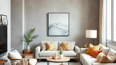
How to create a timeless look with classic neutral wall colors in the living room.
In a world where design trends wax and wane like the phases of the moon, the quest for timeless elegance in our living spaces remains ever-relevant. Enter the classic neutral wall color—an understated palette that not only breathes life into a room but also serves as a versatile canvas for personal expression.By embracing tones like soft grays, warm beiges, and crisp whites, homeowners can create a serene backdrop that enhances the beauty of furnishings and accessories rather than competing with them. In this article, we will explore the art of transforming your living room into a sanctuary of sophistication through the thoughtful application of classic neutrals, guiding you on a journey to craft a look that transcends the fickleness of fashion and stands the test of time.
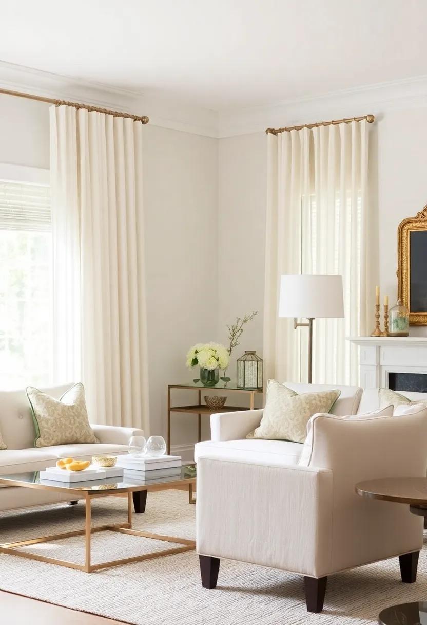
Creating a Subtle Elegance with Soft Beige Wall Colors in Your Living Room
Embracing soft beige wall colors can transform your living room into a sanctuary of tranquility and sophistication. This versatile hue serves as a perfect backdrop, allowing other design elements to stand out while maintaining an air of understated elegance.When choosing shades, consider layering different tones of beige to create depth, ensuring that your space feels warm and inviting. You might also want to incorporate natural textures, such as wood and linen, to enhance the organic vibe that soft beige promotes.
To complement your soft beige walls, accessorizing thoughtfully becomes essential. here are a few elements to consider adding:
- Artwork: Select pieces that incorporate warmer tones or metallic accents to create visual interest without overpowering the serenity of beige.
- Textiles: Use cushions and throw blankets in earthy tones or soft patterns to add comfort and dimension to your seating area.
- Furniture: Opt for pieces in natural woods or soft whites, creating a cohesive look that ties the room together.
This harmonious fusion of color and texture not only elevates the aesthetic but also makes your living space feel inviting and timeless.
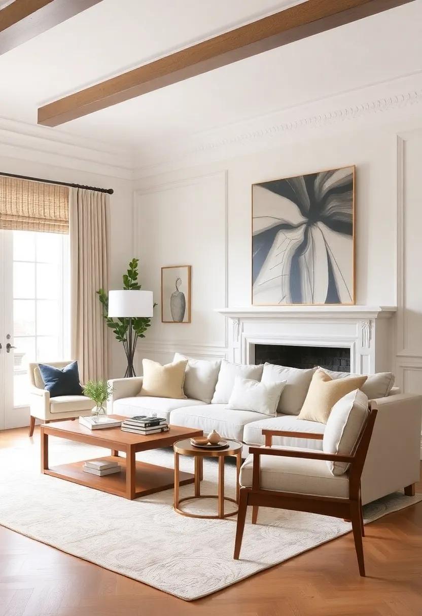
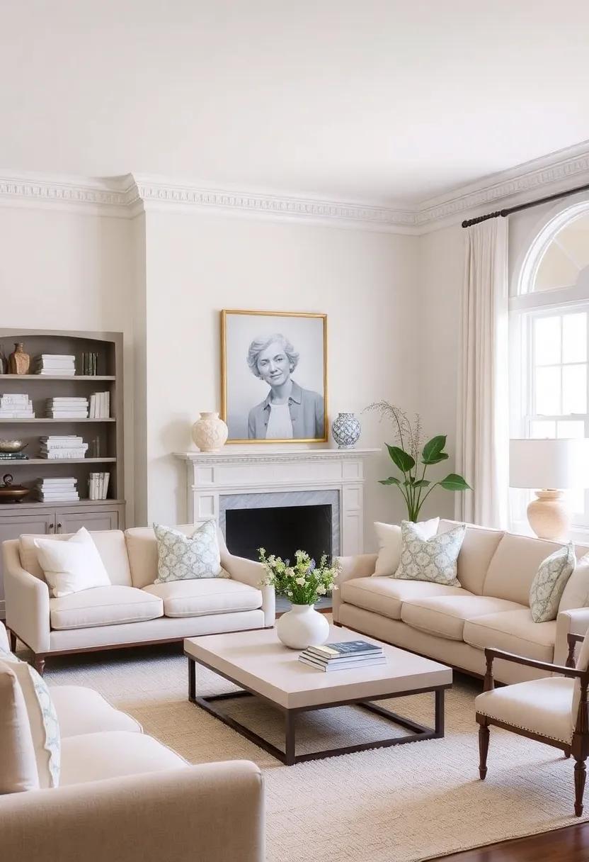
The Charm of Creamy Whites: Timeless neutral choices for Warmth
The allure of creamy whites lies in their ability to create an inviting atmosphere while maintaining a complex edge. These soft hues, from ivory to alabaster, enhance natural light, effectively making spaces feel larger and more airy. They serve as an ideal backdrop for various decor styles, allowing you to effortlessly incorporate contrasting elements, such as rich textiles and vibrant accents. A few decor ideas that thrive against creamy white walls include:
- Warm wooden furniture: Provides a grounded, rustic feel.
- Textured fabrics: Introduce coziness and tactile interest.
- Earthy color pops: create a striking focal point without overwhelming the space.
Layering these creamy hues with different materials can also add depth and personality to your living room. Consider pairing semi-gloss finishes with matte elements to create a visually captivating contrast. Accessories such as gold or brass accents can introduce a touch of elegance, while natural greenery breathes life into the palette. Below is a simple table showing complementary decor ideas:
| Decor Element | Complementary Color |
|---|---|
| Textiles (Cushions, Throws) | Mustard Yellow |
| Art Pieces | Deep Blue |
| Rugs | Terracotta |
Exploring the Serenity of Cool Grays for a Peaceful Living Space
In the realm of interior design, cool grays emerge as a soothing backdrop that promotes tranquility and calmness. These versatile shades not only create a serene environment but also allow for endless creativity in decor. By choosing a range of cool gray tones, from soft mist to deep charcoal, you can establish depth and interest within your living space. Imagine a cozy corner adorned with plush gray fabrics, punctuated by hints of cream and silver accents. This harmonious palette effortlessly invites relaxation and can be transformed with seasonal decor, ensuring your living room remains inviting throughout the year.
Incorporating texture is key to enhancing the beauty of a gray-themed space. Consider these elements to amplify the overall aesthetic:
- Textiles: Layer your furniture with various fabrics such as velvet cushions, wool throws, and linen curtains to create a warm, inviting atmosphere.
- Artwork: Choose abstract pieces that include splashes of color—these become focal points in an otherwise monotone setting.
- Natural Elements: Integrate wooden accents or indoor plants to add an organic touch,balancing the cooler tones with nature-inspired warmth.
When planning your living room’s design, consider this simple color spectrum table for guidance:
| Color Shade | Mood Enhancer |
|---|---|
| Light Gray | Calmness and Clarity |
| Slate Gray | Stability and Strength |
| Charcoal | Cozy Intimacy |
By employing cool gray tones thoughtfully, you not only lay the foundation for a timeless living space but also cultivate a serene atmosphere that fosters relaxation and balance.
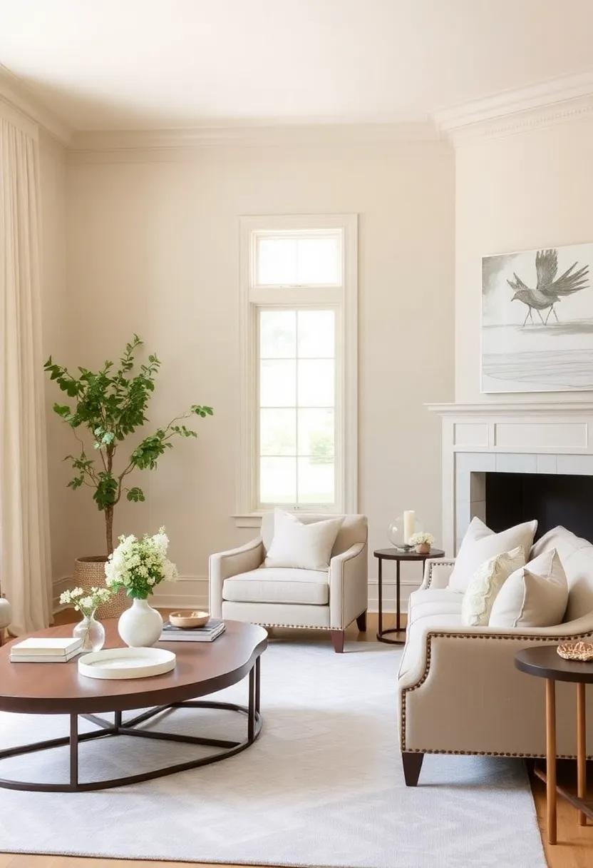
Embracing Earth Tones: Rich Taupes to Ground Your Living Room Design
The allure of rich taupe hues transforms a living room into a sanctuary of warmth and elegance.These earthy tones create a versatile canvas that can harmonize with various styles, from contemporary to rustic chic. By incorporating natural materials like wood, stone, or woven textiles, you can enhance the grounded essence of taupe. Consider layering textures with throw pillows, rugs, and blankets in complementary shades like soft creams and charcoal grays, ensuring to create depth and interest without overwhelming the tranquil atmosphere.
To effectively utilize taupe in your living room, consider the following design elements:
- Accent Walls: A single taupe wall can serve as a stunning backdrop for art or a stylish media console.
- Furniture Choices: Choose upholstery or wooden furniture pieces that echo taupe’s natural elegance, seamlessly blending with your overall decor.
- Accessorizing: Incorporate decorative elements like ceramics, plants, and metallic finishes that enhance the taupe without competing with its subtle sophistication.
Finding the Balance: Mixing Neutral Colors for Depth and Dimension
Creating a living room with a timeless aesthetic frequently enough starts with the right choice of neutral wall colors.To achieve depth and dimension, consider layering different shades and textures of neutrals. Incorporating a variety of tones—from warm beiges and soft greys to cool whites—can transform a flat space into one rich with visual interest. Add elements such as textured fabrics and natural materials like wood and stone to enhance the layers further. This mix not only adds warmth but also creates a soothing atmosphere, perfect for any gathering space.
To optimize the balance between light and shadow, consider the following color pairings that work harmoniously together:
| Color Pairing | Effect |
|---|---|
| Warm Beige & Cool Grey | Creates a cozy yet modern vibe |
| Soft Taupe & Crisp White | Brightens the space while maintaining warmth |
| Sandy Brown & ashy Blue | Adds tranquility and depth |
Accessorizing with Complementary Accents can further enliven the space. Use furniture and decorative pieces in different textures, such as a plush velvet sofa paired with a woven wool throw. Incorporate metallic or glass accents to catch the light, wich will create dynamic reflections that enhance the neutral palette. Paintings or wall hangings with splashes of color will also provide focal points without overwhelming the tranquil ambiance of your chosen neutral tones.
accent Walls: Highlighting Neutral shades with Strategic Color Placement
Accent walls are a brilliant way to introduce visual interest in a living room while maintaining a timeless aesthetic. By strategically placing vibrant colors against a neutral backdrop, you can create a focal point that draws the eye without overwhelming the space. Consider using shades like deep navy or rich forest green against a soft beige or warm gray. This allows you to keep the overall ambiance relaxed while enhancing the architecture of the room. Accentuate the wall with artwork, mirrors, or lighting to bring out the chosen hue and create a cohesive look.
When selecting the right accent color, think of the atmosphere you wish to foster. Here are some color combinations to consider:
- Terra Cotta paired with Earthy Tan for a warm, rustic feel.
- Slate Blue against a Soft White for a crisp, modern vibe.
- Burnt Orange with Light Cream to evoke a cozy and inviting environment.
To simplify your decision-making process, the table below summarizes various accent colors alongside their complementary neutral shades:
| Accent Color | Complementary Neutral |
|---|---|
| Olive Green | Soft Taupe |
| Poppy Red | Warm Beige |
| Charcoal Gray | Light Gray |
Textures and fabrics: How to Enhance Neutral Walls with Material Variety
To create a captivating living room that features classic neutral wall colors, one effective approach is to incorporate a variety of textures and fabrics. Layering different materials not only adds depth to the space but also creates a sophisticated visual narrative. Consider using elements such as linen, cotton, and velvet in cushions or throws to introduce tactile diversity.A soft, chunky knit throw can contrast beautifully against the smooth surface of a cotton-upholstered chair, while a sleek leather sofa provides an elegant counterpoint to plush textiles. Experimenting with various textures, like a woven rattan side table paired with a slick metal lamp, further enhances the overall aesthetic.
To maximize the impact of these materials, use accessories to create focal points throughout the room. Here’s a quick overview of how different textures can complement neutral walls:
| Fabric Type | Texture Description | Recommended Use |
|---|---|---|
| Linen | Lightweight,breathable | Pillows and curtains |
| Velvet | Soft,luxurious | Upholstery and throws |
| Jute | Textured,natural | Rugs and baskets |
| Leather | Smooth,polished | Sofas and accents |
Incorporating these materials not only draws the eye,but also helps create a sense of warmth and comfort that is essential for a timeless living space.To further enrich the ambiance, consider adding decorative items like textured wall art or woven storage solutions.These pieces can echo the textures in your fabrics and contribute to a cohesive design that remains inviting and stylish over time.
The Art of Minimalism: Achieving a Clean Look with Neutral Wall Colors
Embracing a minimalist aesthetic in your living room begins with selecting the right wall colors. Neutral hues such as soft grays, crisp whites, and warm beiges create a serene backdrop, allowing your space to breathe while showcasing both functional and decorative elements. These shades do more than just provide a clean look; they serve as a canvas that highlights textures and shapes, enhancing the overall design. When your walls are painted in calming tones, the room naturally exudes a chic simplicity, making it easy to incorporate furniture and décor that reflect your personal style. A few strategically placed items, such as a woven basket or a sculptural piece, can add warmth to the space without overwhelming the senses.
To further elevate the minimalist vibe, consider complementing your neutral walls with furniture that follows a sleek, streamlined silhouette. Incorporating materials like light wood,metal,and linen can create a harmonious balance with the soft wall colors. Here are a few elements to consider for a polished look:
- Layer Textures: Use cushions and throws in different fabrics to add warmth.
- Natural Light: Maximize windows to allow natural light to infuse the room.
- Accent Pieces: select a few eye-catching décor items that accentuate the walls’ neutrality.
To make your design choices more impactful, you might also consider how various neutral shades interact with one another. The following table presents popular neutral colors and their potential pairing for a cohesive aesthetic:
| Color | Pairing |
|---|---|
| Soft Gray | Warm White |
| Cream | Charcoal |
| Stone Beige | Muted Sage |
By thoughtfully incorporating these elements, you can create a sophisticated yet inviting living room that reflects the essence of minimalist design while maximizing the beauty of classic neutral wall colors.
Layering Lighting: Illuminating Neutral Walls for a Cozy Atmosphere
To achieve a warm and inviting living space, it’s essential to incorporate different layers of lighting that complement your neutral wall colors. Start by considering a variety of light sources such as table lamps, floor lamps, and overhead fixtures. Aim for a mix of ambient, task, and accent lighting, which will not only highlight the beauty of your walls but also create a cozy atmosphere that is perfect for relaxation or entertaining. Here’s a quick guide to get you started on layering lights:
- Ambient Lighting: Use ceiling-mounted fixtures or recessed lights to provide overall illumination.
- Task Lighting: Incorporate reading lamps or under-cabinet lights where extra focus is needed.
- Accent Lighting: Employ wall sconces or picture lights to draw attention to artwork or architectural features.
The color temperature of your bulbs can greatly influence the feel of your space. Opting for warmer bulbs can add a soft glow,enhancing the neutral palette of your walls and creating a more inviting environment.For a quick reference, you might consider the following lighting options that work beautifully with neutral shades:
| Light Type | Recommended Color Temperature | Best Use |
|---|---|---|
| LED Bulbs | 2700K – 3000K | General/Task Lighting |
| Incandescent Bulbs | 2700K | Ambient lighting |
| CFL Bulbs | 3000K | Accent Lighting |
By layering your lighting thoughtfully, you can create a harmonious blend that highlights the warmth of your neutral walls and invites a sense of comfort and style into your living room. Ensuring lights are dimmable can further enhance the ambiance, allowing you to easily adjust the brightness depending on the occasion, thus making your space feel welcoming at any time of the day.
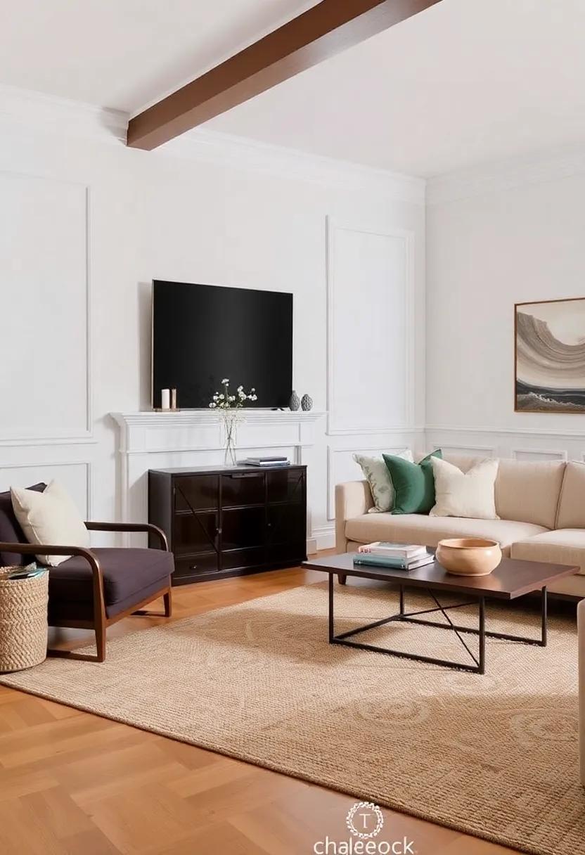
Furniture Selection: Choosing the Perfect Pieces for Timeless Appeal
When it comes to selecting furniture that will enhance your living room’s timeless appeal, consider pieces that embody a classic aesthetic and versatile functionality. Look for items that feature natural materials such as wood, leather, and linen. These materials not only age gracefully but also offer a warmth that complements neutral wall colors beautifully. Prioritize furnishings with clean lines and subtle details,as they help create an understated elegance. A few standout items may include:
- Mid-century modern sofas that provide comfort and style
- Classic wingback chairs for a touch of sophistication
- Sturdy coffee tables made from reclaimed wood
- Elegant sideboards to showcase decor and store essentials
Creating balance in your living space is equally important. Layer textures and styles that work in harmony with the neutral walls, enhancing the room’s overall aesthetic while maintaining a sense of cohesion. Incorporate throw pillows in soft colors, chic area rugs, and a carefully selected mix of vintage and contemporary accessories. when considering the placement of each piece, think about the flow of the room and how each selection contributes to inviting warmth and comfort. Here’s a simple comparison of furniture styles that work well with neutral wall colors:
| Furniture Style | Characteristics | Best Complement |
|---|---|---|
| Traditional | Ornate details, rich woods | Dark greens, deep blues |
| Modern | Sleek lines, minimalistic | soft whites, light grays |
| Eclectic | Mix of styles, bold accents | radiant pastels |
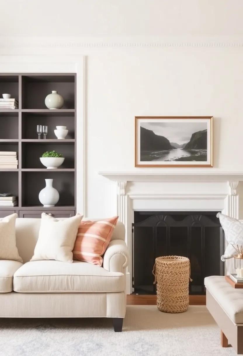
Art and Decor: Adding Personality to Classic Neutral Color Palettes
When working with classic neutral wall colors, art and decor are your secret weapons to infuse life and personality into the space. Choose pieces that reflect your personal style, whether it be contemporary, traditional, or eclectic. Here are some ideas to consider:
- Gallery walls: Create a stunning focal point by grouping framed art, photographs, or even mirrors of varying sizes.
- Textured textiles: Incorporate different fabrics such as throws, pillows, and rugs to add warmth and depth while maintaining the neutral palette.
- Statement sculptures: Select bold pieces that contrast with the walls,serving as conversation starters and adding a tactile element to the decor.
Moreover, balance is key in maintaining harmony within your neutral space. Opt for decor items that complement the colors of your walls yet stand out enough to catch the eye. Consider the following:
| Decor item | Color Influence | Visual Impact |
|---|---|---|
| Framed Black & White Photography | Minimalist | Timeless Elegance |
| Bold abstract Painting | Vibrant Contrast | Focal Point |
| Natural Wood Elements | Warmth & Texture | Organic Charm |
By thoughtfully curating your art and decor, you ensure that your living room radiates not only style but also a true sense of self. With each piece, you can tell a story, creating spaces that feel lived-in yet sophisticated.
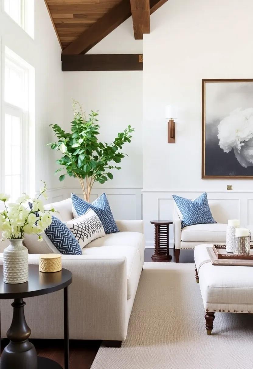
Incorporating Greenery: The Freshness of Plants Against Neutral Backdrops
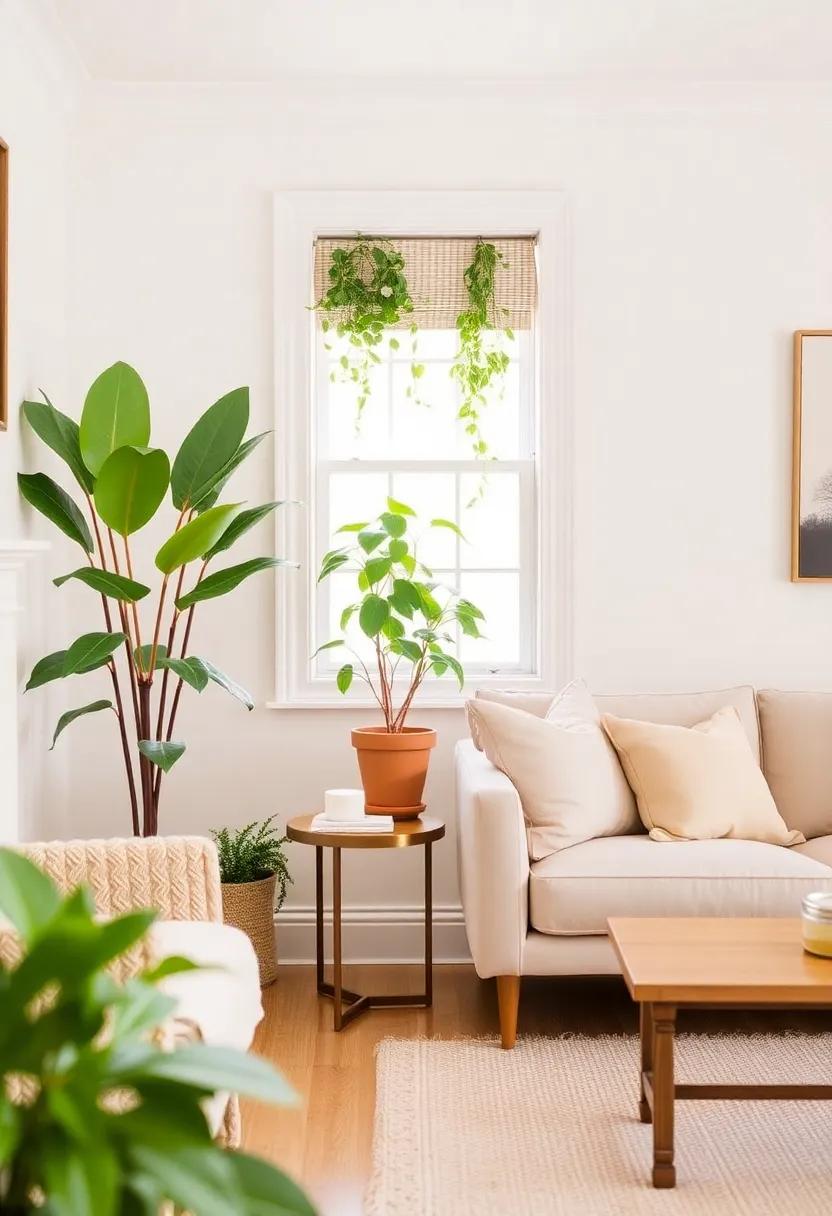
Integrating plants into a neutral palette serves as a vibrant counterpoint that breathes life into any living room. Not only do plants introduce a dose of color and texture,but they also foster a sense of calm and well-being. To enhance this effect, consider selecting pots that complement your chosen wall colors, as the right container can accentuate the plant’s natural beauty while maintaining a cohesive look. Here are some excellent options for incorporating greenery:
- Low-maintenance succulents: Perfect for adding a touch of life without overwhelming the space.
- Fiddle leaf figs: Their large leaves create a stunning visual contrast against neutral walls.
- Herbs in the kitchen: Not only do they enhance the decor, but they also serve a functional purpose.
To make the most of your green additions, consider varying the heights and textures of your plants. grouping different species together can create visual interest and draw attention to specific areas of your living room. You might also utilize shelving or a tiered plant stand,showcasing plants at different levels for a dynamic effect. Here’s a simple layout suggestion to help you visualize your greenery arrangement:
| Area | Suggested Plant | Container Style |
|---|---|---|
| Coffee Table | Snake Plant | Geometric Ceramic Pot |
| Corner Space | Rubber Plant | Large Woven Basket |
| Side Table | Pothos | Hanging Macrame Holder |
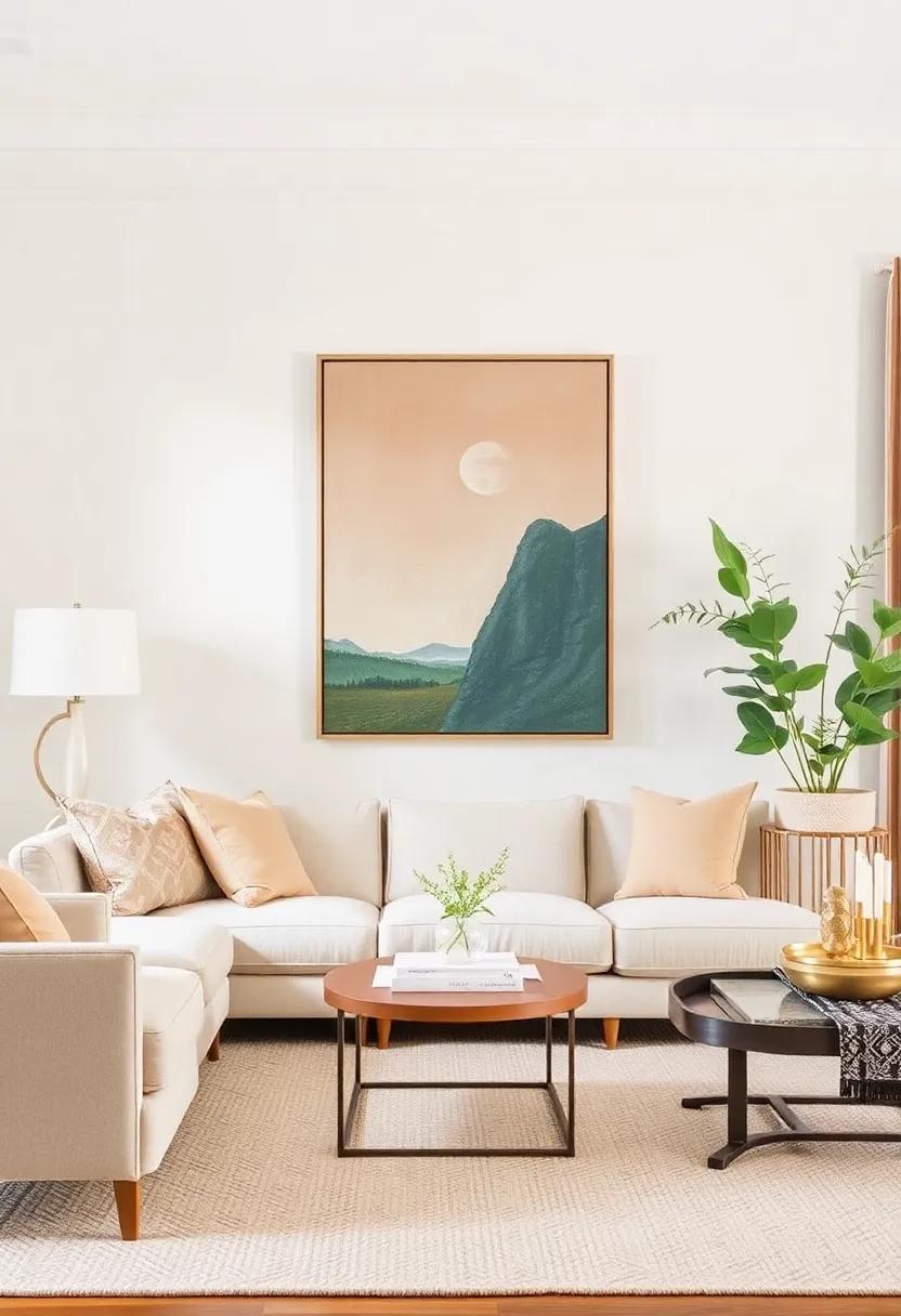
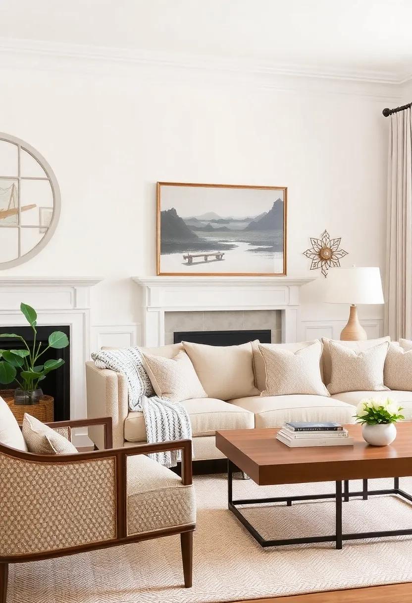
Statement Pieces: Bold Artwork to Contrast and Complement Neutral Tones
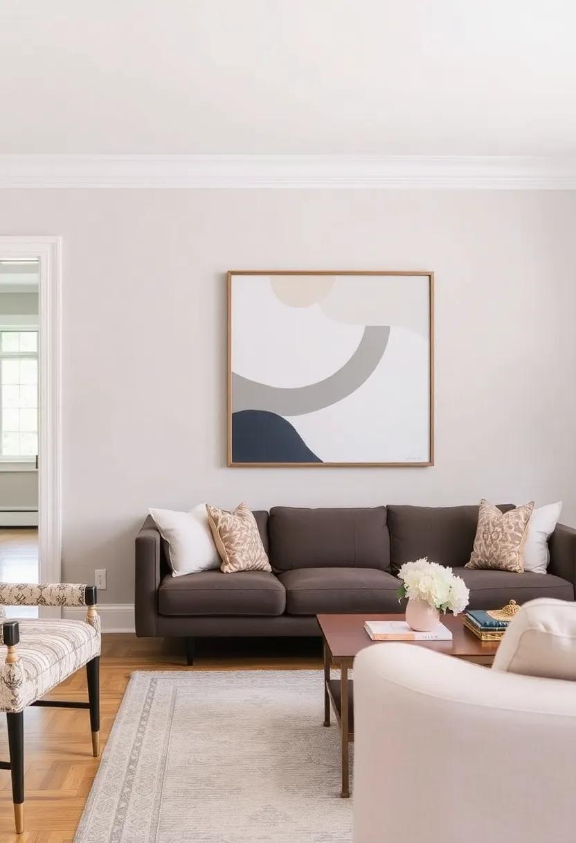
To truly elevate your living space, incorporating bold artwork can serve as a striking contrast to your classic neutral walls. Consider pieces that feature vibrant colors, unique textures, or compelling narratives. Large canvas prints, oversized framed photographs or mixed media works can act as focal points, guiding the eye and infusing personality into your room. Aim for artwork that not only stands out but also complements the undertones of your neutral palette, creating a harmonious yet dynamic balance. Here are some ways to choose your statement pieces:
- Color Harmony: select artwork with hues that echo or highlight accents in the room.
- Texture Play: Incorporate pieces that vary in texture, such as a metallic sculpture or a fabric wall hanging, to add depth.
- Scale Matters: Opt for large pieces to create impact, but ensure they fit proportionately within your space.
Moreover,arranging your artwork thoughtfully can further enhance the overall aesthetic. Grouping smaller pieces in a gallery wall style can provide interesting visual flow,while a singular large piece can serve as a bold anchor. Ensure each piece is thoughtfully placed, considering the viewing level and nearby furnishings to create a cohesive look. A well-designed layout not only showcases the art but also harmonizes it with the broader design of the room. Here’s a quick guide:
| Art Piece Type | Placement Tips |
|---|---|
| Large Canvas | Center above the sofa or fireplace |
| Gallery Wall | Cluster near a reading nook or hallway |
| Sculptural Artwork | Position on shelves or mantels |
Rug Selection: Grounding Your Space with Texture in Neutral Shades
In the quest to craft a timeless living room, selecting a rug with a captivating texture can serve as the foundation that ties together the room’s aesthetic. Opt for options that incorporate various weaves and materials, such as jute, sisal, or soft wool, to create a rich textural contrast against smooth walls and simple furnishings.Consider these key elements when choosing the perfect rug:
- Color Palette: Stick to soft greys, warm beiges, or creamy whites to enhance the neutral wall colors.
- Pattern: Choose subtle geometric patterns or organic motifs to add interest without overwhelming the space.
- Size: Ensure the rug is proportionate to the room; a larger rug can make a cozy,inviting feel when placed under furniture.
By integrating a textured rug into the living room, you not only ground the space but also invite a tactile experience that invites guests to linger. A rug in neutral shades allows versatility in layering with other decor elements, such as cushions and throws while maintaining a harmonious, serene environment. To guide your selection further, consider the table below for popular material choices, each bringing unique characteristics to your living space:
| Material | Characteristics |
|---|---|
| Jute | Natural, durable, eco-amiable, with a rustic appearance. |
| Wool | Soft, warm, and resilient, suitable for high-traffic areas. |
| Sisal | textured, offers a more refined look, great for layering. |
Curtains and Draperies: Softening Spaces with Sheer Neutral Fabrics
Choosing sheer neutral fabrics for curtains and draperies can substantially enhance the ambiance of your living room, creating a serene and inviting atmosphere. these materials allow natural light to flexibly filter into the space while providing just enough privacy to keep it cozy. A well-designed layering of textures, even with simple sheers, contributes to a sophisticated yet relaxed setting. Consider how these soft fabrics can gently diffuse harsh sunlight, casting a warm glow throughout the room, especially when paired with deeper wall colors.
To maximize the impact of sheer neutrals, think about the following key elements:
- Color Harmony: Use fabrics that complement your wall color palette for a seamless look.
- Layering Techniques: Combine sheers with heavier drapes for added depth and versatility.
- Heightening the Ceiling: Hang curtains higher than the windows to create an illusion of height.
| Fabric Type | Style Impact |
|---|---|
| Voile | Soft, airy feel |
| Linen Blend | Textured elegance |
| Organza | Delicate and light |
Functional layouts: Arranging Furniture for an Airy Look in a Neutral Room
Incorporating multifunctional furniture can contribute to a spacious feel while serving practical purposes. For example, an elegant coffee table with drawers can provide storage without cluttering the room. When selecting accent pieces, opt for designs that are minimal but impactful. Use transparent materials like glass or acrylic for tables or shelving to maintain an open feel, and complement these with a few key elements from a cohesive palette:
| Element | Purpose |
|---|---|
| Mirrors | Reflect light and create the illusion of space |
| light Fabrics | Add softness without bulk |
| Wall Art | Inject personality without overpowering |
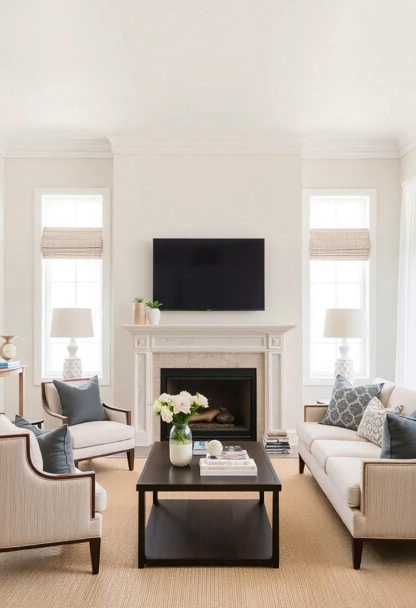
Color Psychology: Creating Emotional Warmth with Timeless Neutrals
In designing a living room, the colors we choose play a monumental role in shaping the environment and the emotions it evokes. Timeless neutrals, such as soft beiges, creamy whites, and gentle grays, can transform a space into a warm and inviting sanctuary. These shades promote serenity and balance, allowing the eye to rest while creating an atmosphere that encourages relaxation and connection. When paired with carefully selected accents, these neutral tones enhance the overall calming effect, allowing for an effortlessly chic aesthetic.
Incorporating textural elements alongside neutral wall colors can amplify the emotional warmth of a living room.Consider the following suggestions to create a harmonious space:
- Layered textiles: Use a variety of fabrics, such as knits, linens, and velvets, to add depth.
- Natural accessories: Introduce wooden decor or terracotta pots to ground the space in nature.
- Soft lighting: Employ warm-toned lights to create a cozy atmosphere during the evening.
furthermore, consider creating a simple color palette table to visualize your options:
| Neutral Color | Emotion Evoked | ideal Accent colors |
|---|---|---|
| Soft Beige | Warmth | Deep Blue, Olive Green |
| Creamy White | Peacefulness | Coral, Mustard Yellow |
| Gentle Gray | Stability | Blush Pink, Charcoal |
Transcending Trends: selecting classic Pieces for Lasting Impact
To create a living room that stands the test of time, neutral wall colors are essential. They serve as a perfect backdrop, allowing furniture and decor to shine without overwhelming the senses. Consider using shades such as soft taupe, dove gray, or warm beige. These hues not only complement various design styles but also promote a sense of calm and cohesion. Pair these walls with classic molding and trim to enhance architectural interest while maintaining a luxurious feel.
When selecting furniture and decor to accentuate your neutral walls, focus on timeless pieces that exude quality and craftsmanship.Think about integrating:
- quality upholstery: Choose classic fabrics like linen or leather that can withstand changing trends.
- Wooden furniture: Opt for solid wood pieces with simple lines that will remain stylish year after year.
- Artworks and accessories: Invest in a few statement art pieces or sculptures that resonate with your personal style but adhere to a neutral palette.
Creating harmony between these elements can yield an inviting and sophisticated space where comfort reigns supreme.
Seasonal Touches: Updating Your Decor While Maintaining a Neutral Palette
To effortlessly update your decor while keeping a neutral foundation, consider incorporating seasonal elements that complement your existing palette. This can be as simple as swapping out throw pillows or adding accents that reflect the current season. Such as, during fall, introduce deep burgundies and warm golds through textured fabrics like velvet or knit. In spring, lighten the atmosphere with soft pastels in floral patterns that can harmonize with your muted walls. Texture and layering can also play a key role; think about incorporating natural materials such as wood,rattan,or ceramic,which add warmth and interest without overwhelming your neutral backdrop.
Another way to celebrate the seasons is through botanical touches and artwork. A tasteful selection of seasonal greenery can breathe life into your space; consider neutral or muted pots to maintain a cohesive look. You might also rotate wall art to reflect the time of year, choosing light and airy pieces for the warmer months and richer, cozier artwork during the colder seasons. Additionally, using decor items that feature minimalist designs in natural tones will ensure that your living space remains timeless while still feeling fresh. Here are some ideas to consider:
- Winter: Soft white and silver accents, cozy blankets.
- Spring: Light floral arrangements, pastel cushions.
- Summer: Natural fibers, bright yet soft hues.
- fall: Earthy tones, warm textures.
Cohesive Design: Integrating Neutral Living Rooms with Adjacent Areas
Consider using furniture and accessories strategically to interlink spaces. As a notable example, a stylish console table in the hallway can mirror the living room’s color scheme, while plants or artwork positioned in vignettes can bridge the adjoining rooms. When mixing materials, aim for natural elements like wood and stone, which harmonize beautifully with neutral tones. By maintaining a few key design principles, you can create a timeless and elegant look that flows effortlessly from the living room into the adjacent spaces. The ultimate goal is to ensure that every element contributes to the overall aesthetic, resulting in a tranquil atmosphere that invites relaxation.
Final Flourishes: Adding Shelving and accessories for a Complete Look
To elevate your living room with a timeless feel, consider implementing stylish shelving and carefully chosen accessories that harmonize with your neutral color palette. Open shelving units, whether wall-mounted or freestanding, provide an chance to display decorative items, books, and plants. These elements not only add character but also enhance the depth of your design. When styling your shelves, aim for a cohesive look by layering textures and varying heights. Incorporate elements like:
- Artistic sculptures that echo your color scheme
- Framed artwork that introduces subtle contrasts
- Curated collections that reflect your personal journey
Along with shelves, thoughtfully selected accessories complete the room’s aesthetic. Opt for decorative items such as ceramic vases,vintage finds,or tasteful picture frames that can inject personality without overwhelming the serene backdrop.Consider every item’s shape and material; as an example, mixing metals and natural fibers can add an engaging visual dynamic. Here’s a quick overview of accessories that can enhance your living space:
| Accessory Type | Material | Effect |
|---|---|---|
| Vases | Ceramic | Adds elegance and color |
| Candlesticks | Metal | Introduces warmth and glow |
| Throw Pillows | Fabric | Enhances comfort and texture |
Insights and Conclusions
embracing classic neutral wall colors in your living room offers a canvas of possibility, allowing you to craft a space that is both enduring and evolving.These hues serve as the perfect backdrop, effortlessly highlighting your personal style, whether it veers towards the contemporary or the traditionally chic. By thoughtfully selecting furnishings, accessories, and artwork that complement these timeless tones, you can create a harmonious environment that remains inviting through changing trends and seasons. Remember, a well-curated living space is not just about the colors on your walls but about the stories they help tell.So take the plunge into neutrality, and watch as your living room transforms into a serene sanctuary that stands the test of time.
As an Amazon Associate I earn from qualifying purchases.