Transform Your Sanctuary: Inspiring Soft Gradient Bedroom Painting Ideas
In the quest for tranquility and rejuvenation, our bedrooms hold a special place as personal sanctuaries, where we seek solace from the outside world. The choice of color in this intimate space can substantially influence our mood and overall sense of well-being. One artistic trend that has gained momentum is the captivating use of soft gradient painting techniques, which gracefully blend colors to create a soothing atmosphere. this article invites you to explore a variety of inspiring soft gradient bedroom painting ideas that not only enhance the aesthetic appeal of your sanctuary but also evoke a sense of calm and balance. From gentle blues that mimic serene skies to warm blushes that echo the softness of dawn, discover how you can transform your bedroom into a harmonious retreat that reflects your unique style and fosters relaxation.
explore the Serenity of Soft Gradient Colors for Your Bedroom Transformation
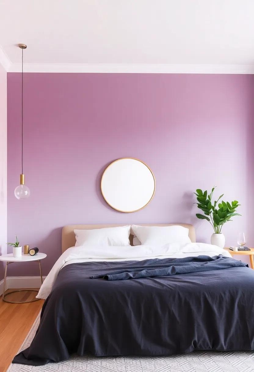
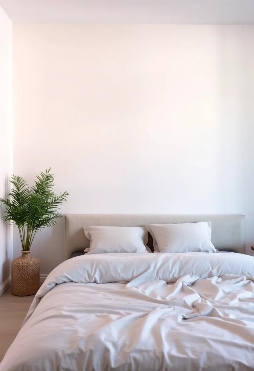
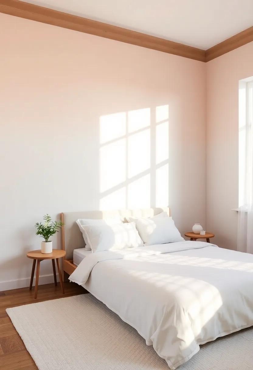
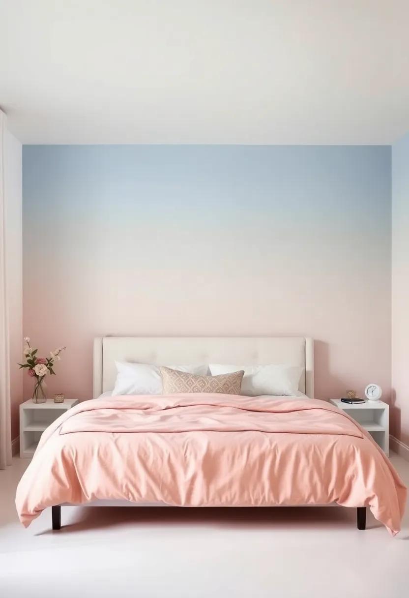
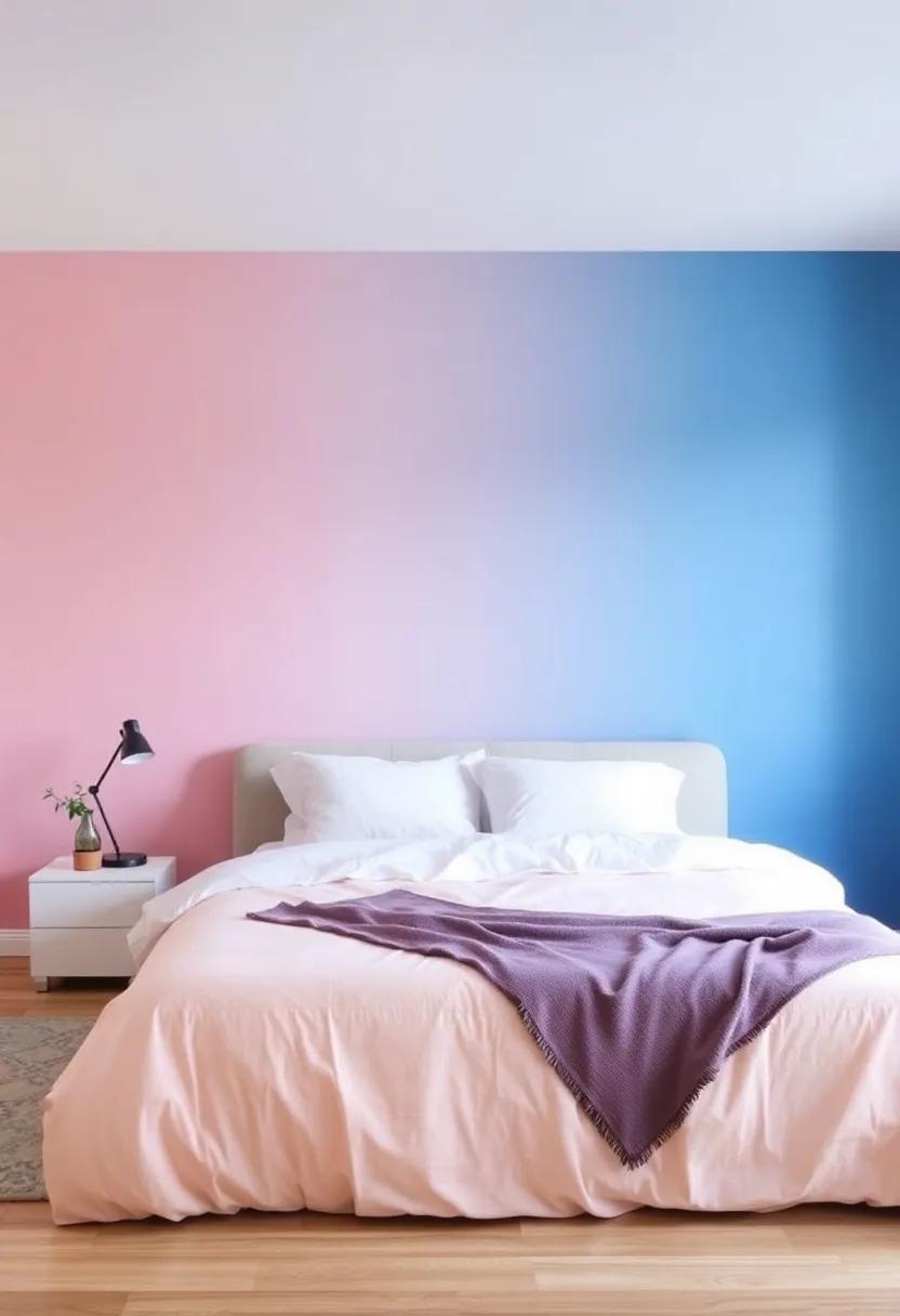
Soft gradient colors can breathe new life into your bedroom, making it a true sanctuary of relaxation and tranquility. Imagine waking up to hues that seamlessly blend from a calming pastel pink to a serene misty blue, creating a soothing atmosphere that gently influences your mood. Gradient walls invite a sense of depth and dimension, eliminating the harshness of solid colors and introducing a flowing harmony that resonates throughout your space. Whether you prefer a bold ombré effect or delicate feathering techniques, these soft transitions can transform your bedroom into a dreamy retreat.
To achieve the perfect gradient look, consider incorporating various painting techniques and complementary decor elements. Here are some ideas to inspire your transformation:
- Faded Edge Effect: Start with a light base and gradually deepen the color towards the base,creating a dipped effect.
- Color wash: Use diluted paint to create an ethereal, washed appearance that feels like a gentle watercolor.
- Vertical Gradient: Take your walls upwards by blending colors from a soft cream at the bottom to a tranquil teal at the top.
Pair these techniques with thoughtfully chosen furnishings and textiles in similar shades to create a cohesive look. Consider adding a few accent pieces in contrasting or complementary colors to enhance the overall aesthetic. The artistry of gradient painting doesn’t end at the walls; you can also incorporate gradients into bed linens, curtains, and artwork for a unified and harmonious design.
For more interior design inspiration, check out House Stunning.
Understanding the Psychology Behind Soft Gradient Colors in Sleep Spaces
Color psychology plays a crucial role in how we perceive our environment, especially in spaces dedicated to rest and rejuvenation. Soft gradient colors, transitioning gently from one hue to another, evoke feelings of calmness and serenity. These colors can create an illusion of space and depth, enhancing the overall ambiance of a bedroom. By using shades that are inspired by nature—such as soft blues, airy greens, and muted blushes—you can bridge the emotional connection between your physical space and mental well-being. The tranquil palette minimizes visual noise, allowing the mind to settle into a peaceful state conducive to sleep.
Moreover,the subtlety of gradients lends itself to versatile design options that can inspire creativity and personalization in a sleep sanctuary. When combined with natural light, these colors can shift throughout the day, providing a dynamic yet soothing aesthetic. Here are some ways to incorporate soft gradient colors effectively:
- Accent walls: Use a gradient effect on a single wall to create a focal point.
- Ceiling treatments: Extend the soft transition to the ceiling for an enveloping experience.
- Layered textiles: Incorporate gradient-colored textiles to enhance depth and continuity.
By thoughtfully choosing these hues,you can cultivate a space that mirrors the tranquility needed for restorative sleep. For more insights on the psychological effect of colors, visit color Psychology.
Choosing the Right Color Combinations for a Harmonious Bedroom Ambiance
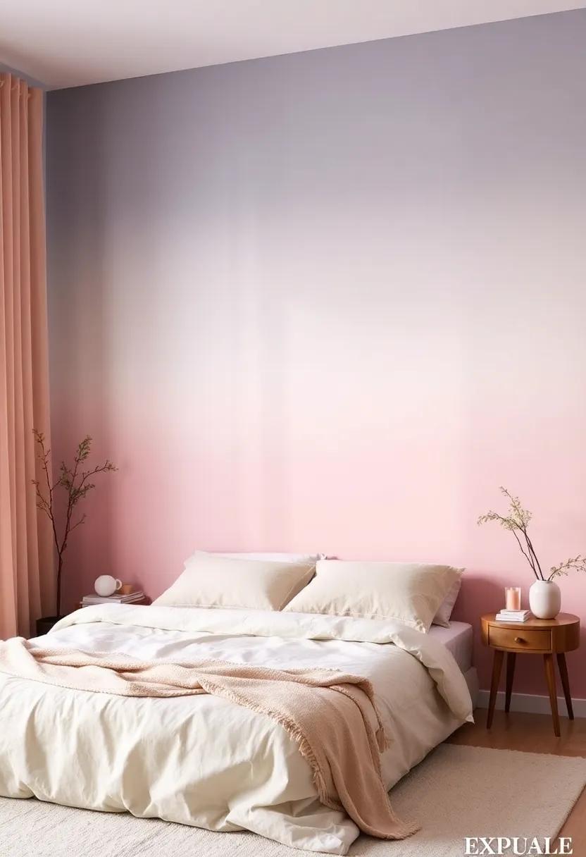
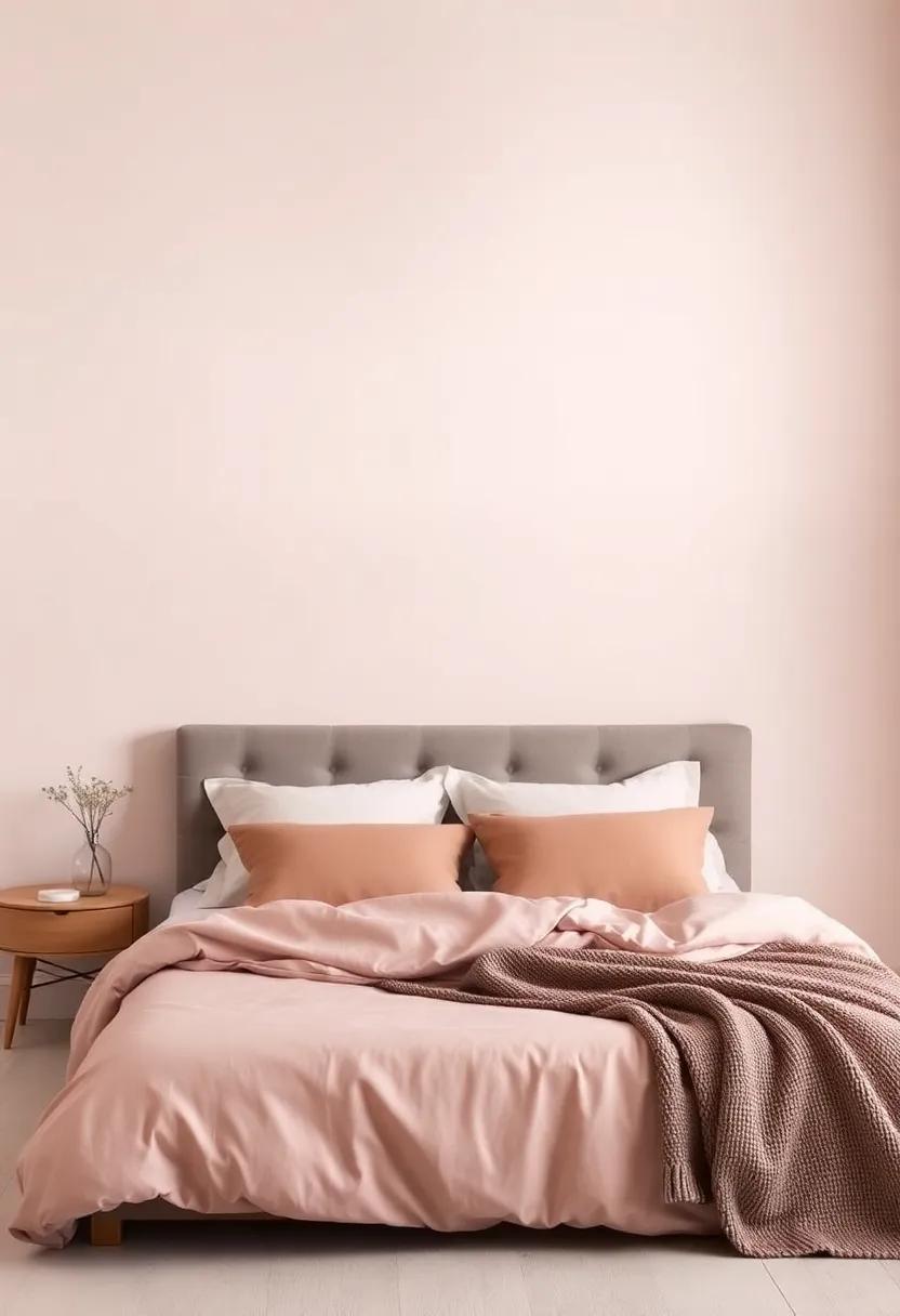
When it comes to crafting a serene and inviting bedroom atmosphere, understanding color theory can significantly elevate your space. Opting for soft gradient palettes creates a visual flow that soothes the mind and body. For instance, consider a transition from calming shades of soft blue to delicate lavender; this gentle gradient not only enhances relaxation but also evokes a sense of tranquility. You can further enrich this palette by incorporating complementary accents such as muted cream or pale peach for decorative elements—think throw pillows, blankets, and artwork—to maintain a cohesive aesthetic.
To make thoughtful choices, explore various combinations that resonate with your personal style while ensuring they promote harmony. Here are some examples to inspire your selection:
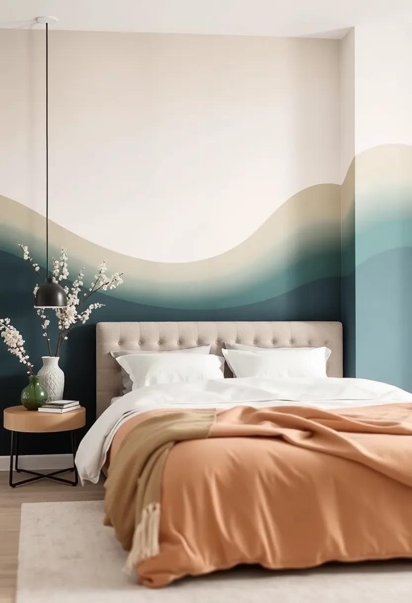
- Ocean Escape: Soft teal fading into sandy beige
- Sunset Bliss: Warm peach transitioning to gentle coral
- Forest Retreat: Sage green blending into a light moss
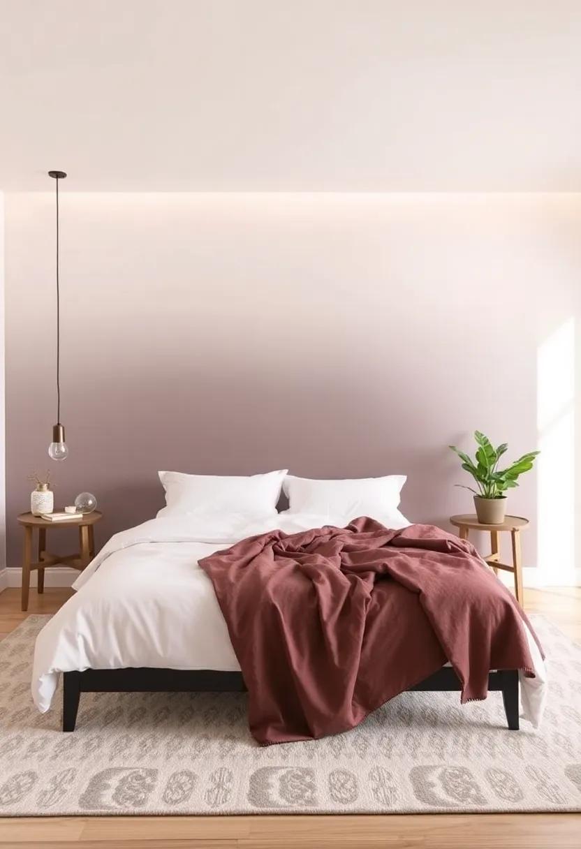
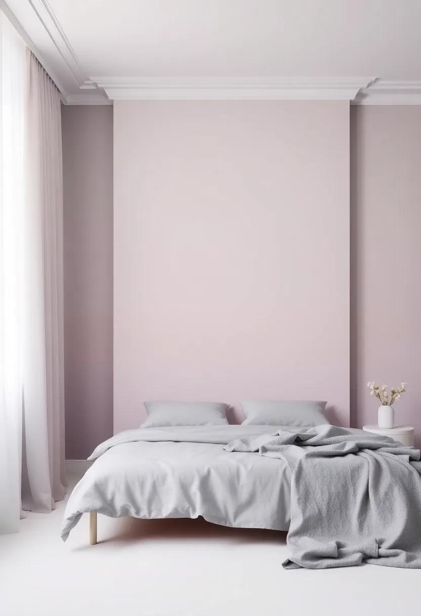
- Subtle elegance: Dusty rose merging into soft taupe
For more in-depth color theory insights, check out Color Psychology, which delves into the psychological impact of hues and their combinations.
The Art of Blending: Techniques for Creating Stunning Gradient Effects
Achieving a stunning gradient effect in your bedroom can transform the space into a tranquil sanctuary. To start, consider the blending techniques that best suit your vision. For a softly blended look, try the wet-on-wet technique, where you apply two colors while the first layer is still wet. This allows them to merge seamlessly. Another option is the dry brush method, where a dry brush is dipped lightly in paint to create soft edges and texture. Remember, practice on a sample board before applying directly to your walls to perfect your technique and achieve that dream-like finish.
When selecting colors for your gradient, think about creating a harmonious flow that reflects your style. Opt for shades that complement one another, such as soft pastels or subdued earth tones. Here are some popular gradient combinations that can elevate your bedroom aesthetics:
- Soft Lavender to Pale Pink
- Seafoam Green to Light Blue
- Peach to Cream
- Warm Beige to Soft Gray
To further visualize your gradient options, refer to the following color transition table, highlighting suggested color codes to achieve beautiful effects:
| Gradient Start | Gradient end |
|---|---|
| #E0B0E2 | #F3C6D9 |
| #A1D9D3 | #B7D7E5 |
| #F3C9B4 | #FDF5E6 |
| #D8CBBE | #E5E4E2 |
For further inspiration, you can explore innovative ideas on bedroom transformations at Apartment Therapy.
Selecting the Perfect Finish for your Gradient Bedroom Walls
Choosing the ideal finish for your gradient bedroom walls can significantly enhance the overall ambiance of your sanctuary. Matte finishes are a popular choice for creating a soft, velvety texture that absorbs light, making your space feel warm and inviting. On the other hand, satin or eggshell finishes provide a slight sheen, adding a hint of elegance while reflecting just enough light to make colors pop without overwhelming the senses. When deciding, consider the level of maintenance you’re pleasant with; matte finishes may require more frequent touch-ups, while glossier options are easier to clean and maintain.
To further refine your selection process, think about how the finish interacts with your room’s lighting. For north-facing rooms that tend to lack warm sunlight, a satin finish can brighten up the space by reflecting available light. Conversely,if your bedroom enjoys an abundance of natural light,a matte finish can definitely help tone down the brightness while promoting a serene atmosphere. As you contemplate your options, explore combinations such as adding an accent wall in a bolder finish to create a stunning focal point; this can elevate the gradient effect and provide a delightful contrast. For more inspiration and tips on paint finishes, visit www.bhg.com.
Maximizing Natural Light to Enhance Soft Gradient Paintings
In the realm of soft gradient paintings, the interplay of natural light can dramatically influence the ambiance of your bedroom. To harness this effect, consider strategically positioning your artwork on walls that receive abundant daylight.North-facing windows provide a soft, diffused light that enhances the subtlety of your gradient hues, while south-facing windows can intensify colors during different times of the day. Place your paintings at eye level to invite admiration and ensure that your color palette flows harmoniously with your bedroom’s existing decor.
Additionally, incorporating reflective surfaces, such as mirrors or glossy furniture, can further amplify the beauty of your soft gradients. These elements will not only bounce light around the room but also create an illusion of spaciousness. For those looking to deepen their understanding of how light interacts with colors, resources like Colorado College offer valuable insights into color theory and natural light dynamics. Remember to maintain a disciplined approach to your light sources to avoid shadows that can detract from the serene vibes of your sanctuary.
Incorporating Textures to elevate Your Gradient Bedroom Aesthetic
When designing a gradient bedroom, the visual impact can be significantly enhanced by incorporating various textures. Combining materials such as soft linens, plush throw pillows, and tactile wall coverings allows for a rich sensory experience that complements the fluidity of a gradient aesthetic. Consider adding elements such as:
- Velvet curtains in a deeper shade, flowing beautifully against your gradient walls.
- textured wallpaper with subtle patterns that add depth but don’t clash with the gradient.
- Woven rugs that transition in color, providing a warm contrast underfoot.
- Decorative cushions in varying fabrics and gradient hues for a cozy, layered effect.
To achieve a balanced yet dynamic look, consider pairing smooth surfaces with coarse textures. For example, a sleek headboard in a soft gradient can be juxtaposed with a chunky knit throw or a macramé wall hanging, creating visual intrigue and inviting touch. Achieving cohesion through your choice of additional decor is vital: select art pieces that echo the gradient and texture theme, perhaps opting for framed fabric pieces or ceramic tiles that resonate with your color palette. For further inspiration on textures in interior design, explore Houzz for ideas that can seamlessly align with your gradient vision.
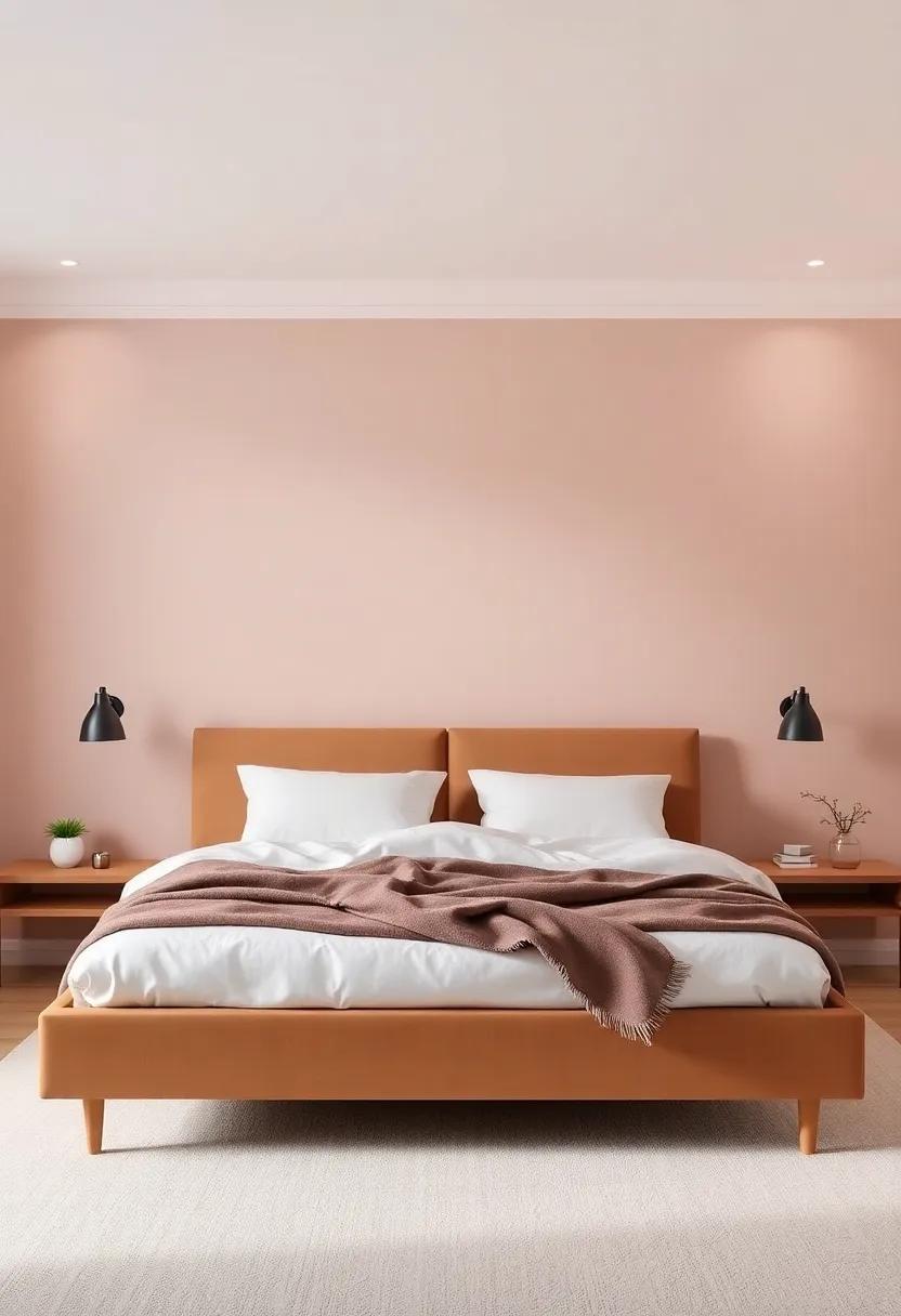
The Role of Accent Walls in Complementing Gradient Color Schemes
Accent walls serve as a focal point that enriches the overall aesthetic of any space, especially when paired with soothing gradient color schemes. By selecting a contrasting or complementary hue for the accent wall, you can add depth and dimension to your bedroom sanctuary. This intentional choice not only breaks the monotony of a singular gradient but also draws attention to essential features in the room, be it a beautifully crafted headboard or a stunning piece of artwork.As a notable example, a soft blush gradient transitioning into a delicate mint green can be beautifully offset by a deep coral accent wall, creating a harmonious yet dynamic visual experience.
Moreover, integrating patterns or textures into your accent wall can further enhance the effectiveness of a gradient color scheme. Consider incorporating elements such as wood paneling, fabric wallpaper, or a subtle geometric design. These textural details amplify the inviting warmth of gradient colors, making the overall atmosphere feel more layered and intimate. Additionally, using materials that reflect light can enhance the gradient effects, creating a captivating play of shadows and highlights throughout the day. For more inspiration and creative ideas on utilizing accent walls to complete your gradient theme, visit Design*Sponge.
Using Accessories to Accentuate Your Soft Gradient Bedroom Design
Enhancing a soft gradient bedroom design with well-chosen accessories can create a harmonious and inviting atmosphere.consider layering textures through textiles such as plush throw pillows, luxurious blankets, and soft rugs that reflect the gentle hues of your gradient walls. Choosing accessories in complementary or analogous colors will deepen the visual interest while maintaining a serene aesthetic. Accessories like artwork, ceramic vases, and decorative mirrors can serve as focal points, enhancing the overall design without overwhelming it. Think about integrating natural elements as well, such as indoor plants, which add life and a touch of color while connecting your space to the outdoors.
To elevate the enchanting ambiance of your bedroom, also explore lighting options that accentuate your soft gradient. Table lamps with soft, diffused light can create a cozy atmosphere, while elegant string lights or LED strips along the edges of your shelving can provide a warm, ambient glow. Artful combinations of wall sconces and floor lamps can also highlight the color transitions in your walls.For a thoughtful approach, pay attention to the scale and materials of each piece. Remember to make use of the Homepolish design principles to strike a balance between functionality and aesthetics, ensuring that each accessory you choose enhances your dreamy retreat.
Layering Colors for Depth and Dimension in your Sanctuary
Creating a sanctuary that feels both inviting and serene frequently enough hinges on the careful selection of colors and their request.Layering can introduce an exceptional sense of depth and dimension. To achieve this, consider the following techniques:
- Gradient Techniques: Blend lighter shades into darker hues to create a soft, ombré effect. This can visually extend the height of your walls.
- Accent Walls: Paint one wall a bolder, contrasting color to draw the eye and define spaces within your sanctuary.
- Textured Finishes: Use sponges or brushes to create textured effects that add a tactile element to the color gradients.
colors should also be thoughtfully chosen to evoke emotions and establish a mood. Soft pastels can promote tranquility, while deeper jewel tones can create warmth and intimacy. Consider these suggestions for achieving a harmonious palette:
| Color Scheme | Emotional Impact |
|---|---|
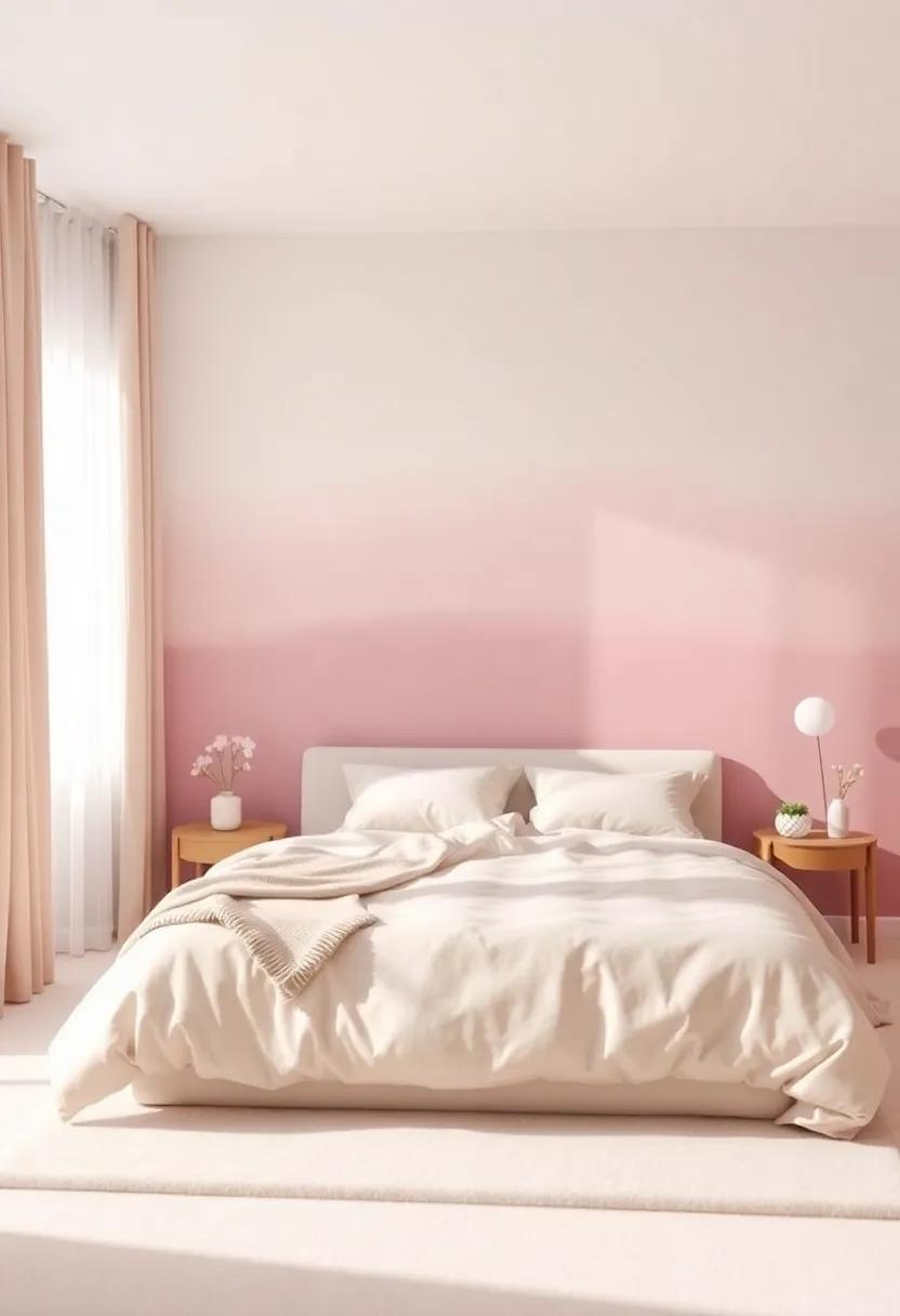
| Blush Pink to Soft Peach | Serenity and Comfort |
| Muted Blue to seafoam Green | Calmness and Freshness |
| Lavender to Deep Purple | Luxury and Creativity |
Experimenting with these techniques and color combinations can transform your space into a personal retreat. For more ideas and visualization tips, visit Better Homes & Gardens.
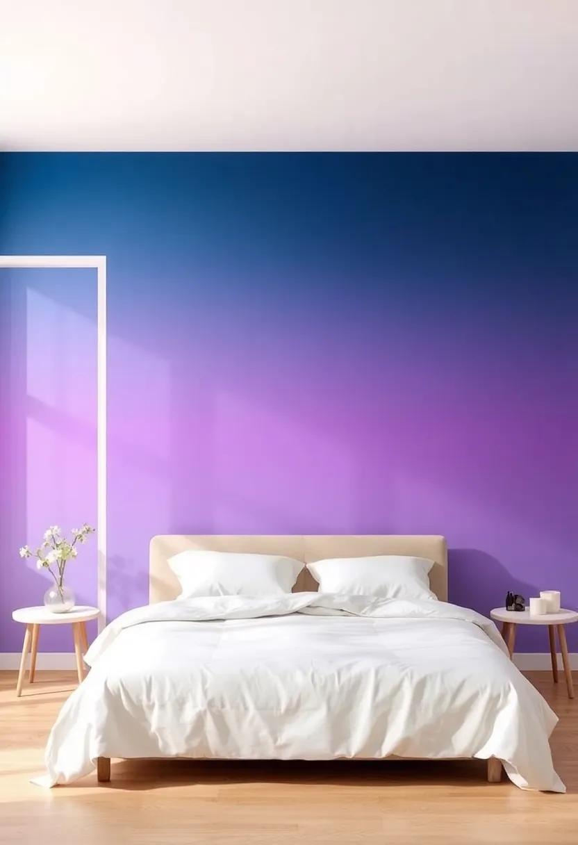
Creating Mood Zones with Thoughtful Gradient Color Placement
To create harmonious mood zones within your sanctuary,explore the transformative potential of gradient color placement. Soft transitions between hues can evoke feelings of tranquility, energy, or romance depending on your selection. start by identifying the different areas in your room where you want to influence the atmosphere—such as the sleeping space, reading nook, or workspace. By applying gradients that flow seamlessly from one area to another, you can psychologically delineate spaces while maintaining an overall unified look. Consider using a palette where calming blues might fade softly into energizing yellows, guiding the mood through the room in a gentle wave.
When arranging your color scheme, think about the emotional response that each gradient can inspire. Consider these combinations to elevate your décor:
- Lavender to Soft Pink: Perfect for a romantic retreat.
- Light Mint to Crisp White: Invigorating yet serene, ideal for a refreshing atmosphere.
- Warm Sands to golden Hues: Exudes a cozy, inviting feel for social spaces.
Additionally, the gradient placement should consider the room’s natural light. When hues are positioned to catch the light, they can enhance the effect and create a dynamic, changing environment. For more insights into color psychology, check out colorpsychology.org.
Inspiring Gradient Color Palettes for Different Bedroom Themes
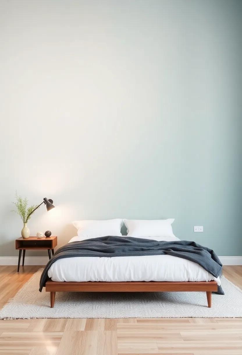
For a tranquil and soothing atmosphere, consider a blue to soft lavender gradient. This palette mimics the serene skies at dusk, offering a calming influence that’s perfect for winding down after a long day. The soft transition between the two hues can be achieved through a layering technique that creates depth, making your bedroom feel like a peaceful retreat. Pair this with white or light wooden furniture to maintain an airy and spacious vibe, enhancing the overall serenity of the space.
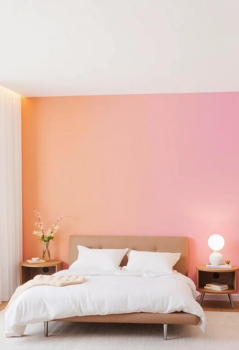
For those aiming for a bold statement, a sunset-inspired gradient of coral, peach, and gold can transform your bedroom into a vibrant sanctuary. This lively combination can energize your mornings and create a joyful ambiance. Use the deeper coral shade at the bottom of the walls, gradually transitioning to a lighter peach and finishing with a gentle gold near the ceiling. This approach celebrates warmth and creativity, while also allowing you to accessorize with neutral-colored bedding and decor, striking a balance between vibrancy and relaxation. to explore more ways to elevate your space, visit Houzz for tips on color schemes that complement your unique style.
How to Prepare Your Bedroom Walls for a Flawless Gradient Transformation
To achieve a flawless gradient transformation on your bedroom walls, it’s essential to start with proper planning. Begin by clearing the space of all furniture and decor to create an open canvas. Next, inspect the walls for any imperfections such as cracks, holes, or bumps. These should be filled and sanded smooth to ensure an even paint application. Once the surface is prepped, wipe down the walls with a damp cloth to remove dust and debris. This step is crucial, as even small particles can lead to uneven paint results. Lastly, applying a coat of primer can significantly enhance paint adhesion and improve the longevity of your gradient finish.
As you think about the colors for your gradient, consider creating a color chart that outlines your desired transition. Use small paint samples to visualize how different shades complement each other. Here’s a simple table to help you strategize:
| Color Transition | Suggested combinations |
|---|---|
| Soft Blues | Sky Blue to Powder Blue |
| Gentle Pinks | Peach to Blush |
| Earthy Tones | Sand to Olive Green |
| Cool Grays | Light Gray to Charcoal |
For additional design inspiration and tips on color selection, consider visiting Lowe’s. Their resources can guide you in finalizing your perfect palette.
Exploring Eco-Friendly Paint Options for Your Bedroom sanctuary
When it comes to creating a tranquil space in your bedroom, exploring eco-friendly paint options can significantly enhance the atmosphere while keeping your sanctuary safe from harmful chemicals. Enduring paints are typically made from natural ingredients and non-toxic compounds, ensuring a healthier environment for you and your loved ones.Consider choosing paints that are low in volatile Organic Compounds (VOCs),as these can definitely help reduce indoor air pollution while providing a vibrant,inviting palette for your walls.
Here are some eco-conscious brands to consider when making your selection:
- Benjamin Moore: Known for its eco-friendly line, “Aura”, which provides excellent coverage and a low environmental impact.
- Behr: Offers a range of low VOC paints that are both durable and stylish.
- Farrow & Ball: This premium brand provides paint options derived from natural materials, ideal for creating a soft gradient effect.
As you plan your bedroom transformation, keep in mind that a smooth transition between colors can add a serene touch to your design. Explore the various eco-friendly options to ensure that your sanctuary not only looks beautiful but is also harmoniously aligned with a sustainable approach to home decor. For more tips on choosing eco-friendly products, visit TreeHugger.
Reflecting Personal Style with Unique Gradient Designs in Your Space
Infusing your sanctuary with a personal touch begins with the bold decision to embrace unique gradient designs.This technique not only adds depth to the walls but also transforms the atmosphere of your bedroom into a serene retreat. Whether you opt for soft pastels or vibrant hues, gradients allow for a seamless blend that reflects your individual style. Some ideas to inspire your choice of colors include:
- Sunset gradients – A mix of warm oranges and calming purples
- Ocean-inspired palettes – Soft blues blending into tranquil seafoam greens
- Muted earth tones – Gradients that transition from light beige to deep terracotta
Beyond just aesthetics, gradients can evoke moods and feelings that resonate with your personal journey. They can create a peaceful ambiance, energize your mornings, or even invite creativity into your sacred space.Experimenting with the gradient effect on furniture, textiles, or accents can also elevate the overall design. For those looking to explore new techniques and ideas, resources like Decoist offer tips on creating stunning gradient features that could make your room feel like an artistic masterpiece. Consider the following simple gradient application ideas:
- Feature wall gradients – Transform one wall to be your statement piece
- Ceiling accentuations – Gradual color transitions from ceiling to wall
- Furnishing with gradient textiles – Incorporate colorful throws or cushions
Blending Gradient Paint with Wallpaper for added Visual Interest
Combining a soft gradient paint scheme with the right wallpaper can elevate a bedroom’s aesthetic, introducing depth and dimension that transforms the overall ambiance.For an harmonious blend, consider choosing gradient colors that complement your wallpaper’s palette. As an example,a serene blue-to-white gradient can perfectly contrast with a floral wallpaper that features similar hues,creating a cohesive feel. Alternatively, you could opt for vibrant colors that bring a pop of energy to a more subdued pattern, emphasizing the playful aspect of your design. this dual approach allows you to create a captivating visual story that invites relaxation and inspiration.
When implementing this creative technique, think about how the transition from paint to wallpaper can tell a story through layers. Start with a gradient that fades softly into a statement wall or a section with bold patterns. You might explore options such as:
- Vertical Gradients: Create height perception with upward fading.
- Horizontal Waves: Reflect serenity by mimicking ocean waves.
- Accent Areas: Use gradients to highlight specific sections, like headboards.
To visualize this, take into account the following simple table that illustrates the best gradient and wallpaper pairings:
| Gradient Color | Wallpaper Pattern |
|---|---|
| Soft lavender to White | Subtle Floral |
| Peach to Cream | Geometric Designs |
| Ocean Blue to Soft Gray | Abstract Waves |
For further inspiration, consider exploring resources on sites like Houzz to see how others use this stylish technique in their homes.
Incorporating Blackouts and Drapes for a Cozy gradient Vibe
To create a truly inviting atmosphere in your bedroom, the choice of window treatments is just as important as the paint on your walls. Incorporating blackouts and drapes not only enhances the aesthetic appeal of a soft gradient color scheme but also ensures your sanctuary remains a peaceful retreat from the world outside. Choose drapes that feature lighter shades of your gradient palette, allowing them to softly diffuse the daylight while, at the same time, maintaining the vibrant tones when closed. combining textural elements adds depth to the overall look, so consider fabric options like velvet, linen, or sheer materials that will harmonize with your gradient choice.
Imagine this: during the day, light filters through delicate drapes, illuminating your room in gentle pastels, while blackout curtains create a snug cocoon at night, promoting restful sleep. For a cozy gradient vibe, choose complementary colors that flow seamlessly from one to another. Here are some tips for selecting the right combination:
- Layering Options: Play with different lengths of drapes to add dimension.
- color Harmony: Select tones that transition smoothly to enhance the gradient effect.
- Textured Fabrics: Mix various materials to create visual interest.
Utilizing these elements ensures that your bedroom remains a haven of warmth and tranquility, perfectly blending stylish aesthetics with comfort. For further inspiration on creating an inviting space, check out The Spruce.
Enhancing Gradient Walls with Thoughtful Lighting Solutions
When adorning your soft gradient walls, lighting is key to amplifying their beauty and mood. Thoughtful placement of ambient and accent lighting can create a breathtaking visual experience. Consider installing wall sconces that complement the gradient hues, casting a warm glow that accentuates the color transitions. Additionally, using adjustable LED strip lights can definitely help create dynamic lighting effects, allowing you to change the ambiance according to your mood or the time of day.
Incorporate layered lighting solutions to enrich depth and drama in your sanctuary.Here are some ideas to get you started:
- Dimmer Switches: Adjust the brightness to achieve a calming atmosphere.
- Table lamps: Use lamps with unique designs to highlight specific areas of the room.
- Natural Light: Maximize windows to enhance the gradient colors with the changing daylight.
| Lighting Type | Effect |
|---|---|
| Wall Sconces | Focus on color transitions |
| LED Strip Lights | Dynamic color shifts |
| Table Lamps | Warm cozy corners |
To explore more inspirational lighting ideas for your space, check out Houzz, where you’ll find countless design concepts to further elevate your gradient walls.
creating a Focal Point: Artwork that Complements Your Gradient Walls
To enhance the serene beauty of your gradient walls, choosing the right artwork is essential. Opt for pieces that engage with the soft hues of your walls, creating a visual dialog that elevates the overall ambiance of your bedroom. Abstract pieces with blended colors or nature-inspired prints featuring gentle tones can provide balance without overwhelming the softness of the gradient.Additionally, consider incorporating a few smaller framed prints to create a gallery wall effect. this not only draws the eye upwards, making the space feel larger, but also gives a sense of personalization that makes the sanctuary truly yours.
When selecting artwork, you might explore a blend of materials and dimensions. Examples include:
- Canvas prints that stretch seamlessly across the gradient colors.
- Framed photography showcasing landscapes or delicate floral images.
- Metallic accents that catch the light and beautifully contrast with softer shades.
Creating a cohesive look can be as simple as sticking to a color palette that reflects the tones of your walls. for those looking for inspiration on where to find unique pieces, platforms such as Etsy offer a plethora of handmade and vintage options that can serve as conversation starters in your tranquil haven.
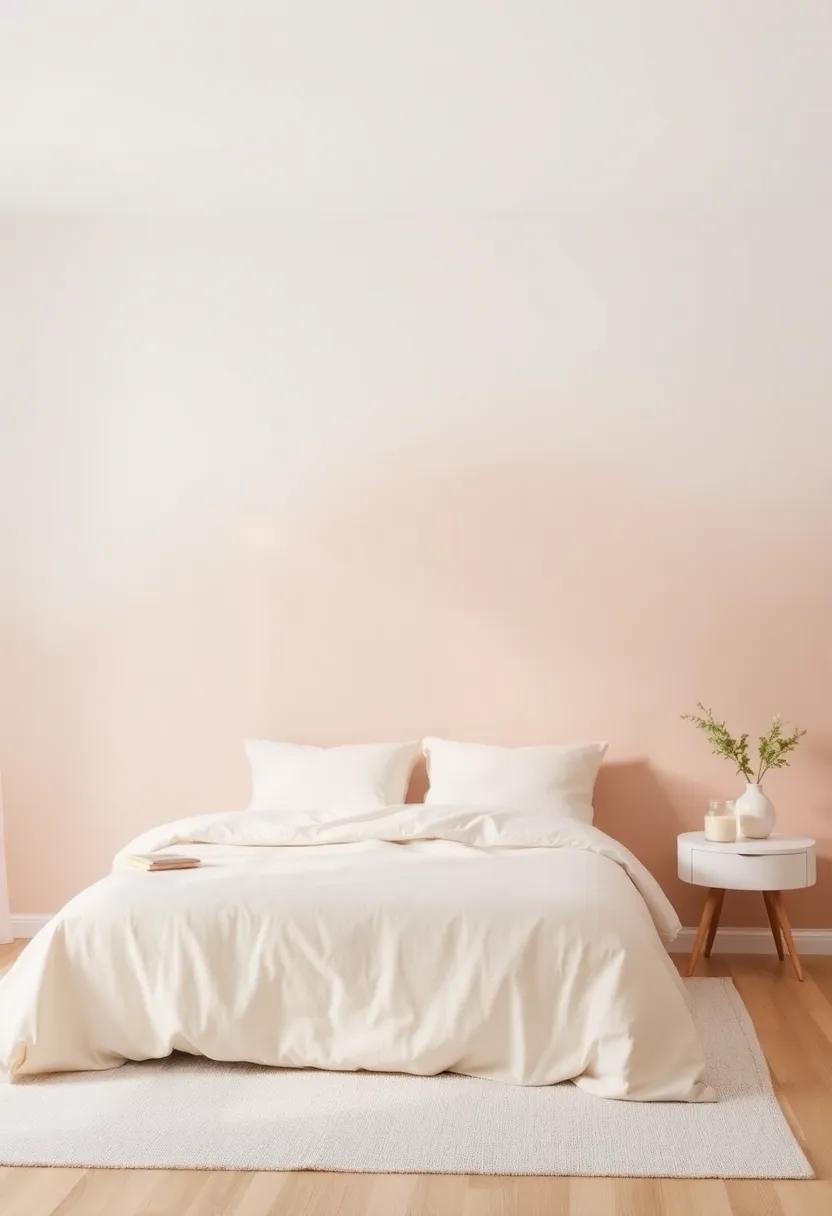
Imagining Your Dream Bedroom with Soft Gradient Inspirations
To curate a sanctuary that resonates with your personality, consider soft gradients that blend harmoniously to evoke calm and comfort. Picture a gentle transition from a soothing pale lavender at the top of the walls to a tranquil white or cream near the base. This technique not only adds depth but also creates the illusion of a larger space, inviting a sense of peace. Other combinations may include muted blues fading into soft greys or blush pink evolving into warm peach. Each choice reflects different moods and styles, allowing you to tailor your bedroom to your unique preferences.
When implementing gradient techniques, layering becomes your best friend. You can experiment with various finishes and textures to further enhance the visual appeal. Consider incorporating design elements such as softly draped sheer curtains, plush throw pillows in complementary hues, and artwork that harmonizes with your gradient palette. To spark your creativity,take a look at this Awwwards collection showcasing innovative designs.It’s a treasure trove of inspiration that can definitely help you visualize how gradients can transform your sleeping space into a tranquil retreat.
Insights and Conclusions
As we conclude our journey through the serene world of soft gradient bedroom painting ideas, we hope you feel inspired to transform your sanctuary into a personal oasis of calm and creativity.The subtle interplay of colors can breathe new life into your space, inviting tranquility and warmth that reflects your unique style. Whether you opt for a gentle ombré effect or a smooth blend of pastels,remember that the power of paint can redefine not just your walls,but the very ambiance of your home. Embrace the art of transitions, and let each brushstroke mirror the journey of self-expression you embark upon. So pick up that paintbrush, unleash your imagination, and watch as your sanctuary comes to life—one soft gradient at a time. Happy painting!
As an Amazon Associate I earn from qualifying purchases.